
What makes an iconic transport logo? Here Studio Blackburn's Paul Blackburn chooses his five all-time favourites, courtesy of Vignelli, Brockmann, Aicher et al…

What makes an iconic travel logo? It should be simple, expressive, reassuring and most importantly defy the trends of consumer culture…
1
SBB Swiss Federal Railways, designed in 1972 by Hans Hartmann and modified in 1978 by Josef Müller-Brockmann and Peter Spalinger.
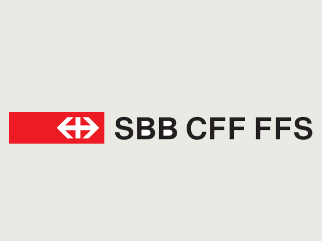
The SBB logotype and identity system is as hard as nails. The central vertical stroke of the logo anchors it and the arrows, left to right, create a modified Swiss flag within them. With Switzerland at the centre, the arrows infer travel inside and beyond the region. The symbol is symmetrical and centred, but ranged right in a rectangular horizontal holding box giving the impression of the white symbol having moved from left to right within it.
The logotype is used as part of a system of typography and information that is beautiful in its simplicity. The red is such a strong stand out colour that the logotype rarely needs to be made too large, and is used on appropriately neutral and dark backgrounds that give the symbol a jewel-like quality.
The Swiss need to produce information in three languages, and this is dealt with expertly. Clear, solid and authoritative, there’s a system in place here, a feeling of a power that’s in control of the situation: no need for smiling commuters or train drivers, this is the ultimate in functional reliability. On time and on the money, and never off the rails.
—
2
NS (Dutch Railways), designed by Gert Dumbar at Tel Design, visual Identity by Dumbar Associates.
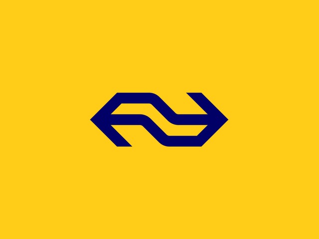
If it’s movement you’re after, Dutch is for you; a shake of the bum, a wiggle of the hips, live the dream on Dutch railways. The Dutch rail logo design is a play on two arrows. It is geometric with the arrows combining to make one symbol. But it contains a squiggle motif, suggesting movement back and forth – trains switching direction and taking corners.
The system of implementation is striking and impactful, if not beautiful in a classic sense. It employs a confident use of negative space, the blue on yellow produces high standout, and the yellow is strong enough to carry white text and the logotype.
The logo is squat and compact with an air of self-containment, a bit like the Netherlands itself. This is not an invitation to traverse Europe by train, but to travel quickly and solidly in an environment designed for your needs.
—
3
Bilbao Metro, designed by Otl Aicher.
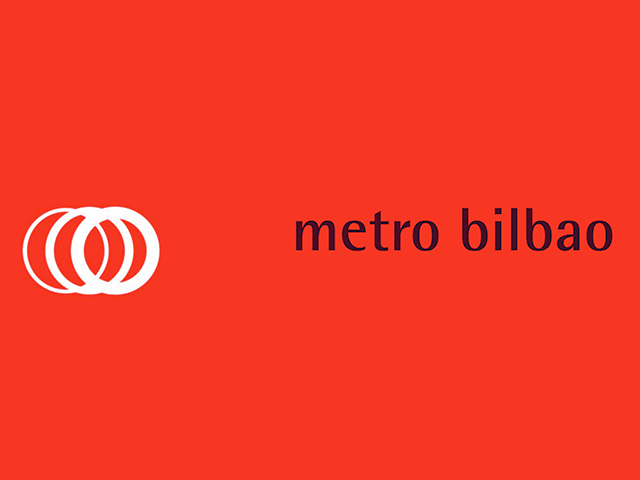
The really interesting thing about the Bilbao Metro is that Aicher worked very closely with Norman Foster – the architect who designed the stations – they were friends and collaborators. It’s a great example of information design, graphic design and architecture working together from the outset of a project to a successful end. Both Foster and Aicher were trying to achieve something fairly neutral with an emphasis on assisting people travelling around the city – without confusing them or imposing an unnecessary design style.
The shell shaped, tube like, glass canopy entrances to the metro are influenced by shapes of sea creatures – I’d say they’re as expressive as Foster has ever been, and Aicher was probably influenced by this when he developed the three rings approach to the symbol, although the Bilbao Metro site states that it is, “based on tunnels and wheels in movement”. The white area to the right of the symbol - which creates a space for the symbol to move towards and is the same width - amplifies the suggestion of left to right movement. Aicher used the phrase ‘bi-dimensional architecture’ which suggests that he was trying to conjure the perception of multi-dimensional travel with two-dimensional forms.
The typeface used in the logotype and sign system is Rotis Semi Sans, also designed by Aicher and lending itself comfortably to the rounded but accurate forms of the logotype.
—
4
Lufthansa, designed in 1918 by Otto Firle and modified from 1963 onwards by E5.
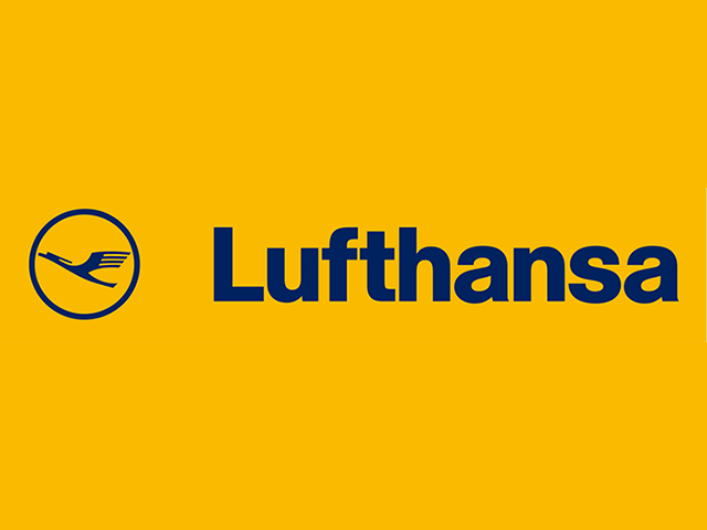
The Lufthansa logo is a perfect combination of soaring flight anchored by perfectly spaced typography. The symbol is based on a crane in flight, the circle holding it in perpetual motion. The logo uses three colours – yellow, blue and white – that portray modernism and excellence in design. These colours were intended to depict purity, safety, peace, optimism, reliability and the sense of responsibility of the company. The fact that they haven’t changed in more than forty years is testament to their strength, and even more so is the fact that to some extent they’ve become industry standard colours – often copied but rarely put to better use.
The rigorous, restrained and high quality rendering of the logotype is enhanced by Lufthansa’s use of a logo featuring a custom-designed rounded typeface. Lufthansa were ahead of their time by developing and using a proprietary typeface Lufthansa, which is based on Berthold Helvetica. This enables any additional branding to be typeset in the Lufthansa typeface. In recent years Lufthansa have successfully used these few simple but well chosen elements to increase brand recognition at all levels including ATL campaigns, proving that it can be done – I’m talking to you, advertising agencies.
—
5
American Airlines, designed by Massimo Vignelli / Unimark International in 1967.
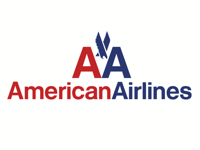
If the definition of art is the implicit made explicit, then the American Airlines logo and identity designed by Massimo Vignelli is the ultimate expression of art as design. So simple that it takes your breath away.
The idea itself is beautiful, making use of the good fortune of having two words beginning with the first letter of the alphabet, the first being the most defining word of the company’s country – American - and the second being the defining word of the sector – Airlines. The two A’s are rendered in American Red and Blue, the most significant colours of the USA. And the typesetting is perfect. The company’s ethos was ‘gimmick-free professionalism’, the simplicity of the approach flavoured only slightly by the inclusion, at the client’s request, of a geometrically illustrated American eagle.
The other trick that Vignelli pulled off with this logotype was to create a sense of movement from an almost symmetrical and conventional logo mark. The blue ‘A’ and the blue ‘Airlines’ look like they’ve just moved out from the shadow of the red typography. This is a logotype and identity that was not in need of change, but could not have anticipated the negative effect that consumerism would have on how we hold our aesthetic values.
Paul Blackburn is a Creative Consultant and the Founder of Studio Blackburn. The Studio recently redesigned the brand and logo for The Trainline, find out more at studioblackburn.com