
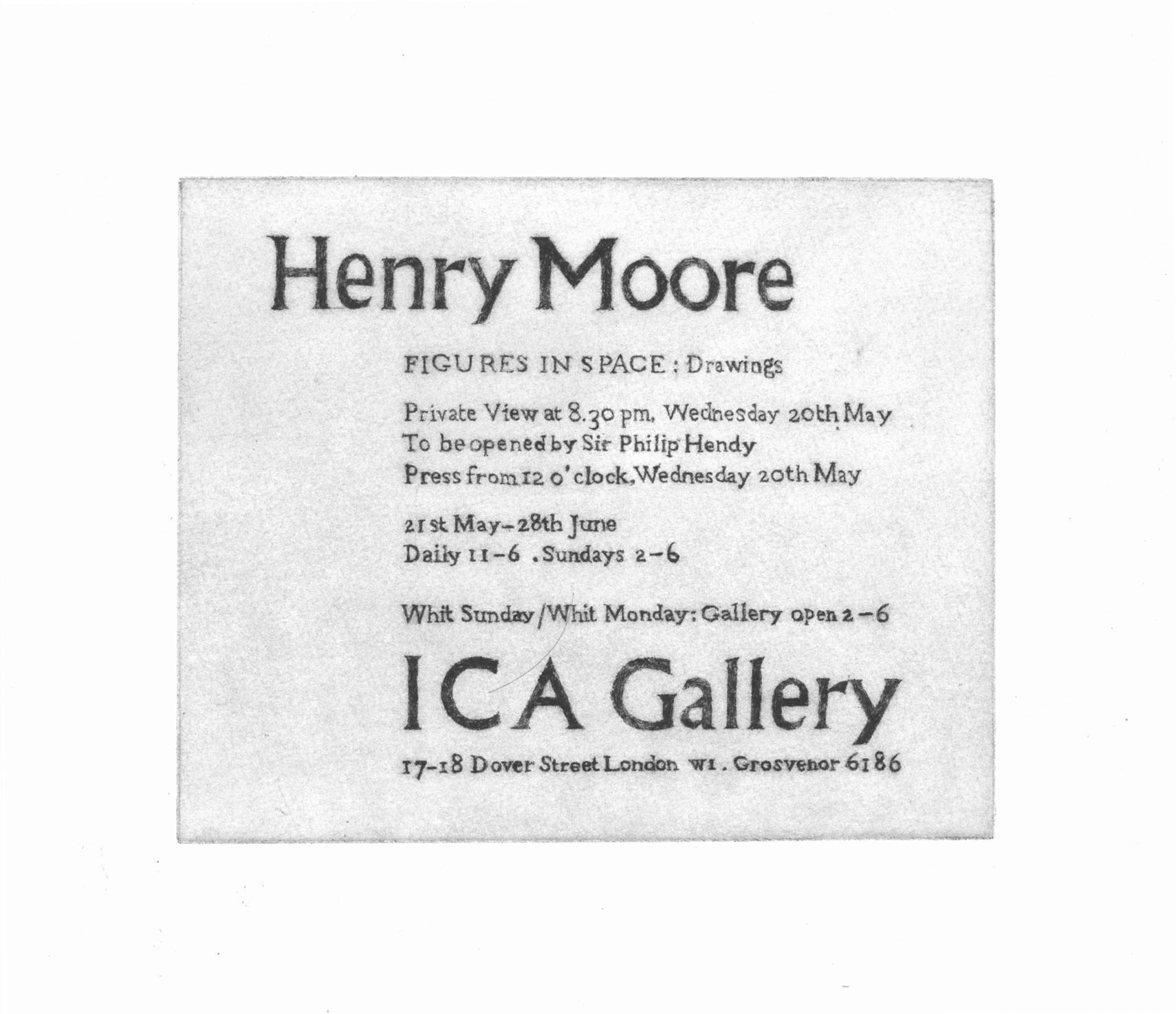
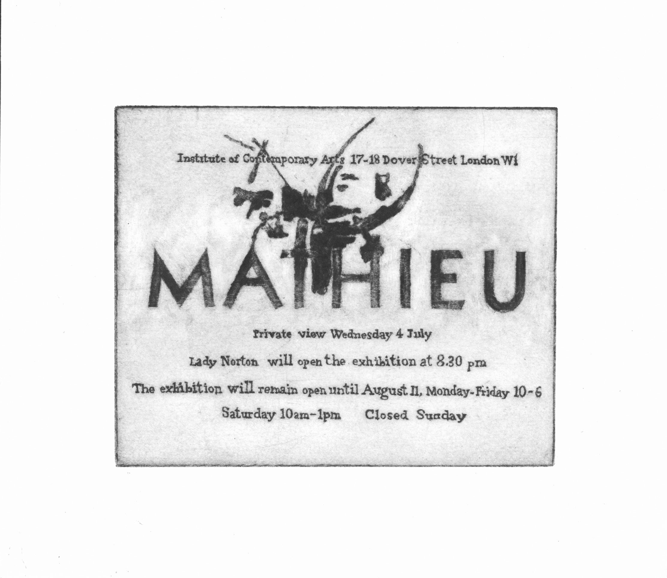
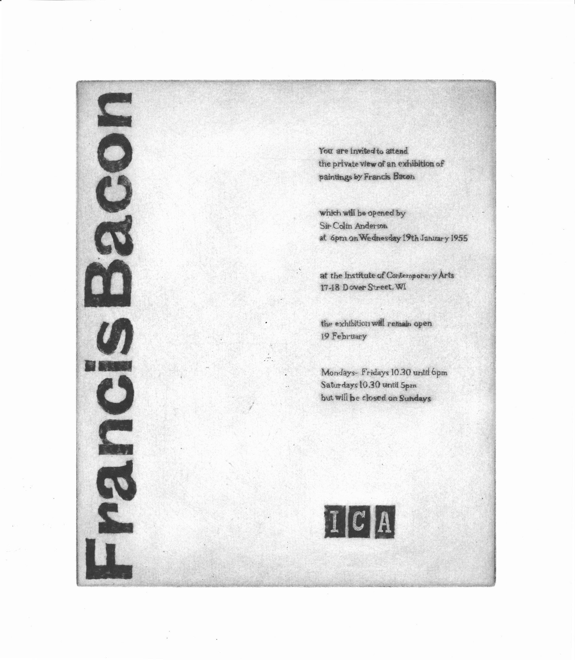
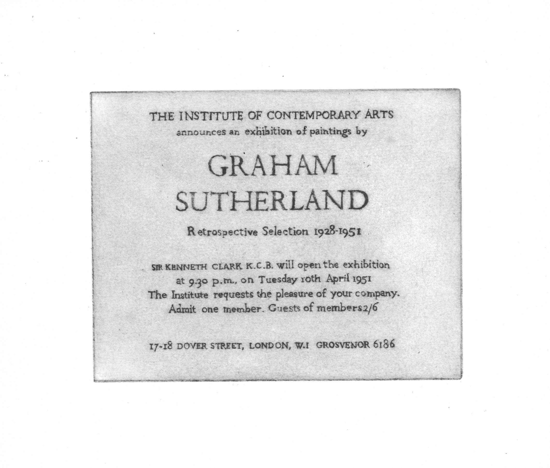
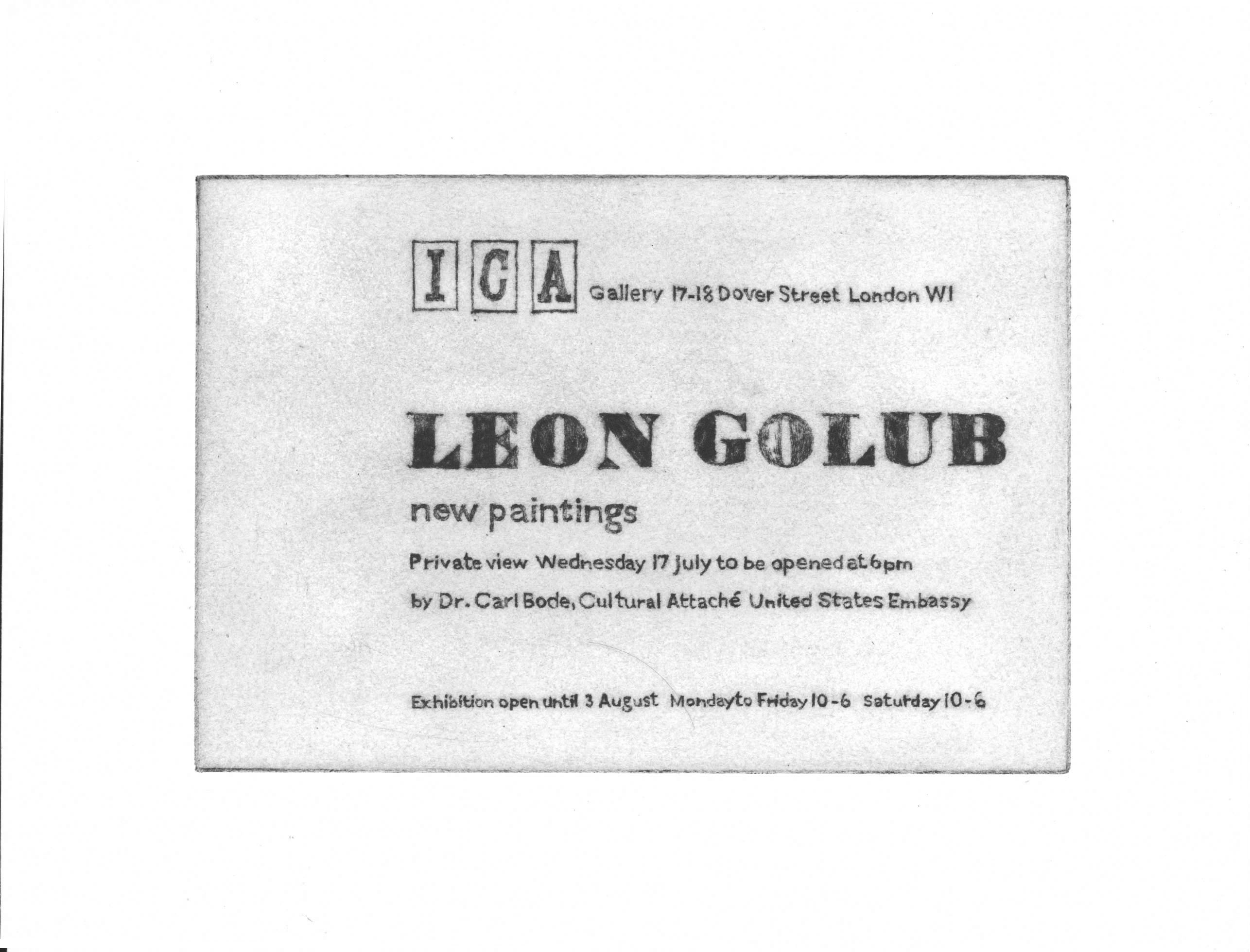
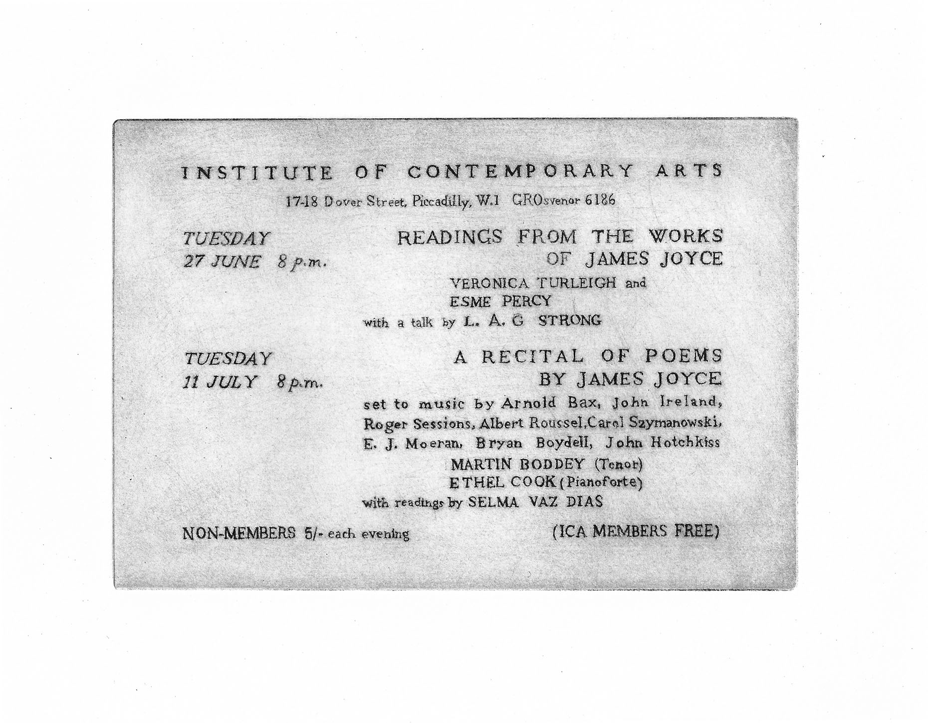
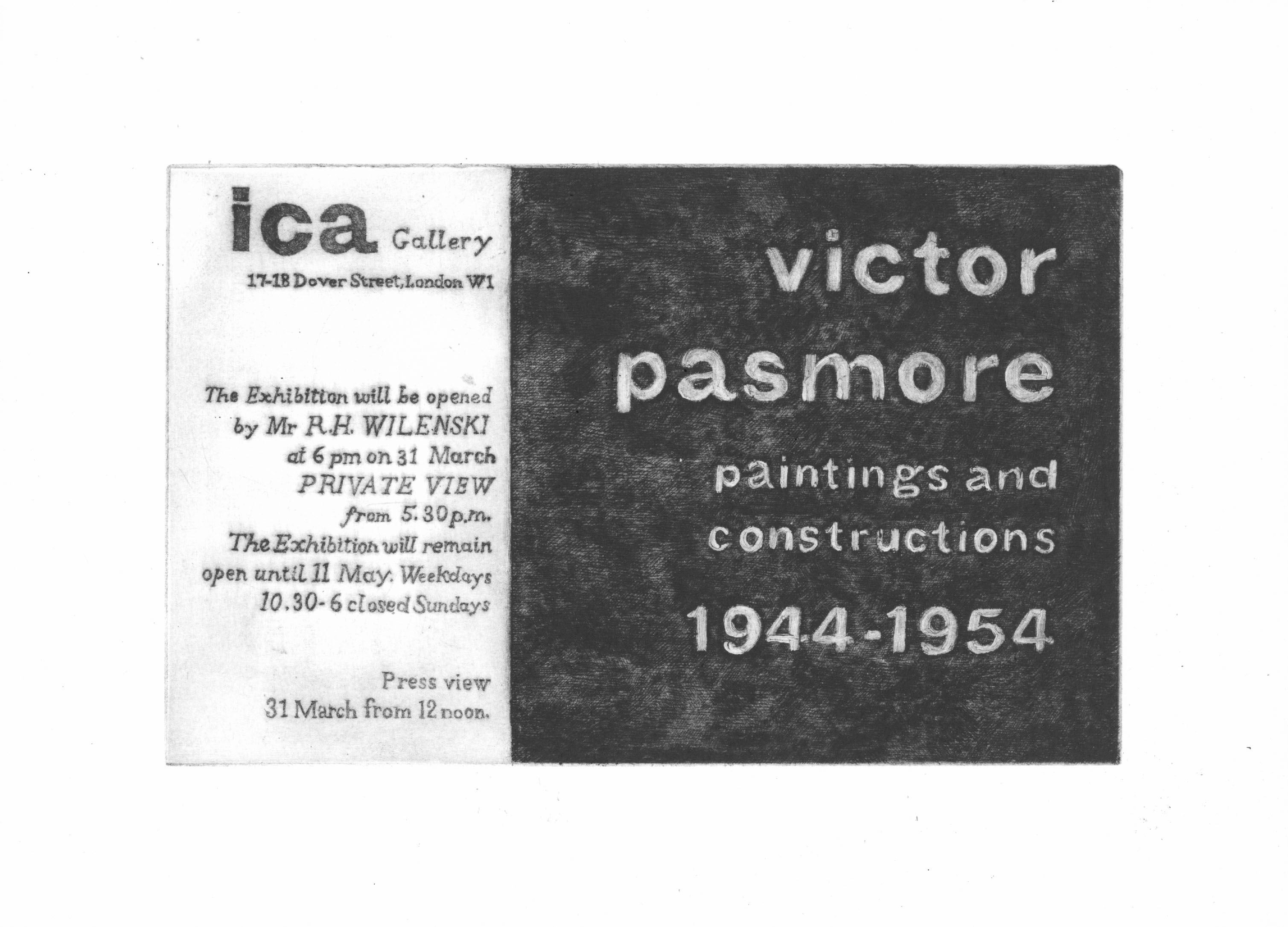
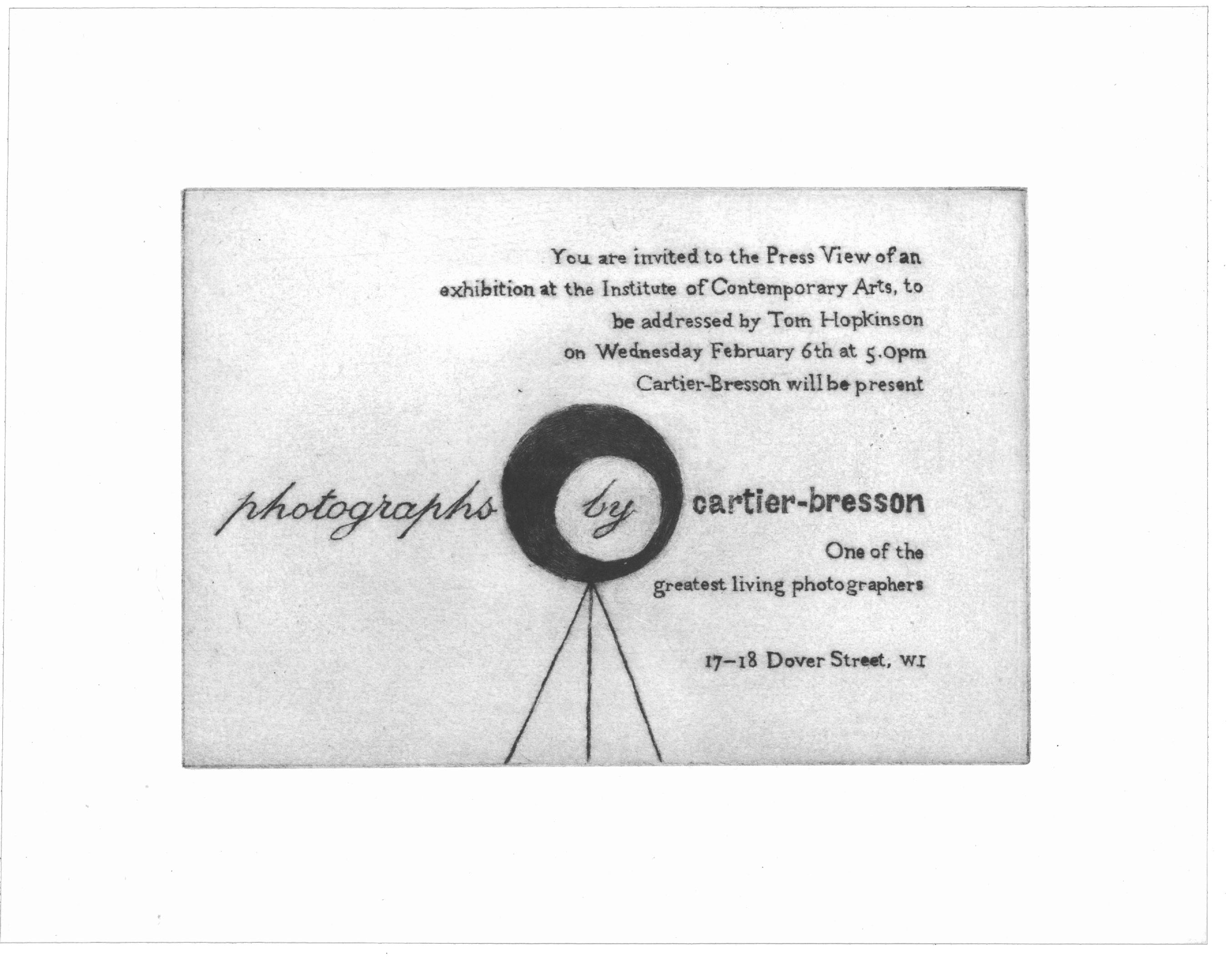
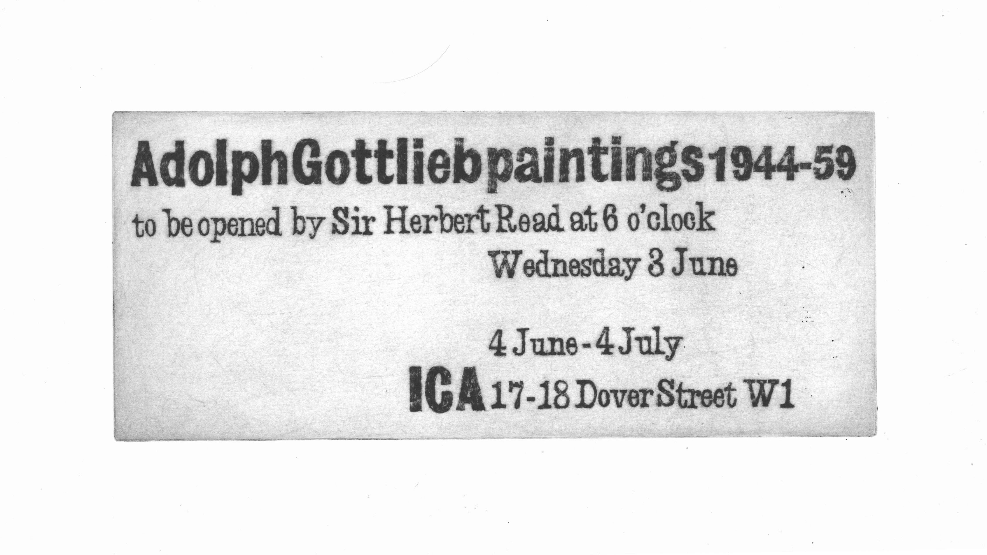
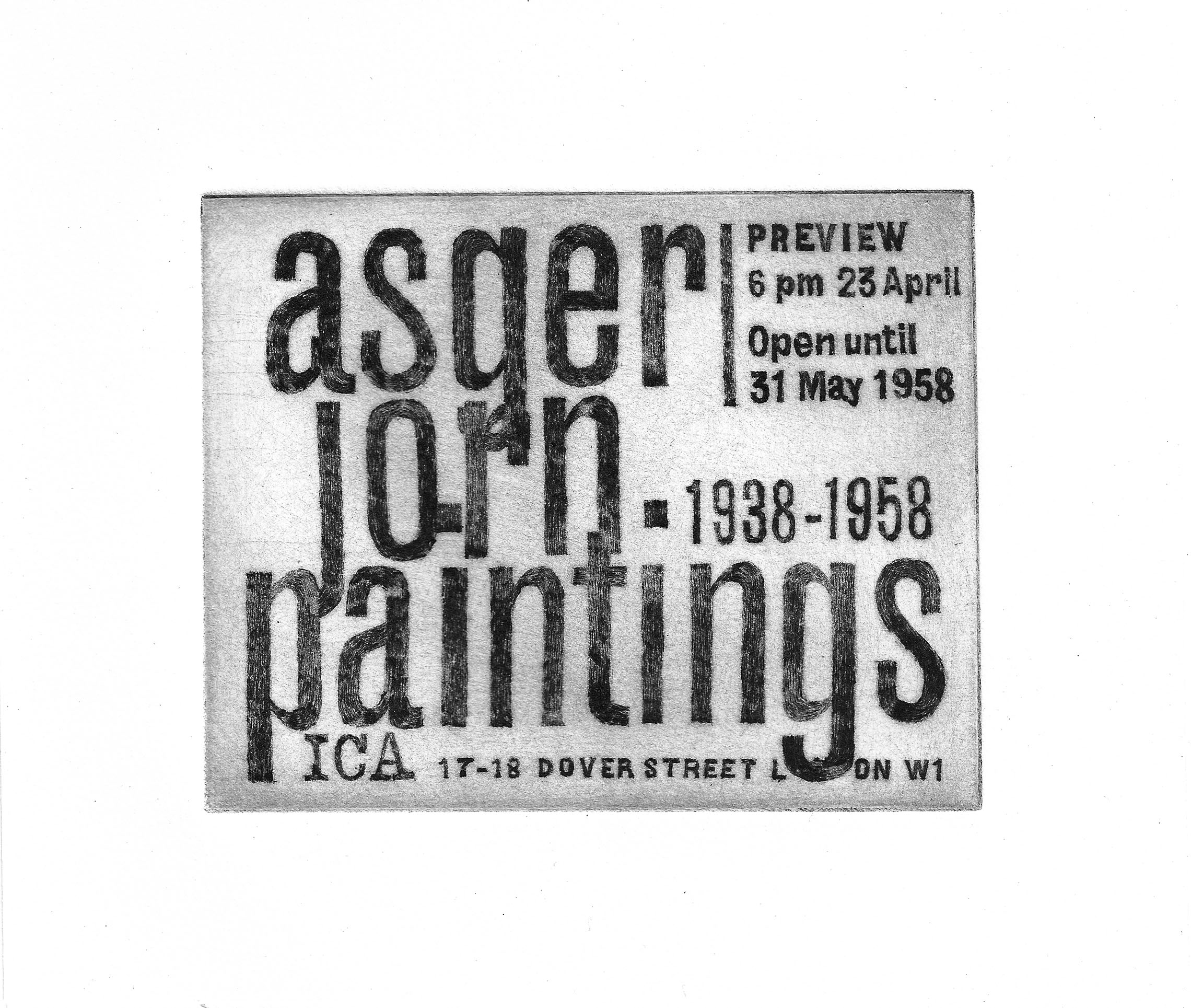
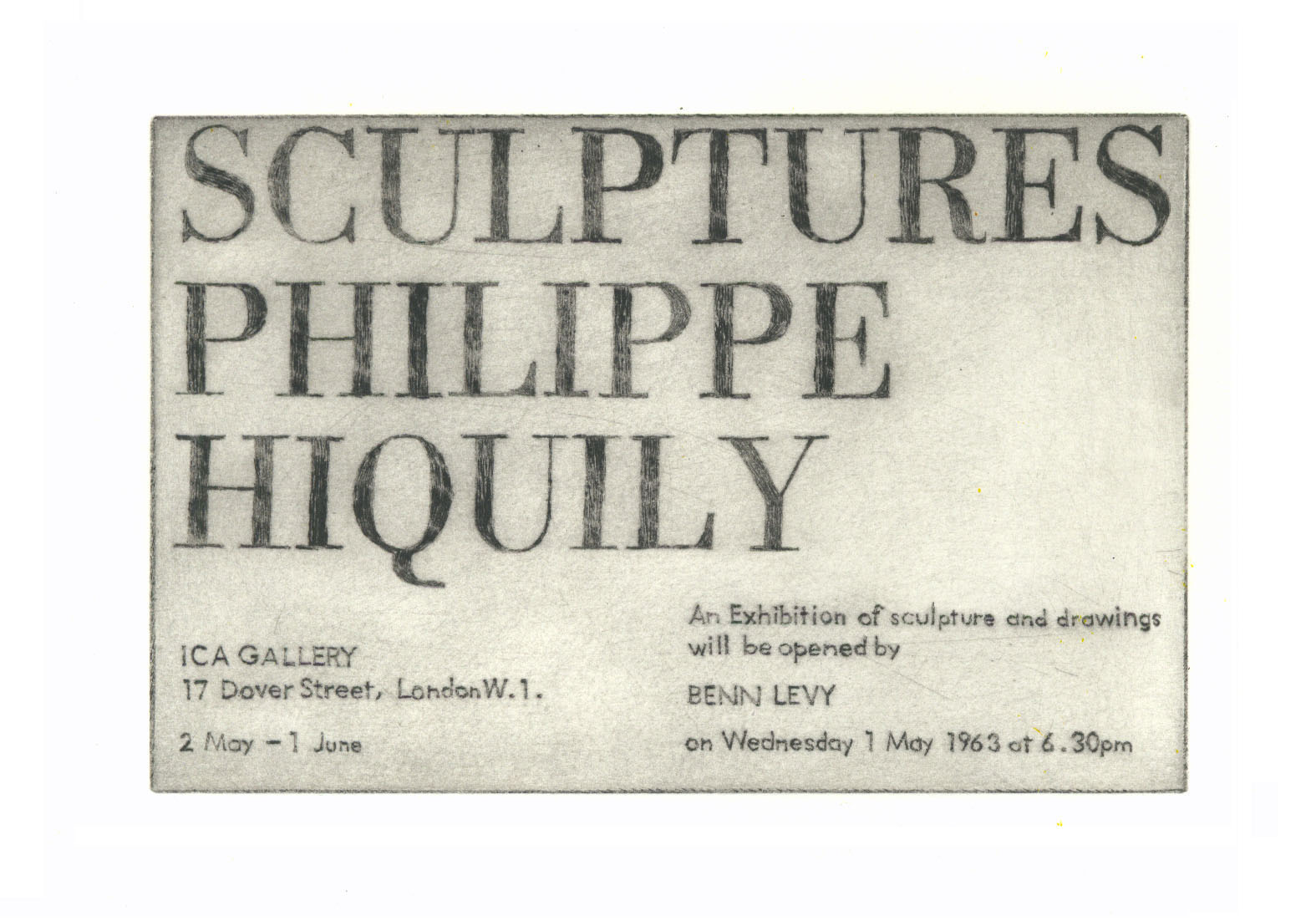
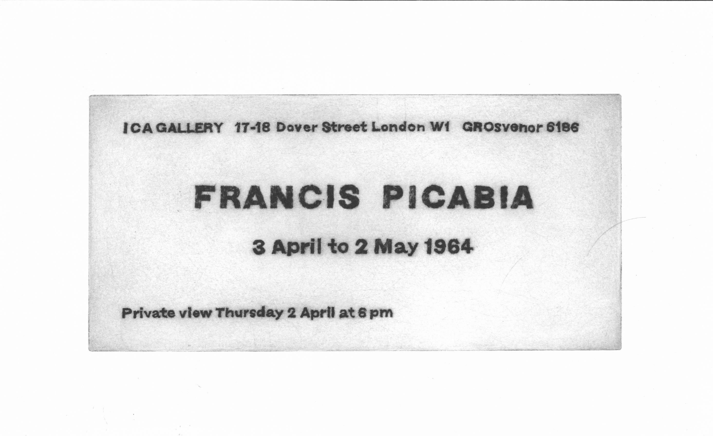
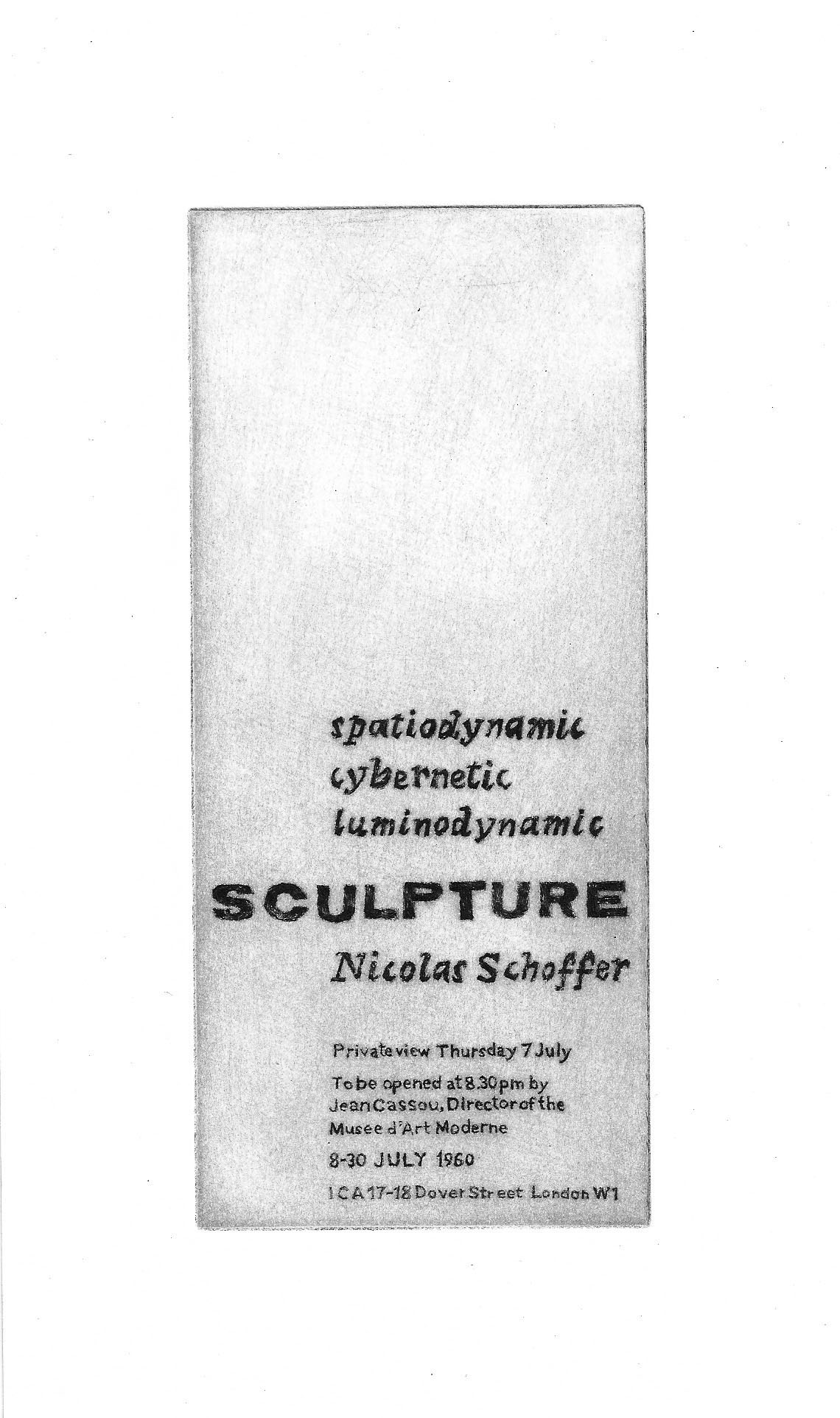
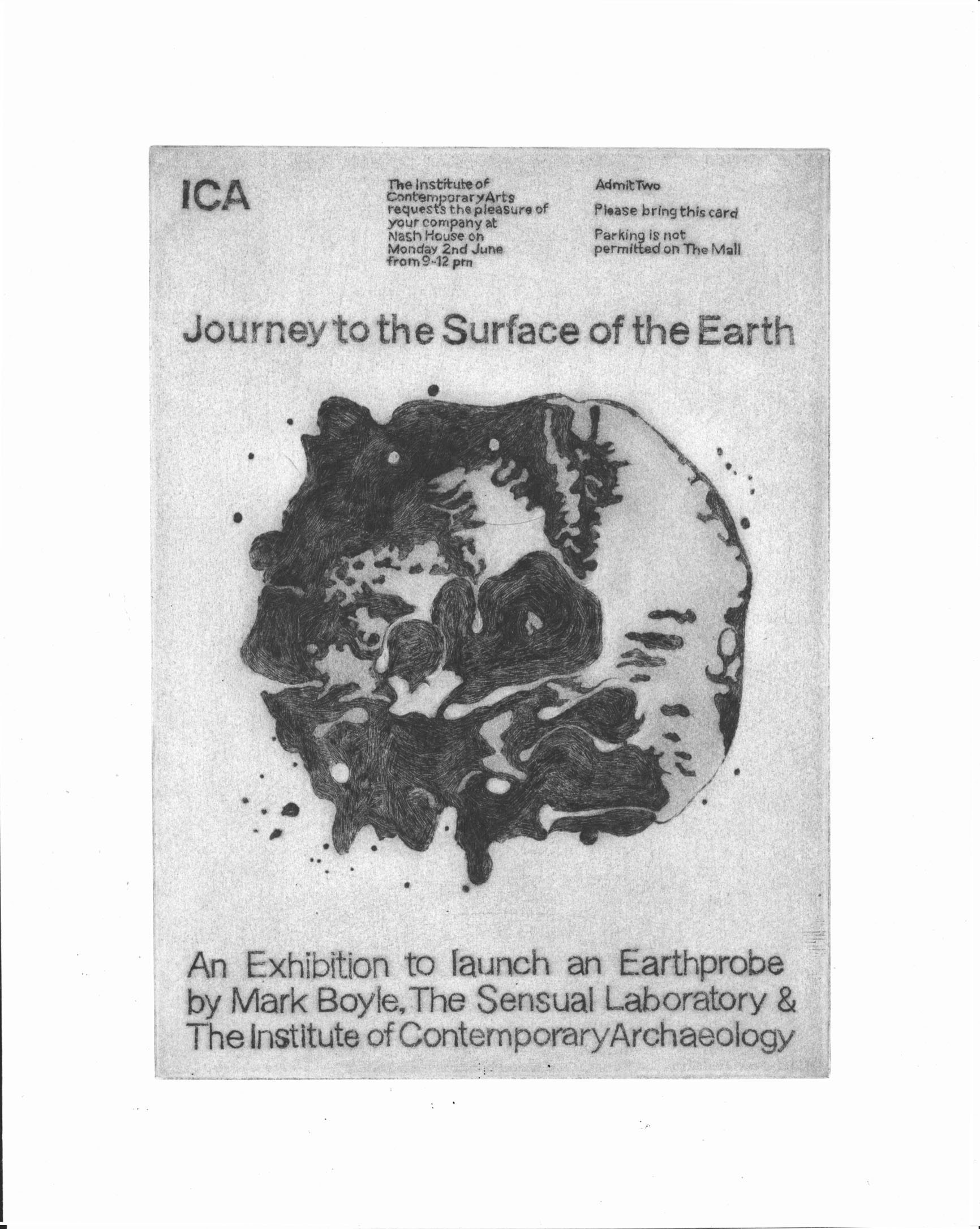
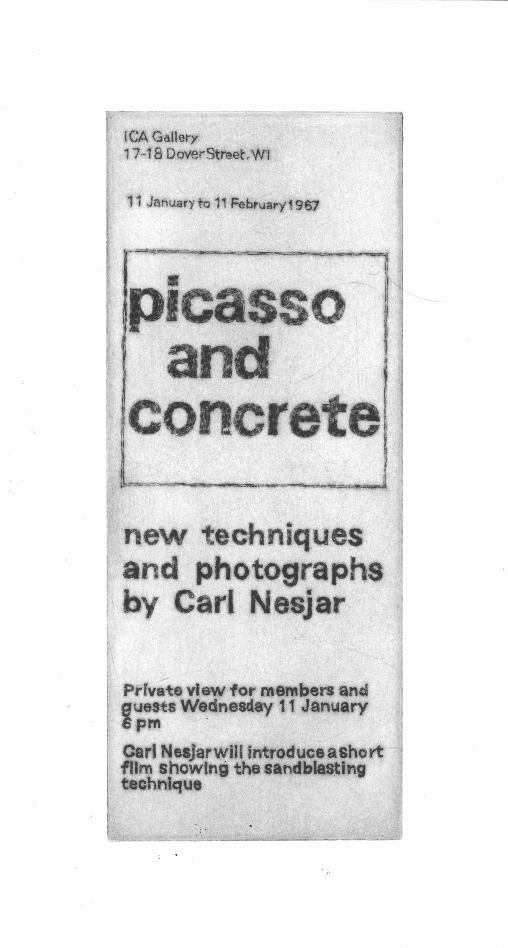
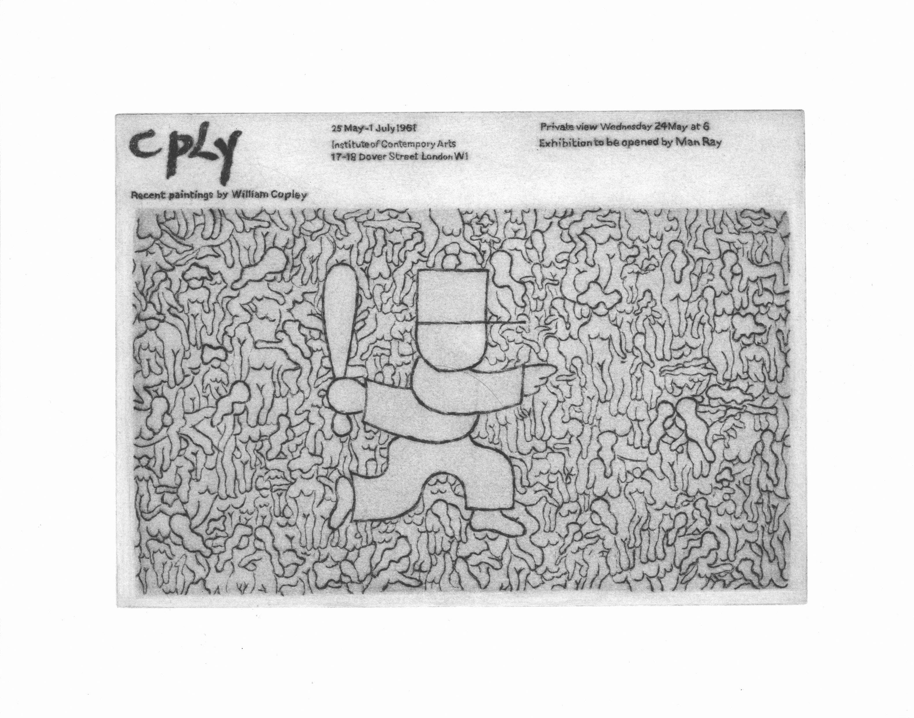
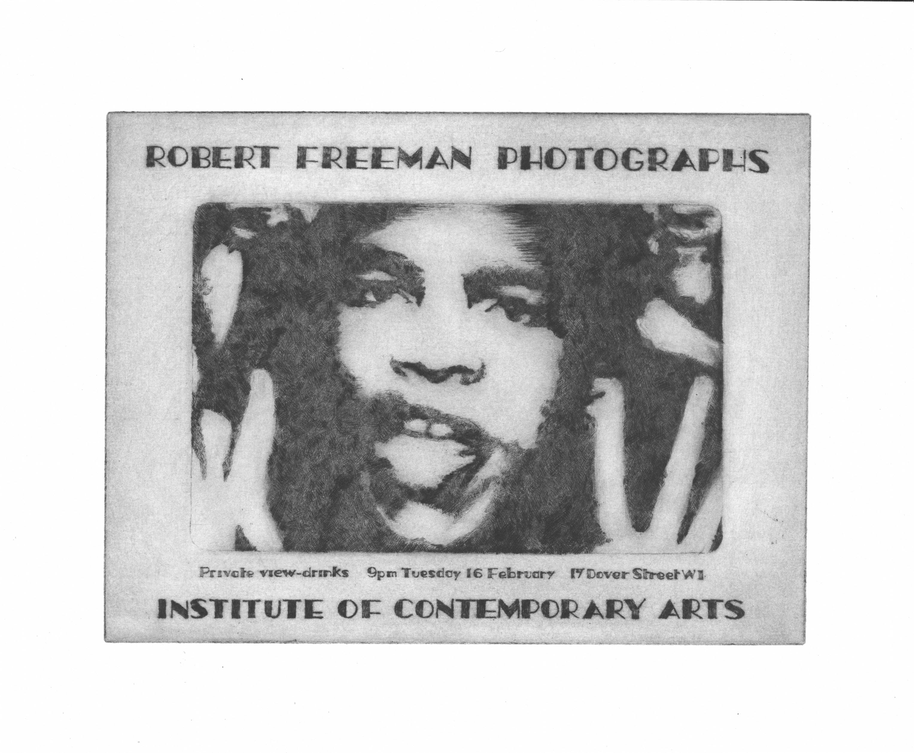
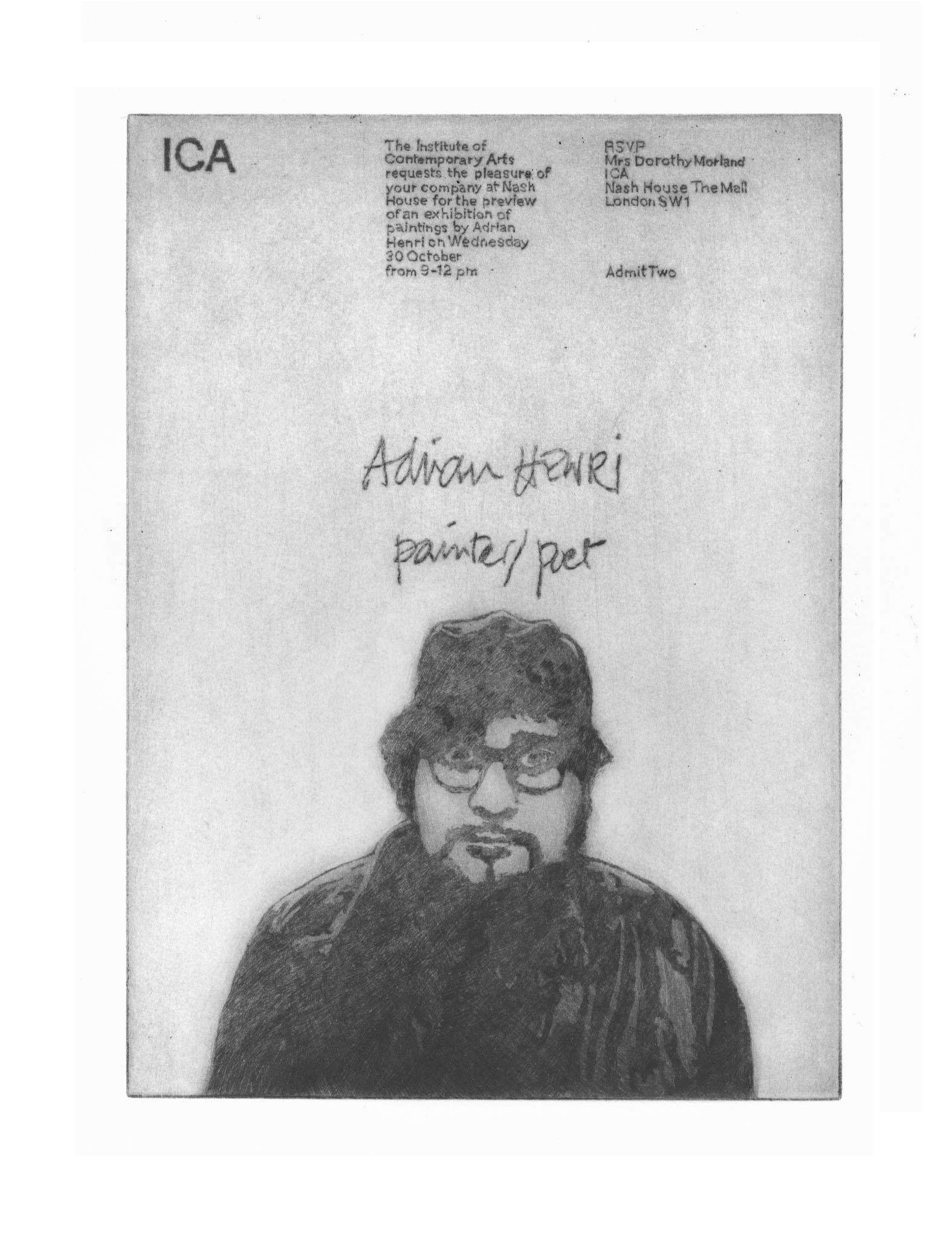
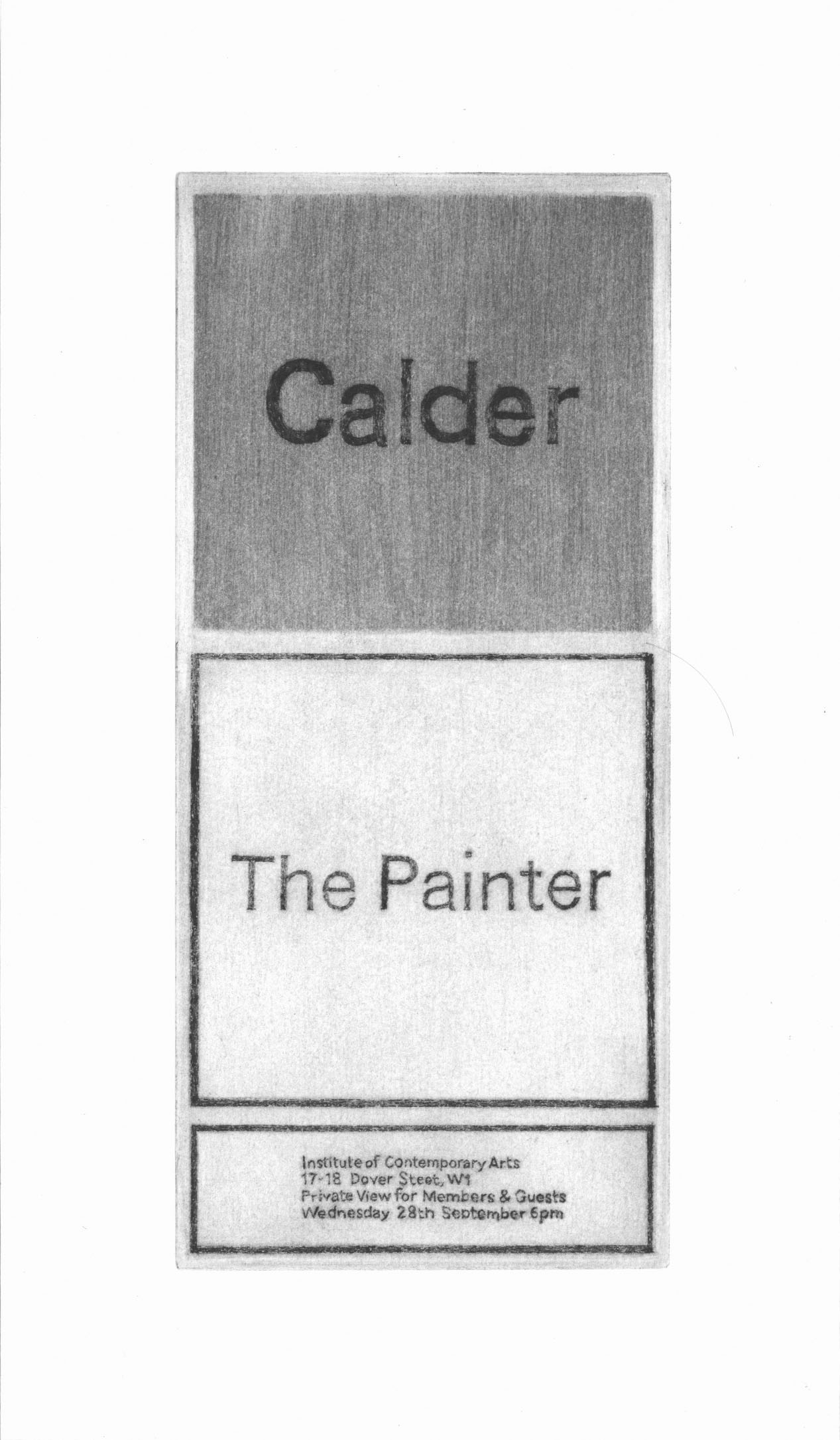
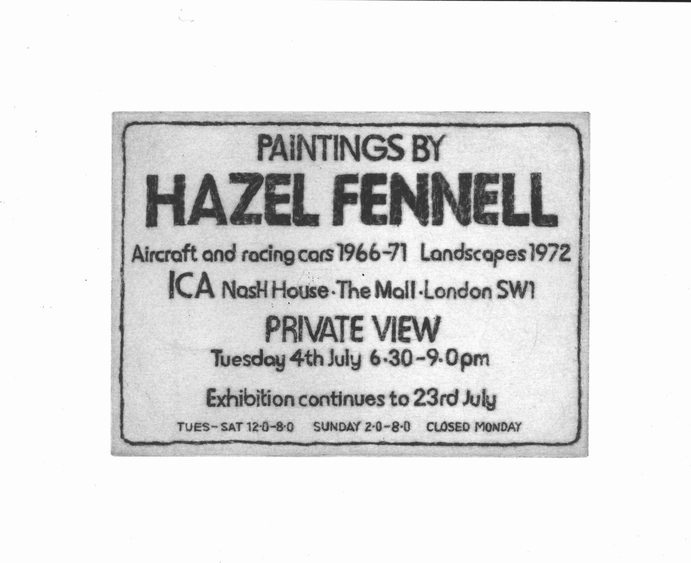
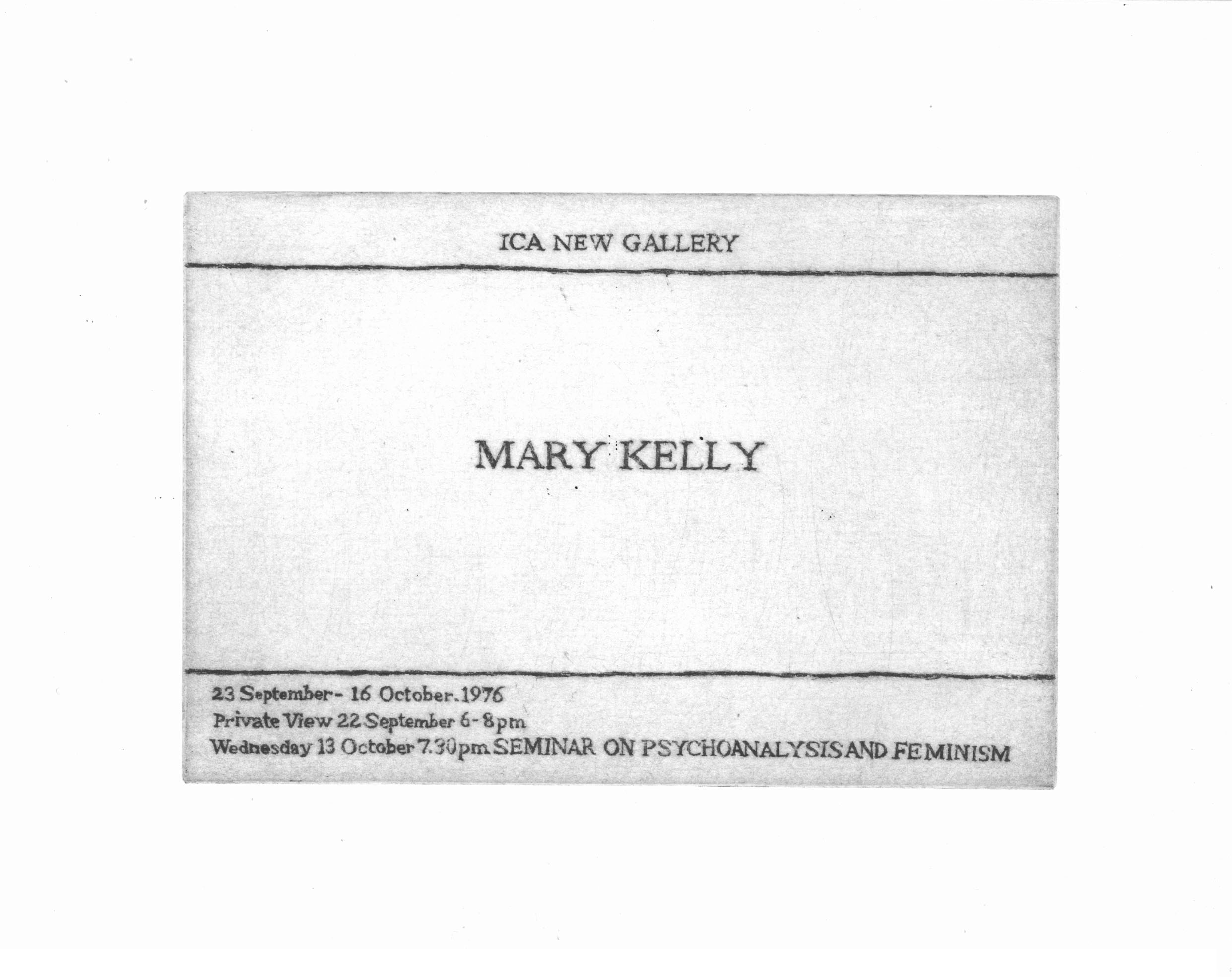
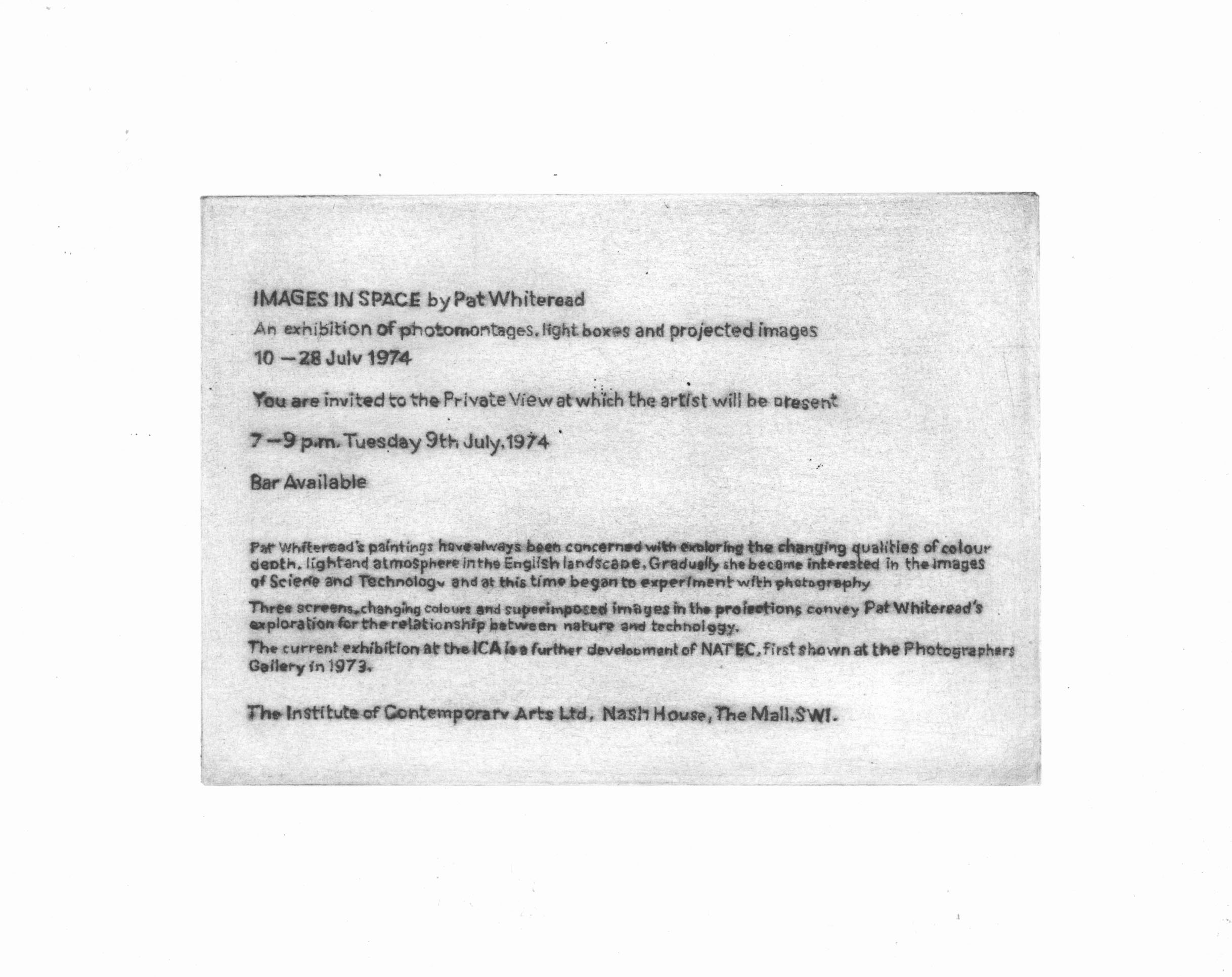
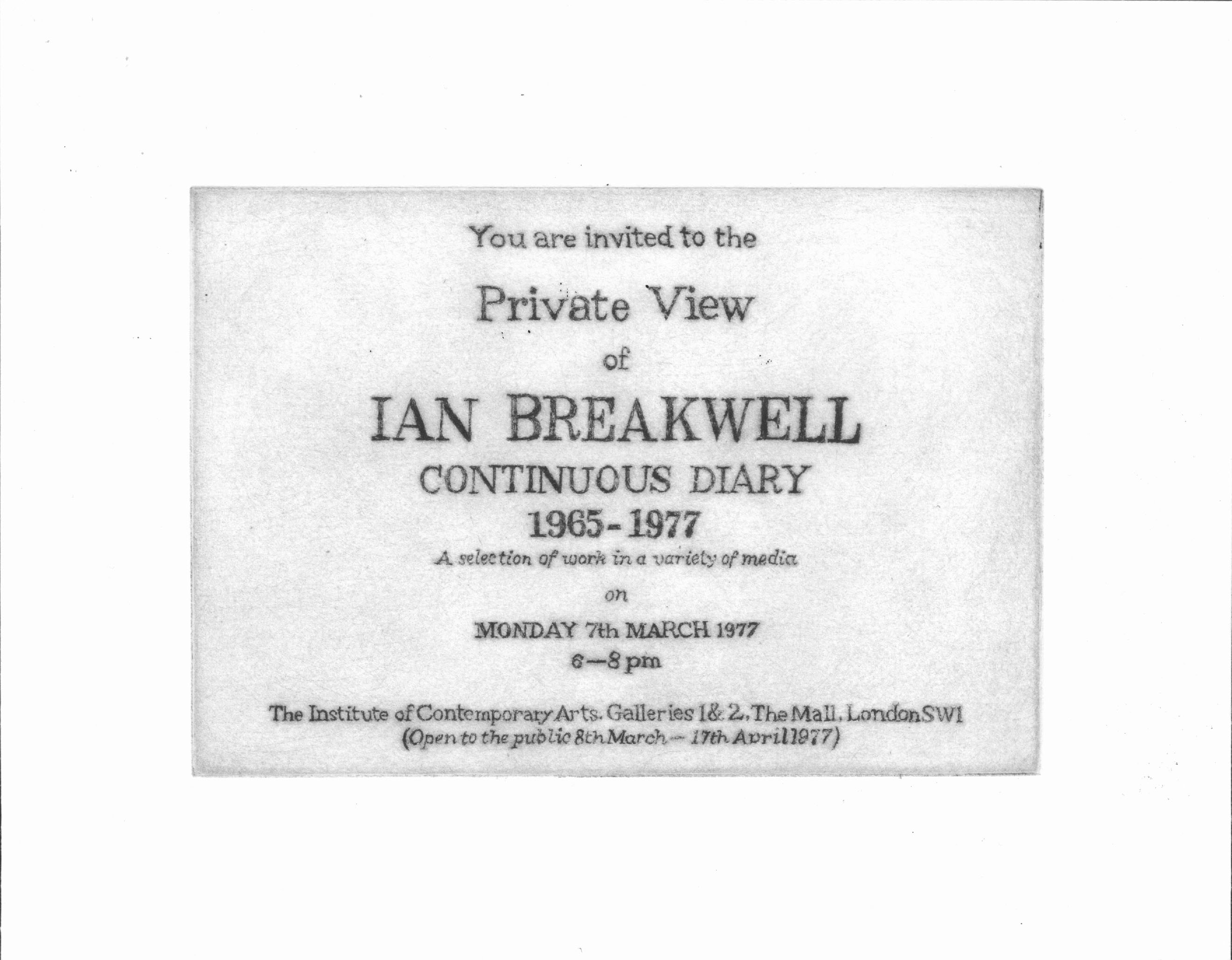
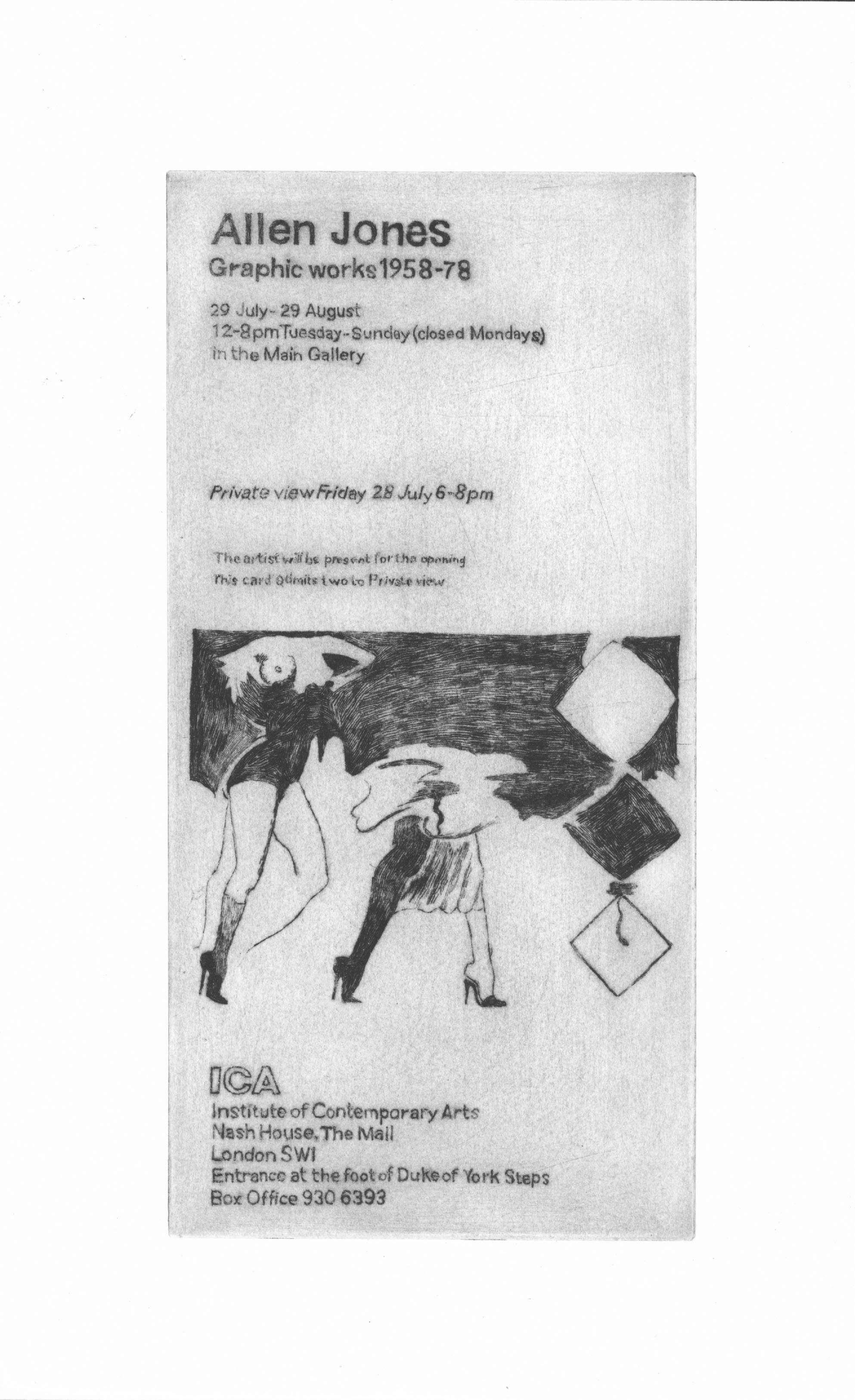
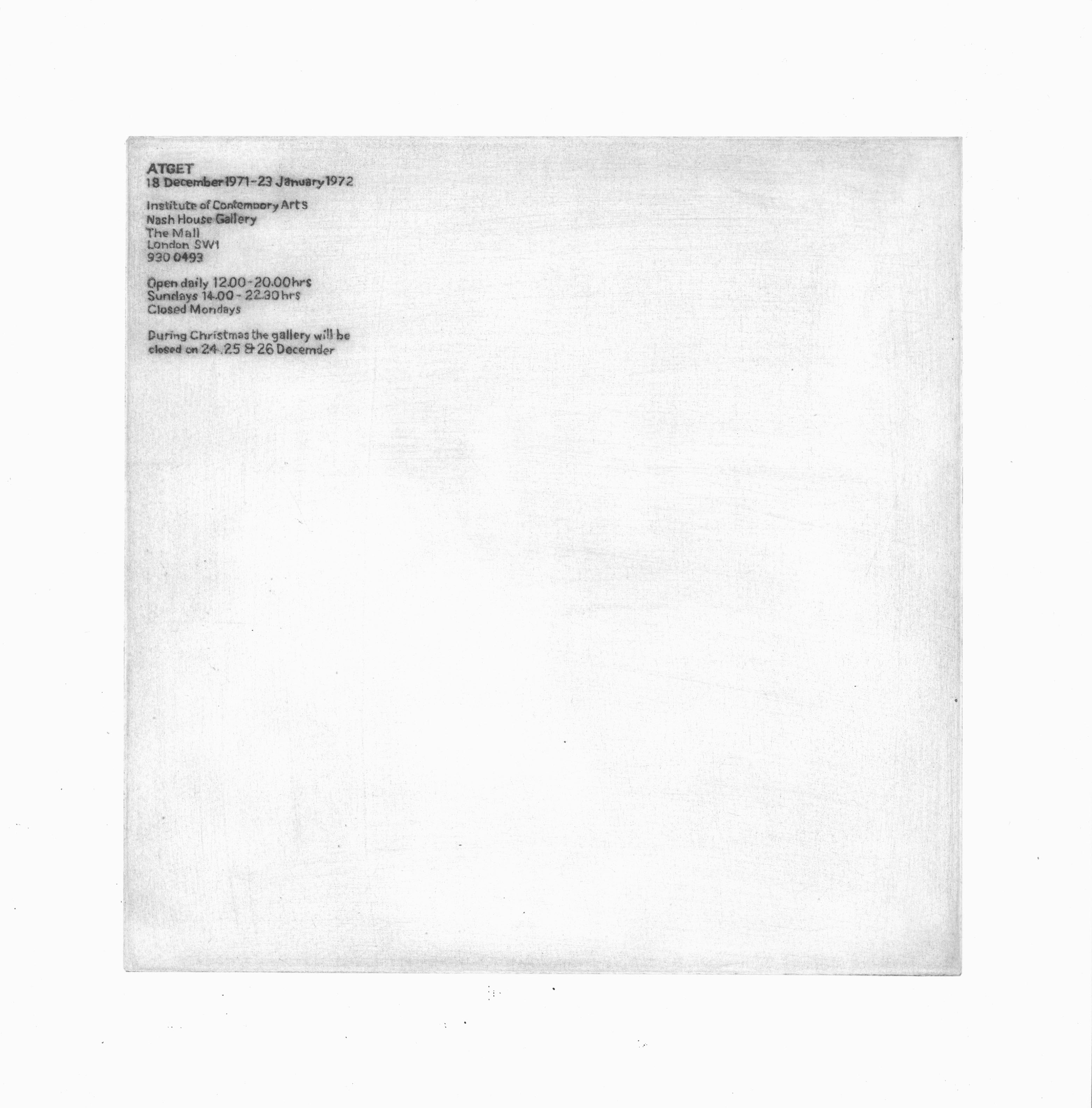
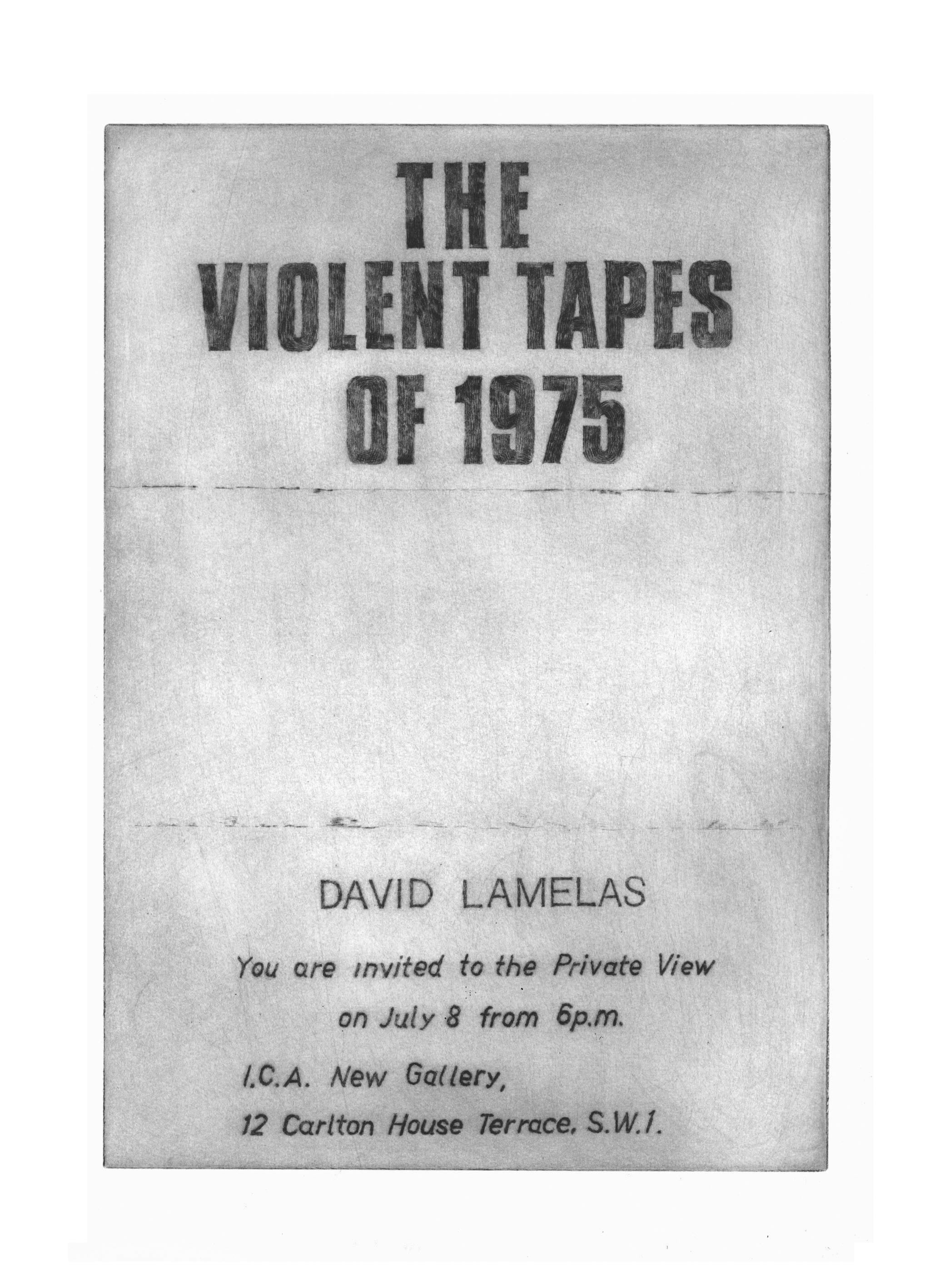
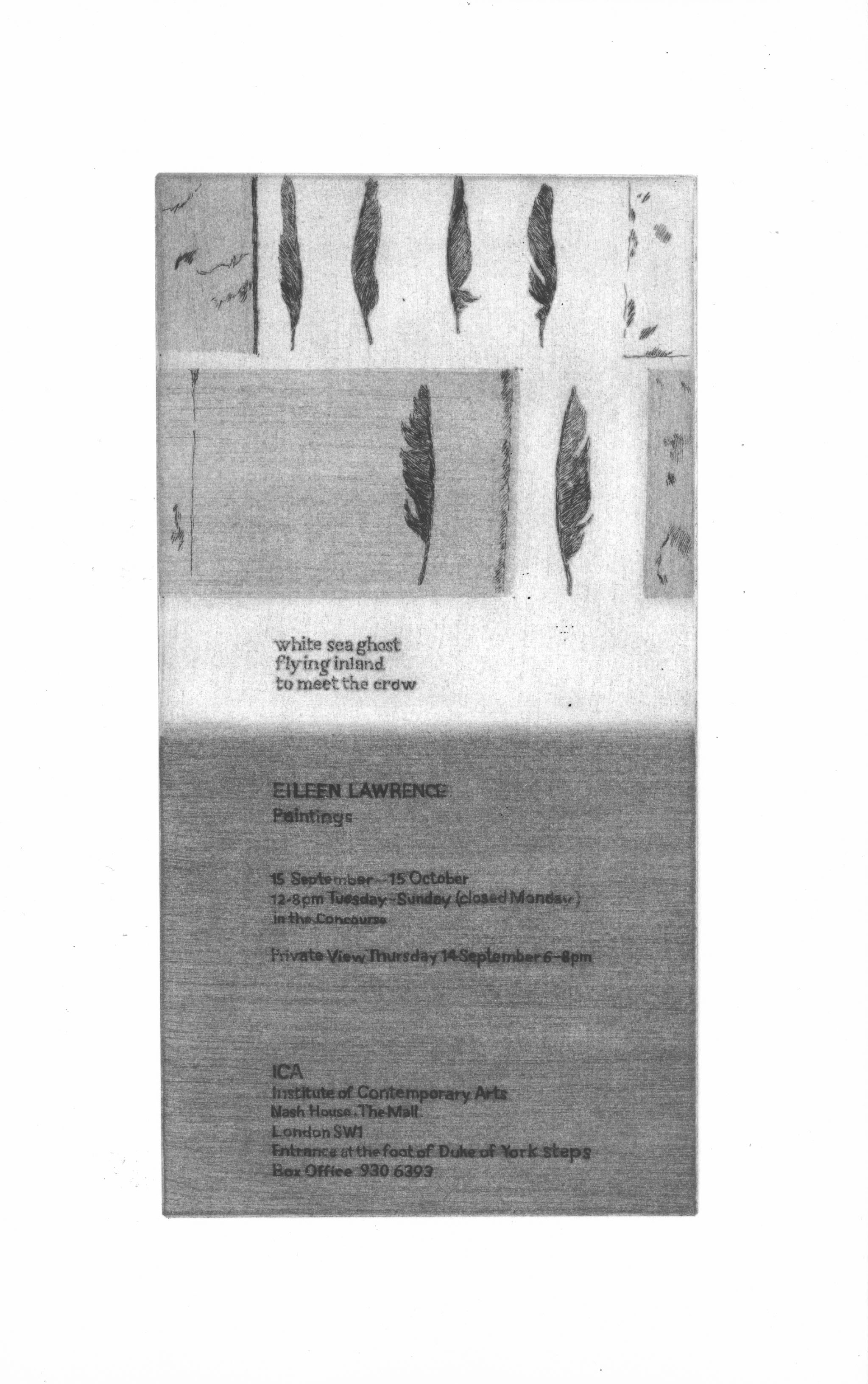
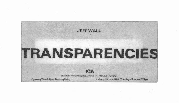
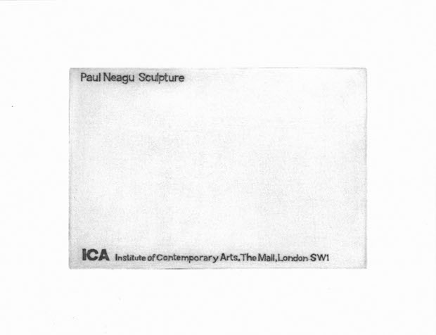
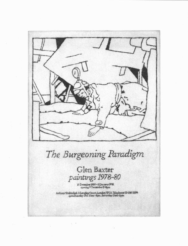
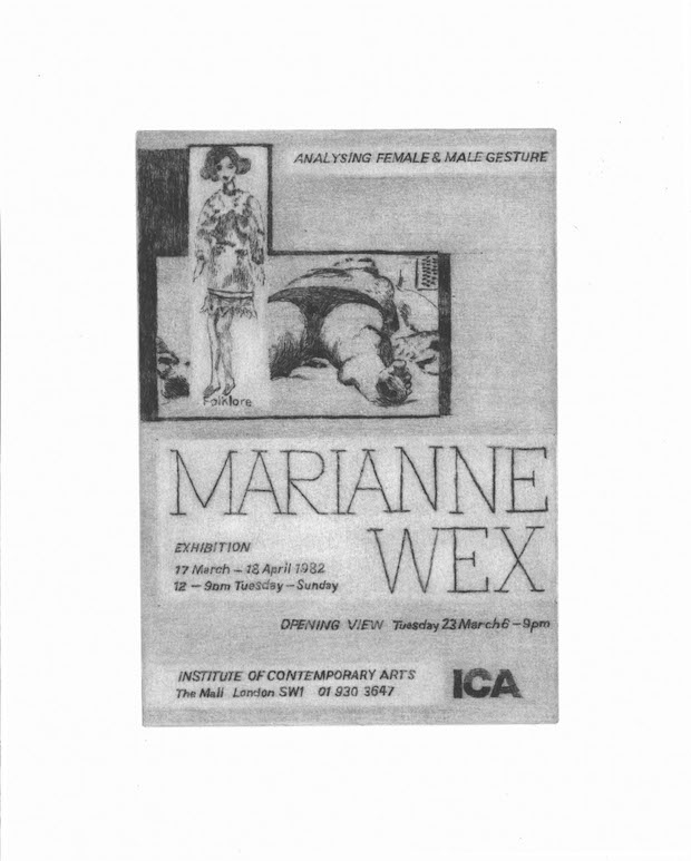
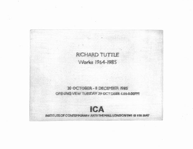
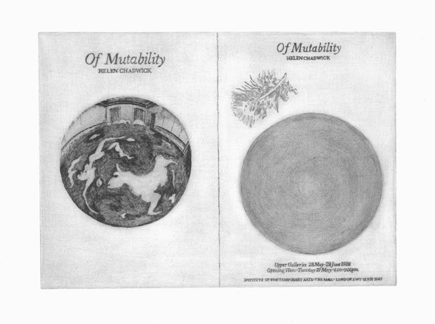
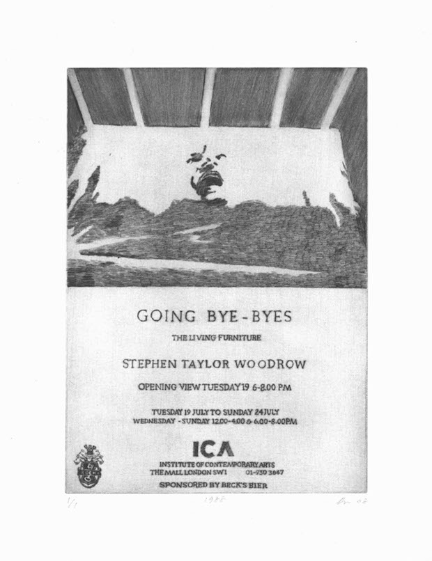
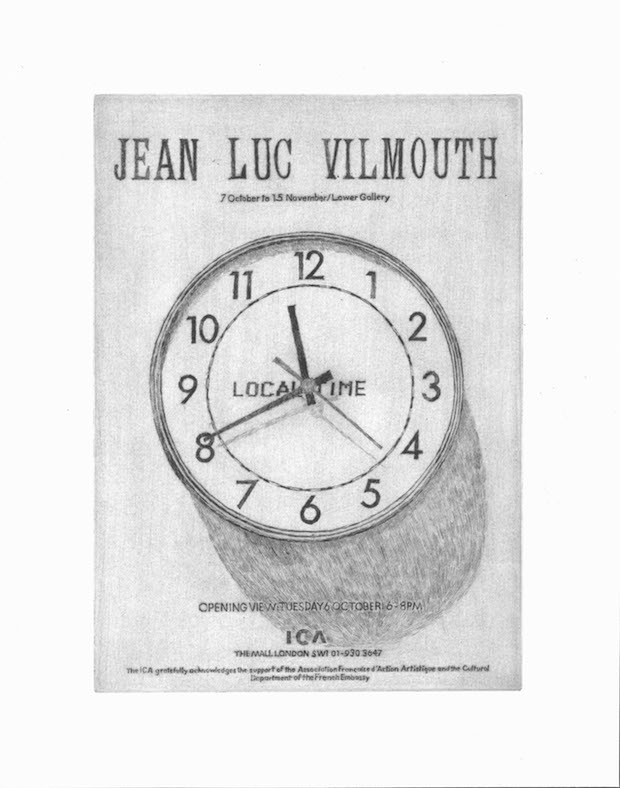
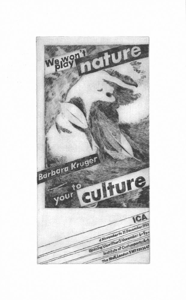
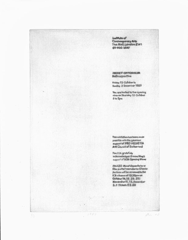
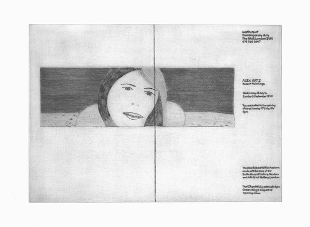
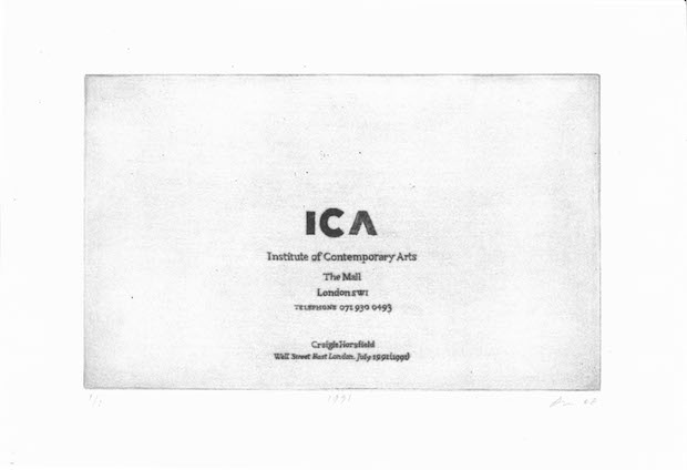
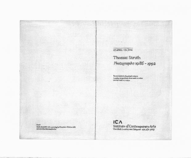
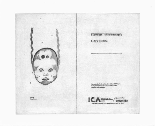
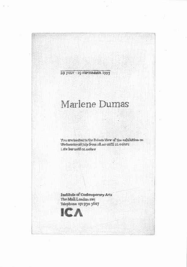
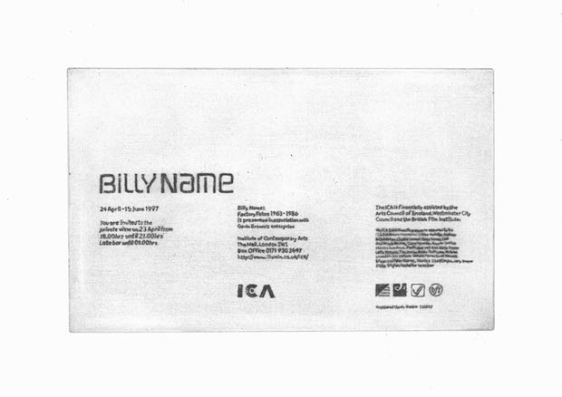
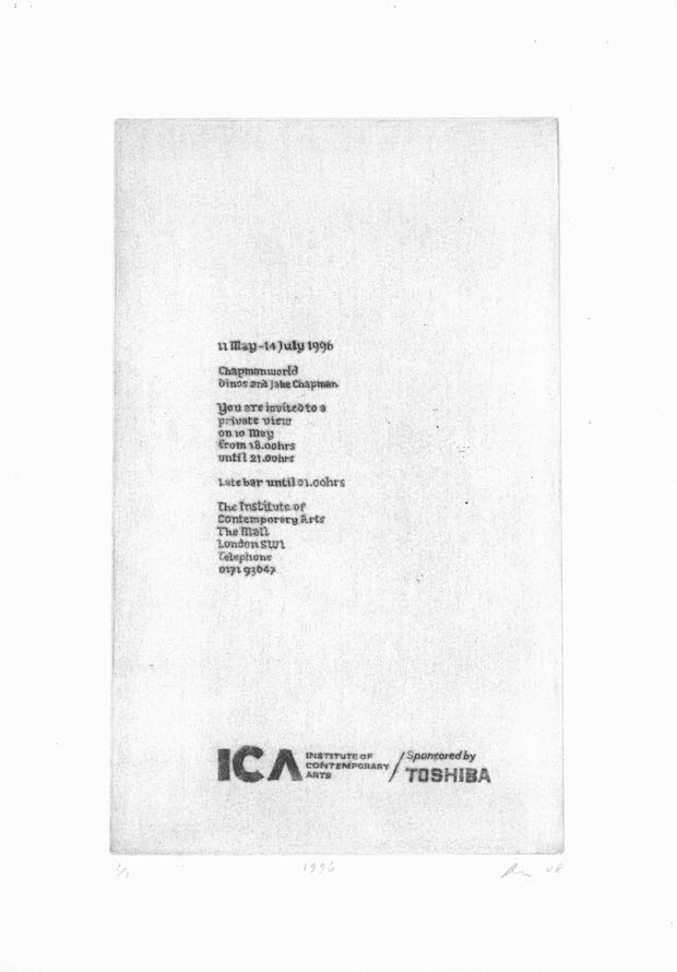
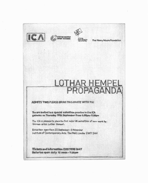
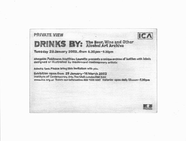
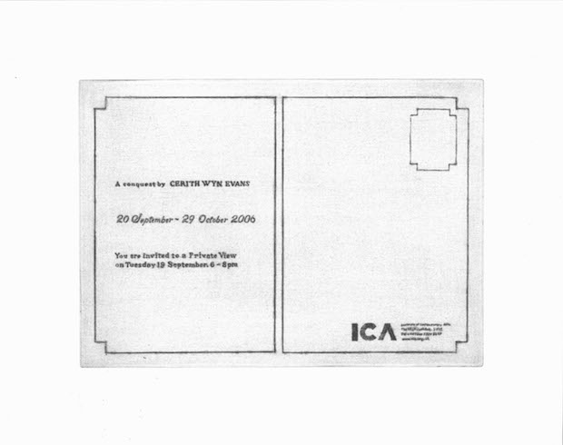
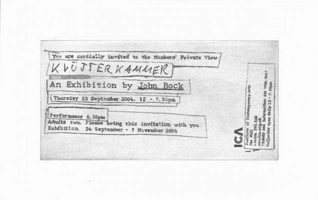
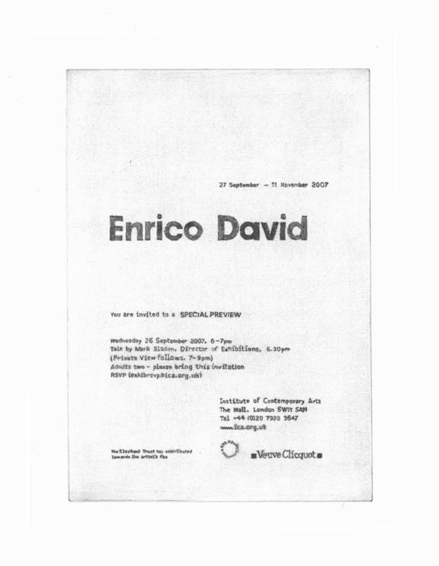
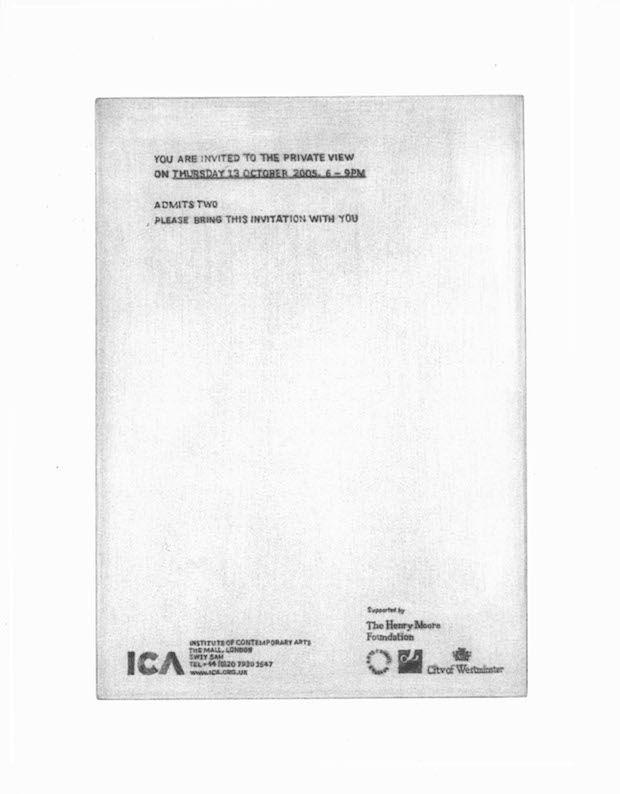
In this casestudy from Grafik 168, we revisit David Osbaldeston's The Pleasure of Your Company. Created as part of the ICA’s Nought to Sixty series, the artist used dry point etching to reproduce 57 of the ICA's private view invitation cards, dating from 1950 onwards.
Seeing reproductions of fifty years’ worth of preview cards in chronological order exposes fluctuations in their visual and written content. The logotype and its usage, and the language of invite cards change. Could you describe what you observed of this?
It's a good question. As it progressed, what came out of it was an understanding of an evolution of the institution and the way it presents itself. The first card I worked with for recitals of the works of James Joyce in 1950 is interesting as it's been well documented that Richard Hamilton was heavily involved in the ICA in its infancy and I believe he worked on some of the early catalogues for shows including the one for Joyce. Maybe I'm wrong but it doesn't look as though he's been involved with the card as it looks like it’s been knocked up by an admin clerk, or even left up to the printer. What's interesting about it is that it could have been produced at any stage in the previous thirty years.
After 1950 the institution gets a lot more serious and self-aware about how it's presenting and framing its activities; that's also reflective of the art that's being shown, to one of the most discerning and difficult audiences imaginable.
Then you get something that's very like an early BBC logo – the first ICA logo, which appears for the Francis Bacon show in 1955. This logo drops away in the 60s and resurfaces in a different form in the more professionalised 80s which is still evident in the cards to this day. What's clear is the fluctuation between the absence and need for consistency, which is great as otherwise it'd be fifty-seven varieties of Heinz Baked Beans rather than fifty-seven years of significant cultural production.
Did your process of manually reproducing the minutiae of words and visuals on the cards add to your understanding of how they evolved? And how might it affect the viewer's understanding of that evolution?
In terms of evolution maybe, maybe not; I'm not sure. There's that well-worn phrase that the devil is in the detail and he most certainly is here.
My understanding of their evolution came out of an interest in working with these ephemeral, and in many ways inconsequential, objects and loading them with significance in terms of time, culture and memory, and in some way filling them with a redundant kind of pathos which to me works as a metaphor to question the way in which we aestheticise the past through the eyes of the present. It's a bit like looking at the film Where Eagles Dare. You know you’re watching a film that's set in 1943 or whatever, but with Clint Eastwood and Richard Burton you can't get over the fact that it's really the 60s. The whole thing is an anachronism.
How did you go about choosing which invite to recreate from each year?
That's perhaps the one question that most people have been interested in finding out. Having seen all the cards from the whole of the ICA's history that are held in the Tate archive, I realise that design plays a massive role in reflecting their own particular time and place in history. Having worked in a contemporary art institution for a number of years, you get this understanding that each exhibition produced is completely variable in terms of the significance of its relationship to that moment in time. And this of course is highly variable depending on how the exhibition is received by the audience. I was really interested in pulling out cards that reflected this variability, yet I was also fully aware of how subjective this process was – in some cases it was hard to avoid sentiment. My selection for 1968 coincided with my birthday which I had to use, but there was a kind of ruthlessness in picking one for each year: I would come across an artist I really liked who might have had a major show but whom I had to forgo in favour of a different design aesthetic or sensibility that might perhaps be for an event that occurred for one night in the bar and is only memorable to the handful of people who witnessed it.
I was interested in covering the widest spectrum of activities: from those exhibitions that are either forgotten or half-remembered, to those that have become part-mythologised and in some cases eulogised for their significance to contemporary discourse. Even though it was ultimately a subjective selection, my considerations were as much as possible about the audience, some of whom might live with the presence of these experiences in their heads.
On the surface the project might appear like some kind of take on the idea of institutional critique, and to some extent it is, in a 'bringing it all back home’ kind of way. But I was also interested in how the whole thing might be a bit like looking through a collective family album, with all its moments of horror, humour and success, and what's left is this functional piece of card that somewhere in the past has served its purpose.
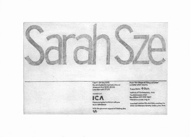
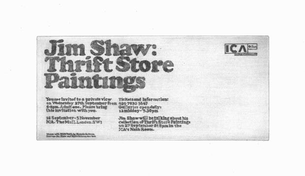
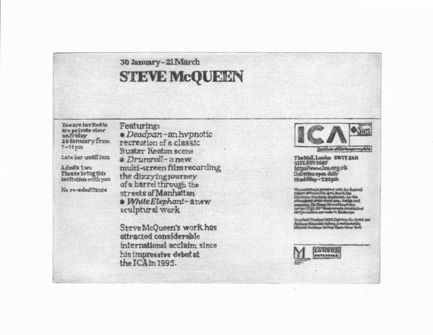
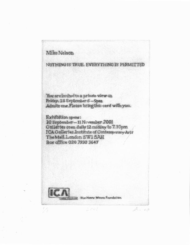
All images
David Osbaldeston, The Pleasure of Your Company, 2008 Series of fifty-seven etchings
Courtesy of the artist and Matt’s Gallery, London
This piece originally appeared in Grafik 168, November 2008