
In this piece from the Grafik archive, we revisit Mind Design's identity for the exclusive Paramount members’ club in Centre Point, and Op Art-inspired system of playful geometry that echoes the building's architectural quirks.
Centre Point in London is a glass-half-empty-glass-half-full kind of a building. Maybe you see it as a hellish monument to bad town planning and brutal architecture. Maybe, like Mind Design, which has just deigned the identity for the very posh, very exclusive new Paramount members’ club in Centre Point, you see it as a pillar of 1960s achievement and a glorious architectural manifestation of Op Art. How did the job come about?
We have been working with Tom Dixon for a couple of years on various projects (packaging for his Lacoste Eco/Techno polo shirt, catalogues for Finnish furniture company Artek, etc). What we share with Tom is a strong interest in the production process and experimenting with different materials. Tom Dixon’s company Design Research Studio was asked to design the interior for Paramount. We worked with Helene Bangsbo Andersen at Design Research Studio under the creative direction of Tom Dixon. Tom first mentioned the project to Holger [Jacobs, of Mind] on a trip to Korea and later introduced us to the client, club owner Pierre Condou. We were asked us to design the identity, all printed material, signage and some interior elements for his new venture.
We knew the Centre Point building as a London landmark but had never really given it a closer look. Holger worked in Japan and was used to clubs and restaurants being at the top of tall buildings but for London this was an unusual and exciting location.

How did you approach the brief?
Centre Point was one of the first skyscrapers in London. Often labelled as an example of 1960s Brutalist architecture, the façade and the interior of the building feature many architectural details and a variety of strong geometric shapes. It was obvious that our design had to relate to the building in some form and we love concrete as well as strong honest shapes.
There wasn’t a clear written brief, more a list of items that had to be designed. Our concept was simple and based on two main aspects: the architecture of the building and the notion of height. The height of the building can be experienced not only by looking up the façade but quite physically by going up to level thirty-two in one of the three high-speed lifts. (We tried to express this feeling in a small animation we did for the Paramount website.) Another strong influence was 60s Op Art, especially the work of Victor Vasarely.
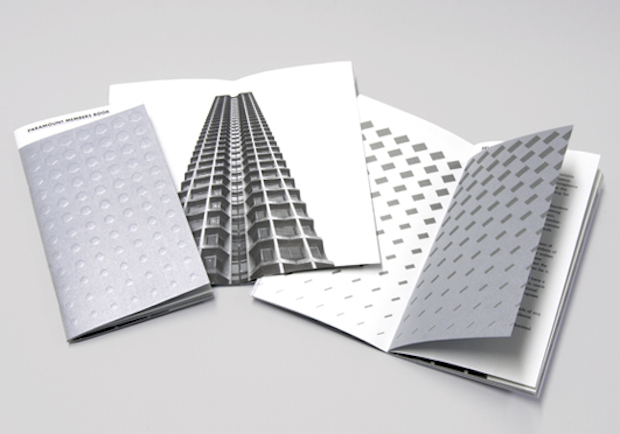
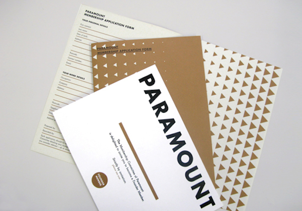
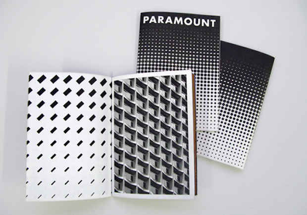
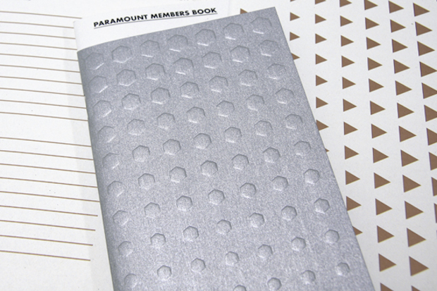
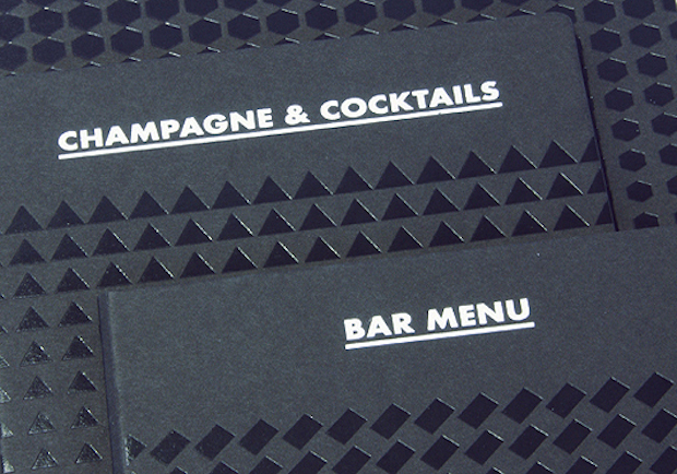
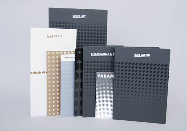
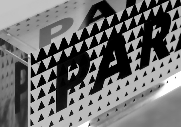
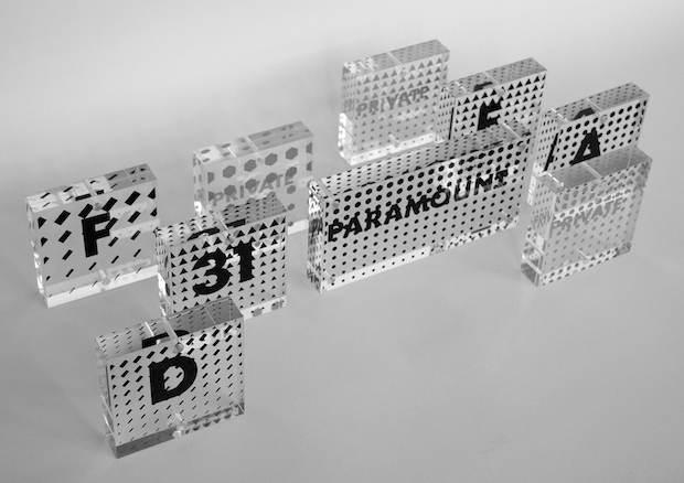
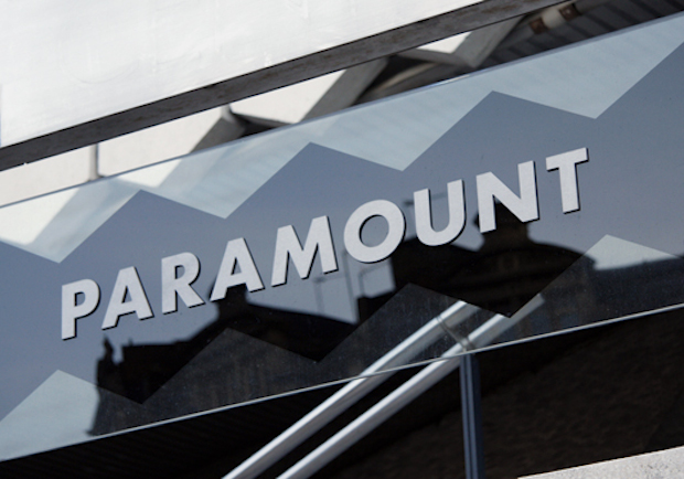
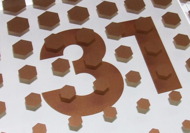
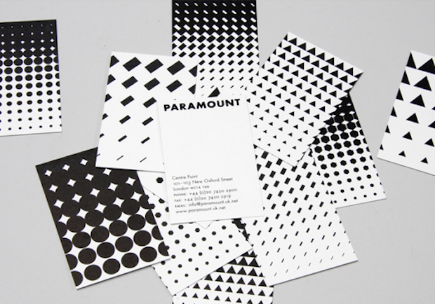
The Paramount identity is a set of four graduation patterns expressing the view or movement upwards. Each pattern is created from one of four simple shapes (hexagon, triangle, circle and stripe) that can be found in the building or the interior, repeated thirty-three times (for thirty-three floors). We used different sections of the pattern for different applications: sometimes we cropped in very close, sometimes we only used the lighter bottom or the darker top end of the graduation. Variation was important as there were so many different applications to design (brochures, stationery, menus, tapestry, signage, sliding glass screens, etc). We wanted each item to look different but be connected by a common theme. A menu, for example, had to look subtler than a brochure cover.
The fonts we used are Futura and Beton. We chose Futura because it's based on geometric shapes, but we also felt that the misconception of constructed fonts being more legible relates to the social economics of concrete slabs. As a secondary font we picked Beton because we needed a slightly more elegant text font. Its designer, Heinrich Jost, was a friend of Paul Renner and Beton has been described as a Futura with serifs. It is a welcome coincidence that the name ‘Beton’ means ‘Concrete’ in German [and French] and therefore relates to the building material.
Tell us about the materials, type and processes used.
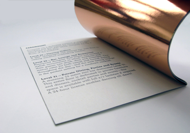
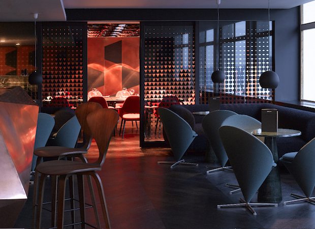
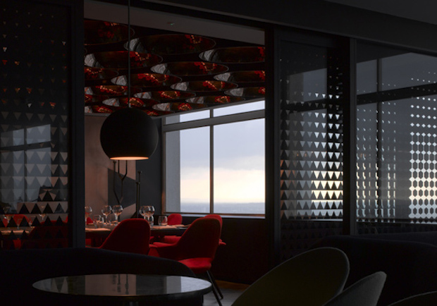
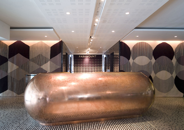
A main feature of Design Research Studio’s designs are the materials zinc and copper, used for the bars on level thirty-one (zinc) and level thirty-two (copper) as well as the reception desk on the mezzanine level (copper).
In relation to those materials we used copper foil-blocking, printed copper on uncoated stock and a zinc-like metallic paper for the members' book (embossed with the hexagon pattern). For the menus we designed four different-shaped brackets (or clips) acid-etched from copper. This system allows one to change the menus but keep the same cover. It is interesting to see how copper oxidises and changes colour when handled.
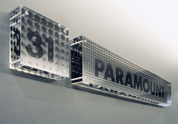
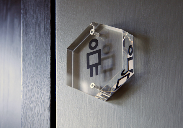
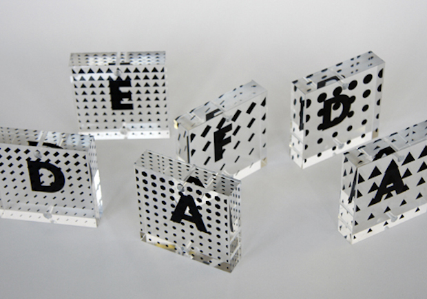
The interior signage is made up from up to 50mm-thick transparent acrylic blocks screwed directly into the wall. Each block is screenprinted with a pattern on the front and text on the back. Depending on the angle of view the text can be obstructed by the pattern. The thickness and transparency of the material creates interesting visual effects and we later discovered that Vasarely did similar installations using two separate sheets of glass. It was difficult to find a company that could drill through thick acrylic without the material ‘crystallising’ around the drill holes and we now know everything there is to know about drill-bit lubrication.
For the sliding glass doors that separate the private dining area we were interested in the way different patterns overlap (when the doors are open) and form new shapes. This was very difficult to plan on the computer and we were surprised how close our simulation came to the real effect we had hoped for. Since this area is next to the window the screens also create very interesting shadows and reflections during daytime that we didn’t expect.
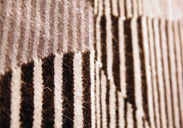
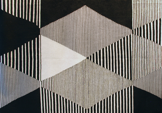
For the reception area we designed three large wall rugs that were handmade in India. Although our drawings were very precise, the Indian weavers produced a slightly looser interpretation of our design, which added to its handmade charm. None of the shapes is the same and the letter spacing of the word ‘Paramount’ on the rug in the centre is slightly adventurous.
The website (currently just an extended holding page) features an animation of the pattern that probably expresses the aspect of height most directly. The pattern changes randomly each time the site loads.
A small brochure that went out with the initial invitation to selected members and the application form were printed on Cyclus offset, a recycled paper we chose for its grey concrete-like colour.
The difficulty in all the printed material was to produce a design that is elegant and appealing to the members of this rather prestigious club but at the same time that stays true to the raw aesthetics of the building.
Were there any particularly memorable moments from the job?
The project was not without difficulties. A particular problem was to imagine how the lighting (which was not installed at the time) would affect the signage we designed. Most walls are painted in a grey tone and our signs were printed in black, copper and a dark silver. Since there is not much contrast the light situation was crucial. We made dummy signs and tested them while there was no electricity in certain parts of the building. I remember one meeting where I was wielding a very heavy industrial-sized neon light tube (like a light sabre) while our intern was holding signs up to the wall.
It certainly was a memorable moment being up on the top level directly behind the large letters of the Centre Point signage. I took a photo of Craig [Sinnamon, of Mind] standing right next to the letter ‘C’ at the time when there was no glass in the windows of the viewing gallery.
Credits
Graphic design: Holger Jacobs and Craig Sinnamon (Mind Design)
Interior: Senior designer Helene Bangsbo Andersen and creative director Tom Dixon (Design Research Studio)
minddesign.co.uk
designresearchstudio.net