
All That is Solid Melts Into Air is the latest collaboration between designers APFEL and artist Jeremy Deller. Created for Hayward Touring, the acclaimed exhibition examines the human cost of the Industrial Revolution.
About the project
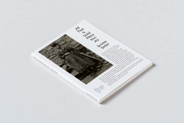
All That Is Solid Melts Into Air is an exhibition curated by Jeremy Deller, created with Hayward Touring, which opened at Manchester Art Gallery in October 2013 and will tour the UK throughout 2014. The show is accompanied by a 82pp publication of the same name published by Hayward Touring.
How did the project originally come about?
APFEL has worked with Jeremy Deller on several projects in the past; we have a good, collaborative working relationship and enjoy working together. For this particular project, we were approached by Hayward Touring with a view to designing both the book and the exhibition and to consider them together as one project. An important part of the brief was also that the graphic approach would help to clarify the structure of the show and make sense of all the different kinds of content – through the process of design and of making sense of the works graphically and logically.
What was the original brief and did it change at all?
We were involved in the project from quite an early stage, and the concept of the show was evolving as we worked – it was fascinating to witness it take shape from the broad and, to an untrained eye, seemingly disparate selection of works and source material gathered by Jeremy for the exhibition. Our brief was to work with him and the curators, to design a graphic identity and approach to the exhibition and book which worked well with this content.
Did this project present any particular challenges, and if so how were these overcome?
All That Is Solid… is a touring exhibition, so all the graphic elements needed to be designed and produced in a way that would withstand multiple de- and re-installations in a variety of different gallery situations. For exhibitions like this, it can be more useful to try to devise a single solution that is quick to produce and can travel from show to show; something more temporary with a relatively short lifespan would need to be re-made or replaced each time.
Another challenge came from the fact that there was no 3D designer involved in the exhibition. Often, when working with shows like this we will work collaboratively with an architect or 3D designer to create the exhibition design, a large part of which will be three-dimensional installations to tailor the space to the show and guide visitor experience. In this case, without a 3D designer on board, our challenge was to bring character to the show using purely graphic elements.
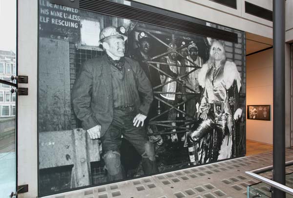
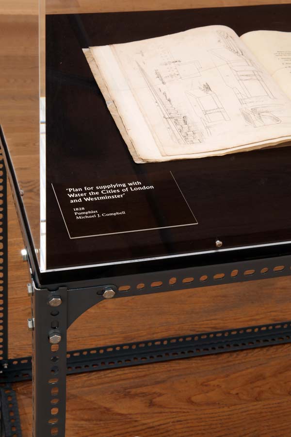
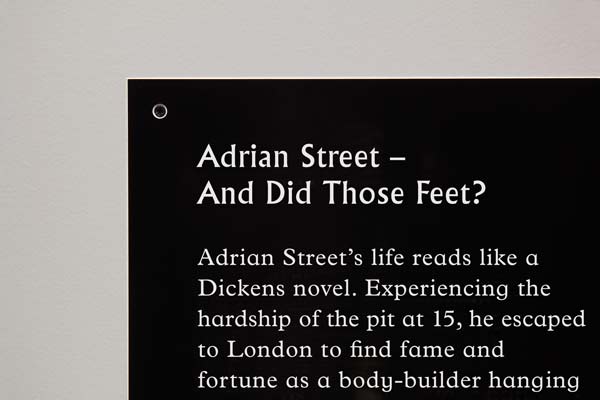
In this case, we decided to use engraved plastic panels to carry the interpretation texts and captions throughout the show, in a way that suited the conversational style of the content. The material was one we'd been interested in using in some way for quite a while, the kind of layered plastic you'd most often see on industrial or machine signage. In this case, they felt appropriate for several reasons. Firstly, their industrial connotations contrasted nicely with the woodblock-influenced type chosen for the exhibition identity, echoing the theme of contrast within the exhibition itself. Secondly, they felt more impactful than type applied directly to the walls of the space, more of a physical intervention. We developed guidelines for how the different panels should be grouped, to create some structure within the exhibition, and used them to intervene with and draw comparisons between the different kinds of works on display.
What do you think has worked particularly well?
We are very pleased with the way those panels turned out – we even had some extras made to grace the walls of the meeting room here at the APFEL studio.
Did this project involve sourcing any new materials or using any new processes?
The aforementioned exhibition text panels and captions were an interesting production challenge – we had been keen on using this kind of engraved plastic signage in an exhibition for some time, but this was the first in which we'd pursued the idea to its conclusion. Finding a supplier with the right combination of materials available and the right equipment to engrave the typefaces we had chosen was a challenge, and involved an extensive sampling process. Thankfully, the supplier we ended up working with did a beautiful job on a tight schedule so that sampling process really paid off.
What was the client's feedback?
Everyone on board has been really positive about the outcome, which is great, as we are really happy with it. It's very interesting to see the exhibition evolve as it moves from venue to venue – each space can't help but impose something of its own character and interpretation on the exhibition.
Technical spec
Typefaces: Albertus and Plantin MT Schoolbook
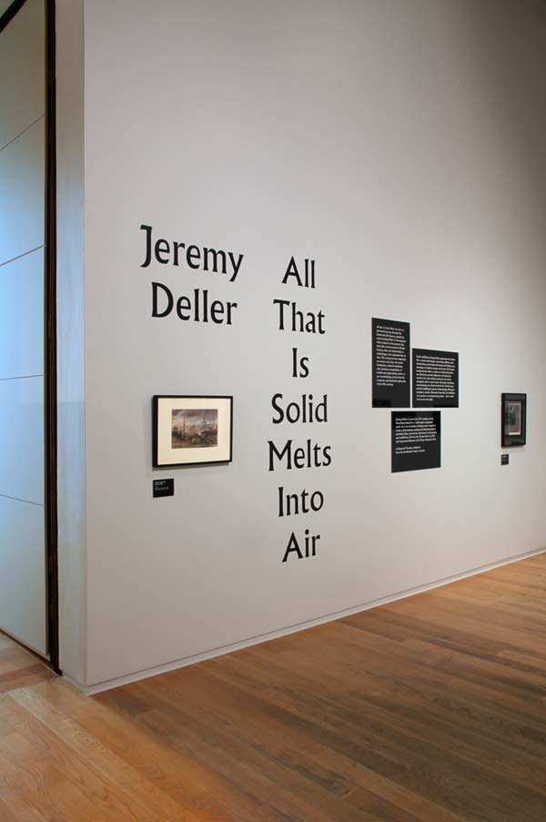
All That is Solid Melts into Air
Manchester Art Gallery 12 October 2013 - 19 January 2014
Nottingham Castle, Nottingham 31 January - 21 April 2014
Mead Gallery, University of Warwick 2 May - 21 June 2014
Laing Art Gallery, Newcastle 12 July - 26 October 2014
apracticeforeverydaylife.com
jeremydeller.org
Hayward Touring
southbankcentre.co.uk


