
The first in a new series exploring the changing covers of iconic books, Emma Tucker plunges down the rabbit hole to investigate how Alice In Wonderland has evolved over its 150-year history.
In the 150 years since it was first published, Alice in Wonderland has come to be associated with a very specific kind of visual architecture; much of which has been underscored – and occasionally undermined – by the thousands of different interpretations in book, film and theatre. However it's the literary world that's given rise to some of the most iconic and subversive depictions, everything from Sir John Tenniel's traditional depiction of Alice, through to Yayoi Kusama's pattern-led reinterpretation.
Some of these covers are the subject of a new exhibition at the V&A Museum of Childhood, which brings them together alongside clothes and photographs to mark the novel's 150th anniversary this year.
“Some really successful covers pare it right down to a single visual element. These are usually really identifiable, often associated with the text, like flamingos, teapots or watches,” comments the exhibition's curator, Kiera Vaclavik. “There have been such a huge number of editions across the world in all kinds of formats – from early readers to luxe art books.”
Alice herself has played a key role as the singular visual motif of many of these books, from the first ever edition which shows a golden cameo of the heroine holding the pig, or the many times she's shown in the company of various Wonderland creatures (particularly the White Rabbit).
The exhibition features covers taken from across the last century and a half, showing both the famous – Helen Oxenbury's cover – and those that have been forgotten, or are lacking attribution. “The covers were selected from a dizzyingly enormous choice to show how Alice specifically has been kept up to date or made familiar to local readers through domestication,” says Vaclavik, commenting on a couple of particularly unusual examples – a cover from the Nineties that shows Alice in Jeans, notable because she's so infrequently shown wearing trousers in any format, and a Provencal edition that shows Alice in a sun frock and tropeziennes.
Early editions of the book were often surprisingly radical in their portrayal of the protagonist, with one American edition depicting Alice with blue hair, and another doing away with the now-iconic dress and pinafore combination in favour of a blue and gold daisy-covered jacket (a link to the opening moments of the book when Alice is making daisy chains).
Some of these early editions were also surprisingly inconsistent with their depiction of the main character, with illustrations inside often not matching the cover portrayal. “The record so far goes to an American edition which features no less than four different versions of Alice within a single edition,” recalls Vaclavik. “Some seem to have been chosen completely at random – Alice with a tennis racket anyone? Or feeding ducks with a male companion?”
Not just books, Alice has found her way into films, plays, theatre posters and even advertising, with some authors creating entirely new versions of the tale, and a completely new visual language to accompany it (Whoopi Goldberg's Alice, or Grazia Nidasio's illustrations for Alice in 2000 for example.)
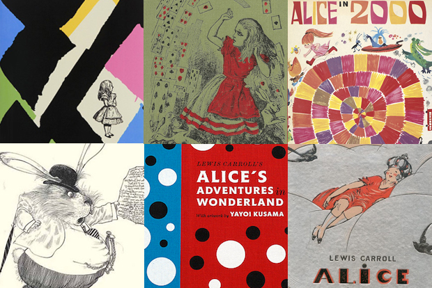
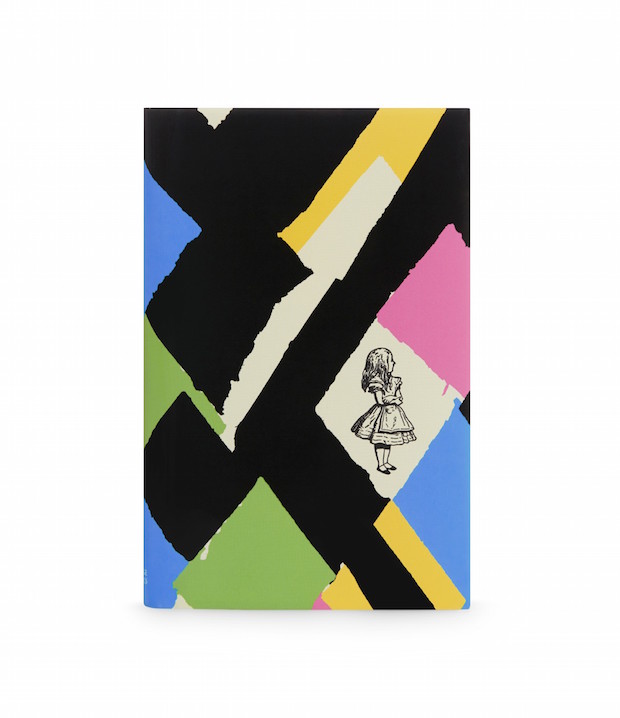
Together with Vaclavik, Grafik looked through Alice's cover history to find some of the most iconic, and unusual, examples from its 150-year history.
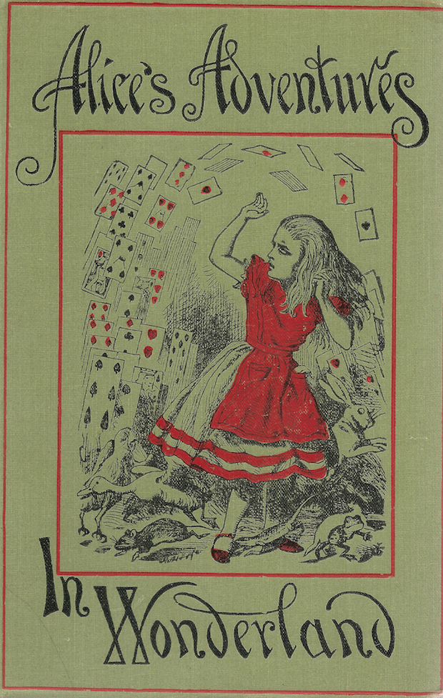
John Tenniel
Perhaps the most recognisable depiction of Alice was created by British illustrator John Tenniel, whose images of the heroine have continued to influence book designers and illustrators ever since. Approached by Caroll himself in 1964, Tenniel was paid just £138 for the 42 illustrations that were included in the first edition. He continued working with Caroll to create illustrations for Through The Looking-Glass, after the author had promised to pay Punch for five months of the illustrator’s time.
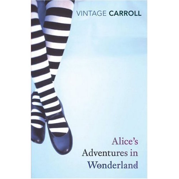
Vintage Classics
“Although it is wrong because Tenniel's Alice only wears striped stockings in Looking-Glass, I think the Vintage cover with only Alice's be-striped legs and plain black shoes is powerful. It says something about the status the text has achieved, that its heroine is recognisable by two small details, but at the same time it leaves room for readers to fill in the rest. This is, of course, an example of a publisher imposing house style on a classic work,” says Kiera Vaclavik.
Vivienne Westwood
In 2011, Dame Vivienne Westwood revealed an entire Autumn/Winter collection inspired by Alice, and the fashion designer has continued her appreciation for Alice with an 150th anniversary edition of Alice's Adventures in Wonderland. It includes the original Sir John Tenniel illustrations, which Westwood has explained were very important to her. “They are how we normally think of Alice – a little girl with a band holding her hair back,” comments Westwood. “Because they are so brilliant, the drawings are an important part of appreciating the story.” However aside from the stereotypical image of Alice on the cover, Westwood has dispensed with tradition, keeping the cover free of typography and instead introducing a bold Harlequin print in a matt and gloss finish, that references the fashion label's own visual heritage.
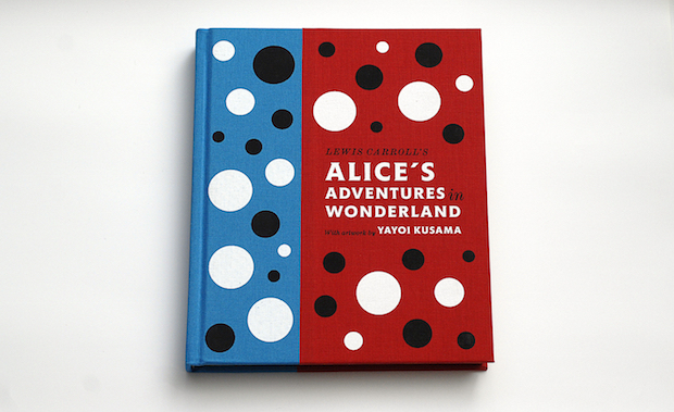
Yayoi Kusama
“At times illustrators and artists can do idiosyncratic things, like Yayoi Kusama’s polka dot cover (which is more to do Kusama than Wonderland),” says Vaclavik of Kusama's 2012 edition, which comes in a fabric-bound hardcover, and also features illustrations in the artist's trademark style. Stefanie Posavec designed the book, as well as a limited-edition Louis Vuitton version, which included two works signed by the artist, a serigraphy and unpublished photos. Posavec’s packaging for the Louis Vuitton edition housed the book in a gigantic box, intended to make the reader feel as if they'd shrunk to a similar size as the White Rabbit.
Dutch edition
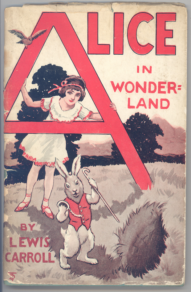
“Some covers do interesting things typographically, like the early Dutch edition which uses the same ‘A’ for the first two words of the title or another cover we’re showing in the exhibition featuring a giant red ‘A’ from which the heroine peers out. The date and artist of this edition are unknown,” says Kiera Vaclavik.
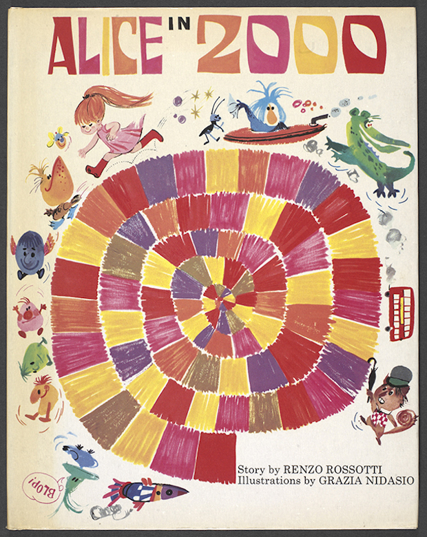
Grazia Nidasio
“Alice in 2000 with illustrations by Grazia Nidasio from 1970 is a wonderful burst of energy and colour,” says Vaclavik of this retelling of Caroll's original tale.
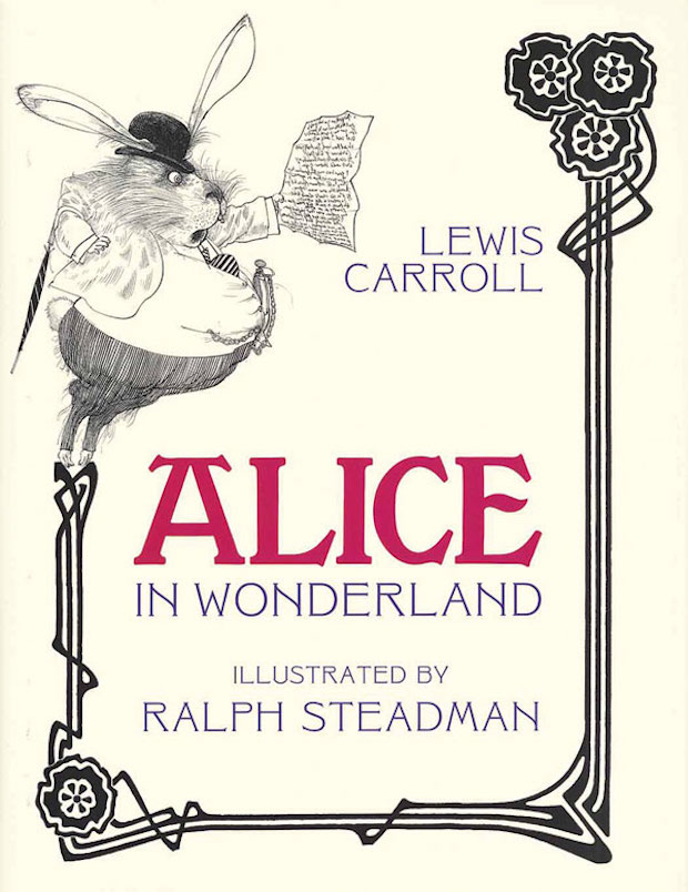
Ralph Steadman
Steadman applied his distinctive illustrative style to this edition of Alice in 1968, which sees his trademark scrawly ink drawings applied to great psychedelic effect.
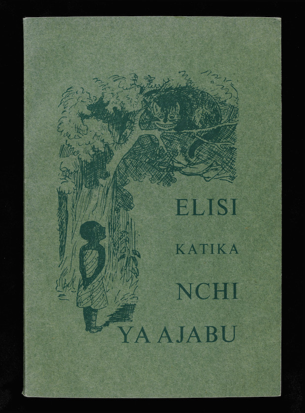
Swahili edition
A 1940s Swahili edition of Alice, Elisi katika nchi ya ahabu, features a charmingly illustrated take on both the central character and the much-loved Cheshire cat.
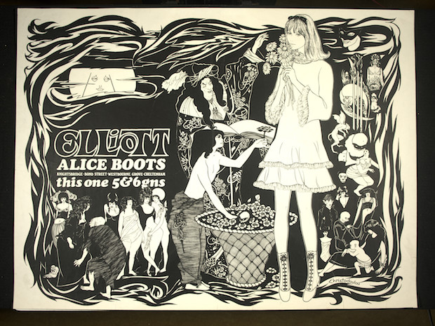
T Elliot & Sons
While not technically a book cover, this poster for T Elliot & Sons boots makes it clear just how far the influence of Alice had spread, with the image of the main character becoming an instantly recognisable visual motif.
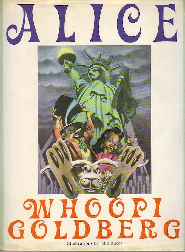
Whoopi Goldberg
“The most radical editions come from adaptations or spin-offs of the original texts. Whoopi Goldberg’s Alice features a black heroine positioned in front of the statue of Liberty is powerful,” Kiera Vaclavik says of Goldberg's distinctly 90s recreation of the tale.
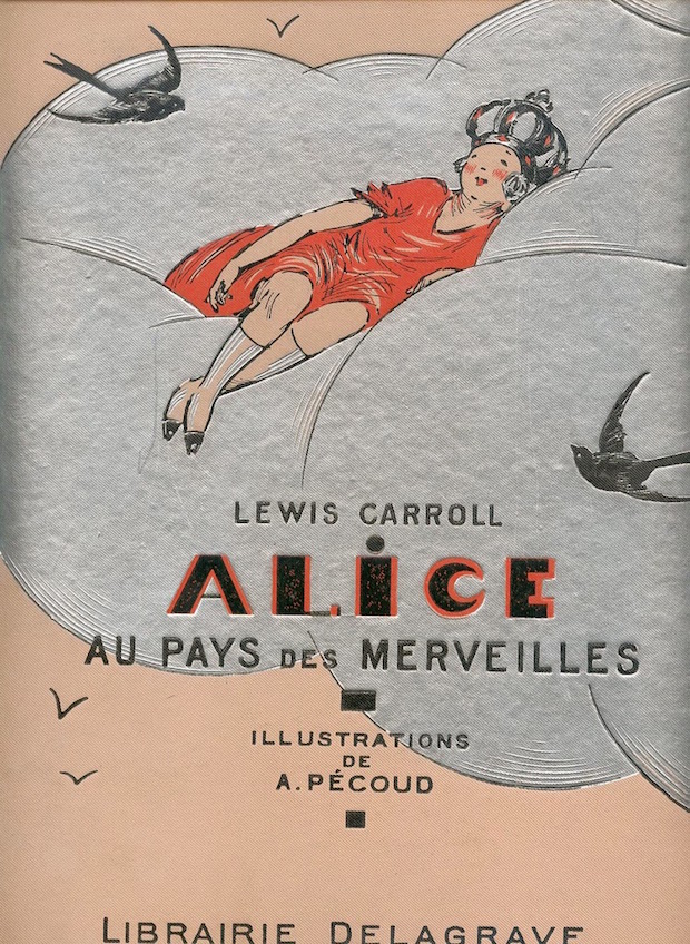
André Pécoud
“There are too many for there to be a definitive version. But I do have a favourite: André Pécoud’s glorious pink and silver confection featuring Alice reclining in a cloud surrounded by swallows from 1936 is a delight,” says Kiera Vaclavik.