
In this profile which first appeared in Grafik 152 in June 2007, Steven Bateman went to meet Zak Kyes – who was just starting out and who we described as "precocious and prodigious" – in his London home-from-home.
If you’re familiar with the work of LA-alien-in-London Zak Kyes, you won’t be surprised to learn that in his CalArts days he nearly jumped ship for fine art. We are as glad as Kyes himself that he stuck with design. Steve Bateman met the precocious and prodigious graphic designer in his London home-from-home and uncovered the thinking behind his print.
“I first stayed in East London five or six years ago. I thought it was absolutely dismal, but there was a ruinous desolation that I found very romantic.” Before he made the move to London, Kyes studied at CalArts in Valencia, thirty miles outside Los Angeles and a far cry from the dilapidated vistas of East London. Once an isolated arts community, Valencia has since been swallowed up by the concrete sprawl of suburbia (Zak refers to it as a “parking lot”). CalArts has been there since 1971, urging “active collaboration and exchange among artists, artistic disciplines and cultural traditions”.
Five years on and little has changed in Shoreditch. The jeans have got tighter and the shoes a lot pointier, but that unmistakable atmosphere of bohemian endeavour and creative possibility still lingers in the air. There is certainly something ‘exotic’ about the area that Zak Kyes chose as his home-from-home. His studio is just around the corner from the Boundary Estate – the world’s first council estate – on the first floor of a beautiful row of nineteenth-century redbrick workshops. He shares the space with architect Natasha Sandmeier, while musicians, set designers and glass designers inhabit the studios opposite and below. It feels like a dynamic environment to work in, and especially rewarding for somebody like Zak, who thrives on creative collaboration.
“The important thing about CalArts for me wasn’t so much the classes – although I had several very good teachers – but the context and community that surrounded it. You could collaborate with people and create your own projects. That’s the way I’ve always learned and it’s the same now. When I collaborate it’s because I want to learn something new, or change how I think. At CalArts we produced posters and all these other side projects, and they were as much a part of my education as the curriculum.”
Open-minded, passionate about discourse, always eager to experiment, it came as no real surprise that Kyes was at one point tempted to leave the graphic design course for fine art. “I was always more interested in what the fine artists and the writers were doing and I often felt like I should change from graphic design and go to one of the other programmes. I’m happy I didn’t.” Instead, he took full advantage of the school’s tendency towards “creative risk-taking”, collaborating on a range of projects with writers and artists, and exploring his interest in language, research and ideas.
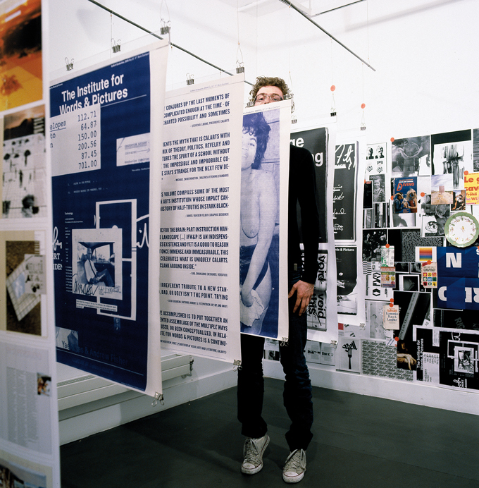
Perhaps the best known of Kyes’ projects at CalArts was one of several collaborations with classmate Tahli Fisher. Commissioned to design an invitation announcing a forthcoming 80s-themed graduation ceremony, they were given no brief and no content and this allowed them a certain amount of freedom. They subsequently produced a ‘novel’ and a series of dyeline posters collectively known as The Institute for Words & Pictures. The book, essentially a constructed and fictionalised document of the history, politics and identity of CalArts during the late 1980s, incorporated myriad stories and images taken from the school’s substantial archives.
“We treated the book as though it had been published in 1987, lost and then subsequently re-found. A lot of people really hated it, which we took as some kind of accomplishment. Some people had knee-jerk reactions. They thought it wasn’t the territory for graphic design, creating a history... creating content. They thought the role of graphic design was to announce something very clearly.”
The work he produced as a student at CalArts fostered interest and acclaim from across the design industry and beyond. In 2004 the Art Directors Club of New York honoured him with its inaugural Hall of Fame Scholarship, and in 2005 he won the graphic design category of Creative Futures, so announcing his arrival as a major talent here in the UK. Still in his early twenties, Kyes’s work has already been published widely and exhibited in the US, Europe and here in London, where he had a solo exhibition at Kemistry Gallery in 2006. Anthony Burrill described his work as “very open”, saying that “it could go in any direction”– and therein lies its appeal. Click through the Zak Group website and you’ll find a body of work that is refreshingly varied and accomplished, united by an apparent disregard for stylistic constraints.
“People expect graphic design to inform and solve problems, at least in certain contexts they do, but for me it became much more interesting to think of it as a way to author content as well.” Kyes sees graphic design as an interface and his belief that “looking at graphic design for ideas isn’t very fruitful... the ideas are elsewhere” is a subject we revisit several times during our conversation. Collaboration is one way of ensuring that each new project has a fresh perspective, informed by different viewpoints and practices. “Collaboration in the first place rose out of the necessity of having a small studio, not as a premeditated strategy. It’s also something that was instilled in me during my art education, where I realised that it’s much more interesting to work with people rather than for them.”
As we discuss his various collaborations he cites Andy Warhol’s thoughts on the matter. Warhol loved working with assistants because there was always a chance they might misunderstand his instructions. The happy accidents that would often come out of that collaborative process delighted Warhol, and Kyes too is passionate about producing work where the aesthetic of the final piece might be affected by circumstances that are out of his control. He explored this method of working when he was commissioned by Los Angeles- based Colby Poster Printing Co. (“Family Owned and Operated Since 1946”) to produce a series of posters for photographer Kim Schoen’s exhibition Living History Project. “Colby use letterpress. They put your poster together and you have absolutely no control or input. The aesthetic is pretty much determined by their process. I really wanted a stripped-down format for Kim’s posters that would reference the way the poster was made.”
Kyes made the move to London because he feels “there are more possibilities to practise design, especially print design in a cultural context”. His desire to work with cultural clients in the capital is already bearing fruit; his relationship with the Architectural Association in particular has evolved a great deal over the last two years. Established in 1847 “by a pack of troublesome students”, the AA is Britain’s oldest and most vital school of architecture, an institution “whose independence of thought and operation has been fought for by generations of students, tutors and staff”. Kyes started by designing one-off posters and is now art director of both the AA and the AA Print Studio, where he works with Wayne Daley – “an amazing designer” – on a range of work including posters for talks, invitations and catalogues for exhibitions, and the publication AArchitecture.
“What’s so interesting to me about the AA is that there’s this great history of publications. A large degree of their reputation is based upon the material they published in the 60s and 70s. That lineage continues today and that’s what I’m interested in bringing back.”
While AArchitecture provides an opportunity to celebrate the heritage of AA publications, it’s also aimed at inspiring current students to continue that lineage. For issue three Kyes revived Ghost Dance Times, a student newspaper published weekly during the mid-70s. The same issue also features a small tipped-in booklet called Satellite. Guest-edited by students, Satellite colonises “the architecture of other AA publications”, creating “an autonomous space for editorial and curatorial projects”.
“There was an exhibition in New York recently called Clip/ Stamp/Fold, which looked at architectural publications from the 60s and 70s, and what’s so interesting about that time is that there was all this visionary architecture. The term they used was ‘paper architecture’, because it only existed on paper as a hypothetical vision. So these magazines were the perfect domain for those ideas to live in.”
AArchitecture is an evolving publication –“it started life as a newsletter but now it’s turning into more of a journal” – and while specific constraints such as format and a core colour palette have been set, each issue introduces a varied visual approach, adopting different typefaces for headers and body text. Issue three features a beautifully balanced typeface called Wedding Sans, designed by friend and collaborator Andrea Tinnes of Typecuts. With articles by staff, students and external contributors, it’s an informative and invigorating read.
Kyes’ involvement at the AA goes beyond that of art director; he teaches a media studies class and has led several workshops. He sees teaching as an opportunity to“pursue projects that I’m already interested in. I also think of teaching as my MFA [postgraduate degree] because it provides an opportunity to clarify ideas and address new ones.” Teaching a publication workshop at the AA helped determine a standard format for the programmes designed for exhibitions at the AA Gallery: each new programme features a poster that folds out from inside a uniform cover.
“I think the idea came to me when I saw what the students were doing. They’re architects, and so they tend to treat publications super-structurally. You have to build it, carve away space, build different areas for different kinds of content.”
One of the most striking projects to come out of the AA Print Studio is a poster announcing a new term focused on rapid prototyping. “Instead of just making a poster I wanted to make an object, because the AA is full of all these beautiful architectural models.” The type was set using a customised version of Wim Crouwel’s Gridnik, subsequently rendered and then fabricated in foam. Leant against a skip outside the AA workshops and photographed by Tim Brotherton, it was transformed back into two dimensions, reproduced actual size and overprinted with information on the new term. It is an engaging image, the grain of the photo suggesting the material of the model, and a fine example of how Kyes’ collaborative approach can lead to work that is informed by different creative practices, and which in turn informs the work of those involved.
So what’s next for Kyes? He continues to collaborate with Wayne Daly on projects for the Architectural Association and also has several publications on the horizon. The Disreputable Projects of David Greene will present a series of projects and texts by David Greene, architect, educator and founder member of Archigram. He’s also working on Forms of Inquiry: The Architecture of Critical Graphic Design and on First Spaces: Then Structures. Kyes describes the latter project as “a ‘high- concept, multiple-phase curating’ book project” initiated by Los Angeles-based artist Steven Hull, who has commissioned twenty-six short stories from writers, which will then be interpreted/illustrated by twenty-six visual artists and designed by twenty-six graphic designers including Kyes.
Those familiar with Zak’s work will wonder why I haven’t mentioned specific projects, some of which illustrate this article. Limited word count aside, I found his refreshing approach to graphic design was something worth focusing on. He’s one of the most exciting designers in London today, and those interested in his work should point their mouse in the direction of the Zak Group website, which provides an ever-growing catalogue of Kyes’ work to date. With new projects added on a regular basis, it’s a valuable resource for anybody interested in exceptional and progressive design.
Download the original article as it appeared in Grafik here
zakgroup.co.uk/
This article first appeared in Grafik 152, June 2007