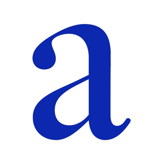
Monotype’s Jim Ford expresses his love for lowercase ‘a’ - a letter packed with character that presents a typeface’s innate attitude and posture. If you look at an ‘n’ from four centuries ago, you may notice that not much has changed in the form. The lowercase ‘a’ however, has had an evolution – a journey through different hands. Nevertheless, it is an important member of the alphabet, and not just to me. Without the ‘a’ there is no alphabet, there’s nowhere to start; there’s no language, without the ‘a’, there is no art.
I’ve always had an affection for the spectacle letters, such as the two-story ‘a’. Being that the ‘a’ is so individual and frequent, special care must be taken. The ‘a’ can test the limits of volume, it can magnify the voice, personality or character of a design. And in life and letters, character and personality is important to me.
The design of the ‘a’ shows historical, personal and cultural preferences, as well as it can vary based on its intended use or environment. In many typefaces, the ‘a’ is a point of expression, style, and it presents the type’s innate attitude and its posture. There are as many elegant ‘a’ forms as there are duds, and there are infinite possibilities. I believe a good ‘a’ has certain ‘studied finesse’ about it; it is balanced in a way that it sings with the choir, albeit quietly, enough to not disrupt the design and its function in typography.
That ‘a’ is quite the character. An ‘a’ can smile, frown, squat, stand up and jump, it can throw a left jab and a right hook, and it can sing and dance too! (Need I mention that it can also sit still and silent?). And it is all part of our art as type designers to direct it appropriately and fashionably.
I’m not one to call ‘bests’, in any medium – everything has its place. My favourite ‘a’ is the one that you haven’t seen yet – the ‘a’ in my mind. I am in love with the possibilities it presents. However, one of my recent obsessions was the Enschedé Fleischmann ‘a’, which I’ve interpreted above.
Jim Ford
… joined Monotype as a typeface designer in 2013, with a background in fine art and ten years experience in album artwork, poster design, lettering and custom type projects. “The most useful typefaces are based on time-honoured shapes and proportions, while also bringing something fresh to the aesthetic plane,” he says.
The Letter ‘a’
The third most common letter in the English language (and second in both French and Spanish), the letter ‘a’ can trace its ancestry back to the Phonecian letter aleph, which itself was inspired by a proto-Sinaitic pictogram depicting a bull’s head. In English it’s used to depict six different vowel sounds (depending on context), and its premier place in the alphabet has meant usage in other spheres, to represent unknown quantities in algebra and the universal affirmative in logic.
August 5, 2014 2 minutes read
Alpha Tale
Monotype’s Jim Ford expresses his love for lowercase ‘a’ - a letter packed with character that presents a typeface’s innate attitude and posture.

