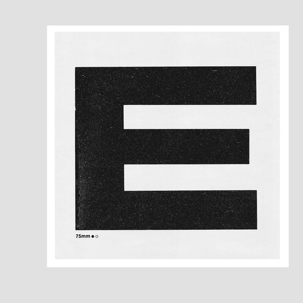
Graphic artist Danny Flynn pays homage to the intriguing form of the ampersand, in particular one that shows off its roots in the letters 'e' & 't' and tips a digital nod to letterpress printing. The ampersand logogram originates from the Latin ‘et’ (meaning ‘and’) and, forming a ligature of the two letters: ‘e’ and ‘t’. This is especially noticeable within some ampersands, for instance the font Taz Black, which was custom designed by Berlin-based Dutch type designer Luc(as) de Groot for German daily newspaper Die Tageszeitung (the moniker Taz is an abbreviation for the newspaper’s title). As I often use letterpress in my work, I am particularly fond of using onscreen poster typefaces like Taz, as it is apparent in its form that it was based on a bold wood letter style. I like the heavy cast iron sculptural element it displays and the negative shape in the middle that it contains.
In evolutionary terms, through calligraphic styling, the ampersand’s origin becomes less visible as it develops an appearance that loops around like an animal snare or a diagrammatic instruction of how to tie a particular rope knot. The glyph itself is very usefully used on signs and within titles of intellectual works, which can afford a more decorative element as opposed to the main, more prolific amount of information text.
I like to think of it as being an awkward yet showy glyph that always manages to get in-between when introducing couples. I mean, it manages to paradoxically attain a vain self-attention and yet it is only of incidental use, a functional link. I always include it whenever I lay out an A - Z of letters placing ‘&’ between the letter ‘Y’ and the letter ‘Z’ just to disrupt the habitual or expected formality of the alphabetical listing.
Find out more about Luc(as) de Groot and his fonts.
Danny Flynn's G511ERY.
This article was brought to you as part of Press Pass Takeover – by students of the Press Pass studio at The Cass, London Metropolitan University
Danny Flynn…
…
is a graphic artist, whose bookworks are included in international collections and have been shown at the Tate Gallery, Royal Academy, and the Yale Collection of British Art. Despite being fired from his first job for excessive sarcasm, Danny today manages to teach some students at The Cass at London Metropolitan University when they are paying attention and can generally be found at his gallery, G511ERY, in Tottenham Seven Sisters, North London.
Luc(as) de Groot…
…established Dutch type foundry Fontfabrik with Wim Westerveld and is the designer of the well-known font families of Thesis, Calibri and Consolas. Born Luc, many people called him “Lucas” while he was growing up. He came up with the typographic solution, Luc(as), to embrace both names when still at school.
May 26, 2016 2 minutes read
And Made
Graphic artist Danny Flynn pays homage to the intriguing form of the ampersand, in particular one that shows off its roots in the letters 'e' & 't' and tips a digital nod to letterpress printing.


