Munich's Studio Mirko Borsche, famous for work on Die Zeit and other magazines has completely redesigned art title Kaleidoscope. Here's how they matched classic layout with contemporary art content...
The graphic style of the new Kaleidoscope feels daring for a fine art magazine — could you describe your approach?
Together with the editors, we decided to give it a more classic and bolder look to refer to a wider audience, like Alexey Brodovitch did for Harpers Bazaar.
How does your redesign relate to changes in the editorial direction of the magazine? What was the process of collaboration between you and the editors?
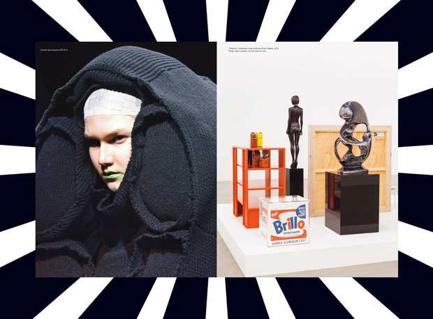
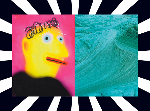
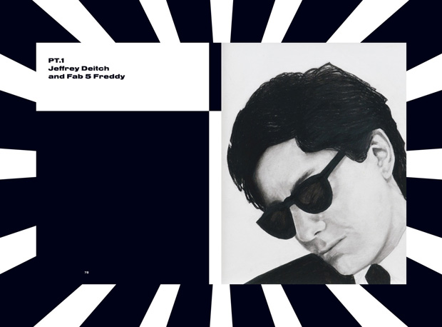
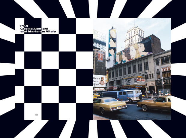
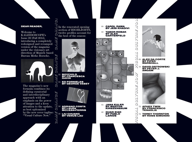
The editors' approach was to open up the magazine to a bigger range of readers and make the chapters and sections look catchy from the first sight. The idea was to have different magazines in one magazine; this is especially visible in the MONO chapter; in this case the layout is based on the art of the artist. The different parts really pop out and form their own special visual aesthetic.
You have a lot of experience of editorial design challenges — what was unique about this one?
To combine classic graphic design with modern art. The aim was to make a classic magazine layout that is able to transport modern art.
How do you envisage the design of the magazine evolving over future issues?
We have built a stepping-stone with the first issue. Now there is enough room to let the look grow and develop hand-in-hand with the content shift. mirkoborsche.com
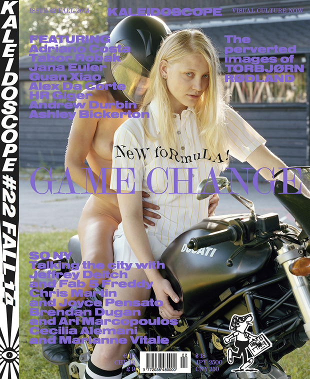
Kaleidoscope Magazine
Issue 22 (Fall 2014) available now