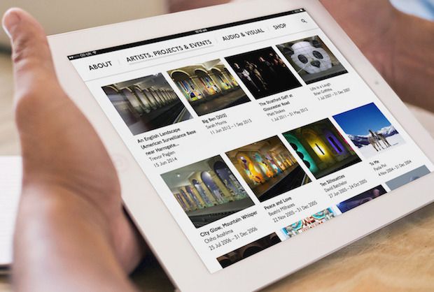
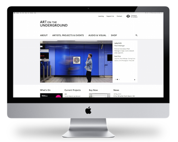
Art on the Underground's fifteen-year output was somewhat buried in Transport for London's previous site, leading Cog Design to develop a brand new framework that put the artwork centre stage.

Tell us a bit about the Art on The Underground project.
We were introduced to Art on the Underground when Cog took over the business of digital agency Red Leader in 2014. Art on the Underground has been producing major artworks across London’s Tube network for the past fifteen years, working with some of the UK's most important contemporary artists including the likes of Sarah Lucas, Mark Wallinger, Richard Wentworth, Tracey Emin, Bill Fontana and Bob and Roberta Smith.
Red Leader had created Art on the Underground's previous website in 2009 (with a design based on TfL templates) as well as the microsite and web app for Mark Wallinger’s Labyrinth. As the ambitions of the programme had grown, the site had become outdated, and struggled to communicate the scope and range of their work. In 2014 we started work on a complete redesign of the site.
What was the original brief and did it change during the project?
Despite being part of Transport for London’s enormous infrastructure and producing large-scale and high-profile artworks, Art on the Underground is at its heart a gallery programme, managed by a small core team. The clients were inspired by gallery sites including Red Leader’s design for Camden Arts Centre, and wanted a clean, minimal design in which the artworks took centre stage. A mobile-friendly site was a must, particularly with the increase of wifi access on the Tube network. They also needed something that could be managed and maintained by a small team, at the same time making the programme look active and busy.
The site exists as a microsite of the main TfL website, and a requirement for the previous site had been that it was based on TfL’s existing website templates, seriously limiting what could be done with the design. We were a little nervous that we would face the same restriction this time around, so very pleased that the design brief actually specified the opposite – the site should break away from the constraints of the previous TfL-based site, and have a visual personality of its own.
How diverse were the artworks featured and how did you design need to respond to that?
With commissions that range in scale from building cladding and billboards to the pocket-sized tube map covers as well as performance art and film, the works featured on the site are incredibly diverse.There are, however, threads that connect the works and we wanted to find a way to highlight these common elements. The projects' grid and filtering options offer that opportunity. Viewing the works by station, or by project series, connects the works visually very immediately – you’re struck by the very different ways that artists have approached the distinctive arches of Gloucester Road, or by the way the colours of tube lines are used and repurposed in the Tube Map cover commissions.
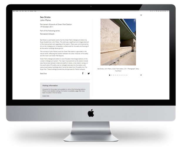
On individual project pages we wanted to allow space for the artworks to speak. On the old site these pages felt especially cluttered and complicated, so we’ve stripped them back to focus solely on the content. Longer sections of text, comments and visiting information are shown in shorter form with ‘read more’ functions and image slideshows remain in a fixed position as you scroll down the page.
What decisions did you make about the user journey?
We know from analytics of the previous site that most users are likely to come looking for further information about one project. The new site aims to increase audience engagement, encouraging users to explore from project to project, as well as to make it easy for users to find what they’re looking for. Again, the search and filter functions are an important element, as is the ‘related items’ function, which enables the Art on the Underground team to make connections between projects, artists and other content.
We were also keen to make the wealth of audio and visual content Art on the Underground have produced accessible to users, so it features in the main navigation as well as on individual project pages.
How did you change the connection to the shop?
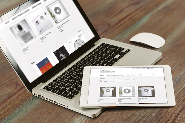
Art on the Underground merchandise, limited editions and artists’ products are sold through the TfL online shop and London Transport Museum shops. The previous site had a single-page ‘shop window’ for these products, featuring small thumbnail images, pricing information and a link through to the shop.
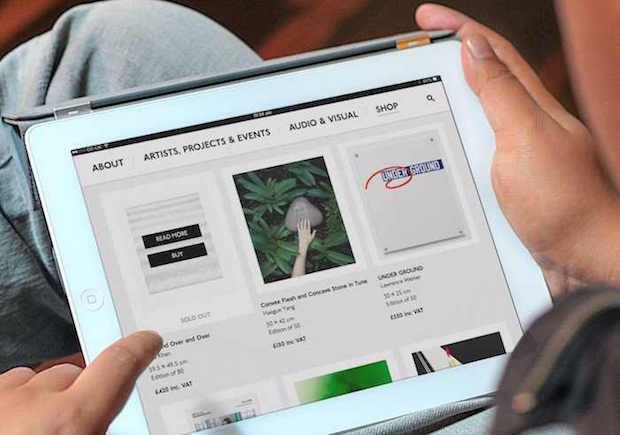
The new shop still links to the TfL or LTM shops for purchases, but allows for much richer content before that point. Art on the Underground can categorise and feature products, and include multiple images and further information about each one.
What was the most challenging part of the project?
One of the biggest challenges was working with the clients to balance their desire for a clean, minimal look with something that had character and represented their brand. Like many of our (particularly visual arts) clients, Art on the Underground were very keen that images were not cropped, treated or overlaid with text. Being able to use the iconic TfL New Johnston font was invaluable – it instantly connects with TfL and gives the site some personality. We also framed images, particularly in the shop, to allow a variety of shapes of uncropped images within a set space.
The previous site included a lot of content (a fifteen year archive of projects and artists) which needed to be migrated carefully from an old content management system, and we needed to create a URL redirect strategy for this content. This behind the scenes work doesn’t have a huge impact for users, but saved a lot of time for the client and means their search rankings weren’t affected by the development.
What was the clients’ feedback?
Three months since the launch and the Art on the Underground team are delighted with the new site. Feedback from visitors has been great and they have been actively updating the site with new work.
Technical spec
WordPress
Transport for London’s New Johnston font
cogdesign.com

