In today's Letterform, Matthew Burvill looks at a letter ‘Y’ which really turns heads, designed in 1973 using french curves and a mechanical pencil by the Austrian typeface designer Othmar Motter. When you think about it, ‘y’ is quite a dull character. You take ‘v’, attach a hockey stick to it and job done, no? Of course it’s not really as simple as that, in fact it’s quite difficult to get right, but that still isn’t enough to elevate it to the most interesting letter of the alphabet.
That’s why when a ‘y’ catches my attention, it’s really time to take notice.
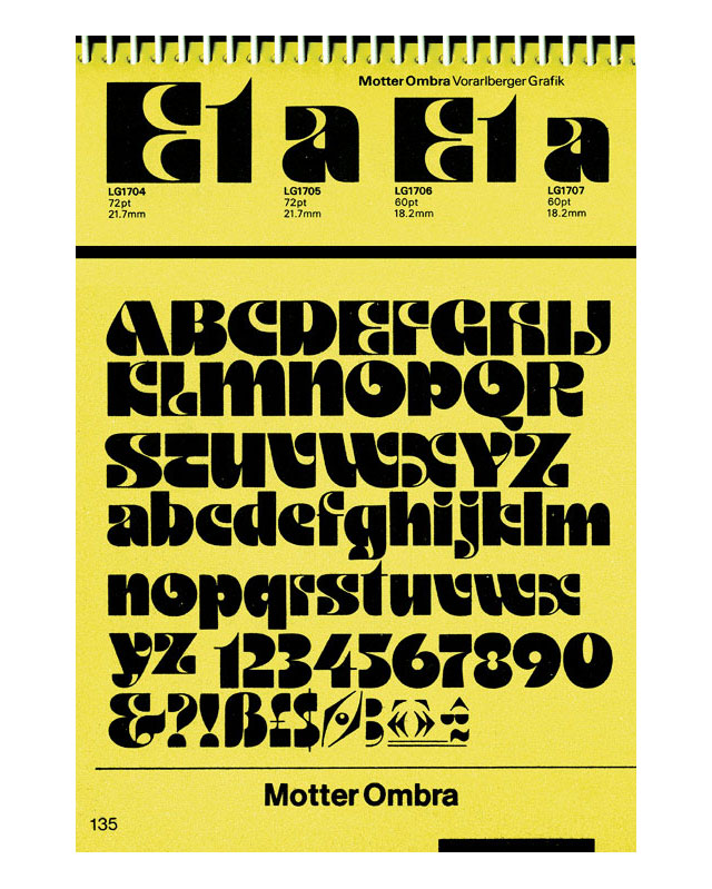
The ‘y’ you see here is one such example. It is unashamedly bold, big, ornate and beautiful. This is the ‘y’ from Motter Ombra and it might be the most eye-catching ‘y’ of all.
Ombra is the work of Othmar Motter, an Austrian graphic and type designer who was most active in the ‘pre-digital’ era. Ombra was designed in 1973 using french curves and a mechanical pencil and was Motter's second or third typeface design to be released.
He later designed what would arguably be his most famous typeface, Motter Tektura, in 1975 which was used famously by Apple in its original logo. The ‘a’ of this font apparently informing the shape of that iconic bite.
Being of this vintage, Motter’s typefaces were hard to come by as digital fonts, inspiring the bootleg versions of his Ombra, and later Femina, typefaces that typically adorn the flyers of local DJ Dave’s funk night at the Red Lion.
Whilst the 70s as we would like to imagine them are driven by an aesthetic that Motter’s fonts define so well, I believe his work is worthy of use for much more than this kitsch nostalgia. Since his death in 2010, I understand that his family are developing and releasing official digitizations of his fonts and I strongly suggest you take a look. Least of all for the original ‘y’ that differs from the bootleg which was apparently drawn not by Motter, but by otter.
houseofburvo.co.uk
Othmar Motter…
…was the first high-profile type designer to hail from Austria. Born in 1927, he set up the design agency Vorarlberger Graphik (together with Hans Kaiser and Sylvester Licka) in 1952. Despite four of his typefaces being released by Berthold and Letraset, for many years he concentrated on designing logos, eventually retuning to typeface design in the 1990s. The foundry motterfonts.com is now run by his grandsons
Matthew Burvill…
…is the naïve publisher of various dubious quality fonts from the years 2008-2011, not all of which have been successfully removed from the internet. Although learning the mysteries of opaque font software with no instruction was exciting, he later made an effort to 'go pro', supplying custom fonts for branding and releasing a decent font with Gestalten. He now works at Dalton Maag in London.