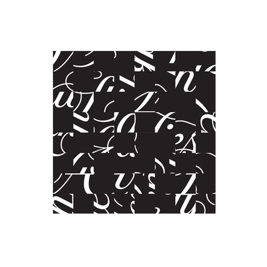
As the shopping bonanza known as Black Friday takes hold, Miho Aishima remembers Pentagram's daring 2007 rebrand of one of her favourite Stateside stores, Saks Fifth Avenue. Growing up in the States meant that Christmas officially started the day after Thanksgiving in what is now called Black Friday. Back in those days, we would watch the Thanksgiving Day parade as a family on tv, with the floats bobbing down the streets of New York City which glittered with the shop fronts of many department stores. The next day would kick-start a frenzy of sales and I am not sure how Santa managed, but he seemed to be in every mall across the Detroit area simultaneously, waiting patiently for children to sit on his lap and tell him their Christmas wishes.
Shopping back then was a social activity to do with family or friends; a sort of analogue Pinterest. We spent our time searching for treasures, collating which shop displays were the most appealing and creative. One of the stores that brought New York glamour to the suburbs of Detroit was Saks Fifth Avenue.
The interior of Saks Fifth Avenue was spacious, fitted with plush carpets and items were carefully displayed in a curation of style and taste not easily found in our area. Luxurious items were their meticulous arranged, inviting you to take them home. This was not your usual hectic Christmas shopping experience.
Considering the grandeur of the experience, it seemed odd that the branding itself was a subdued grey, quietly existing either as a script or as a sans serif arrangement. The 2007 rebrand by Pentagram of Saks Fifth Avenue gave the store the brand it deserved, with an eye-catching modern twist updating the scripted logo. Script logos for American department stores were not that unusual: Lord & Taylor and Neiman Marcus both opted for this type style. However, boldly moving from the recessive grey brand to a punchy black & white identity of 64 tessellating squares was groundbreaking. Through this fresh, modern approach, it managed to marry script with geometry to great effect. This was an intelligent solution to a classic brand. The choice of lettering remained a redraw of a 1973 classic but through the sectioning of the identity into 64 squares, the rotating action brought almost 100 googols of combinations and created millions of options used across all touchpoints. This was not an obvious solution. Abstraction meant that legibility was lost, yet artistry of the form and brand recognition both increased. Even on the bags and packaging, where only a handful of the squares were featured, it was easy to recognise that it as a Saks Fifth Avenue bag.
Eight years on, the identity still seems fresh. It has become a sophisticated, cutting-edge classic. Black Friday may be amongst us again, but brands like Saks Fifth Avenue retain a nostalgic Christmas feeling that is more about experience than bargain hunting.
Read more about Pentagram's design here.
aishima.co.uk
Miho Aishima...
After a decade of working for high profile agencies such as johnson banks, CDT Design and Macmillan Publishers, Miho set up her eponymous studio Aishima. In addition to her beautifully-considered client work, she has recently started a series of blog posts about a range of diverse branding-related topics including
colour, events and Christmas, as well as her research into craft beer branding in South London.
Black Friday...
Originating in the USA, the hyped-up shopping bonanaza that is Black Friday has spread around the globe. As well as encouraging people to buy stuff they don't need, several people have been killed and seriously injured in the States as a result of this crazy bargain hunt-induced madness. As a refreshing reaction to this 'artificial stimulation of short-term desire,' Grafik's favourite furniture retailer Vitsoe has taken a stand this year, and decided to close its NYC and London shops on Black Friday. Here here....
November 25, 2015 3 minutes read
B+W Friday
As the shopping bonanza that is Black Friday takes hold, Miho Aishima remembers Pentagram's daring 2007 rebrand of one of her favourite Stateside stores, Saks Fifth Avenue.

