
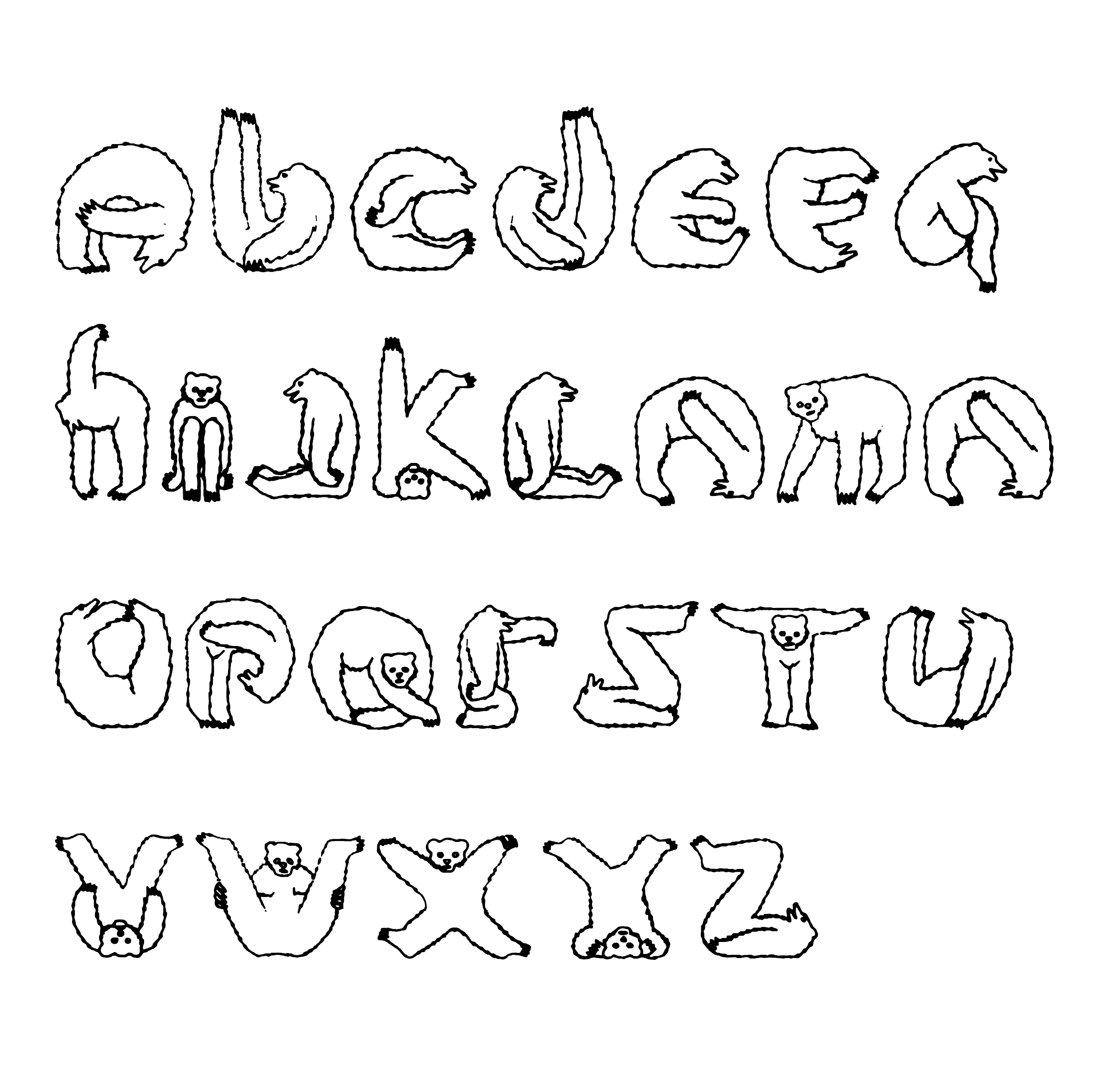
In today's Archive piece, we revisit Craig Oldham's Letterform, where he sings the praises of a typeface which doesn't take itself too seriously – the wonderfully irreverent (and surprisingly agile), Mr Bear.
Designers take typography so seriously.
And rightly so, I guess. It’s an important thing in the industry – a serious craft – and the nearest thing we have to a trade in this profession. There are many designers who study typography their whole careers: learning the names, practising the methods and obeying the rules. But the trouble with rules is, although they prevent mistakes, they can prevent discoveries. And Mr. Bear is one such discovery.
Just look at the twenty-six characters of Mr. Bear (a very well-suited term in this case). It’s like he’s been captured as he relishes every dance step to Village People’s YMCA – and then some. Sure, he’s not the best-looking bear out there, but look how gracefully he curls for ‘O’, how creative he becomes for ‘K’, and how he cites Twister as a personal hobby, and influence, in the creation of ‘Q’.
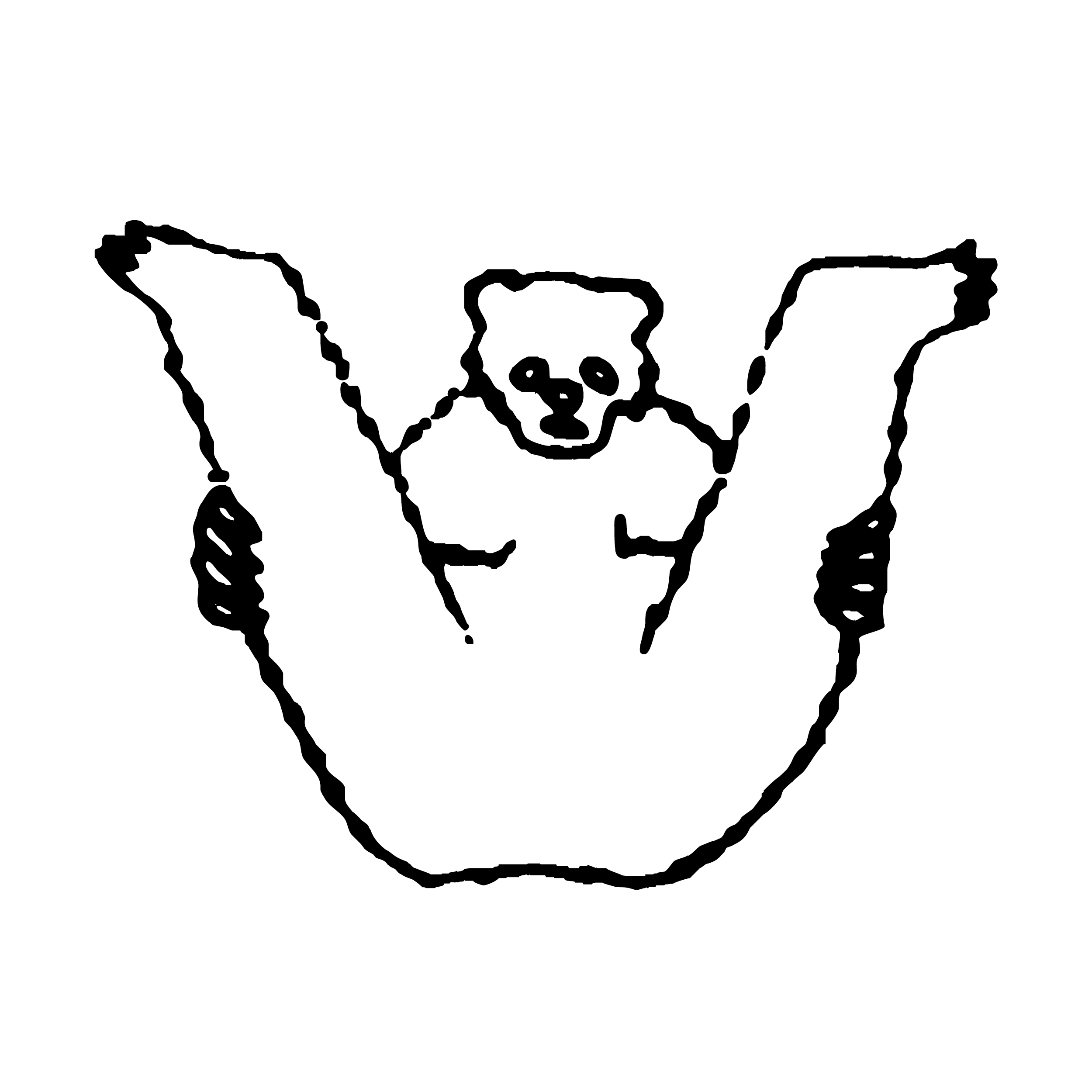
But, for me, Mr. Bear excels when he executes ‘W’, and when you take a look at it, I don’t think I need to say why.
Now, many of you out there, reading this, will see Mr. Bear performing ‘W’ and regard it as tosh. Utter nonsense. A disregard for all things typographical and elegant. And you’re probably right.
Sure enough, Mr. Bear wouldn’t be your typeface of choice for many – OK, none – of the jobs you’ll design in your career. But entertain me if you will. Visit your nearest children’s bookstore, and inside, no doubt, will be a selection of those alphabet books that play the vital role in the development of literacy in children – hell, I’d even bet you had one, I know I did. Just take a look at these – Aa, Bb, Cc – books and see how many are set in a Swiss typeface, tightly kerned and leaded, with adequate line length, ranged right, and with enough white space to make a polar bear happy.
For me, Mr. Bear, like everything else, has a place. It just so happens Mr. Bear’s is a less serious place than the world of typography. But, if anything, you have to smile, don’t you.
—
Craig Oldham is speaking at our next Letterform Live event on Wednesday 25 February at Protein Studios, London EC2 along with Alistair Hall, Susanna Edwards, Sarah Boris, James Greenfield and Gordon Reid. Tickets are £12.50 (including drinks) and there are a limited number of available to purchase here.
The Office of Craig Oldham
This piece first appeared in Grafik 183, March 2010