As issue 2 of the revamped Monotype Recorder hits the streets, we asked designer Luke Tonge to give us the lowdown on designing a magazine that comes with an auspicious pedigree and a very discerning audience.
How did you get the job of designing the Recorder? It must be many designers’ dream commission…
I’m still pinching myself – you’re right, it is my dream job. The short answer is I pitched and was chosen, but the longer and more honest answer is years of sleepless nights and determination. I used to be art-director of bi-annual travel publication Boat magazine and I took the role of type in that magazine very seriously, that work got me on the radar of James Fooks-Bale (creative director at Monotype). The timing was perfect too as my stint on board Boat had just come to an end a couple of weeks before I received the invitation to submit a proposal for what would become the Recorder. If I’d known who else was submitting I probably wouldn’t have bothered. But they saw how passionate I was, and amazingly gave me the opportunity.
What was the original brief for the magazine’s look and feel?
I’ve just had a look back at the brief to make sure I get this right. Basically the aim was create a print edition that respected Monotype's history (and the heritage of the original Monotype Recorder) but that also established the Recorder as a contemporary design journal – showing the creative community that although Monotype might be a big corporation they’re also passionate about producing and facilitating experimental and unexpected work. Of course they were keen to showcase Monotype’s typefaces too, which was a no-brainer. Type has sometimes had a reputation as a stuffy or nerdy subject, so we tried to make sure we created something the that could be understood and enjoyed whatever your knowledge of type.
The Recorder is a publication with a long history and tradition, and the new design is very expressive and playful. What was the thinking behind taking that approach?
I feel like I have to address this quite often, I guess because there’s been a noticeable swing with indie mags during this latest ‘golden age’ of publishing toward very stripped back, sparse and minimal publication design and we’ve intentionally taken a different direction. It’s an issue that the latest Gym Class Mag called into question on its latest cover. I’ve always been a firm believer that when appropriate, aesthetics should help deliver content – of course that can mean just getting out of the way – but it can also mean enhancing and expressing the content visually. I love the confidence and use of colour in publications like Eye and Baseline and I wanted to explore in a similar vein how to give each story in our magazine an identity and personality of its own. Looking back at some of the original Recorder issues there was some pretty brave layouts for that era, so a serious or quiet design was never on the cards.
How has issue two developed in terms of design?
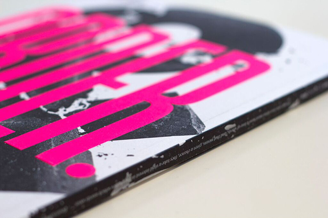
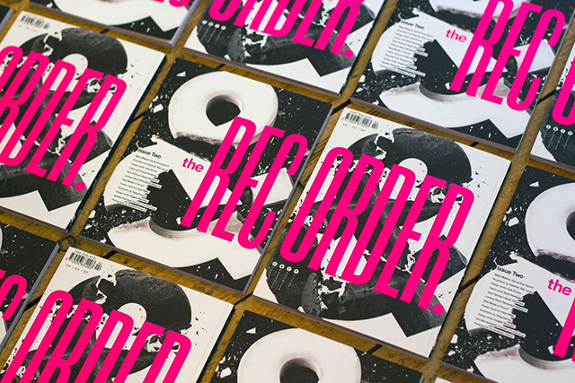
We’re growing in confidence, and refining. I’m definitely happier with this issue – the reborn Recorder is less than a year old so we’re still exploring and testing new things out – but we have the benefit of decisions and structures already in place from Issue 1 (like the grid, sections, page furniture etc), but I switched up much of the type, partly in reaction to the content, but also on reflection after living with Issue 1. The content is really strong again so in many ways my job was very easy. The cover is probably the biggest visual change, we’ve kept our huge wrap-around masthead in place, embossing it in neon pink (after some pain endured with gold foil last year), but this time we featured some striking photography from one of our features. We experimented with some very abstract tessellations and gradients but it didn’t feel right or make sense for this issue.
Does the subject matter present any particular challenges, and if so how did you overcome these?
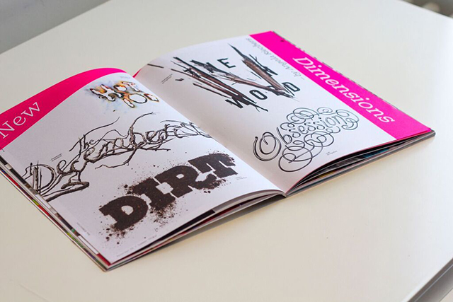
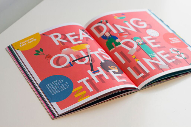
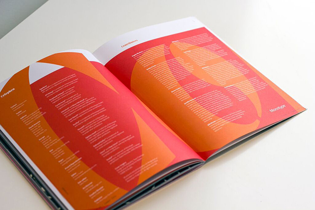
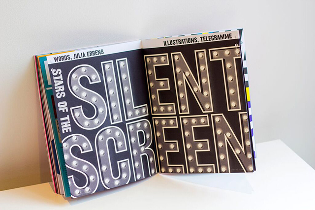
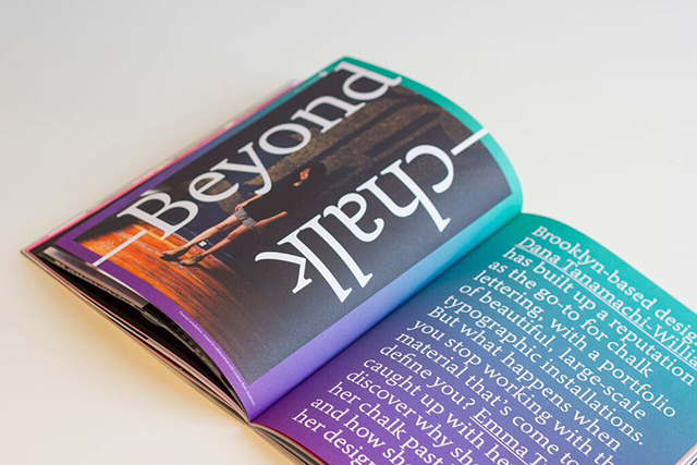
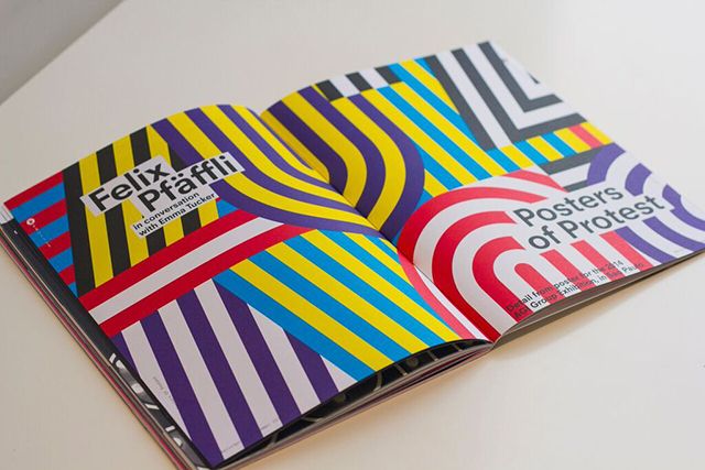
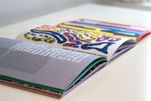
Our content is split into four sections – features, profiles, opinions and essays – usually two of each per issue. Some of these, like profiles, are visually very exciting as we have work to showcase and in the case of this issue, some beautiful commissioned photography of the people being profiled. Essays are probably the hardest pieces to present, as they can be a bit more cerebral and abstract, so illustration has been put to good use – we had some beautiful pieces by David Doran and Neasden Control Centre in Issue 1, and this time around from Kiki Ljung and Telegramme. As with any design job the biggest challenge is usually to avoid a cliched response – thankfully because there’s a generous amount of time spent on each article we try and push beyond the obvious as quickly as possible to get them out our system.
What are the challenges faced when designing a magazine which will be read primarily by designers?
Designers are a funny bunch – we can be hugely critical of anything we think we could do a better job on – without any knowledge of the brief, the client or even the audience. So suffice to say, it's nerve-wracking designing for that audience, and then with the Recorder there’s a sub-set of that audience who have known Monotype for a long time and also who might have long-established views on ‘proper’ use of type. The flip side of that coin is I’m fortunate to call some incredible designers friends, both on and offline, so there’s been some helpful input along the way – plus when you receive genuine compliments it means that much more. I try to put aside concerns about audience when designing and let the content and the brief dictate the outcome – then hope it naturally finds a receptive audience.
Which aspects do you think have worked particularly well? What’s your favourite story or spread?
It's not often talked about, but from my perspective the thing that has worked best of all is the team. As someone who works in a busy studio with layers of people often involved it's always incredibly enjoyable to be part of a very tight (and tiny) team. Emma Tucker, our editor, is an absolute dream to work with – she’s super organised and smart – but she trusts me and allows me huge freedom (like I said, dream project) and James F-B is always on hand when we need him, and has been very supportive.
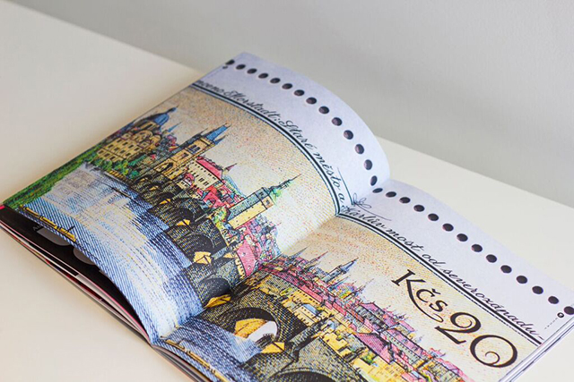
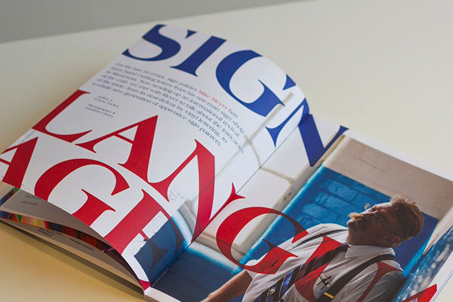
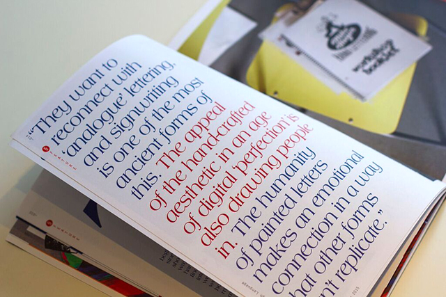
It terms of the content, I was stoked to be able to commission a great friend (and long-time collaborator) of mine Jonathan Cherry to shoot American sign-writer extraordinaire Mike Meyer during a workshop at Waste Studio, we paired his beautiful portraits with the typeface Americana, which is bold and confident just like Mike, and I’m really happy with the opening spread to his profile. I’m also increasingly fascinated with beautiful old stamps (thanks in part to Blair Thomson’s excellent ‘Graphilately’ Instagram account) so I’m pleased we managed to give over some generous space to an essay about stunning Czech stamps.
What’s been the response from the readers so far?
It's early days, but so far it's been great (and that doesn’t even count my Mum..) of course the proof is in the pudding and we’re fortunate to be hitting a much wider audience this time around so it’ll be interesting to see how it goes down. Response to Issue 1 was overwhelmingly positive – I think people appreciate that although its clearly a Monotype gig, it's a really small and passionate team trying hard to put out something worth the cover price, that adds to the conversation and inspires new audiences to engage with type. As a magazine fanatic myself I’m only too aware of how many great publications are out there asking for attention.
What can we expect to see in Issue 3?
No clue... Emma and I are always exchanging ideas about what could make for a great piece, and we occasionally get pitched some ideas – so there’s a longlist out there that Emma will expertly trim to leave us with a nicely balanced Issue. I’ve got a wish-list of collaborators which I’m steadily working through, and always adding to. I’m excited to try some new things with Issue 3, always keeping in mind the brief to be experimental, so I’m hoping it’ll be another step forward.
What do you do when you’re not designing the Recorder?
I work full-time at a big agency in Birmingham, and outside work I’m involved in a few different roles…I’m also a part of the team over at FormFiftyFive which is a huge privilege. I’ve some exciting editorial side-projects in the pipeline that I can’t talk about just yet, one day i’d love to make magazines full-time – but I’m so thankful to be able to do what I love for a living. I’m also married to Tash who is amazing and deserves recognition, she puts up with all my obsessing over design, overspending on books and mags, and late nights spent staring at a screen nudging words and pictures around...
See more of Luke's work here and order your copy of issue 2 here.