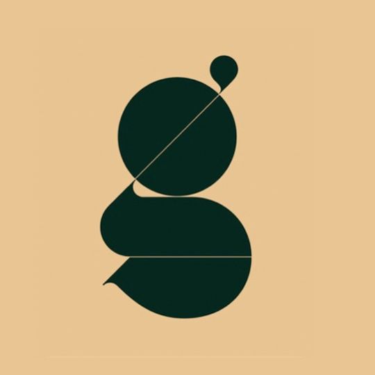
Lowercase ‘g’ is a glyph that never fails to perplex and beguile, designer Amishi Parekh goes gaga over Áron Jancsó’s sophisticated version created for typeface Ogaki. Few characters must confound type designers as much as the lowercase ‘g’. One has to make a multitude of decisions at every curve of its extensively labelled anatomy: single or double storey? Closed bowl or open tail? Other letters may fall in line, but the lower case g is always the pesky one chewing gum, with its tie off-kilter and shirt badly tucked in.
Rising to the challenge, Hungarian designer Áron Jancsó decided to make it the centerpiece of his typeface, Ogaki. Urban Dictionary considers the lower case ‘g’ a ‘poseur’ – upper case ‘G’s have it all figured out. They clearly haven’t met Áron Jancsó’s version in Ogaki. This ‘g’ could run circles around any ‘G’, and could teach any disheveled ‘g’s how to get in shape. Complete with a wardrobe of immaculately pressed tuxedos, it is screaming to be used on its own as a logo.
The hairline break, which can only be a nod to Bob Noorda’s quiet sophistication, offers the elegant contrast of a crisp white shirt peeking through inky black. And once the suit is in place, it’s time for the finishing touches. Like a well-chosen pair of cufflinks (often mistaken as a frivolity by amateurs, but which in the right hands can make a nondescript outfit sing), what makes this particular ‘g’ stand out is the oversized ear ‘drop’. One can only imagine the hours spent staring before a mirror, agonising over that little accessory. In the case of Ogaki, the reflection clearly took over. What would have been a run-of-the-mill ear is instead mirrored to the left, reminding us that this gentleman was once quite the troublemaker.
While Ogaki is a pure display face, to be used with a heavy dose of caution (this font will definitely not minimise), when it comes to more conventional serifs, such as ITC Century Book, the addition of a bespectacled ‘g’ is sure to dress up any typeface. The double storey version, as it is commonly referred, was introduced when printing with Roman type was adopted. Closing the ‘bowl’ allowed more lines of text to fit on a page, debunking the ‘less is more’ crew, in being an ornate letterform that actually offers economy. It’s certainly more fun to draw than the single storey version.
What’s most exciting, is when the ‘g’ chooses to dress down to the single storey italic. Then it’s all casual, shirtsleeves rolled up, just so. It is possibly the most dramatic switch in styles – another reason why the lower case ‘g’ has set so many hearts aflutter. Drawing a ‘g’ that’s as comfortable in coattails as it is zooming down the coast with the top down, wind and sand tousling hair, is a task best left to the brave-hearted.
Amishi Parekh
Mumbai-based designer Amishi Parekh moved from prolific Indian studio Design Temple, to complete an MA in Innovation Management at Central Saint Martins in London. Interested in how cultural differences influence design, her approach is highly collaborative and often brings together people from different countries and professions.
Áron Jancsó
Áron Jancsó seeks inspiration for his fonts from a blend of modernism, street culture and calligraphy. Ogaki, a super-fat display typeface, is his first commercial font and has been released by Gestalten. The lowercase ‘g’ so beloved by Parekh was the result of “restless experimentation”, says Jancsó, and went on to inspire the other letterforms in the family.
April 17, 2014 2 minutes read
Best dressed
Lowercase ‘g’ is a glyph that never fails to perplex and beguile, designer Amishi Parekh goes gaga over Áron Jancsó’s sophisticated version created for typeface Ogaki.

