
Inspired by warehouse parties, William Blake and standing stones, The Beautiful Meme’s identity for East London outdoor art gallery The Line combines a clever logo with experimental screenprinting by Heretic.
Tell us a little bit about The Line.
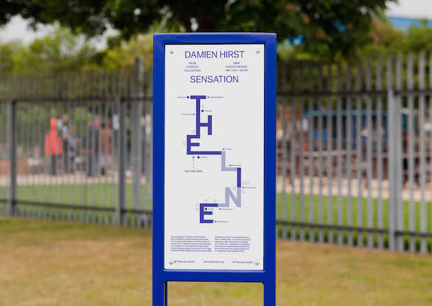
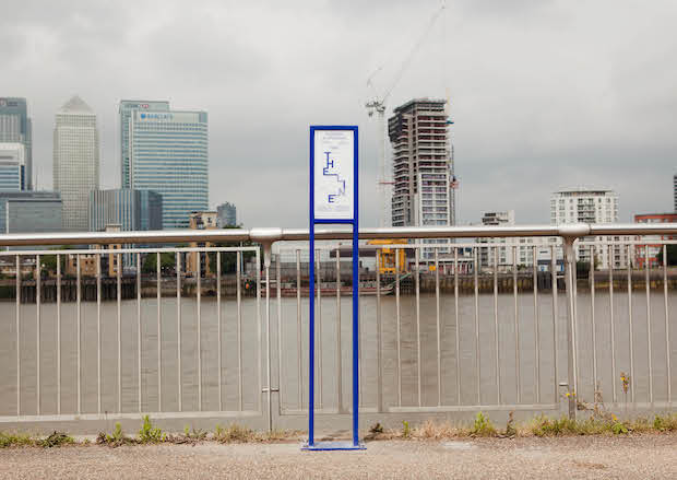
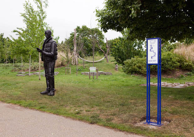
The Line is an art walk that links the Queen Elizabeth Olympic Park in London and O2. Along the way you can see world-class contemporary sculpture.
What did the client want from the brief and did it change at all during the project?
The client wanted what all clients want – to stand out and be exciting, to have a position and convey it clearly, to cause a stir, to be bold and brave and to move people. The brief didn’t say that though. The brief asked for some signage designs based on another logo they’d already created. So we ignored that brief.
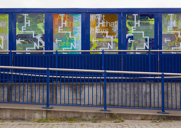
William Blake and Bruce Chatwin were both inspirations for the project, how did they influence the design?
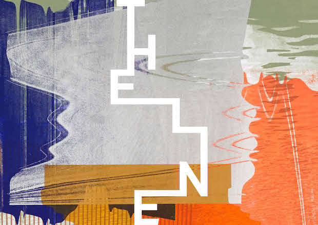
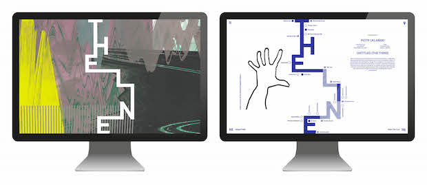
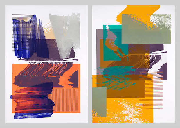
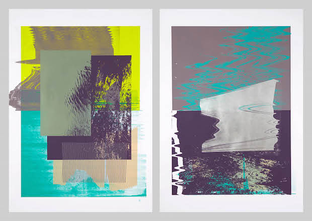
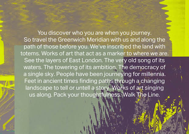
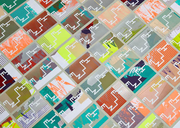
We actually wrote the piece of positioning copy first, this opened up the idea to us that The Line wasn’t just an outdoor art gallery, but an experience that’s within a very old tradition of people marking landscapes with totems such as standing stones. Allied to this, cultures have always mapped their environments through origin stories – or as Bruce Chatwin referred to them ‘songlines’. With Blake we were thinking about the preface to ‘Milton, a Poem’ where he describes Jesus walking through a ‘green and pleasant land’ and contrasts that with ‘dark Satanic Mills’. It's the idea of wildly different landscapes existing in one, visionary, transcendent journey. All these themes found their way into the identity, particularly in our approach to the visual language – twenty unique screen-printing experiments based on imagery from the actual walk. These prints conceptually embraced randomness, vision and exploration, and visually referenced a variety of ancient anthropological markings and artwork.
How did you develop The Line’s logo?
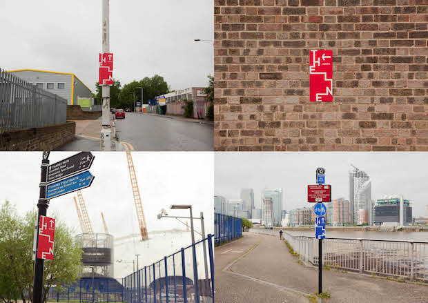
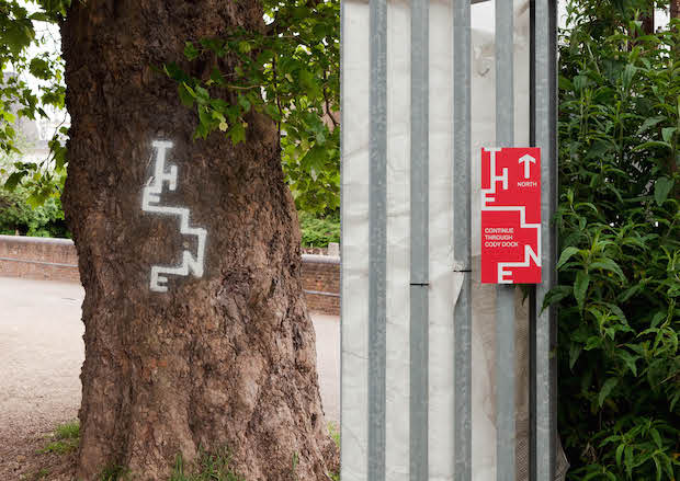
We wanted to create something that felt more East London warehouse party rather than West London gallery. Using the pure vertical and horizontal strokes of the seven characters, our logo is an interpretation of the path of The Line – in the same vein as Harry Beck’s tube map. We also wanted to make sure we created something identifiable from a distance to work on anything from a sign to a tree or a rock.
You collaborated with Heretic on the project, what was the process like working together?
Fantastic. Our brief to Heretic was to simply experiment with our base designs and the colour palette, to play with the printing process and see what happened. They are artists as much as they are printers and the results were exactly as we hoped they would be.
What would you say was the most challenging part of the project?
As can be seen in their openness to us challenging their original brief, we had a brave and trusting client. We did have to spend some time however selling in the experimental visual language concept. We couldn’t show anything and could only really describe our idea as ‘screen printing experiments’. In the end we got the client into Heretic’s studio so they could see some tests we were running. They started to get excited when they saw the colours begin to emerge.
What was the client’s feedback?
Our creative process is quite involved and we make sure our clients have the opportunity to feedback at lots of different stages. We first presented our positioning concept in a bar, on the back of a napkin. That went down well. We then followed up in our studio with positioning copy and a wall full of trail markings and tribal art to indicate the visual language direction we were heading in. A couple of weeks later we presented just the one logo. Our clients were pretty cool throughout.

Technical spec
Typeface Aktiv Grotesk by Dalton Maag
Visual Language: 6 colour screenprints
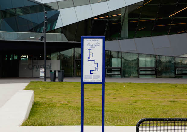
Artwork Info Plaques: Matt white 3mm aluminium pane with over layer of matt UV stable lacquer, Single spot colour print, Double powder coated stainless steel framework
Comp Cards: 300gsm Fedrigoni Arcoprint, 6 colour screenprint, White Foil
Bus cards / Invites: 540gsm/350gsm Colourplan Bright White, 1/1 black foil
Wayfinding signs: 8mm diabond, Single spot colour print
Graffiti tags: Semi-permanent survey marking paint


