
From typefaces inspired by the trawlers of Reykjavík harbour to trophies made from bent neon tubes, the work of this Icelandic designer never fails to surprise and delight.
How would you describe your approach?
I like to work in a variety of media, both regarding my working methods and the platform I use to produce my work. I don't like to limit myself to any particular thing. As a graphic designer I specialise in type design but I also work as a street artist specialising in sign painting. In the beginning of a process I focus on the concept as well as the material suited for the project. I often like to look through my sketchbooks and try to blend old ideas with new to match the current project brief. I emphasise working with my hands because I believe that gives me a more original and better quality end result.
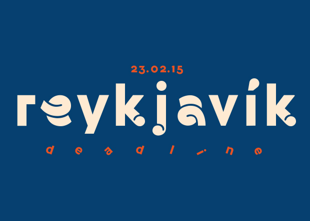
Tell us a little bit about your Harbour typeface.
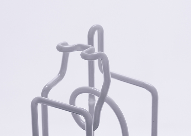
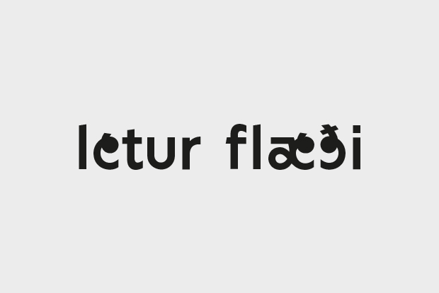
Harbour typeface is actually my first complete typeface. I never really learned type design, I’m pretty much self-taught through curiosity. I have the advantage of coming from a background of street art and sign painting so I've been making letters and working with type for for the last few years.
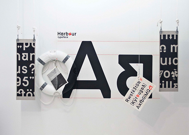
My studio is by the harbour in Reykjavík so I walk pass the shipyard every day and observe the ships rolling in and getting re-painted. The signs and markings on the trawlers are hand-painted and have a personality of awkwardness and imperfection, and that is something that really caught my eye.
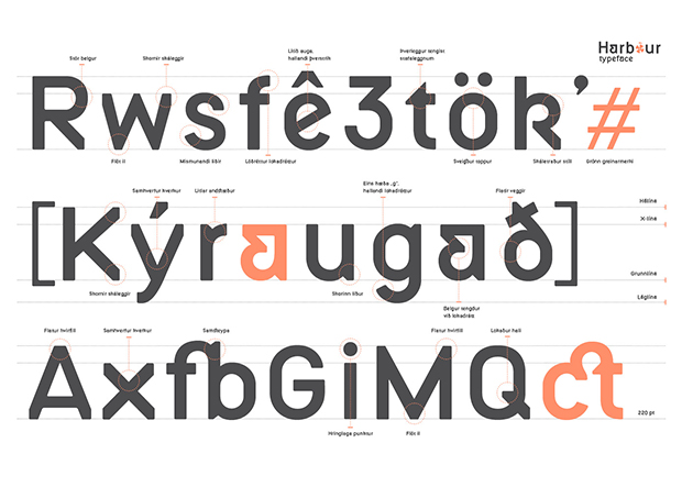
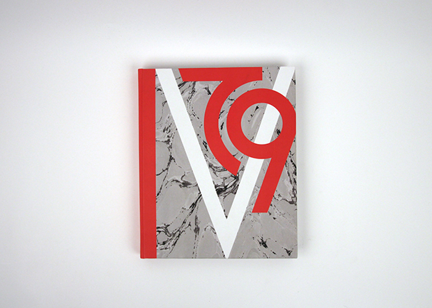
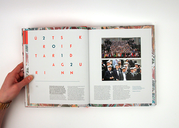
The typeface is inspired by these signs. Harbour typeface is a geometric sans serif with an industrial and contemporary feel. The signs don't have any lower-case letters, so in the typeface they are modelled from the grid and form the upper-case letters. Some of the signs are melted in steel and therefore have cut corners, and I applied that detail in the typeface. To present the typeface I made a type specimen that was shown at the Icelandic Academy of the Arts graduation show in Reykjavík Art Museum in 2014.
Tell us about a recent project that you're particularly proud of.
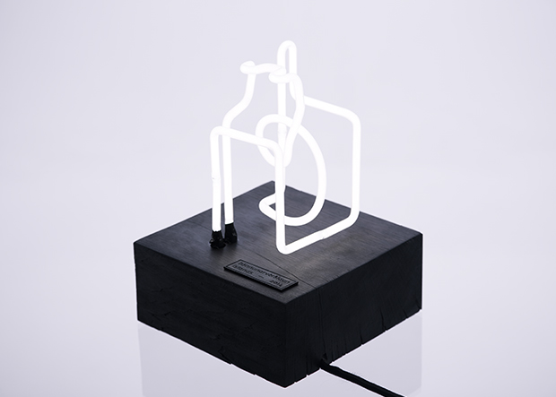
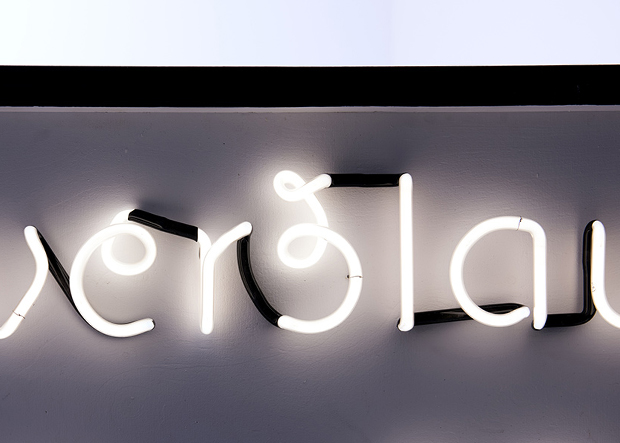
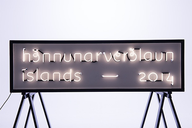
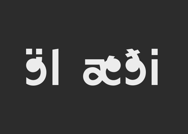
Recently I finished branding Hönnunarverðlaun Íslands or the Iceland Design Award. I created that brand with my colleague Elsa Jónsdóttir. We started making a brand typeface for the award inspired by the curves of neon lights. The brand concept is based on light itself, reflecting that we are putting the winner in the spotlight. The trophy for the award was created out of neon light in the shape of the first three letters of the Icelandic word “hönnun" which means design.Working on this project was really rewarding. The time to complete it was really tight, but everything eventually ran smoothly. I have to thank Karl Jóhann, the neon expert, for making the sign and the trophy very quickly and additionally holding a small private workshop for us, showing us how to bend neon glass. What a legend.
How do you think your experience in China has shaped your practice?
In 2013 I lived in Beijing and studied in CAFA, The Central Academy of Fine Arts. I met some really interesting people there and I think studying in China shaped my mentality towards my work. Designing something you can't read or understand makes you look at things differently. After that experience I've been more open to experimenting with my design. I was very satisfied with my experience living in China and I wouldn't be surprised if I end up living there later in my life.
bjornloki.com