
How do you create a publication that does justice to one of the greatest films ever made? Mathias Augustyniak from M/M (Paris) lifts the lid on how they built their own monolith.
Can you explain what the project is in basic terms?
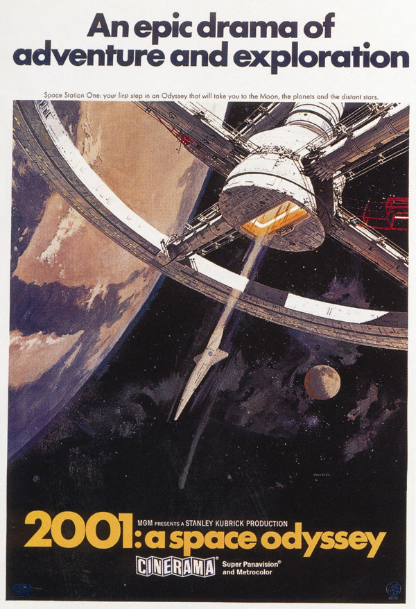
The idea was to make a book about a movie that was already considered a masterpiece. For a long time Kubrick was obviously obsessed with how to portray or describe space in film. I think his greatest achievement was 2001: A Space Odyssey. We first met with Piers Bizony, the project’s editor, whose text had been updated from his bestselling 1994 monograph 2001: Filming the Future. That original text was roughly 30,000 words long; the new version is almost 100,000, partly thanks to the fact that we had access to the vast Kubrick Archives this time round. Piers has described this new edition “as similar to the first book as a floodlight is to a candle.”
I think that at the time, and Benedikt Taschen agreed, that the visual quality of that original book was not appropriate to the visual quality of the movie, so that was how it all started. As a starting point we suggested a kind of ironic provocation, that it would be ideal to design the book and store it within a black monolith that you see at the beginning of the movie. Originally, I had some trepidation about the trend for creating books about movies, but I now understand why a book about a film has reason to exist in 2014, because there is less and less proper cinema, an aspect of the form is dying. I think such publications help reinforce the notion that movies of the ilk of 2001 aspired to be challenging works of art, to be culturally impactful. This book is for the film’s core fan-base, to reactivate a sense of its significance. This type of project aims to aid in saving something significant for the collective memory.


This books is described as being “exhaustive” in terms of how it relates to the film, how do you as a designer prevent yourself and the reader from becoming exhausted by the wealth of material that you have to contain.
It took us around two years to do this book. It was a long and exhausting process. We were in discussion with Kubrick’s wife and brother-in-law, who worked with him as a producer for a long time. The good thing is that the editor Piers was very adept at digging out the material and from that glut of information we were able to pick out what we thought made sense in relation to the making of the movie. We decided right at the beginning that we should do a book dedicated purely to stills from the movie, because it is important just to have as something that stands next to the archive and helps you understand it in relation to the film. We made it vertical so that the reader has the experience of going through a labyrinth. It takes the reader almost three-quarters of an hour to flip through [its 1386 pages] and exhaust the visual material. That’s why it has so many internal flaps and fold-outs, almost like it’s a video game where you progress level-by-level with the potential of getting completely lost. We felt that it should be a very time-consuming experience.


For the designer’s point-of-view, what are the pros and cons of designing a limited edition, as opposed to mass-produced, object?
I don’t have anything against limited editions. Physical, books are limited by nature. Relative to the price I don’t think you can buy many other objects today that give you as much information and excitement as this one. For me, it’s positive to know that I am designing a book that will be extraordinary because I know the run of the book [published in a limited edition of 1500]. If I knew that there were to ten thousand copiesthen I would have designed it in a different way. I don’t think the whole world needs this book. Whether it is a limited run or not I always presume the reader to be extremely bright and I wouldn't change the way I present the information. For me what changes is the object itself and how it’s bound, whether it fits on your shelf or not. One can expect from an extraordinary book for it to be a frustrating object that doesn’t conform to rule.
Were there any particular aspects of Kubrick’s visual language that were difficult to translate to the page and some that were more amenable to it?
The main difficulty dealing with the project is that Kubrick’s visual language is extremely strong. It is dense, powerful, weighty… so for designers such as ourselves, who also have our own language, we have to first work out how to deal with that vibrance. It took us a long time to come up with something that was completely new and design for the project, because for a while it was just us using things that were already resolved, like an art historian piecing images together. Eventually, by the end of the project, we decided that we had to add something that was completely bespoke for the project itself – that became the four eyes that form a motif throughout the publication. These were designed in 2014 for a film called 2001 that was shot in the mid-1960s.


What was the client’s feedback? Were there any moments of divergence?
We’ve been working with Benedikt Taschen for quite a while now. One of the first big projects we did with him was the archive of the movie that Kubrick never shot, Napoleon. In doing that project we set up a range of working rules, one of which was that we had to come up with an idea that would surprise Benedikt. In such a context we were asked to work on 2001. We took a month or so deciding what we would like to do and then met with the editor Piers and told him about our monolithic container conceit. At that stage he was not at all convinced about that approach, but he spoke to me at the launch he told me that he was completely won over by the finished object. We forced him with a solution with which he didn't feel comfortable but Benedikt thought that this was the correct sort of challenge. Projects such as this only work if you promise something impossible.
mmparis.com
The Making of Stanley Kubrick’s '2001: A Space Odyssey’
Four hardcover volumes with a metal slipcase, designed by M/M (Paris)
Published by Taschen, $1000
Edition of 1,500 (sold out)


