Art director Gail Bichler helps us break down the monotony of the celebrity front cover. Celebrity magazine covers are ubiquitous, having become standard fare for most fashion and general-interest publications since the mid-eighties, when actors and pop stars first began replacing models as cover subjects. But a practice that originated as a strategy to grab attention and sell covers has lost its power over time. Indeed, even the most beautifully shot and designed covers, though eye-catching, tend to blend together, forgotten the second they’re out of sight—so inured are we to the stream of famous faces used to sell magazines. Because of that, surprising and visually distinct covers are difficult to achieve in this genre.
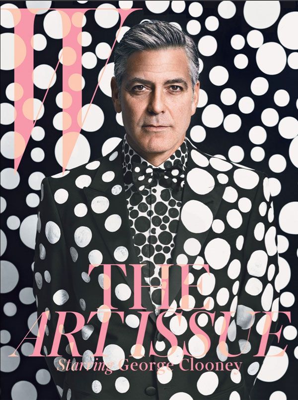
All the more reason, then, that the cover of W magazine's December 2013 issue—the publication’s annual Art Issue—is such a standout. The subject is George Clooney, chosen for his current directorial and starring role in The Monuments Men, a movie about recovering stolen art treasures from Nazi thieves. Inside the magazine is a portfolio of images of the actor, shot by five female artists including Marilyn Minter and Tracey Emin. The cover photograph is by lenswoman Emma Summerton, know for her colourful fashion imagery, and art directed by reclusive Japanese artist Yayoi Kusama. Kusama—with one foot in the art world and the other in fashion, courtesy of her recent collaboration with Louis Vuitton—outfitted both Clooney and the set in her trademark polka dots, eschewing her typically vibrant palette for stark black and white. The optical pattern makes for a super graphic cover that jumps out from a sea of comparatively tame newsstand images.
On a visual level, the photograph is stunning. But ultimately it is the marriage of that great visual with the graphic design that elevates the cover to the next level. The sole coloration comes from the logo and the singular cover line, both printed in fluorescent pink. Sometimes the details really make a design: In this instance, it is the thoughtful touch of carrying the polka dots through the logo and typography that makes an already playful cover even more so—while creating an integrated, cohesive whole. A smart, of-the-moment idea and flawless art direction partnered with a beautiful design result in a truly memorable cover.
twitter.com/GailBichler
Kusama
Yayoi Kusama is an 84-year-old Japanese artist. Working across a broad range of media, she is perhaps most instantly recognisable as the lady who covers things in polka dots. Her influence on art in the twentieth and twenty-first centuries can hardly be over estimated — after all, both Claes Oldenburg and Andy Warhol would count her as a personal inspiration. She has been a setter, not follower, of style, foreshadowing both Pop and Minimalist art before they were recognisable zeitgeists. Since 1977, she has been a voluntary admittee at a psychiatric hospital because of self-perceived mental health issues.
W
W is an American fashion magazine that was established in 1972. The title has a history of producing divisive cover stories: for instance July 2005’s Domestic Bliss piece featured Angelina Jolie and Brad Pitt in what Pitt conceived of as an ironically perfect 1960s American home; or October 2004’s controversial Asexual Revolution shoot in which fashion photographer Steven Meisel explored his fascination with androgyny in an issue that shocked some of W’s more conservative readers. The magazine also gained infamy for the debacle surrounding a poorly photoshopped image of Demi Moore in 2009, with both the editors and the actress denying what experts claimed to be a piece of highly artless fakery.
March 27, 2014 2 minutes read
Blind Spot
Art director Gail Bichler helps us break down the monotony of the celebrity front cover.
