Book design is the keystone of Atlas's design practice and the passion of co-founder Astrid Stavro. Here, Stavro talks us through some highlights in her illustrious career as a book designer...
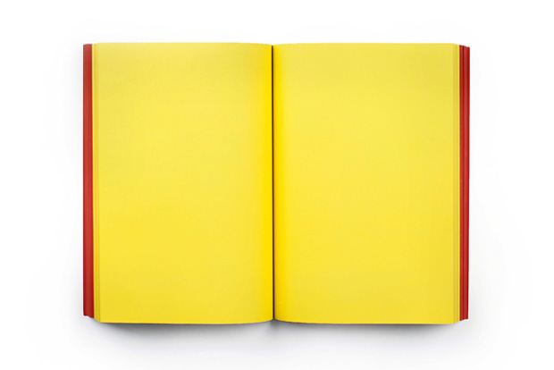
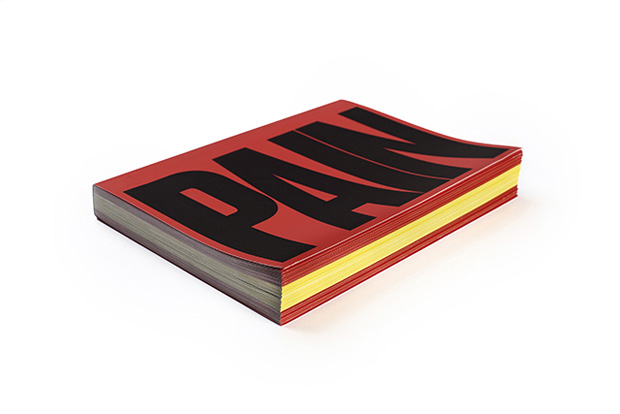
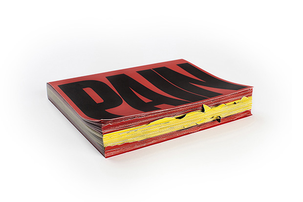
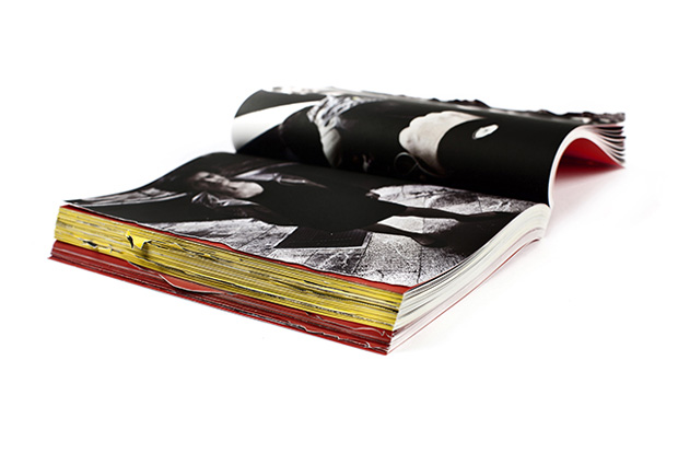
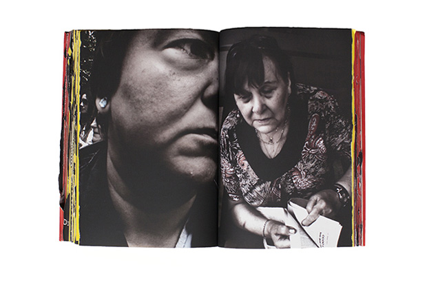
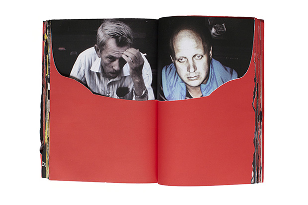
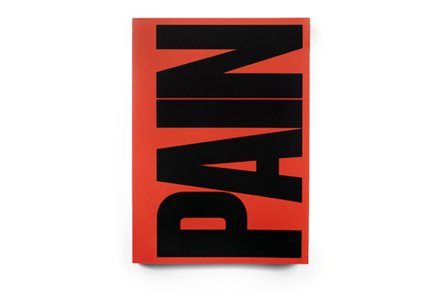
PAIN, 2014
Client: Toni Amengual
This photobook is a stark, painful portrait of the crisis situation in Spain and the consequences of the financial cutbacks on the Spanish population. All the pictures were taken by the photographer with a mobile device camera over the course of four years. We worked as both editors and designers, coming up with the title, design and concept of the photobook. The book is provocatively French-folded so that the act of opening the book would be a ‘painful’ act – you have to break it to open it. This was reinforced by printing the Spanish flag on the edges and by using silicon paper. The absence of the letter 'S' on the cover speaks for itself.
——
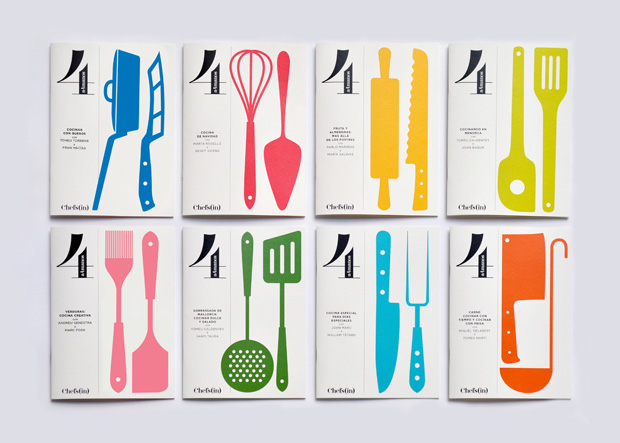
Chefs(in), 2014—present
Client: Deacorde Marketing
Catalogue design for a series of booklets for Chefs(in), an organisation that represents the best chefs in the Balearic Islands. We created the whole identity including the naming, the identity of multiple sub-brands, merchandising and printed matter.
——
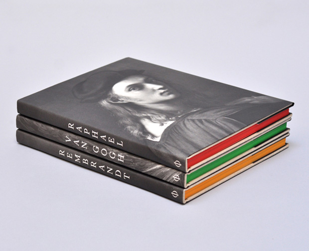
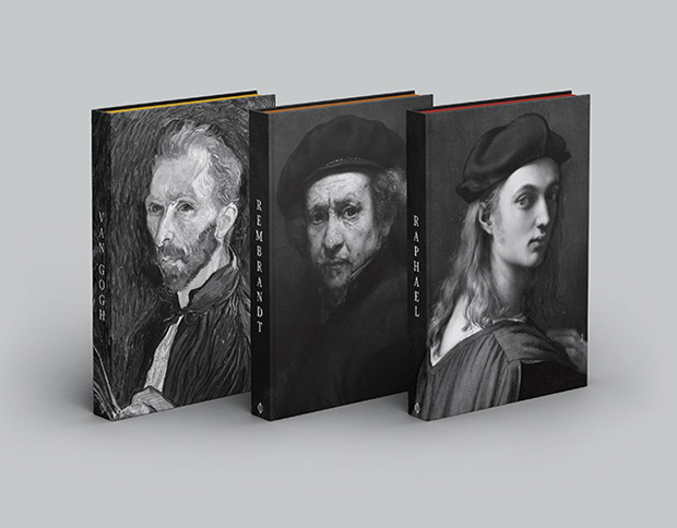
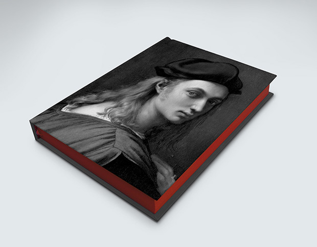
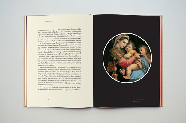
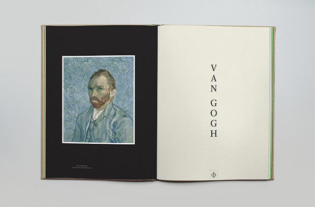
Phaidon Classics, 2014—present
Conceived as ‘collectors’ editions’, the Phaidon Classics volumes are lavishly produced and elegantly crafted monographs of artists such as Vermeer, Rembrandt, Raphael, Van Gogh, etc. Including tipped-on image plates and the finest papers, these sumptuous editions reproduce and update the selection of works made by Phaidon co-founder Ludwig Goldscheider for the original 1942 edition.

——
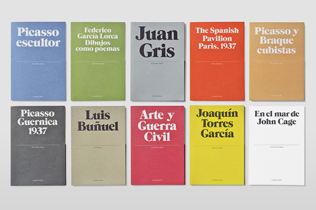
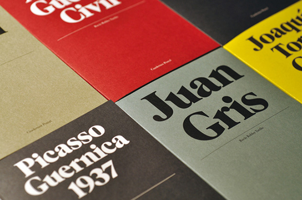
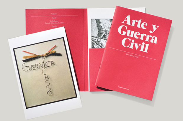
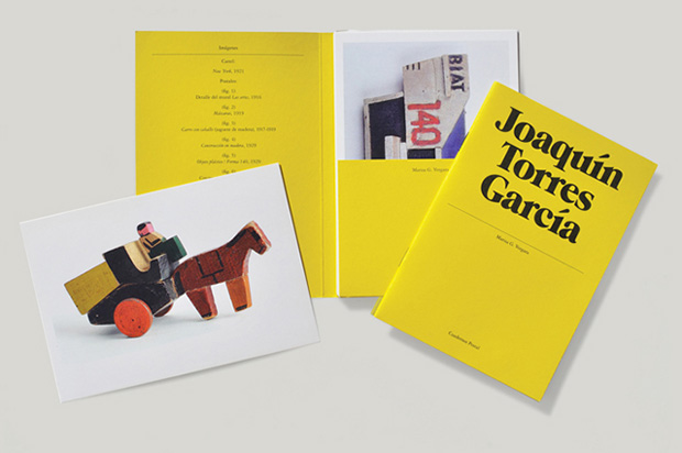
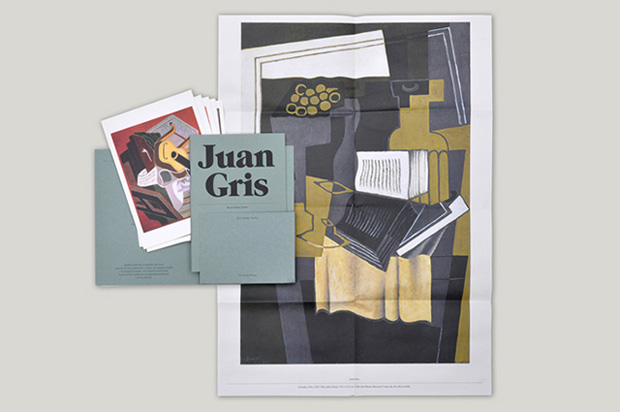
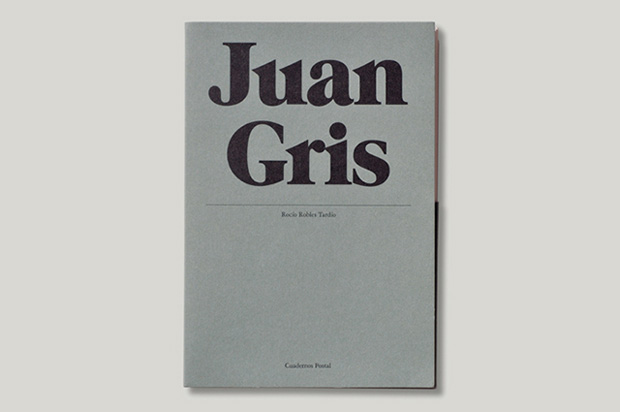
Cuadernos Postal, 2009—2012
Client: Ediciones de La Central
Cuadernos Postal (Postcard Notebooks) is a collection of pocket-sized monographs on artists and architects. Each ‘notebook’ contains a small book, a folded poster and a series of postcards. The design concept (as the title of the series suggests) is based on the vertical line that divides the reverse side of standard postcards. Simple changes in colour help to distinguish the titles. Special attention was paid to the choice of paper stocks, the colour combinations and small details like the use of black staples on the spines in order to give the series a distinctive and not-too-precious feel. Working under such a tight budget was a real challenge. Sometimes working under tight restrictions produces interesting results as it obliges you to be twice as creative and resourceful.
——
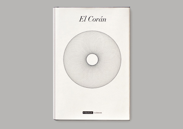
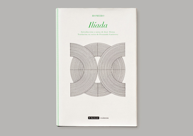
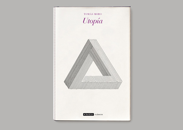
Backlist Classics, 2008—2012
Client: Grupo Planeta
The Backlist Classics collection is a hardback series that uses a unifying grid system. Both The Coran and The Iliad feature Richard Sarson’s hand-drawn black and white geometrical illustrations. The Coran’s illustration picks up the book’s metaphysical and religious nature, while the circles on The Iliad hint at the intricate, circular nature of the story. An illustration of a ‘Penrose’ – or impossible – triangle was used for Utopia, to reference the idea of an idealised or impossible reality. The aim was to produce elegant, attractive books that evoke the rich heritage of classic literature, while retaining a fresh appeal to modern readers. They had to stand out in bookshops but also have a longevity appropriate to their content.
——
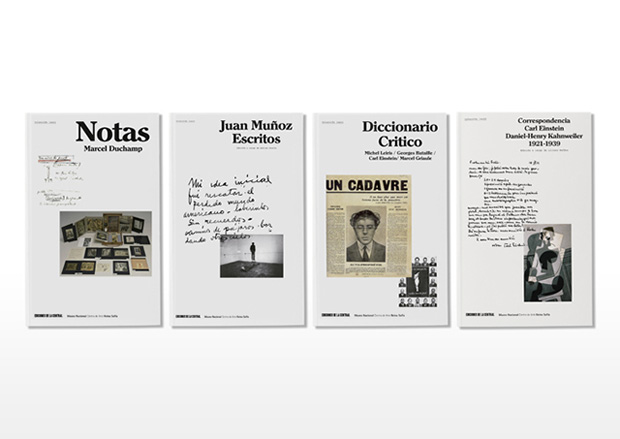
14 x 22, 2009
Client: Ediciones de la Central + Reina Sofía Museum
A collection of books on art writings and art criticism. The name of the collection, 14 x 22, is a direct reference to the technical specifications of pictures hanging on museum walls and at the same time to the measurements/dimensions of the actual book. The cover is a white canvas that may be filled with scraps of paper, scribbles, extracts from sketchbooks, and actual pictures, depending on the nature of the content. It is a flexible system whose only ‘restriction’ is a typographic block for the title on the upper right corner. The inside of the book (and the entire collection) uses three main typefaces that may be combined depending on the content. To distinguish the book from other art writings and art essays, we designed the insides to look like a cross between a book of essays and a magazine.
——
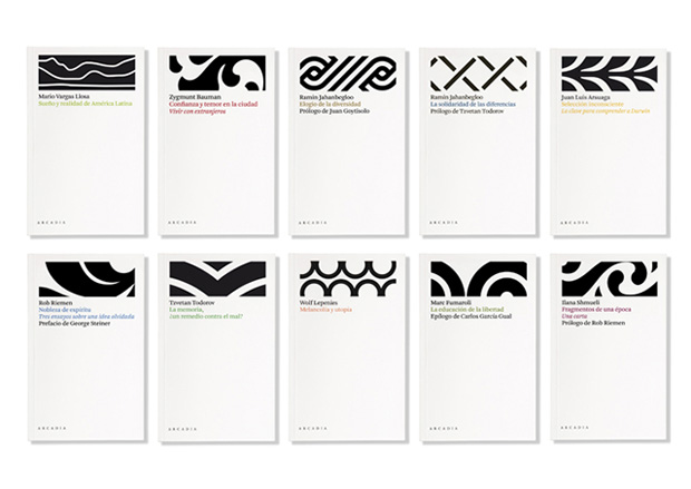
Travesías, 2007—present
Client: Arcadia
Series of typographic covers for a collection of essays that change colour and ornament to metaphorically reflect the content of each particular essay. Set in the font Arnhem (designed by Fred Smeijers).