
To celebrate her new book Creating a Brand Identity, Catharine Slade-Brooking picks five brands which, by challenging the status quo, have revolutionised their sector.
Within certain product categories, such as chocolate or toothpaste, distinct ‘product languages’ – or communication systems created through use of colour, type styles and symbols – has evolved in our retail environments. A critical phase therefore before creating a new brand, is to research the existing language used by the competition, to define the appropriate use of these elements, thus creating a brand that ‘speaks’ effectively to the consumer.
Although generally successful the drawback to this strategy does tend towards the design of ‘safe’ outcomes, reducing risk but also shelf impact. Prepared to accept the dangers of challenging the status quo there have been mavericks, brands that have taken the gamble to revolutionise our shelves.
Traditionally, the product language of soft drinks has referenced either the refreshing fruity qualities of the product, or images that appealed to children. The first two brands however both challenged the status quo to revolutionise their market sector.
1 Tango

Since the 1950s, Tango had followed the crowd – that was until 1992, when the new pack design transformed the soft drinks industry. Repositioning the brand started with the consumer, from children to the teen market. The new pack employed extensively the use of black, a colour traditionally belonging to the product language of alcohol, and obviously taboo for use on soft drinks. The choice of black endowed the product with a new bold and daring personality, along with memorable, bizarre, humorous and often postmodern advertising, featuring the strapline, ‘You know when you’ve been Tango’d’. The soft drinks market has never been the same since.
2 Lucozade

Lucozade has a history of reinventing itself to keep up with changing markets, and in turn transfiguring the drinks market. First produced in the UK in 1927 as Glucozade, by a Newcastle chemist, it sold a source of energy for convalescents with the strapline ‘Lucozade aids recovery.’
During the 1980s markets began to respond to a new consumer desire to become healthier and fitter, the perfect opportunity to reposition Lucozade into this new and exciting market. In revolutionizing its own brand, Lucozade in turn created a new product sector in tune with changes in lifestyles, reflecting the development of sport and physical activity in modern consumer society. 3 Vanish

The washing powder/fabric-care market had been a visually consistent product category before Vanish exploded onto our shelves. Traditionally these products had been known through the extensive use of white as the predominant colour on packaging, with highlights of possibly blue, red and green.
With its strapline ‘Trust Pink, Forget Stains’ Vanish introduced the new intensely vibrant colour, florescent pink through its packaging, thus revolutionising the product category and energising the supermarket shelf.
4 Orange

By integrating a brand’s verbal identity with business objectives and by creating ‘language palettes’ reflected in visual communication such as adverts, brands can achieve a tone of voice that successfully engages with their audience. When Orange launched in 1993, its use of everyday language flouted the sector conventions applied by other telecommunication providers at the time. Orange made a decision to challenge its competitor brands by positioning itself through a new and unique set of visual and linguistic approaches to define themselves as accessible, friendly, honest, straightforward, humorous, people-based and optimistic. Orange transformed  its sector by managing the tricky balance of appearing to be fun as well as reliable.
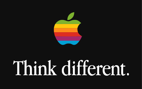
5 Apple

In Walter Isaacson’s biography of Steve Jobs, the co-founder of Apple is quoted as having thought the word behind his iconic symbol and brand name sounded ‘fun, spirited and not intimidating,’ the emotion captured visually in the original ‘rainbow’ apple symbol.
Previously technology brands had used strong ‘corporate’ identities identifying themselves predominantly through the use of typography to define a name or initials. Apple brought a whole new look to the sector using the now ubiquitous fruit symbol. A true brand revolutionary so familiar to us today that it is perhaps difficult to remember how groundbreaking the brand was at the time.
Creating a Brand Identity by Catharine Slade-Brooking is published by Laurence King, £19.95. Grab your copy here.