
In today's Archive piece, Michael Cina looks back on a true design classic – Lester Beall's identity for US paper giant International Paper.
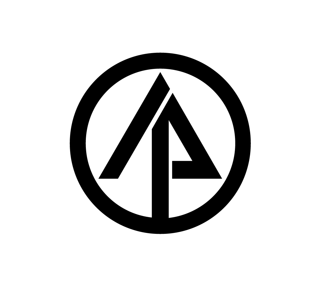
Papermills are very common in the Midwest of the United States because of its heavily wooded landscape. Minneapolis’s ‘Mill City’, Minnesota, has a long history of logging and our city was built around the lumber trade. The abundance of trees attracted papermills in the late 1800s and one of them is International Paper. When driving in rural areas, you can see the International Paper logo gracing the side of weathered industrial mills. There are few things in a designer's career that can make us happier than seeing the combination of a circle, a triangle and a line to create an arrow pointing north. Better yet, that arrow functions as a tree but is also created with a slanted ‘I’ and a ‘P’.
When I design, I try to fit as much as I can into a logo while keeping it simple. At the very least, you want that mark to represent the company's essence. What Lester Beall did is nothing short of a work of art, combined with the escape acts of Houdini. He captured what International Paper is as a company, while also giving it a positive and progressive look in 1960, which still does not look dated by today's standards.

Hailing from the Midwest himself, Lester Beall is mostly known for the covers he designed for Fortune and Collier’s magazines, and the posters he created for the United States government. He had the ability to tell stories with a simple picture, colours and the aid of a few graphic elements. Even today, his work is powerful and evokes emotion.
Beall's work for International Paper is one of the most comprehensive trademark systems of its time. He created a thorough graphic standards manual for how the logo was to be used and what could be done with the mark, such as making patterns etc.
As he said: “Our assignment was to provide management with a strong mark that could be readily adapted to an immense variety of applications. This ranged from its bold use on the barks of trees to its intricate involvement in repeat patterns, carton designs, labels, trucks. In addition to its functional strength, the new mark is a powerful force in stimulating and integrating divisional and corporate identity with positive psychological effects on human relations.”
He had already been doing ‘branding’ and standards manuals in the 1950s, before companies really understood the full power of a trademark and its usage. That is the other reason I chose this logo, because it is always used well and you can thank Beall for that. In his own words: “The designer's role in the development, application and protection of the trademark may be described as pre-creative, creative and post-creative.” He was truly a pioneer.
This article first appeared in Grafik 180, October 2009