The potentialities of digital media have created genre-defining tensions in the comic book world. Art critic Ajay Hothi investigates the uneasy transition from page to screen.
It was an aim of early Modernism: to imbue art with the dynamism of the machine age. To converge form and function to create “the complete work of art”. These were inherently political statements on how art was essential in reflecting society as it was and speculating on propositions for its future. In many formal terms, art became mechanical, processed via print publishing techniques. In regards to composition, art encountered abstraction – its content could be broken down by the viewer and reconstructed, element-by-element.
If we apply the above to comics, however, we’ll notice a paradox. This genre of storytelling, from its earliest incarnations (arising at a time – not coincidentally – which was also around the onset of the Modernist period), was fodder for social commentary, lampoon and satire, published exclusively in newspapers. Secondly, comics were formally mechanistic, designed to be read either as sequential panels or as a single panel containing individual elements – regardless, either format employed a linear narrative structure.
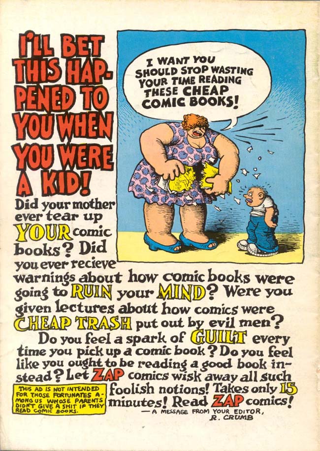

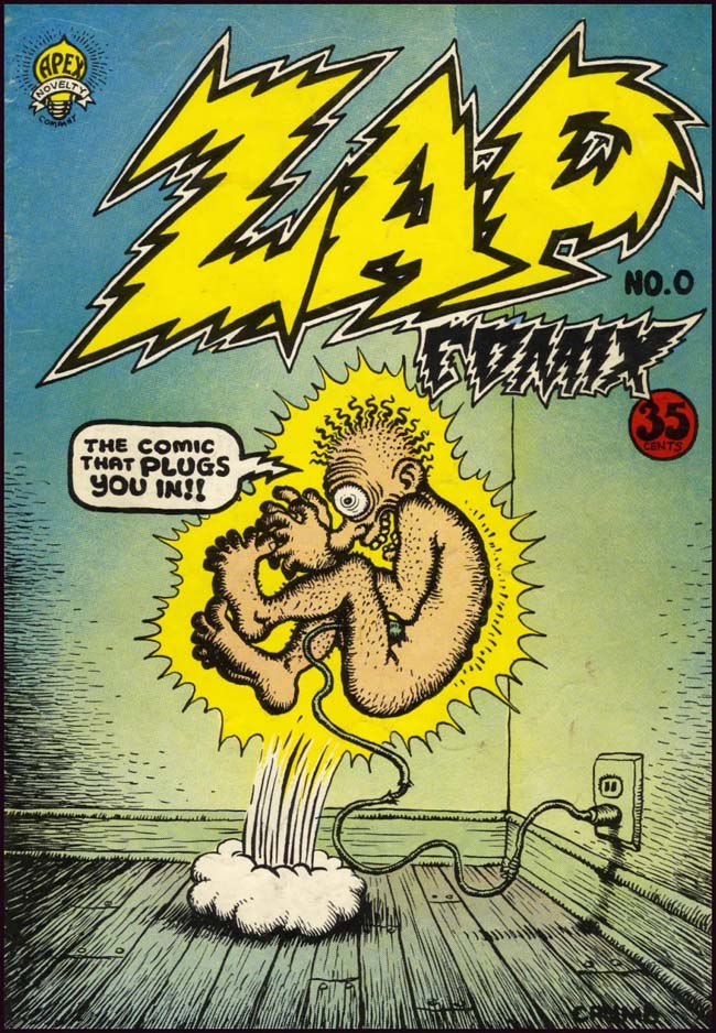
It was not until the late 1960s however, that comics embraced the idea that content could be reappropriated and skewed to invert its original purpose. One publication was particularly fundamental to this turn: ZAP, created in 1968 by a group of eight cartoonists (R.Crumb being the most well known) and published in San Francisco. It was the progenitor of a new sub-genre called comix (alternative, independent press comics). This was graphic storytelling’s avant-garde scene: humorous stories of sex, drugs and comic violence; self-caricatures of the cartoonist undergoing periodic bouts of existential angst; parodies of everyday individuals such as Whiteman, a suited, uptight workaday Joe American, internally seething at an increasingly permissive society; or Mr. Natural, a mystic yogic guru and sybaritic conman.
The so-called ‘Golden Age of the Superhero’ was fading in the wake of distrust in perceived ‘American exceptionalism’ and the political and economic successes of the 1950s. Yes, the 1960s in America were a triumph of liberalisation across politics and across culture, but mainstream comics were the paradigm of conservatism. ZAP, and other comix, were part of the counterculture (a term coined the same year as ZAP’s launch in Theodore Rozsak’s book The Making of a Counter Culture). Abstraction in comics was what happened when artists paid little attention to traditional – conservative – linear pictorial narrative techniques. The success of the work of artists like Crumb, Gary Panter, Kim Deitch, Gilbert Shelton and Art Spiegelman in the late 1960s and early 1970s led to more abstract forms of composition being adopted into mainstream comics. Similar developments in styles of narrative storytelling have only recently begun to change how audiences read comics.
These comics developed their style during the internet’s mainstream nascence. In purely structural terms, the webpage was, at that time, defined by boxes and panels. Until the end of the twentieth century, comics had stringent physical limitations: the artist had paper and a drawing tool, and the most direct way to create a sequential narrative was to compartmentalise each aspect of the story into its own panel, the juxtaposition of these supplying the narrative drive. With the advent of the internet, those limitations have now been broken, hastening the evolution of comics in terms of both form and distribution.
Though the earliest online comics were launched in the mid-1980s, some of the most notable and long-running current series (such A Softer World, Questionable Content, Cyanide & Happiness, and Dinosaur Comics) all launched between 2003 and 2004 (although one of the most established and renowned webcomics, Diesel Sweeties, has been running since 2000). These comics developed their style during the internet’s mainstream nascence. In purely structural terms, the webpage was, at that time, defined by boxes and panels. Each of the above comics are short (comprised of between three and eight panels), updated either daily or three times a week, and suit a quick browsing tempo. They produced a similar form of engagement to that of flicking through newspaper funnies.
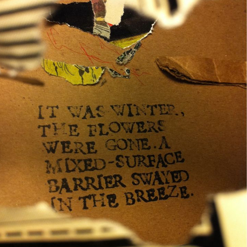
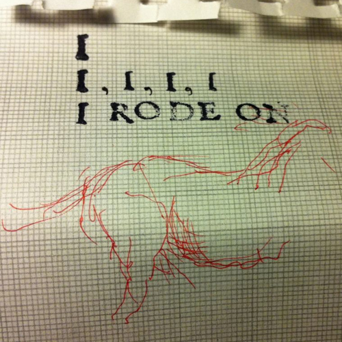
Reading comics this way is the standard. Over the last few years, there has been a rise in market share for digitised comics; ComiXology, the largest digital retailer, reached its fifty millionth download in January 2012, its hundered millionth in Ocotber of the same year and, as of September 2013, its two hundredth million. The benefits of digitised comics are the same as those of using any e-reader: you can purchase comics and graphic novels online and access them immediately and you can carry thousands of comics with you. However convenient, these comic e-readers serve only to further the limitations of the form of the comic itself. They allow the reader to zoom in on individual panels, swiping across the screen to the next panel. Comic e-readers don’t just ignore the possibilities of extending the form, but instead demonstrate a fundamental reliance on the sequential nature of panel-based narrative, inhibiting experimentations between form and content.
Nevertheless, subtle evolutions in front-end web development have seen the structural elements of a webpage converge, integrating into a more holistic interactive design: creating a website in which panels merge into a single immersive interface. Artists such as Austin English, Jason Overby and Caroline Bren, all of whom published regularly on the now-defunct comics blog Comets Comets (a play on the magazine Comics Comics), are indicative of this evolution. They are part of a small movement of comic writers and illustrators whose focus has less in common with the history of comics than it does with the canons of art history. Comics are pulp fiction in the traditional sense of the phrase: cheaply printed on coarse, low-grade paper. They are as ephemeral as their tales. The canon is easily (and often) reimagined. For instance Overby, the oldest of a group characterised by its youth, has regularly exhibited in a gallery environment as a contemporary artist. Critic Andrei Molotiu describes his oeuvre as being constructed “from minimalist panel compositions and bits of collage to create conceptual narrative. His works call to mind the work of Russian avant-garde artist El Lissitzky and the metaphysical animations of Robert Breer.”
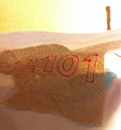
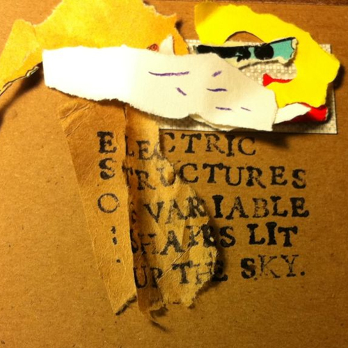
One of Overby’s major works, 2101, is a photographic webcomic that incorporates text and collage. Every photograph has its edge, its frame, but each picture is a messily composed tangle of line, form and printed matter. The story is told sequentially, one photograph following the next, but progress is entirely left-to-right, a horizontal forward movement without discernable end. In this sense, its rejection of structuralism is its formal constraint. Paired with its motion, it calls to mind the famous tracking shot from Jean-Luc Godard’s Week-end. Like the Godard film, 2101 feels portentous, its journey as revealing as its conclusion.
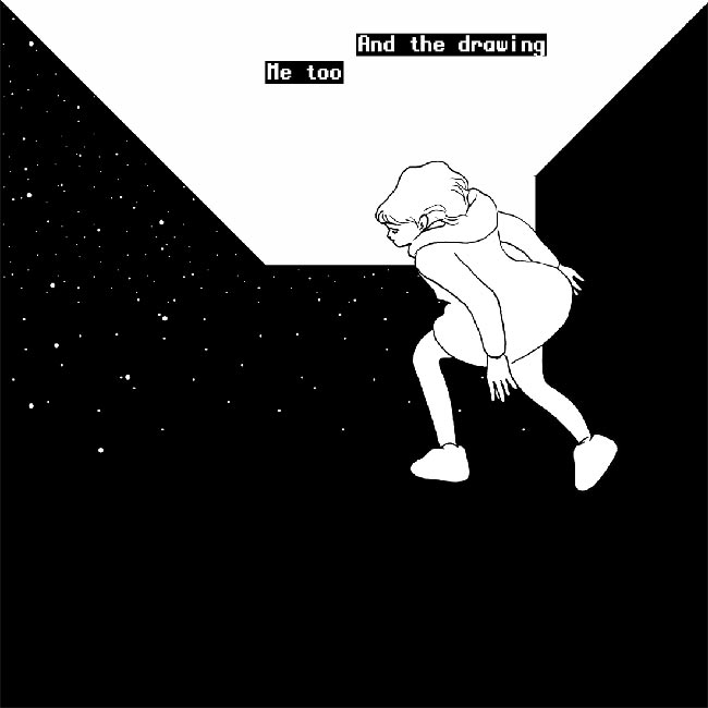
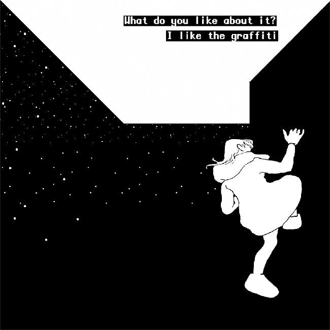
Another artist of the same group is Blaise Larmee. His (similarly titled) 2001 references the traditional comic format, in essence still being composed of panels – here, however, they are rendered almost indiscernible, each one melting into the next. These take up the width of the browser window, but extend to twice its height. To view a single panel, the reader must scroll down, and in doing so the next panel will begin to emerge. The vanishing point for each panel is at its dead centre, so the site creates an unnaturally immersive sense of depth as the reader winds through a seemingly never-ending narrative scroll. Without a defined frame, Larmee creates a perspective in which the reader can float seamlessly around the characters, they move left-to-right, right-to-left, toward or away from the reader. Speech text is suspended on the page, undefined between characters.The reader is...presented with a collection of abstractly juxtaposed images and must assume some responsibility for their navigation. In an interview with The Comics Journal, Larmee comments that “People, places, and things become images as they remove themselves.” This is vital to understanding 2001 as an artwork – and specifically an artwork, as opposed to a comic. The image is the comic’s centre; it can be argued that any text used is even just an image of the written or typed word. One of the reasons that the superhero has been so prevalent in this above all other media (though there is a very close relationship here between comics and cinema), is that the comic enshrines the icon and projects its image.
2001 is designed to examine how the image – the icon – functions in a comic book narrative. It is, primarily, a deconstruction of form. The panels are there, but invisible. A black background, with a near-imperceptible vanishing point, perverts the reader’s perspective, which they must presume runs parallel to the drawn figures; however, the further we scroll the more the perspective tilts in-between panels. The reader is therefore presented with a collection of abstractly juxtaposed images and must assume some responsibility for their navigation. In the same interview, Larmee talks about how the images “become screens for projection,” and how the artist offers himself “as such a screen and I accept all that is projected on me.” We can return here to the Modernist way of thinking, recalling Clement Greenberg’s essay Modernist Painting:
“The Old Masters had sensed that it was necessary to preserve what is called the integrity of the picture plane: that is, to signify the enduring presence of flatness underneath and above the most vivid illusion of three-dimensional space. The Modernists…have reversed its terms. One is made aware of the flatness of their pictures before, instead of after, being made aware of what the flatness contains…one sees a Modernist picture as a picture first.”
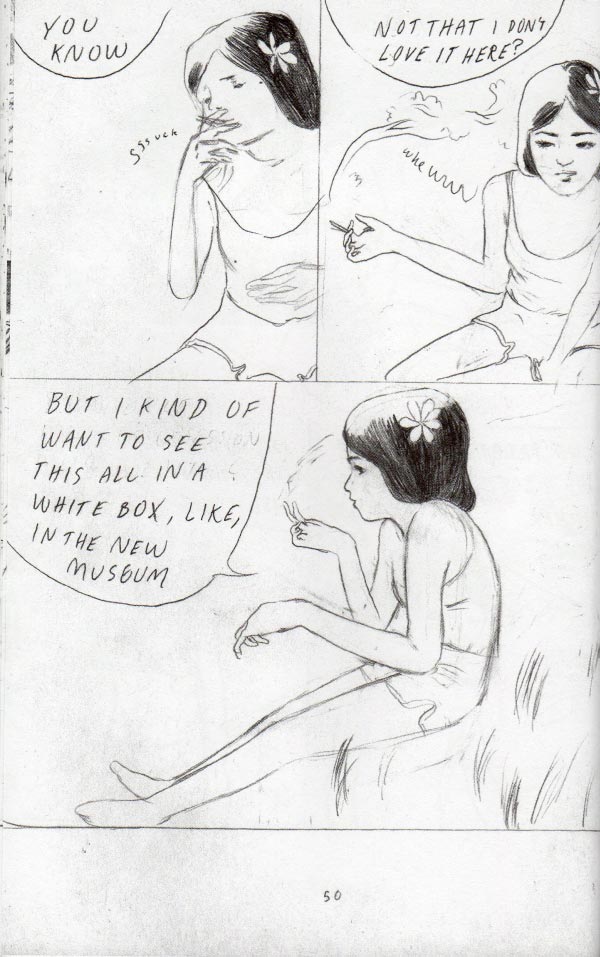
Larmee was a Xeric Grant winner in 2009 for his debut graphic novel Young Lions, the story of three untested artists falling in and out love with themselves, their art and their lives. The novel was a critical and commercial success. Works like 2001 however, which undermine the hitherto linear evolution of comics, have seen Larmee subject to criticism. Where Young Lions was praised for the sympathetic authorial control of its characters and situations, 2001 was disparaged for being the opposite. The fact that that latter work displays erasures of established form and experiments with content has been identified as being a fault, rather than an innovation.
Larmee clearly delineates the structures of the comic book writer’s practice, deconstructing the critical analysis that has been developed around comics in the past thirty years. Comic book theory and the study of the comic book writer’s form have become a significant element in developing audience engagement with the genre. Will Eisner’s Comics and Sequential Art (1985) and Scott McCloud’s Understanding Comics (1993) are cornerstone texts for understanding the subtleties of sequential narrative, how comics differ (in formal and compositional terms) according to content and provenance, and how they have developed historically. Where in the past comics were analysed under the rubric of semiotics (if at all), these texts cited comics as a form of visual artwork.
For a comic to become popular it needs a fervent and loyal audience base. Comic book fans, are stereotypically highly committed and very enthusiastic. They are impassioned followers, closer in their collective nature to music fans than museum go-ers. That 2001’s critical reception fell short compared to that of Young Lions (or, for that matter, a number of other newly-established webcomics) gives an indication that audiences of traditional comics are habitually more conservative in their tastes.
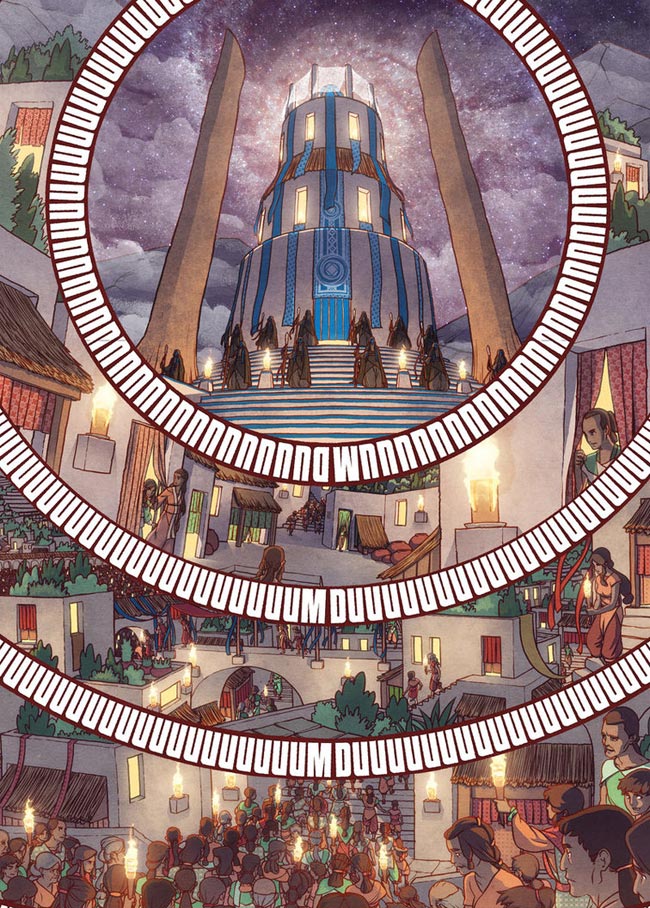
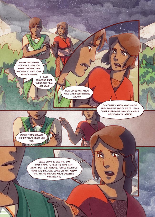
Although there are evident reservations towards new technologies influencing how comics are created and read, the fact that criticality around comics is still in its infancy should not inhibit modes of experimentation that bypass or extend upon our current understanding of the form. 2001 isn’t specifically unique either. In the current British Library exhibition, Comics Unmasked: Art & Anarchy in the UK, a final section that focuses on webcomics features The Firelight Isle by Paul Duffield. This work, which launched in 2011, is set in a mythical civilisation and is again displayed in a scroll-down single-window interface. Though it demonstrates remarkable compositional technique (the narrative unfolds as though illustrated in an ancient scroll), The Firelight Isle still compartmentalises specific actions in panels and dialogue in traditional speech bubbles. It is an example of development of narrative style not matching the ambition of development in composition.
It is fair to say that the criticism of Larmee’s work has some credence. Naturally, there are benefits to experimenting with form, particularly when new technologies encroach upon the artist’s workspace, however experiments in form should serve to benefit the work’s structural narrative. A comic, by its slim definitions, is a sequential narrative. Larmee has developed a style in which the sequencing of a comic assimilates the act of its reading, but its narrative lacks the depth of the artwork. Perhapsthough, 2001 presents us with another option: to expand upon the field of comic studies and attempt to incorporate a set of critical definitions to which we can attribute these aesthetic, formalist and conceptual responses. Even if 2001 fails at being a comic, it’s fair to say that it succeeds at being quite a wonderful piece of conceptual art. ajayhothi.com

