
From Wiener Werkstatte-inspired hand-lettering to commissioning blown glass tap handles, Montréal-based studio Fivethousand Fingers’ identity for Antwerp-inspired craft beer Dageraad is all about the fine details, creative partner Eli Horn explains.
Tell us a little bit about Dageraad Brewing.
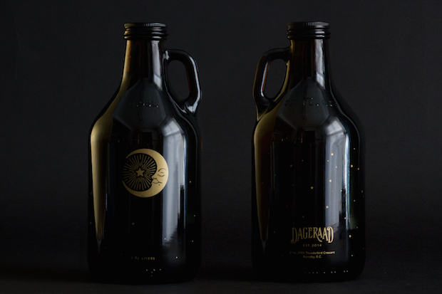
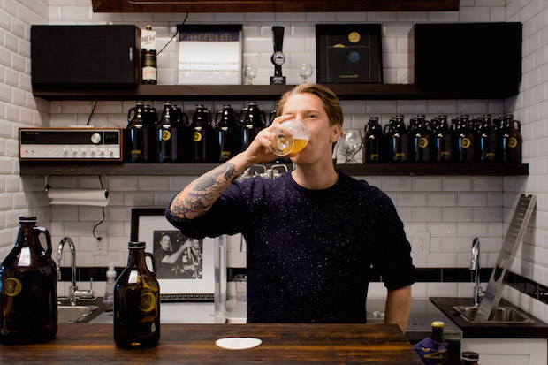
Dageraad is a Belgian-style brewery established in 2014 in Burnaby, Canada. Named after the Dageraadplaats, a neighbourhood on the east side of Antwerp, Belgium, the brewery is an attempt to transport a small piece of the beer culture found in that area to British Columbia.
How did the project originally come about?
Through the good luck of working with an ambitious and creative family. After we completed the branding for Tangent Cafe in Vancouver, the owner's brother approached us to develop the identity for his new brewery.
What was the original brief?
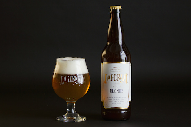
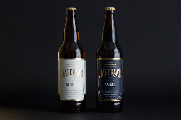
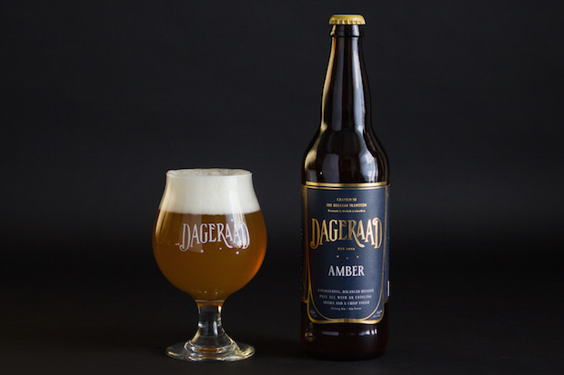
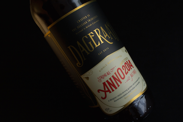
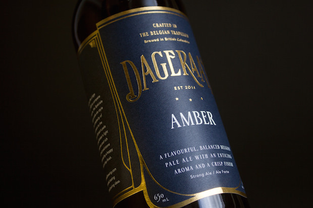
Dageraad not only established itself in a highly saturated craft beer market but did so at a higher price-point than most. Firstly it was important for them to be noticed as a new arrival on the shelves and then to be recognised as a quality product worth spending more on. Fortunately they have a unique and focused product, brewing only Belgian-style beers sold in single-serve bottles and refillable growlers. Our goal was to turn their bottles into artefacts, which would appeal to a more sophisticated crowd of beer drinkers and in particular to a growing market of female appreciators.
Tell us about the design concept.
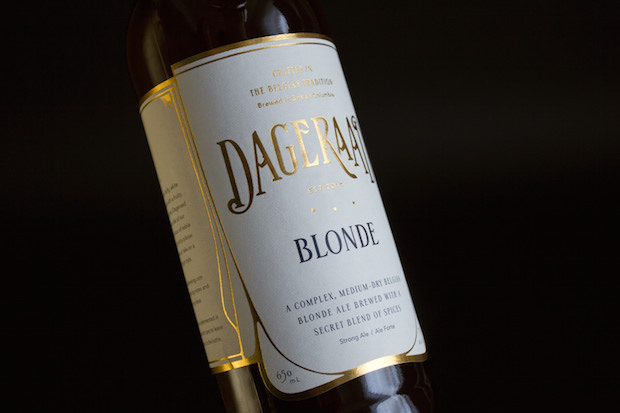
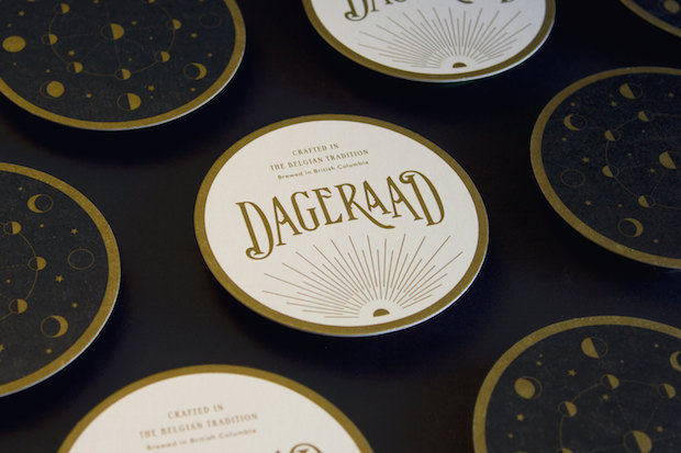
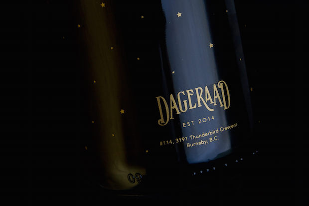
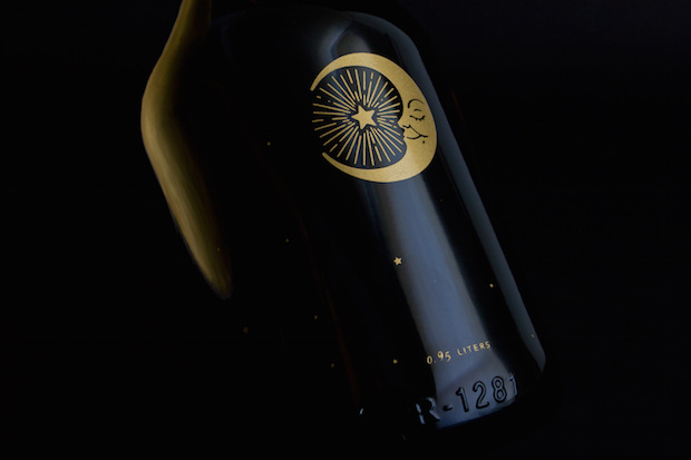
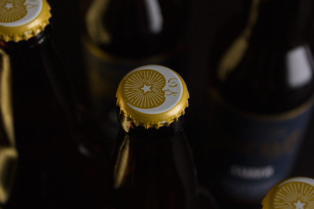
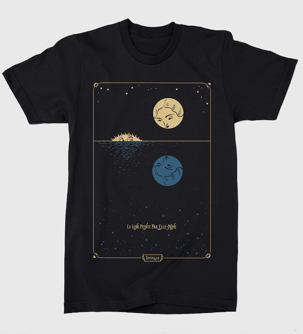
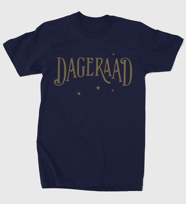
It was important to the owner that the brand pay homage to the European tradition which inspired him. We drew heavily on influences from the Vienna Secession and Wiener Werkstatte, crafting a design language based on the use of hand-lettering and fine decoration. The name Dageraad means ‘dawn’ in Dutch, which seemed to us to signify the perfect symbol – that magic moment where night surrenders to day, but which signals the end of the drinker's domain. This is what inspired the few illustrative elements in the brand, which always allude to some relationship between night and day.
Did the Dageraad Brewing project present any particular challenges, and if so how were these overcome?
The most prominent challenge was to do with the production of the original labels. Aspiring to a more sophisticated feel we looked to wine label specialists to create labels with a noticeable paper stock which would emphasise the foil. Unfortunately, even with their consultation the labels were not able to stand up as well as hoped to the moisture and constant change of temperature which beer can be subjected to, so application of the labels doesn't always remain perfect. That was not a problem with the digitally printed seasonals, but the feel is distinctly different.
What do you think has worked particularly well?
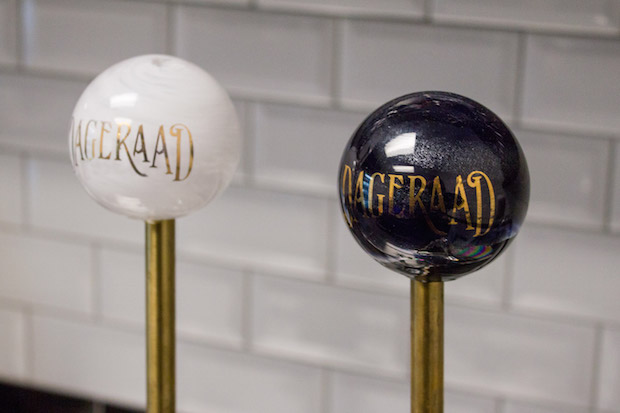
The client's appreciation for quality and detail meant that they were, and continue to be, willing to go the extra mile to achieve something unique to this brand, which lent a lot to the success of this project. This included hand-lettering titles for each individual label and commissioning hand-blown glass tap handles, as well as exploring alternative production methods and materials. Many clients are not willing to invest in this kind of detail, but when they do the creative process is much more stimulating and the results are evident.
Did this project involve sourcing any new materials or using any new processes?
Designing and producing custom tap handles was not something we had a set process for. Brass rods had to be sourced and machined to fit standard tap hardware, and it actually took quite an effort to find a glass blower who was able to produce globes to our vision that would also be sufficiently durable. Needless to say they are still much more fragile than your standard tap.
What was the client's feedback?
The client is very happy with the results and we continue to have a close and rewarding relationship with them. Their audience has responded with a lot of positive feedback, and now a little more than a year in they have exceeded their own expectation for the success of their product – due in large part to the fact that they brew damn fine beer.
Technical spec
Primary typefaces: Stepp, Avenir Paper: Fasson Estate Label 8 Printing: Offset plus foil stamp; Digital on foil; Silkscreen on growlers
fivethousandfingers.net