
In today's Archive piece, Ryan Waller looks at Dunkin' Donuts – an American Classic whose colourful rounded logo promises nothing less than a party in your mouth.
Robert Venturi and Denise Scott Brown celebrated the idea of “ugly and ordinary” architecture in their 1972 book Learning from Las Vegas. They defended the term, saying that “ugly and ordinary items in culture represent the democratic segment of society, as they embody mass consciousness”. The graphic signage of the Strip, then, is saying where a party can be had.
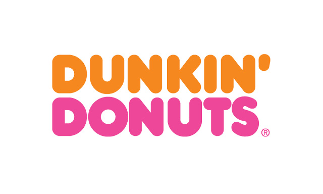
The Las Vegas of the suburbs is lined with big-box shops, fast-food chains and stores that sell just mufflers, just pet supplies, just brown shoes. They announce what they are about. They say: “We are toys/kids/babies”; “We may be a lowly shack, but we have telecommunications”; “We are the king of burgers”; “Dunk some donuts.” Those last two – Burger King and Dunkin’ Donuts – had enormous two-tone signs, both with giant bubble letters set in redrawn versions of VAG Rounded and Hot Dog, respectively. I used to think the two were related – one for supper, the other for dessert – but then I became an adult. Burger King urbanised and swooshed its logo. Dunkin’ Donuts added a coffee-cup icon (which had an unrevised logo on the cup) but it kept the type, and more importantly, its celebratory colours.
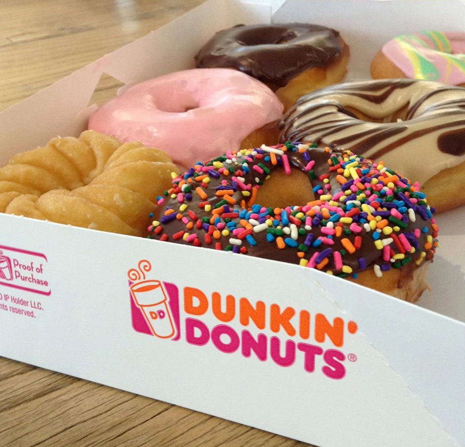

The pink and orange in the Dunkin’ Donuts logo is one of those rare instances where colour is integral to the identity. In the 1970s, Dunkin’ Donuts hired the Sandgren & Murtha marketing and design consultancy to redesign its identity. The in-house interior designer Lucia DeRespinis was in charge of updating its stores. While walking by the graphics department before the logo presentation, DeRespinis recommended they present an option in pink and orange. She had chosen the colours because they were the favourites of her daughter and had been used for her party decorations. Dunkin’ Donuts remarked, “Our colorful new look reflects the spirit of these colorful times.” The focus on coffee reflects that we’ve grown up, but the colours still remind us of the parties.
Ryan Waller is a founder of Brooklyn-based studio Other Means. Find out more about the studio in Robert Urquhart's profile for Grafik here.
This piece first appeared in Grafik 184, April 2010