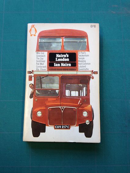
Joyful and replete with British quirk, architectural paperback Nairn’s London forced a grin from Coralie Bickford-Smith – but its boldness also speaks of a publishing industry in healthier shape. This book cover made me smile. It was not until I’d stopped grinning that I decided to really consider what had landed in front of me and analyse aspects such as the grid, the use of colour and typeface. And as always, I gave the pages an obligatory, cursory sniff. It is definitely up there with my favourite book covers. It exudes the witty, joyful design of many Penguin paperbacks of its era.
Given the book roused such a happy reaction, I questioned whether my choice was childish; maybe the child in me that loves a Routemaster was not being professional. But I stuck to my guns. This cover is playful and neat; a smart solution that is seemingly simple, which we all know is deceptive.
This design does exactly as it intends – it instantly tells us that this is a book about London. It is bold, iconic and graphic. The choice of image that symbolises a tour of London is immediate and the title second. And not forgetting the big orange Penguin logo seemingly plonked in the corner. It appears wonderfully obvious that no one won the 'make-the-title-bigger' discussion or that the matter of a subtitle was never even discussed. And that fills me with cheer.
It is these kinds of decisions that I see people struggling with on a day-to-day basis. Breaking the rules and pushing the expectations of what cover design can do is an exciting thing when done for the right reasons. Many of these old Penguin paperbacks broke rules that would be fretted over today. But they could. As is often the case today, people’s book-buying decisions were not based on tiny JPEGs on smartphones and tablets, and those designs reflect that.
Routemaster
Dubbed the ‘Year of the bus,’ 2014 marks sixty years since the original Routemaster started transporting Londoners about the capital with its trademark open platform and conductor. July’s anniversary celebrations will not only involve an exhibition of the many incarnations of the much-loved vehicle in Finsbury Park, but a select number of the new Thomas Heatherwick-designed Bus for London designs will be painted silver in honour of the occasion. However, in a move that has somewhat angered enthusiasts, July has also been chosen as the month when Transport for London will axe one of two remaining ‘London heritage routes’, serviced by original Routemaster buses. The closure of the Number 9, which runs from Olympia to Aldwych, will leave the Number 15 from Trafalgar Square to Tower Hill as the only place for its devotees to get their fix.
Ian Nairn
Architectural critic Ian Nairn won fans for his pithy, populist and sometimes wistful observations on buildings and places, both on TV and as a writing for The Observer, The Telegraph and The Sunday Times. He possessed a nifty turn of phrase and a disregard for stuffy criticism, once describing the elephant on Albert Memorial as having “a backside just like a businessman scrambling under a restaurant table for his cheque-book.” On screen he was noted for his slightly shambolic energy, but behind it all lay a deep understanding of architecture and a passion to prevent the soulless destruction of his favourite towns and landscapes by second-rate urban planning.
April 24, 2014 2 minutes read
Capital Cover
Joyful and replete with British quirk, architectural paperback Nairn’s London forced a grin from Coralie Bickford-Smith – but its boldness also speaks of a publishing industry in healthier shape.

