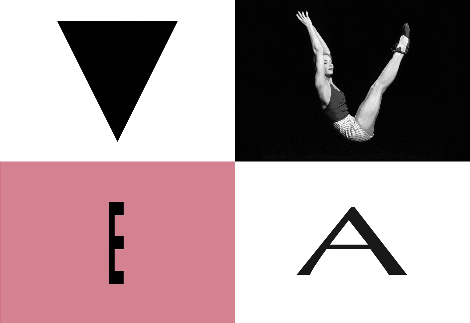
The latest Letterform Live featured fonts which are found in the sometimes fickle world of fashion. Our reporter Theo Inglis looks back over a night filled with pretty pleats, naked alphabets and squashed letters aplenty.

Last night’s Grafik Letterform Live event, in partnership with Monotype, and hosted by Protein Studios, featured four different speakers each talking for ten(ish) minutes. The starting point for each was a different letterform found loosely in the world of ‘Fashion’ – the theme for the night. Each speaker presented a fascinatingly different talk to a sold-out audience. With the selections being a shape, a human body and two letters that have been squashed, it was perhaps not a night for the typography purists.
The first speaker of the night was Camille Walala, the London- based French textile designer turned art director, interior designer and mural painter. Her choice of a solid and perfectly triangular capital ‘V’ was perhaps unsurprising given her bold and geometric pattern based work, she chose it because of an interest in the idea of “a shape becoming a letter”. This choice also reflected two specific yet separate historical influences on her work:

The first influence talked about was early twentieth century avant- garde artists and textile designers, beginning with Malevich and his 1915 painting Suprematism with Blue Triangle and Black Square, as well as other Russians such as Alexander Rodchenko, Lyubov Popova and Varvara Stepanova. Camille admires them for their “amazing and powerful use of simple shapes”. Beyond the Russian group she highlighted the work of Ukrainian-born French artist Sonia Delaunay, a key proponent in ‘Orphism’, the movement that aimed to be a more colourful variant of cubism. Although Camille was keener to show a selection of drawings of the eccentric geometric costumes that Delaunay had designed for various Parisian theatre productions, mainly because they show a ‘sense of humour, not so easily seen in painting’, and lots of triangles…

From costumes to clothes – the other era which informed her choice of the triangular ‘V’ was the 1980s; the loud, dynamic and colourful patterns (pioneered by the Memphis Group) and also the v-shaped silhouettes seen in Women’s fashion, thanks to the trends for shoulder pads and leotards. Although Camille wasn’t too sure she would be trying to bring these particular fashions back any time soon, the huge shoulder pads may be just a little too extreme...

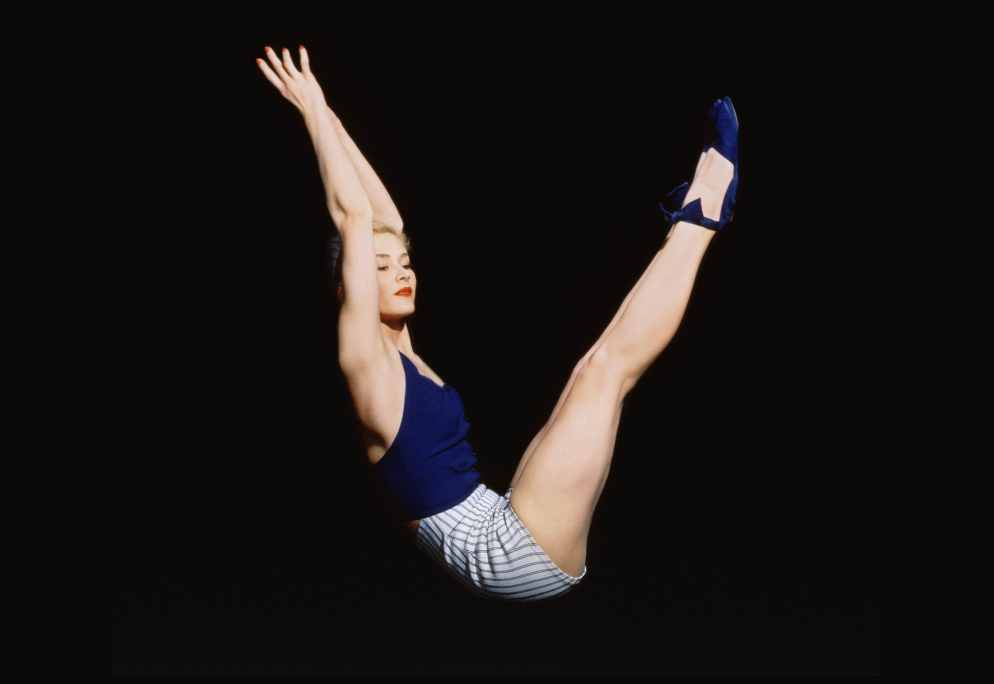
The choice of the next speaker, Austrian designer Tomi Vollauschek, co-founder of the studio FL@33 and label Stereohype, segued very nicely from Camille’s 80s v-shaped silhouettes into an actual human ‘V’. He picked the ‘V’ from the iconic August 1940 British Vogue cover which featured superstar model of the day Lisa Fonssagrives wearing a skimpy blue outfit and positioned into a v-shape. This photographic human typography was the work of German-American fashion photographer Horst P. Horst, and it was an idea also used in the Vogue masthead of the cover, although as Tomi pointed out, the ‘V’ was by far the most elegant, and least contrived letter.

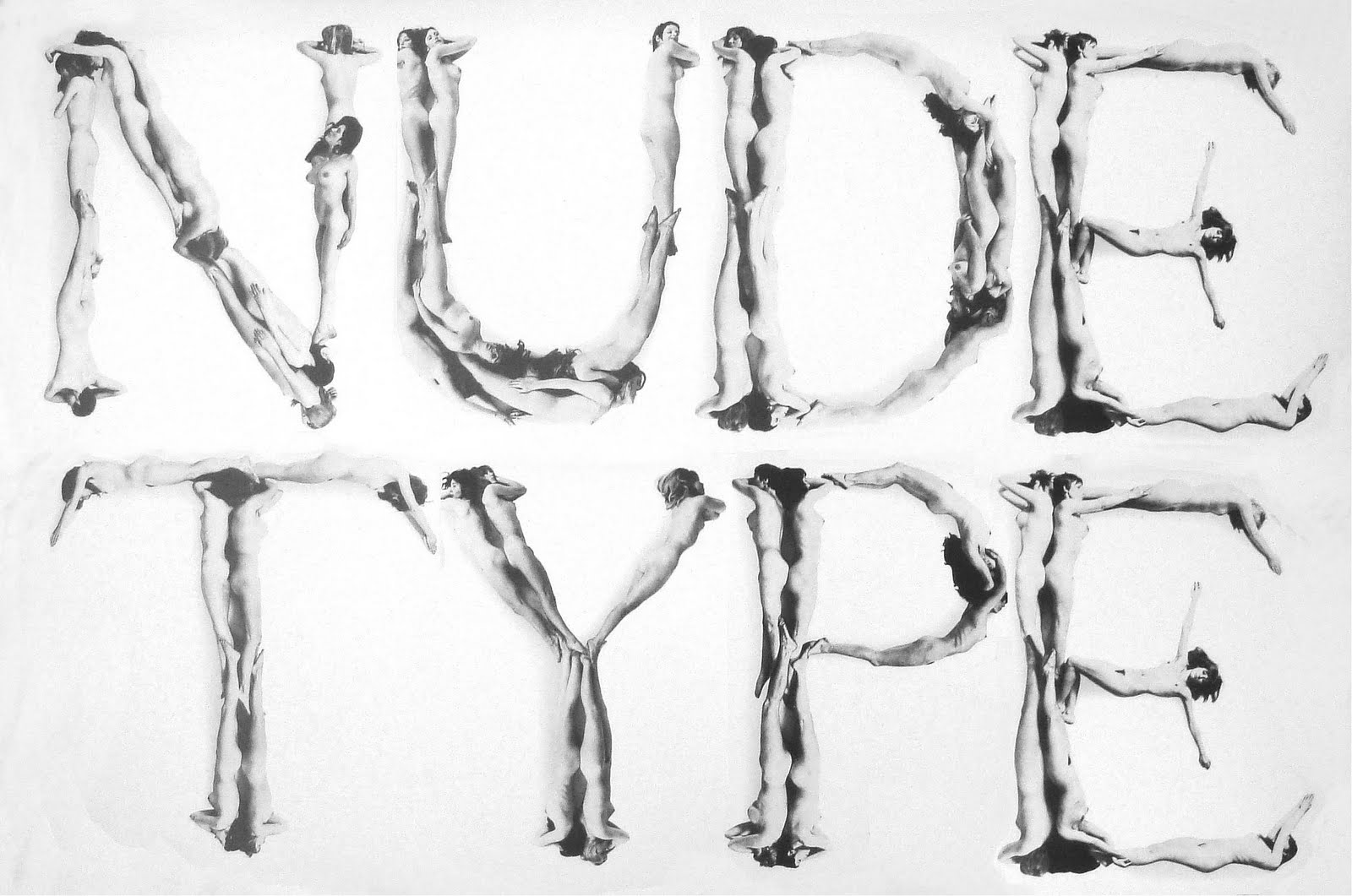
From this starting point Tomi took us on a whirlwind tour of the history of ‘Human Alphabets’: from their humorous yet distinctly ‘not safe for work’ illustrative origins in the sixteenth century, when they possibly began as a salacious way to satirize Da Vinci and his ‘Vitruvian Man’, all the way to key modern photographic examples that came after the famous Vogue cover. He included Dutch designer Anthon Beeke’s ‘Naked Lady Alphabet’ from 1969, Paul Elliman’s passport photo style ‘Alphabet’ from FUSE magazine issue 5 in 1992, Thijs Verbeek von Arjan Benning’s shocking clothes pinned ‘Skinographie’ alphabet and Amandine Alessandra’s ‘Letterform for the Ephemeral’. Many of these examples can be found in FL@33’s 3D Type book, which faced some issues when it came to certain foreign editions, due to the amount of nudity featured inside. All these human bodies provide “proof that typography can be fun.”

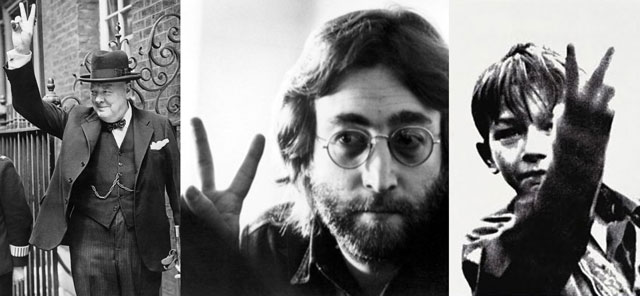
Tomi ended his presentation with some photographic examples of ‘human typography’ in action, that also illustrated the power of context - Churchill’s ‘V for Victory’, Lennon’s peace sign, the boy from the film Kes ‘flicking the V’, the bunny ears V snuck unnoticed behind a head during a photograph and the nightmarish combo of both Donald Trump and Boris Johnson giving the ‘V for victory’ sign (in separate photos luckily). The same letter ‘V’ from our human typeface, used in so many different ways...

Up next came graphic designer and creative director at Moving Brands in London, Sean Murphy, who broke the run of ‘V’s by  choosing a curiously compressed letter ‘E’. Sean grew up hand- drawing the exotic logos of the fashion brands favoured by the ‘football casual’ subculture of his youth – just for fun – so his interest in this area of branding design started very early... Yet Sean has become a bit bored of late of the homogenous vernacular seen in clothing brand logotypes, with the same styles of typeface and the same layouts constantly used to make labels look more legitimate, or just ‘nice’ in a safe way. Sean’s choice, the horizontally squished ‘E’ comes from something that breaks the mould, and all the rules (“not that there are any”) - the logo of Pleats Please, which is a sub-brand from pioneering Japanese fashion designer Issey Miyake. The logo itself was (shock horror) not designed by a graphic designer, but by Tokujin Yoshioka who is highly creative, but more of an artist or interior designer. It is a logo that would “make a type designer flip out”, yet also visually striking and highly memorable. Best of all it is conceptually strong when you know that it is for a brand that specialises in beautifully pleated clothes, that are themselves created by compressing huge bits of fabric into many folds.

Next Sean showed the logo being used in beautiful photographic adverts, art directed by designer Taku Satoh. Which feature the clothes, unconventionally presented not on models, but elegantly  arranged to look like food, creating a fun and playful trompe-l'oeil that still “look delicious”. There was also a further campaign that arranged the clothes into flowers, with a very Japanese feel, which makes you “look twice” to realise that they are not in fact real petals, but pleated clothes specially arranged. Sean showed an amazing making of video for this campaign, which featured balloons wearing clothes, popping and high-speed photography. Unfortunately when Sean tried to find out more about the Pleats Please logo by emailing Tokujin Yoshioka he never got a reply, but possibly because he is too busy working on the new Tokyo Olympic stadium proposal...

Last but not least came fashion writer and editor of the non- seasonal publication Archivist, Dal Chodha, who talked about how digital technology is making fashion become less tangible, and creating an “echo chamber of aesthetics” where popular styles from the past reappear constantly and fashion becomes “stuck on repeat”. Dal worries about how people only follow people online who have the same taste as them, and we “don’t question why we like what we do”. Like Sean he is a little bored of the niceness present in contemporary fashion branding.

Dal’s choice, a squat and stretched capital Optima ‘A’ comes from a now obsolete logo for fashion designer Donna Karan, who is best known for what was originally a less classy sub-brand ‘DKNY’. Dal admires the logo, originally designed by Peter Arnell, for being odd and squat, yet still feminine and strong – a good reflection of Karan’s clothing lines, she pioneered, with her ‘Seven Easy Pieces’ collection, the ‘executive dress’ of American working women in the 1980’s. He also liked the way the logo was used over photographs, with the text and image relationship not neglected.

Part of Dal’s interest in Donna Karan comes from the fact that as a defunct brand, it is “hidden in the depths of the internet”, but there is also a sense of sadness that it didn’t last, yet ‘DKNY’ – the less sophisticated sister brand – did. For Dal the original DK logo looks even more interesting contrasted with DKNY’s recent rebrand, which has switched to a “tasteful but generic” spaced all-caps Franklin Gothic with a really “anonymous look”. A sad symptom of the “massive issues and changes in the fashion industry”, with brands being consolidating and the “sense of freedom” and variety really lacking...
The evening wrapped up with a questions from the audience, before everyone retired to the bar to sample more of the typographic beer kindly supplied by Monotype..
Special thanks to Monotype for its ongoing support. Follow @GrafikMag for details of the next Letterform Live event, which will take place in April 2016.

