The San Franciscan polymath Derek Kim discovers that, when it comes to the signification of the world’s chief currency, uncertain origins allow adaptable futures. It's 4:50 am and yet again I'm suffering a bout of insomnia. As I'm sitting here nervously trying to budget out my money out for the next few months after encountering an episode of financial uncertainty, my mind starts mumbling: "gas bill, phone bill, internet bill, credit card loans, last week's purchases, food…" I'm pretty sure this has happened to a lot of us, especially to those who freelance; it's a risk that comes with the territory.
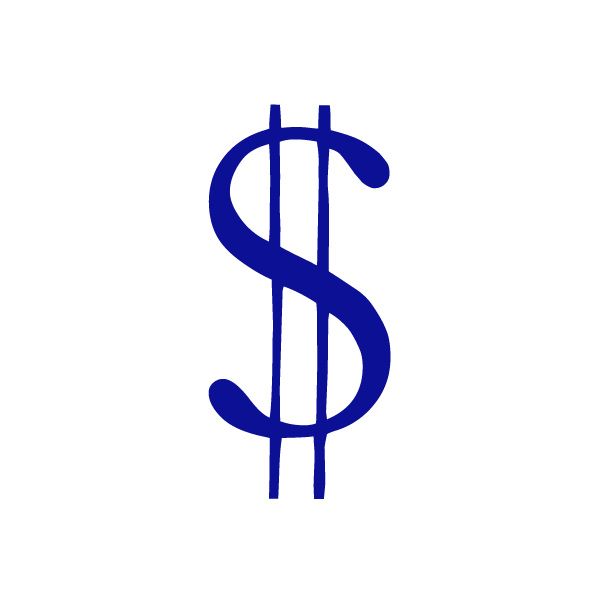
Given such circumstances, it makes sense (from a therapeutic standpoint) for me to talk about one of the most polarising symbols currently in existence: the dollar sign ($). It represents a whole range of opposing values such as comfort, greed, stability, power, happiness, misery, charity, corruption, isolation, deception, avarice, hunger; the list goes on and on. One could argue that all currency symbols are equally representative of these things, but given that America has been the world’s preeminent economic power for well over a century, as well as the place in which consumer capitalism gained its full force, the dollar sign has become the unequivocal and universal symbol for cheddar, benjamins, dough, and cash money, baby.
First, let's start by analysing the form of the $ sign itself. It looks like a snake kebab, maybe acting as a euphemism for the evils of money. It also looks like it's en emblem for something deeper than that, like Satan scratching your soul. While these two personal theories are pretty close to what the symbol has come to signify, I've got the irritable trait common to designers – an irrepressible sense of inquiry – and so I began my research.
Perhaps unsurprisingly, the origins of the design are open to much conjecture – that is to say, we don't really know its exact genesis. The strongest cases is that put forward by the U.S Bureau of Engraving and Printing (which uses the disconcertingly laissez-faire web address of moneyfactory.gov), who suggest that it can be traced back to the Spanish Peso, widely used in the colonial America of the late 1700s. Historical sources record that these "peso de ocho reales" or "pieces of eight" were often simply abbreviated to the letters PS. Overtime these two glyphs somehow (and somewhat aptly) consumed each other, morphing into the progenitor of the symbol that we are familiar with today.
A more spurious, but perhaps more important theory arrives from the annuls of literature. There can be few authors more readily associated with the championing of the consumer capitalist impulse than the controversial libertarian philosopher Ayn Rand (indeed, a striking number of the original Silicon Valley billionaires named their children after characters from her books). In her 1957 novel Atlas Shrugged Rand included an entire chapter on the dollar sign. This she claimed to be not just a basic symbol of the nation's currency, but of its entrenched socioeconomic freedoms. The author hypothesised that the symbol, when written with two downward strikes, originated in commingling of the initials of the United States (with the bowl of the U removed). While this is obviously Rand's fabrication, it hints at the very real evolution of the currency symbol towards the signification of something much larger than an empirical marker of a nation's token of exchange; the dollar sign stands more overtly for the negative excesses of our modern era than any other major currency - the yen, the pound and the euro share nothing of its obtuse gratuitousness - and even if this is projected onto its graphic form after the fact, transfiguring its benign swoops and lines into claw marks and the sinuous bodies of evil creatures, that is because it is proof positive that design is an activity that acquires its value through use rather than creation.
networkosaka.com
Derek Kim
…is a San Francisco based designer with an incredibly broad repertoire. Kim realised that he wanted to be an artist after developing an unexpected fascination with vexillology (the study of flags) aided by a phonebook at the age of six. He graduated from pencil to PC at the age of nine on receipt of a Macintosh LC. As he describes: “My canvas became the screen, my paints became pixels, and my brush became a mouse. It didn't take much for me to start creating my own desktop icons, movie posters, and illustrations. I was amazed and felt empowered to be able to create intricate forms with very few restrictions.” From that moment it would seem that the direction of his career was set. His work now covers everything from Skateboard graphics to type design to album art, and even encompasses a past cover design for Grafik (issue #190, alongside Michael Bojkowski).
Ayn Rand
…sought through her novels to create of a view of humanity that was, in her own words, “like a beacon raised over the dark crossroads of the world, saying ‘This is possible.’” She drew little distinction between her work as being either in a philosophical or literary tradition; indeed her oeuvre presented several key tenants that she wished others in her adoptive America to take up, such as the following of reason over whim, the primacy of hard work, the engineering of self-esteem and the pursuit of happiness as the highest moral aim. Contemporary audiences might have seen this encapsulated in hit television drama Mad Men: Bertram Cooper, senior partner at ad agency Sterling Cooper, is an avowed Ayn Rand fan; while giving his protege Don Draper a hefty bonus, he encourages him to read Atlas Shrugged – “Take $1.99 out of that $2,500 and buy yourself a copy."
August 19, 2014 4 minutes read
Cheddar Dough
The San Franciscan polymath Derek Kim discovers that, when it comes to the signification of the world’s chief currency, uncertain origins allow adaptable futures.


