This innovative Rhode Island School of Design student pairs attention to detail with interesting conceptual ideas, from tackling life’s big questions to imagining conversations with Shakespeare.
How would you describe your approach to graphic design?
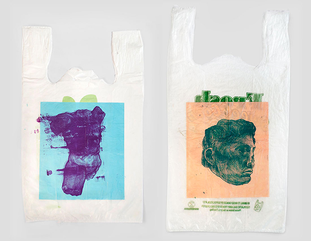
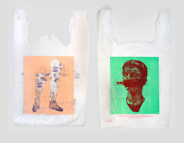
What’s most important to me is that I make work that’s both conceptually sound and aesthetically interesting. A good project is first smart without being contrived or exclusive, and then I try to make it push up against the formal rules of design in such a way that it also nods to them. I use humour whenever I can. I love embedding detail that rewards those who look closely. I love research. Usually I end up hating something before it’s finished, then a day or two later realise all actually isn’t lost. Now I’m trying to develop a methodology that values, maybe even prioritises, elements that are made by hand. I want spending time in the world (drawing, photographing and traveling) to be crucial to what I make.
Tell us about a particularly rewarding project you’ve worked on recently.
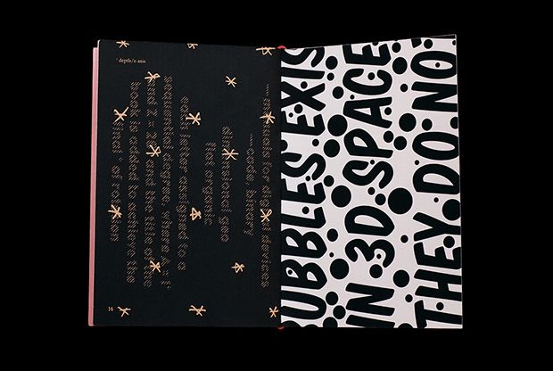
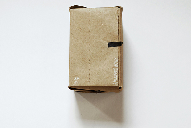
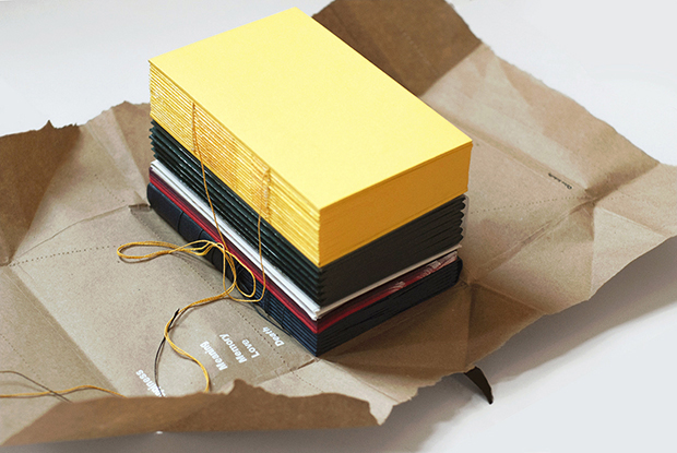
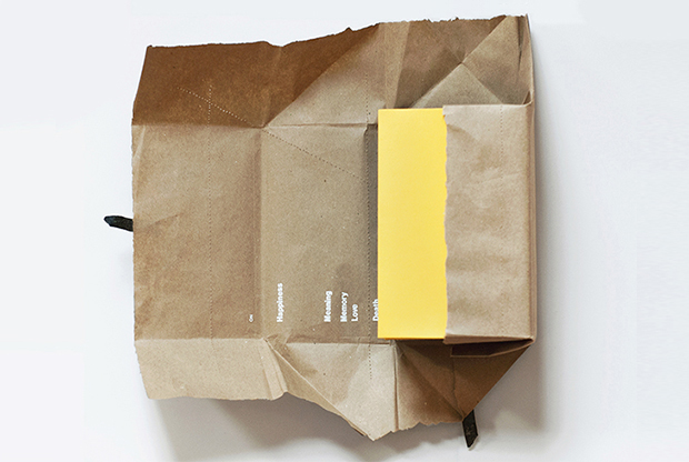
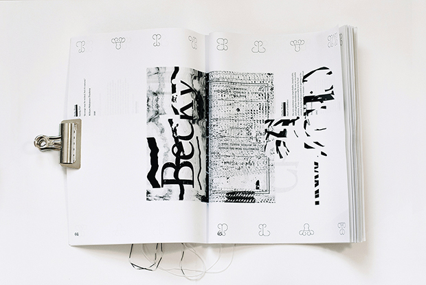
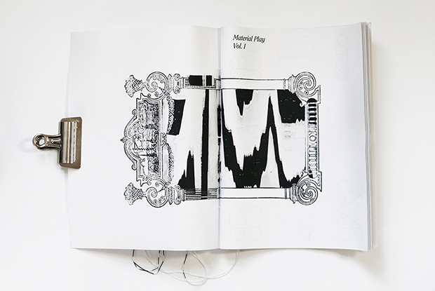
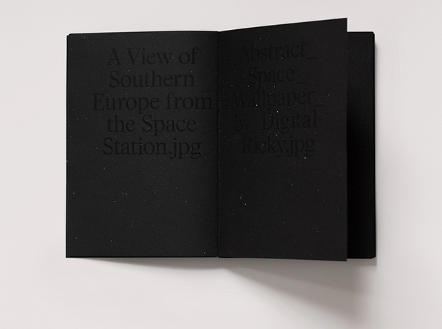
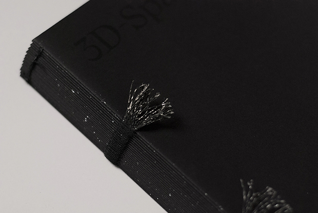
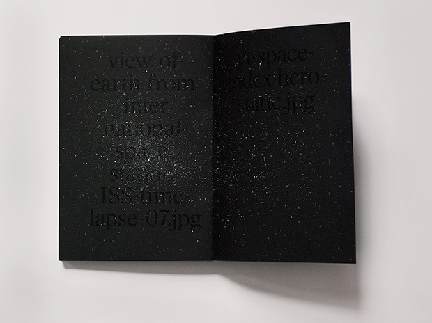
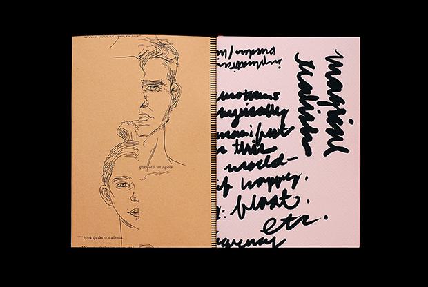
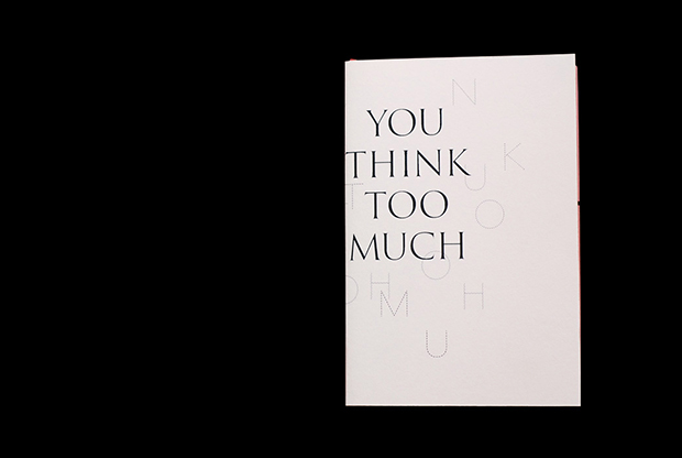
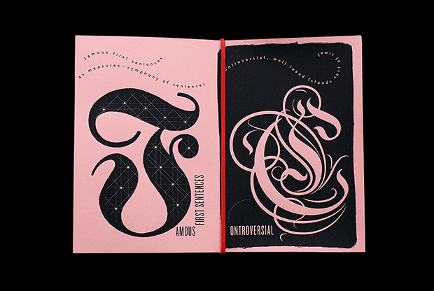
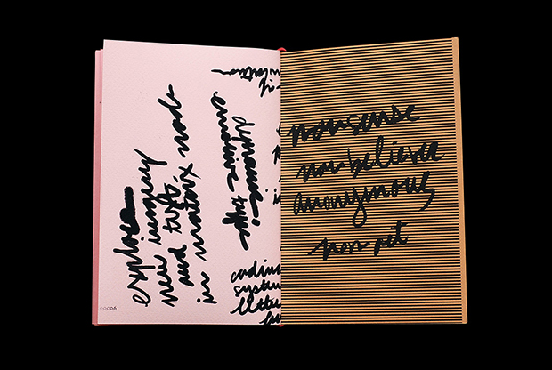
Last semester I took a class on bookbinding, and my final project was a series of five books addressing five of life’s proverbial big questions. I made a long list of the stuff we all worry about, then narrowed it down to happiness, meaning, memory, love, and death. It was a rewarding project because it was so hard to produce. Not only am I always nervous about anything three dimensional, but I challenged myself to do the piece, without words or figurative images (there are some abstract patterns). The other challenge was that I couldn’t quickly undo anything, so I spent most of my time making and re-making prototypes, then working up the courage to apply those edits the final books. You realise designing on a computer is so forgiving! In the end there were many false starts and mistakes, but I got to play with a nice range of bookbinding processes, everything from waxing thread to four-needle sewing to trimming a two and a half inch-thick book block in one go. I’m pleased with the result (also a bit less afraid of doing objects).
What sort of briefs did you work on when you were interning at Pentagram?
The internship was like a junior design position, so there was a good amount of variety, both in kind and scale. Most of the larger briefs were brand or book related. I developed a logo from sketch to finish, did a suite of typographic animations based on an existing brand, and produced signage; laid out spreads for a couple of books, both real and speculative, designed the accompanying dust jacket for one of them, and did 300 pages of fine typographic edits, to name a few. One of the coolest things I got to do was make scans and shoot photographs of Michael Beirut’s notebooks. He gave me free reign over them during the project, and of course they were absolutely incredible to flip through. I was able to see original sketches of some of his best-known work, the rejected concepts for those projects, many of the things we were all working on at the time, and a handful of drawings he’d just done for fun.
Tell us a bit more about your Now Production in Graphic Design book.
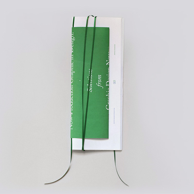
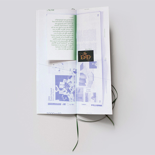
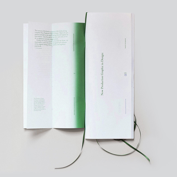
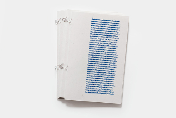
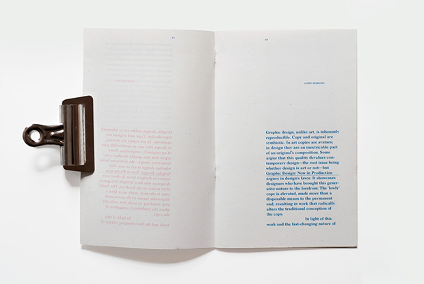
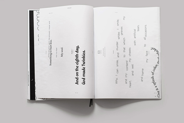
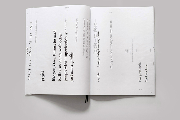
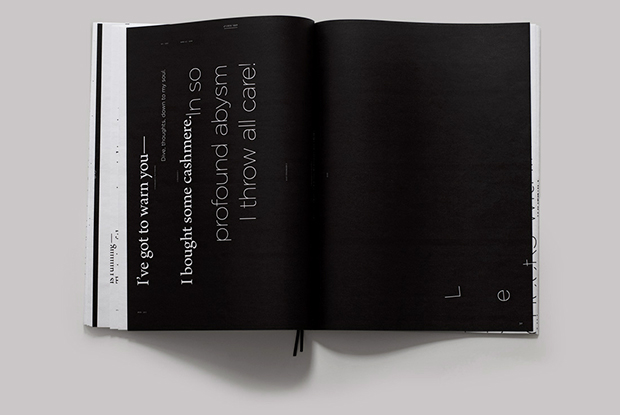
This book is a response to the exhibition Graphic Design: Now in Production, which was installed at the RISD Museum at the time. I was asked to come up with a critical response to the show – positive or negative – and eventually I settled on ‘nowness’. I thought the fact that the show contained the word ‘Now’ in its title and featured work made between 2000 and 2010, which we were then viewing in 2014, was problematic. Graphic design is an almost manically fast-paced discipline, and a very young one, such that relative to all of its history even the lapse of a single year (and all the advancement it contains) is pretty significant.
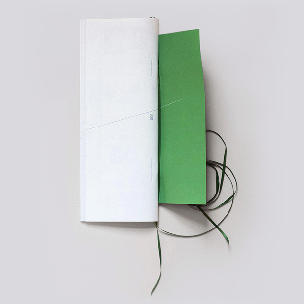
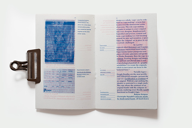
To solve this problem, at least in the short term, I decided to append the show. Now Production Graphic in Design: is essentially an infographic guide that uses the existing catalog (designed by the Walker Art Center) to both reorder the work chronologically and provide an update of it (the newest work from each exhibitor). I aimed to capture that precise moment in the show’s life—since the RISD Museum was the last stop before it closed for good, the book presents the nowest ‘now’ the show ever had.
Aesthetically, Now Production Graphic in Design: responded to the size of the original catalog, then took on its own life from there. The extra long bookmark is a pun on the idea of the timeline. (Bonus: in the final critique one of the male professors compared the whole thing to a handbag.)

You say in your bio that you’re into English Quiz shows. Which is your favourite?
My favourites have to be Would I Lie to You?, 8 out of 10 Cats, and QI, but I also love Noel Fielding on Never Mind the Buzzcocks, anything with Richard Ayoade and Jimmy Carr together, and the Big Fat Quizzes.
What are your plans for 2015?
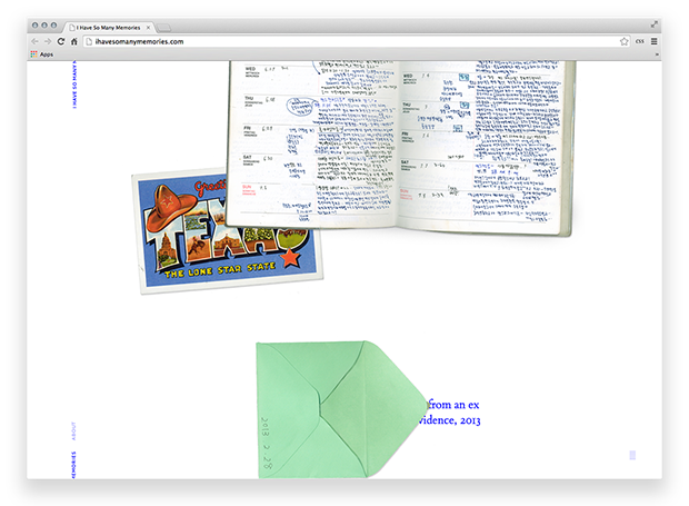
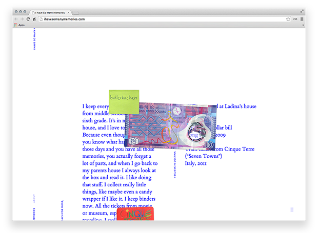
Next month I’ll begin my degree project, which I’m currently forming and researching. I graduate in May (scary thought!) so right now I’m also looking for a full-time position with a studio. I’d love to work on either coast here in the States, or in Western Europe, and even though it’s purportedly dying I want to do print work as often as I can. I also love and want to pursue editorial illustration as part of my practice, and a bit of creative writing.

