Precision, detail and clarity are the three things this Graz-based designer strives for in his creative projects, whether working on branding, publications or audio-visual commissions.

What sort of projects get you excited?
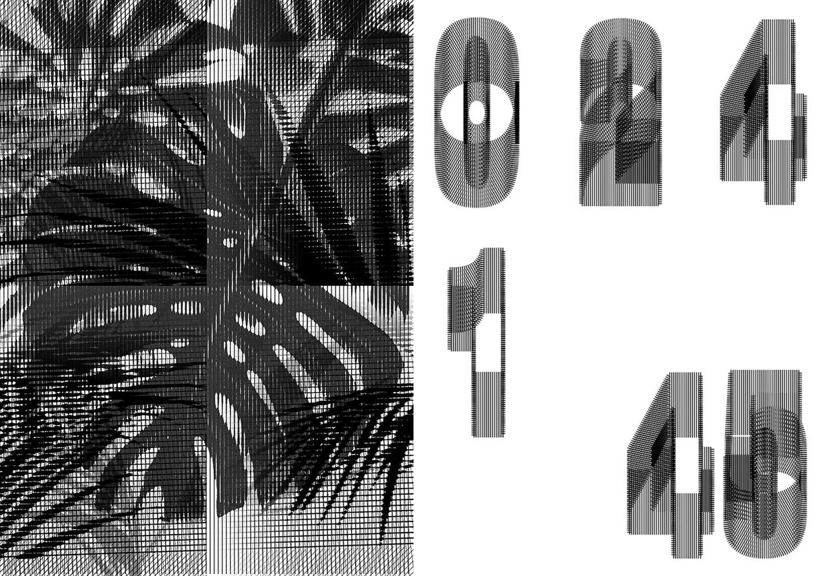
I love projects that invite you to experiment and to push the boundaries of classic graphic design. Sometimes I feel that designs are often repetitive, using the same handful of visual elements. That’s why I enjoy opportunities to test new things, and combine materials from different fields. Creative coding for instance is an interesting balancing act between technology and visual art, and can allow you to escape from those recurring aesthetics, and produce unique, unrepeatable designs.
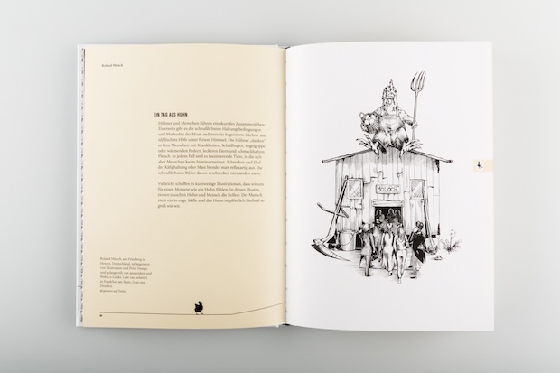
Tell us a little bit about the branding for Parzival Meets Modern Architecture.
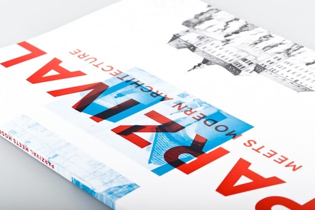
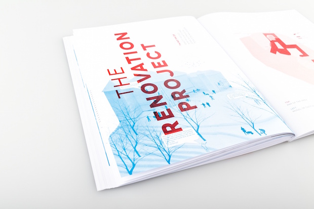
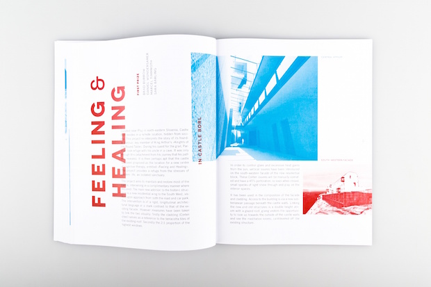
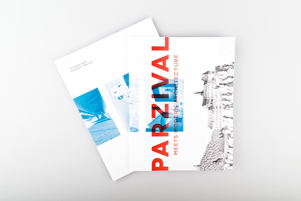
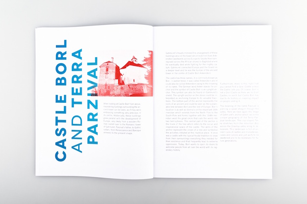
Parzival Meets Modern Architecture is a project on the redevelopment of Castle Borl, a mystical place intertwined with the legend of Parzival and his search for the Holy Grail. Students from five universities in Austria, Germany, Hungary, Sweden, and the UK created architectural proposals and displayed their work in an exhibition in Maribor.
My mate Clifford [Ray Deutschmann] and I wanted to connect this project, which has a lot of historical substance, to its present-day relevance by using a modern visual language for the catalogue. Hence the bold headlines set in Novecento Wide, the use of colour contrasts, duotone images and the experimental layout. We wanted to make a book with a strong identity itself – maybe something more like a collage, rather than just a list of works.
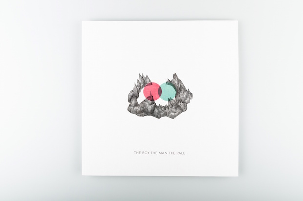
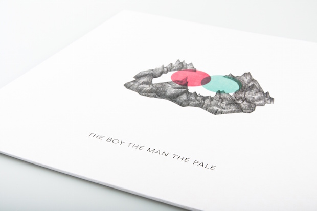
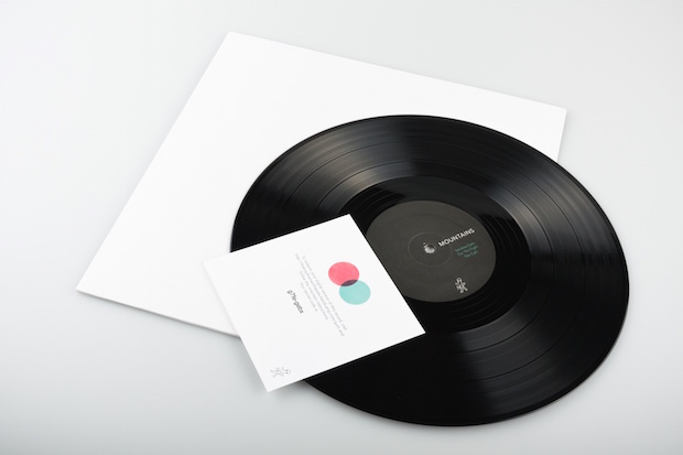
What’s the design scene like in Graz and how do you fit in?
Graz has a strong and flourishing design scene, hosting – for it’s comparatively small size – a rich cultural life. The city in general is an exciting place to be, and with it’s laid back charm possibly one of the best cities to live in.
However since I’m not constantly here I’m not sure if I would consider myself part of the scene. In fact I believe what has influenced me most creatively is the time I have spent living in Montréal, Copenhagen, and London. I always keep returning to Graz though, and I can only recommend coming for a visit.
Tell us about a recent project you found particularly challenging and why.
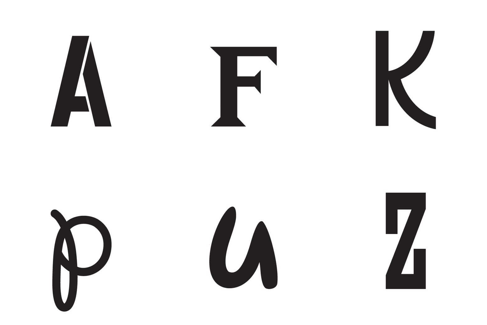
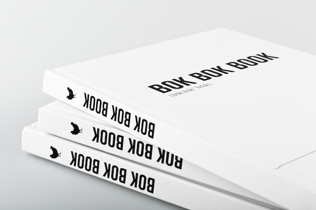
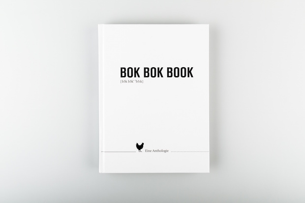
What I found most difficult in the past few months was actually the branding of my own work. When I have to make choices for myself I become terribly indecisive. Even going to the ice cream shop can be a challenge – both blackberry and wild cherry are so delicious. Creating your own identity pretty much gives you infinite possibilities. So I decided to strip everything down and define my own design without symbols or decoration, and rather let white space and typography rule.
jupiterfarms.at

