
This LA native creates work that relies on the tension between pattern, texture and precise forms, all anchored by acres of negative space and the occasional lyrical interlude.
Can you describe your workplace to us?
I live in Los Angeles so I do all my painting outside under the hot sun. I compose the images inside. I don't have a studio at the moment so I have been working at home. There is a certain feeling that's enjoyable about having what you are working on close to you, so that you can return to it at any moment.
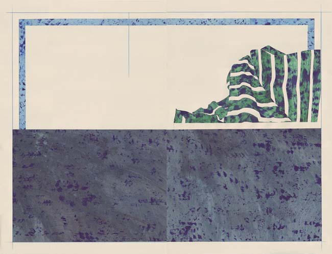
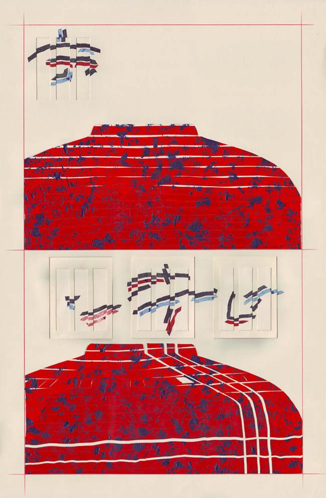
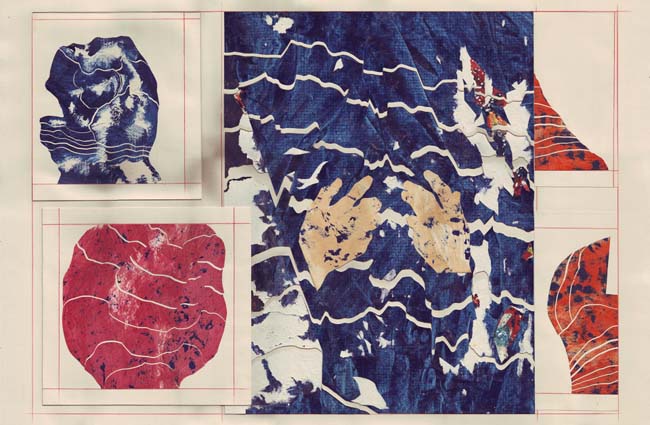
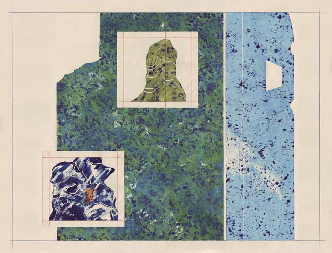
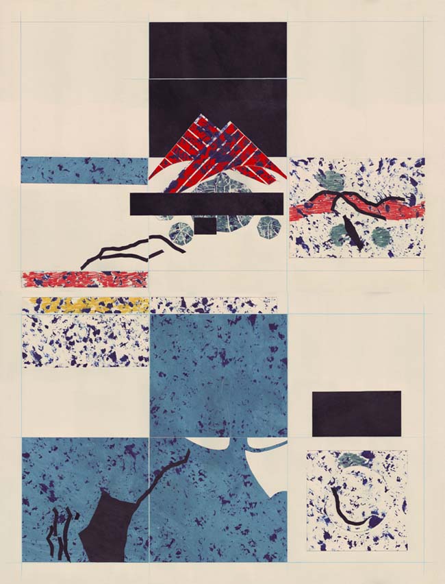
You often employ a faint gridded superstructure to corral various pictorial elements, can you talk about how that is used?
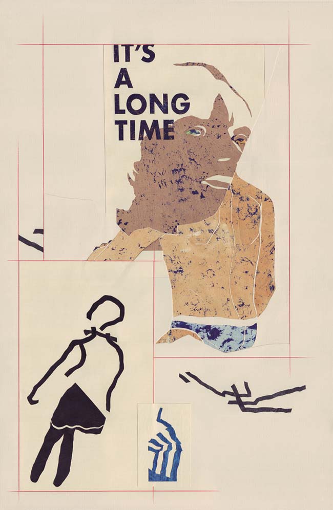
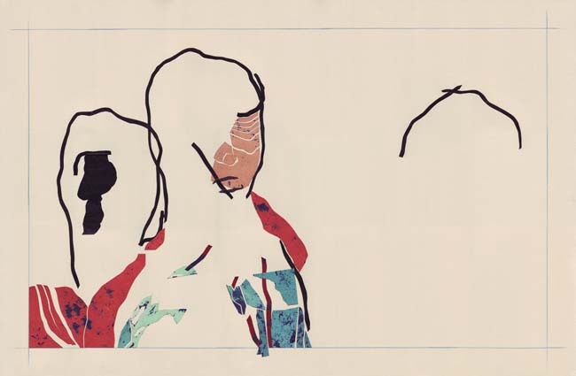
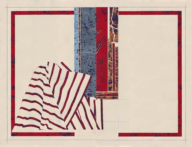
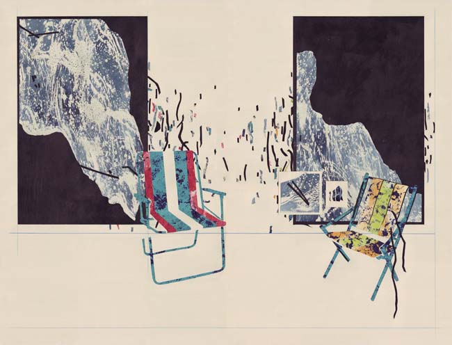
I enjoy creating rules, if only to end up breaking them. I think of it as a framing device that I enjoy starting off with. I think it says a lot to the viewer about what the artist wants you to see. I am attracted to compositions that are ‘contained’ within a space; as you can see in most of my pictures, there is a point at which I tend to break out of that mode, and that is me consciously breaking my own rules. It is a way of keeping things fresh and finding new routes to explore pictorially.

Titling is clearly an important part of your practice – what comes first, word or image?
Sometimes titles float around for awhile until the right piece is made that can support it. I see the title as a kind of idea and the picture as the emotional, unexplainable counterpart to that. There has to be a poetic collision of the two. The title can never be illustrative of the image and vice versa, otherwise I feeling as though I am ‘dumbing down’ or trying to over-explain to the viewer. I think the title should push the image further and act as a sort of aura that lingers around the painting after reading it.
Language occasionally creeps into the work itself, echoing concrete poetry, and the way you write and arrange titles also has a formal resemblance to poetry – is the medium a conscious influence?
Poetry is probably a bigger influence on me than the visual arts. I find the combination of word and image very interesting. I really love the metaphoric quality of poetry and feel as though metaphor is, though harder to achieve, still possible in painting. It is something that very few painters seem to be interested in. My favourite poets, and ones I consistently return to, are Cesar Vallejo, William Stafford, Kenneth Koch, David Ignatow, Antonio Porchia, Robert Creeley, Jaime Sabines, Yehuda Amichai, Roberto Juarroz, Kenneth Rexroth and Roberto Bolano. Unfortunately everyone on this list is dead, and two more great American poets just passed on this last year: Bill Knott and Galway Kinnell. It feels like a dying art as so few people read poetry anymore, but there are a still some great poets floating around, people like Jeff Alessandrelli – his latest book This Last Time Will Be The First is excellent.
Your technique is very particular and you use a fascinating combination of materials – how did this approach develop?
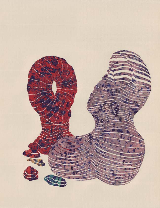
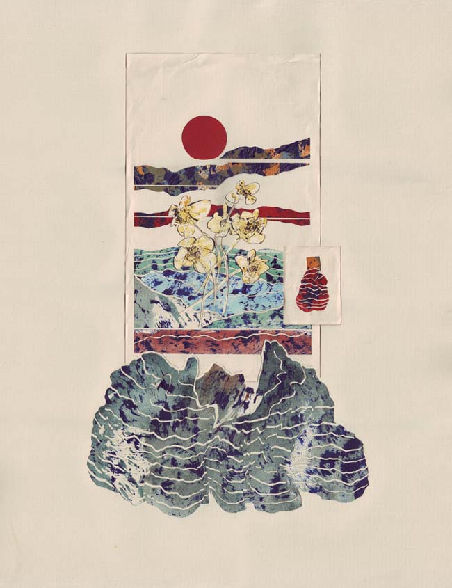
It is mostly a matter of finding the right materials for the individual textures and feelings of each piece. Also, I have no formal training in art so I have never been told not to use this or that. Oil paint works fine on paper if you learn the subtleties of it; the same goes for dyes, waxes, and tapes.
I always paint on paper. I use a heavy 80lb stock. The painting part is completely intuitive, just figuring out the textures and mood. After I reach the desired surface look, I cut the paper with a blade and do the composing onto a larger sheet of paper. I always use an off white paper as white is generally far too bright for someone like me who loves negative space. Also, I want white as a colour to appear as strong and dynamic as the other colours when I use it. The beauty of working on paper is that I can repurpose unsuccessful images. For instance, if a piece doesn't end up the way I want I can cut out the elements or parts of the composition that worked and simply glue it into another composition. Another benefit of working this way as opposed to a traditional painting process is that the compositional process is fluid until I glue it down, meaning that I can try out a number of different compositions.
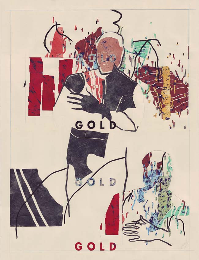
You have said – "the honest value of an image is not built upon its substance, the honest value of an image lies in the viewing of its image.” Can you expand on that?
What I meant specifically by that statement was that no matter the tools or craft employed by the artist, what really matters is the visual connection with a viewer upon looking at an image. That second when you first physically see the image is the most important moment for the artwork. And that is where the value lies. You know, I think this has a lot to do with why I began putting words onto the surface of the work in the first place. In most galleries there is no title for the pieces on the wall along with the piece itself. If it is displayed loudly on the work it plays into that first encounter very comfortably.
What's next for you?
The pieces seem to be getting larger and larger. And I'd like to break out of the rectangle format. I also have my first solo show opening at Ed Varie, New York, 20 November 2014.
chyrumlambert.com