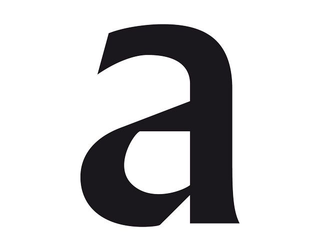
In today's Archive piece, Michael Bojkowski looks at the lowercase ‘a’ from Berthold Wolpe's Albertus – a typeface which will be instantly familiar to anyone who's visited the City of London (or The Village).

Since I’m a fully paid-up member of the type geek squad you can imagine having to choose a letterform to talk about is kind of mindboggling. Being the graphic glue that sticks the world together, typography is endlessly fascinating and the variety of letterforms seemingly infinite.
In part, this is what led me to take on a personal typographic survey of the City of London (I was living in the City at the time) and make a dorky little video about it which you can see on Vimeo.
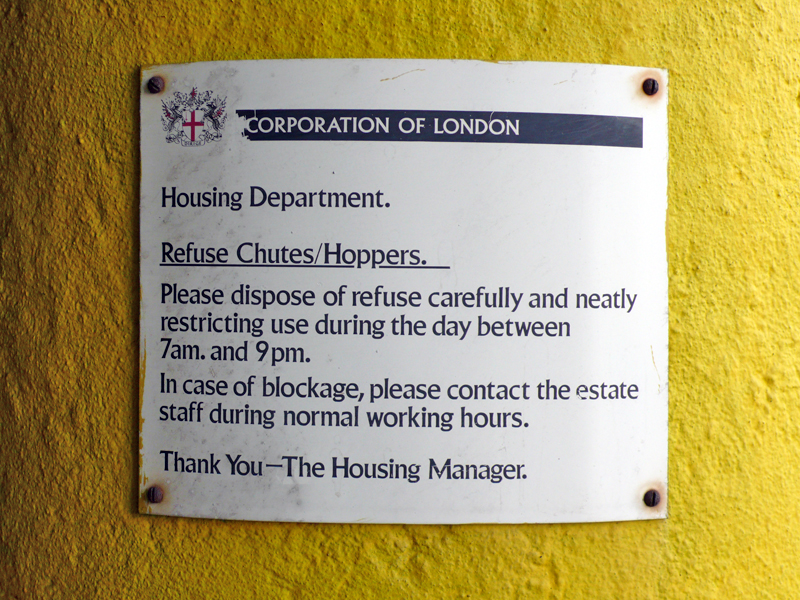
Wandering through the City, it soon becomes apparent that Albertus (or Old King as a certain Russian foundry decided to rename it at one stage) rules here. It was designed by Berthold Wolpe around 1936 and is the mortar that cements the City together. It also has to be one of the more comprehensive examples of typographic brandwork you'll find. Following World War II, the City became the focus of a flurry of regeneration projects (including construction of the Barbican Estate) and signage became a key element during this period. A decision was made to use this one typeface and it has been adhered to ever since.
You can't mention Albertus without mentioning The Prisoner, the frankly bizarre TV show first broadcast in 1967. It's used within the TV show in much the same way the City was using it for real, drawing parallels between the closed world of The Prisoner and the utopian ideas of urban planners at the time.
If you want a snapshot of why this 'quiet achiever' has survived, reasonably unchanged, through the decades, have a look at the lowercase ‘a’. This letterform typifies Albertus's unique blend of the staunchly geometric and the handmade, the slope and chop of its lines giving it both authority and a sense of craft. When researching for this piece, I came across a calligrapher who had rendered a whole alphabet in Albertus by hand without losing any of its formality or presence.
Geek Note: The example shown here is actually a slight redraw based on the lettering that sits above the garbage disposal chutes in Great Arthur House on the Golden Lane Estate.


