
Pentagram designer Paula Scher draws an immersive map of Philadelphia at Temple Contemporary that invites viewers to step into the city and gives Google Maps a run for its money.
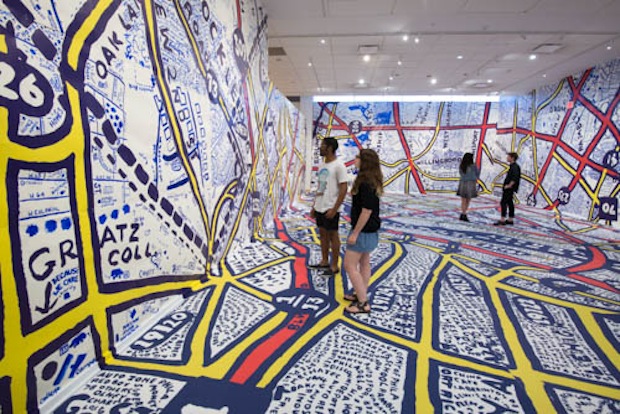
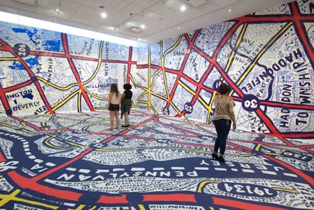
The illustrious designer Paula Scher, of internationally rated design firm Pentagram, has gone back to her roots with Philadelphia Explained, a project made in collaboration with her alma mater the Tyler School of Art in Philadelphia. At the university’s Temple Contemporary art gallery, Scher has created a Keith Haring-esque sketch of the city’s map that trails over the entire space.
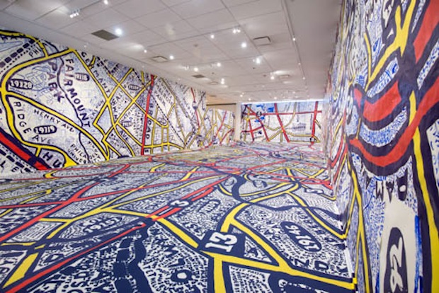
Scher sketched out the skeleton of the map and had 154 Tyler students and Pentagram staffers fill in the detail by hand. The design was then applied to the gallery's walls by Tyler architecture graduate Keith Hartwig, who worked closely with Scher as part of the art school's Distinguished Alumni Mentorship program.
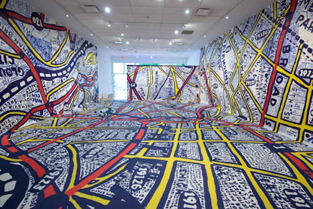
Fat red, blue and yellow lines are scribbled over with street names, landmarks, annotations and social commentary. In a crosshatched area labelled “That place,” a blue dot marks “My house.” The handmade map gives a sense of the city’s personal meaning that you just don’t quite get from Google Maps.
For this exhibition, the art isn’t just on the walls at Temple Contemporary – it is the walls. The wall-as-canvas model reflects Philadelphia’s Mural Arts Program, which has seen the city splashed with paint since its inception in 1984.
For Philadelphia Explained, the design evokes a sense of the city. Philadelphia is New York City’s smaller, grittier little sister; it is a city that feels like a neighbourhood. With Philadelphia Explained Scher and her team have created a true map of the city.
Philadelphia Explained
Until 17 July 2015
Temple Contemporary, Philadelphia