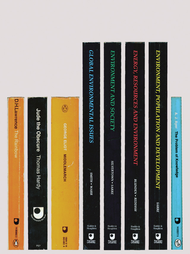
In this Archive piece, Harry Heptonstall talks about his favourite logoform – the deceptively simple but perfectly pitched marque of the Open University.

Logos are funny little things. In isolation they’re actually pretty stupid. The thought of such a minuscule marque supposedly encapsulating the whole essence of what an organisation promises seems like a lot of pressure to load on its tiny shoulders. How can something so small communicate anything other than a pleasing shape? As visual communicators, we’re taught that it’s achieved through employing some well-thought-out semiotics. A learning curve engaged in by the Open University. Its marque accomplishes so much, through so little. Its simplistic appearance looks to the future by invigorating the visual styles of old.
This refreshingly minimalist approach makes it immensely accessible –precisely the ethos the OU was built on. The ‘U’ has adopted a crest-like structure, with the punched-out ‘O’ acting like a gateway to future academic success.

The minimalist marriage between the abstract ‘O’ and ‘U’ is set off perfectly by its asymmetrical composition. A composition that apparently had to be fought over to protect it during its creation. The original marque was born in 1969, with the university’s vice-chancellor, Walter Perry, dreaming up the initial concept. Douglas Clark, director of design at the OU at the time, then produced some forty variations before the final form flourished. Now, forty-one years later, it’s still as bright-faced as a freshman.
This article, of course, refers to the flat, single-colour version of the OU logo and not the tacky glass bevelled effect that can now be seen (a symptom of ruddy Photoshop and effects-seduced clients following the herd). But I digress. The power of this marque is in its unfussiness. Seemingly able to transcend time, this simple form is respectful of its heraldic heritage while looking ahead to the wonderful possibilities offered through further education. Just like a patient mentor, who has witnessed a great deal yet still has so much wisdom to impart.
It’s certainly a first-class logo with honours, which gets a gold star from me.

