Developing the branding for new PR firm Semaphore combined marrying a clear concept with plenty of archival research, making creator Jordan Amer’s job one of an editor as well as a designer, he explains.
How did the project originally come about?
The Founding Partners, Liam and Aaron, were former colleagues who, like me, broke away to form their own proposition. They contacted me off the back of a recommendation and we talked about their new business intentions at the intersection between PR and communications strategy facing the creative industry. When the opportunity to brand them was tabled I jumped at the chance.
What was the original brief?
Very open, short and sweet. They introduced the name (which I liked immediately), why they had chosen it (it was a system of sending messages), and we spoke about a few visual cues. Everything seemed to fit, which put me in the privileged design position of being able to build the house upon the rock.
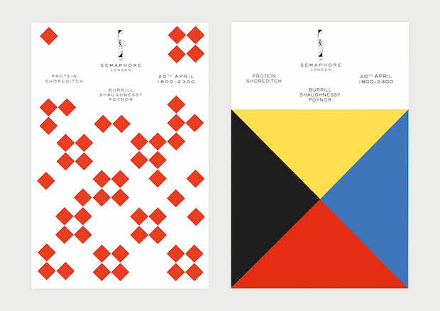
Tell us about the design concept and your inspirations.
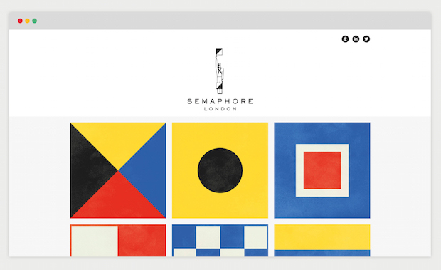
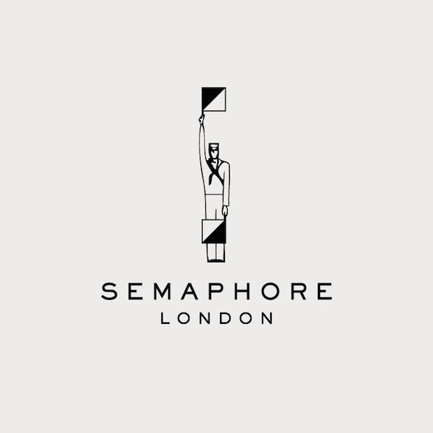
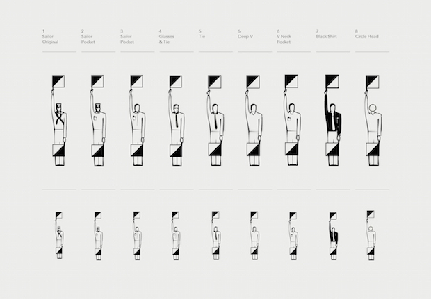
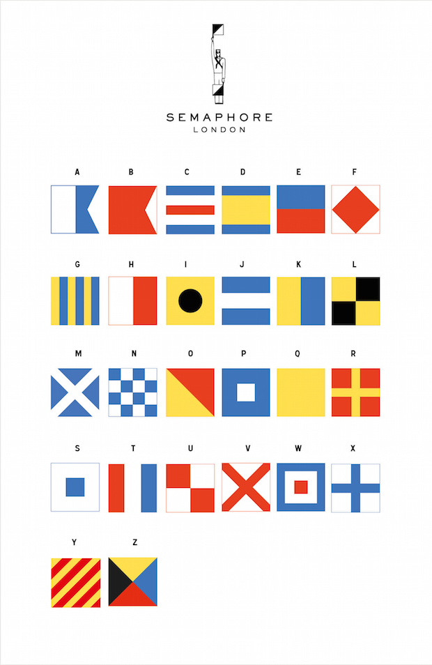
Aside from being totally appropriate to the business, the word Semaphore offers up a raft of, now mostly extinct, visual cues from the world of pre-digital, long-distance visual communication. This meant the research phase was incredibly rich, and far more curatorial than mercurial. I spent it choosing between the different iterations of morse and the different languages and shapes of transportation signalling. The role was more design editor than designer.
Did the project present any particular challenges, and if so how were these overcome?
Discarding routes is always painful. There's a saying in film editing: "It's not ready until your favourite scene is on the cutting room floor.” Since we had so much great material to work with and my process circles around creating something singular and purposeful, that seemed especially pertinent here. There were so many routes that were entirely valid and the exercise of letting them go because they weren't as engaging as some of the others required a level of objective ruthlessness I haven't had to employ before.
What do you think has worked particularly well?
The whole way through, the choice of the semaphore flag holding sailor felt like a risk. Not because it wasn't appropriate or memorable, but because within the context of the design world where brands are increasingly stripped back and minimal, he demonstrated a lot of unfamiliar personality. Now that everything is sitting together it's a point of pride that we didn't buckle and they output still feels controlled. Liam and Aaron deserve as much credit for that as I do though. I advised it, but it was their risk to take.
Did this project involve sourcing any new materials or using any new processes?
Not production processes per se. But one new objective that we kept very close to heart was that, in alignment with Semaphore's offer, we're introducing this brand into an unpredictable media landscape and as such, it needed to be delivered with a flexibility and understanding to be functional in unprecedented circumstances. The process for establishing a hierarchy to achieve that required a lot of attention.
What was the client's feedback?
Wholly positive. We've worked very closely throughout and a committee of three we're fleet-of-foot enough for discussion to be open and productive. The real feedback begins now though: when we start to see how effective the brand is in practice.
Technical spec.
Logotype. Sackers Gothic Heavy. Tracking: 600 (for authority)
jordanamer.co.uk
semaphorelondon.com