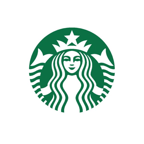
Who knew the logo on your coffee cup had such a salty history? Maggie Macnab unveils the saucy siren of Starbucks. The original Starbucks logo contains a twin-tailed, bare-breasted siren with a sensual pose and a smile: all symbols of access and seduction. She is semantically linked to the virgin – the top half is woman, but the bottom half is fish, without the ability to copulate. Mermaids are the sweetened descendants of the siren, having lost most of the siren’s original power and seduction (it is important not to confuse the two).
Mythological sirens have the head and torso of a woman, but the body of a snake, bird or fish, depending on time and place. They are known for their beautiful singing that seduces wayfaring sailors to fall prey to the depths of the sea. This myth harkens back to Homer’s Odyssey and persists into the present day.
Howard Schultz, in his book Pour Your Heart Into It: How Starbucks Built a Company One Cup at a Time, explains the use of the image on his company’s logo, “That early siren, bare-breasted and Rubenesque, was supposed to be as seductive as coffee itself.” As Starbucks grew, however, the logo was cleaned up for a broader audience that might find the siren’s sexual presentation offensive. In the second version, her breasts were covered by flowing hair, though the navel was still visible, and the fish tails were cropped. In the current version, her navel and breasts are completely covered, and only traces of the outspread fish tail remains. The corporate position states that the revisions to the logo were as a result of the merger of Starbucks with Il Giornale in the late 1980s. Selling a substance with addictive potential is a delicate process: presenting it in a wholesome way is the best strategy for the bottom line.
To understand this logo’s message we need to look at the properties of coffee. As with any substance, coffee can have either a negative or positive influence on health depending on how it is consumed. Drinking one or two cups a day can act as a mild stimulant and painkiller, and people in our culture have traditionally used it to kick us into gear in the morning. It increases heart rate, blood flow to the muscles and blood pressure, and it decreases blood flow to the skin and inner organs while increasing the levels of dopamine in the brain (one of the reasons caffeine is an ingredient in headache medications).
Those who fall under the spell of Starbucks’s marketing will be seduced — as their logo promises — by a jolt of energy and a temporary state of euphoria. But it comes with a price. The original concept of this identity was intuited with a hint of the darker side of coffee — capitalising upon desire can quickly become exploitation. In this case, the ‘siren’ can also be read as a loud and clear warning about the danger of becoming bewitched by the quick fix.
macnabdesign.com
Maggie Mcnab
… is a designer, educator and author. She founded her agency, Macnab Design, in 1981. She is past president of the Communication Artists of New Mexico and has taught on subjects relating to graphic design at the University of New Mexico since 1996 and at Santa Fe University of Art and Design since 2010. She is the author of such books as Design by Nature and Decoding Design.
Bean Benefits
Recent research has disproved the adage that coffee is a bad habit, at least as far as your health is concerned…though if you’re wide-eyed and shaking by 4pm then it’s still probably advisable to cut back on the cups. In fact the increased scrutiny placed on this common addiction has revealed that it may have some surprising benefits, from protecting against Parkinson's and type 2 diabetes to fortifying your liver against disease. Some studies have even shown that coffee appears to improve cognitive function and might stop you getting the blues.
July 24, 2014 3 minutes read
Coffee Lover
Who knew the logo on your coffee cup had such a salty history? Maggie Macnab unveils the saucy siren of Starbucks.

