
None of the many choices made every day by designers are neutral. Here LOKI's Kevin Yuen-Kit Lo puts colour choice into context, in his insightful essay The Propaganda of Pantone: Colour and Subcultural Sublimation.

Aesthetics can be understood as the system of a priori forms determining what presents itself to sense experience. It is a delimitation of spaces and times, of the visible and the invisible, of speech and noise, that simultaneously determines the place and the stakes of politics as a form of experience. Politics revolves around what is seen and what can be said about it, around who has the ability to see and the talent to speak, around the properties of spaces and the possibilities of time. — Jacques Rancière, The Politics of Aesthetics
Questions of representation are central to the practice of graphic design. An understanding of who we are speaking for, and who we are speaking to, is the starting point of any design brief. It is through this role of mediation, expressed as aesthetic form, that design enacts its power and responsibility. However, this mediation often happens uncritically, guided by a designer’s intuition, stylistic trends, and the instrumental framework of marketing and PR concerns. A multiplicity of factors, conscious and unconscious, play into a designer’s aesthetic choices of imagery, typography, composition and colour. And as much as some might argue to the contrary, none of these choices are neutral.
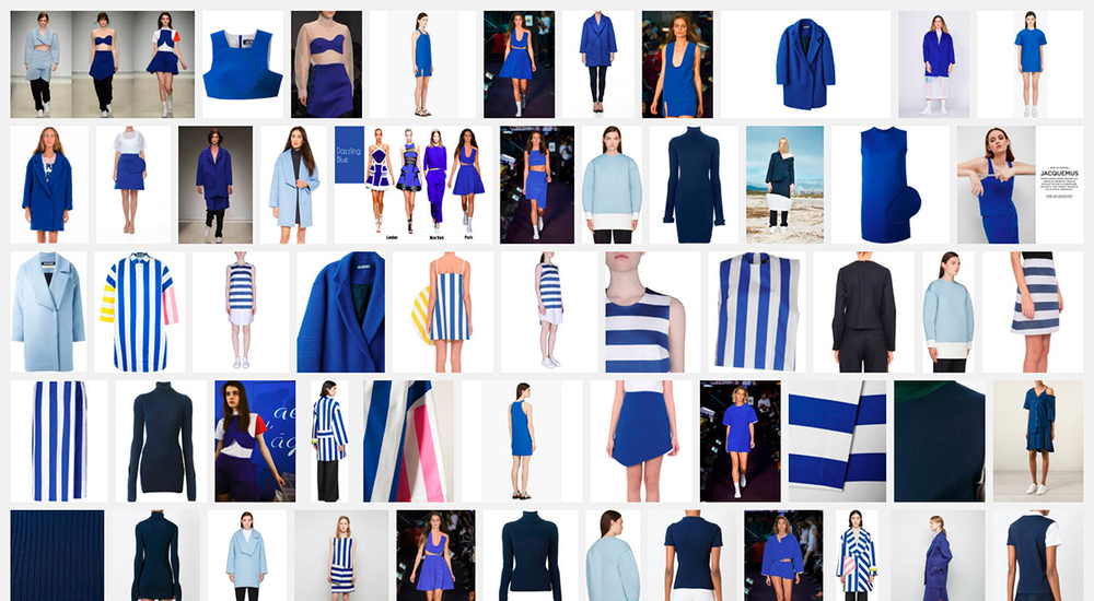
In the case of colour, Pantone Inc. holds incredible influence with their increasingly marketed and mediatised Colour of the Year campaigns. Purportedly determined through a prescient reading of the cultural zeitgeist (by a select cabal of colour specialists), it is important to understand that the company, and the industry it serves, have their own specific interests and agendas that drive these selections. Pantone’s choice of “Rose Quartz” and “Serenity” as the 2016 Colour of the Year is the most insidious move by this colour-industrial-complex since “Blue Iris” in 2008. As with “Blue Iris”, Pantone has once again mined the subcultural landscape and used their monopoly within the creative industries to propagate their colour properties to the world.
From IK Blue to Blue Iris
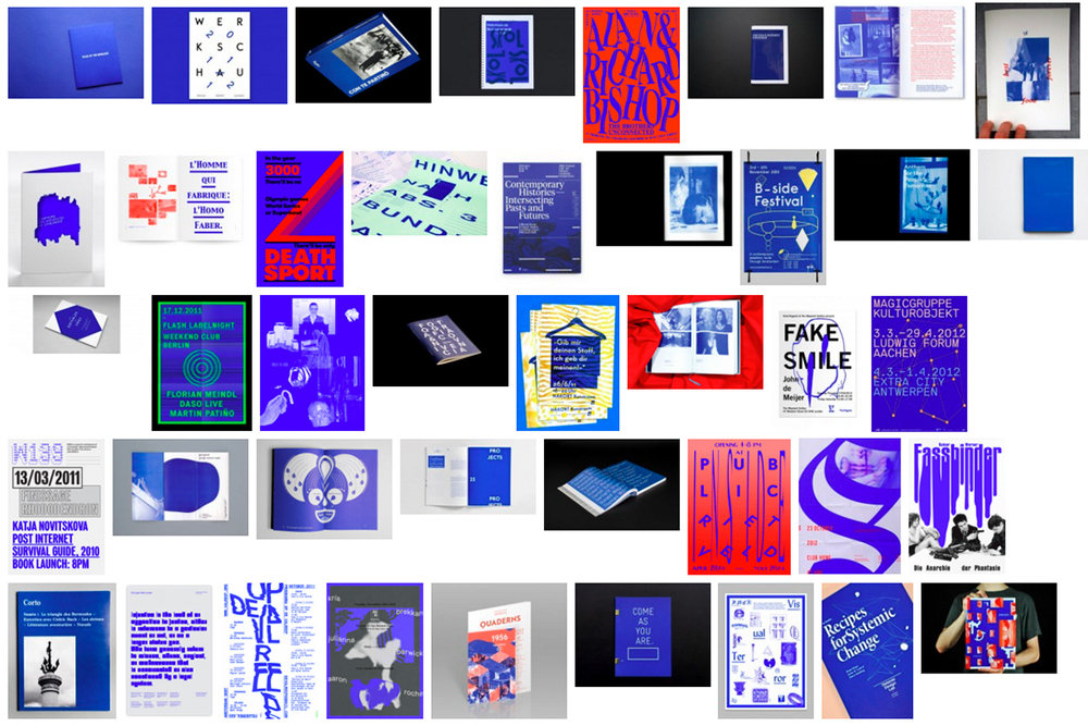
Pantone was on point in 2008, presenting a slightly muted version of the IK Blue (International Klein)/RGB Blue trend that evolved out of the Dutch “default design” approach of the early 2000s. Default design advocated against the smooth surfaces of graphic professionalism, employing low-res imagery, system fonts, crude layouts, and the standard web link hex-colour #0000FF. It incorporated a self-referential criticism into its aesthetic, and the prominent use of RGB Blue became a clear signifier of this. The colour was carried forward with the emergence of a vaguely defined “critical graphic design” aesthetic, shifting between Default, IK, and Reflex Blue, and it was often used monochromatically, in large flat swathes that were both vivid and jarring.
Though IK Blue and RGB Default Blue are not the same, their intense visceral effect is similar, stemming from the colours’ physical/digital materiality; Klein’s blue was unique due to the synthetic resin binder which allowed the pigment to maintain its clarity, whereas Default Blue is as pure a blue as the RGB spectrum can achieve. Referenced in William Gibson’s 2010 novel Zero History, the character Hubertus Bigend has a suit made entirely of material in IK Blue. He states that he wears this because the intensity of the colour makes other people uncomfortable, and because he is amused by the difficulty of reproducing the colour on a computer monitor. Gibson, an astute cultural observer, used this reference to acknowledge its avant-garde popularity while pointing to the inherent subversive quality of the colour.
The mainstreaming of “Blue Iris” by Pantone softened the subversive punch of IK Blue (which by 2008 was already an identifiable commodity in contemporary art and fashion circles), further bolstering its popularity amongst designers and the consumer population at large.
Rose Quartz and Serenity
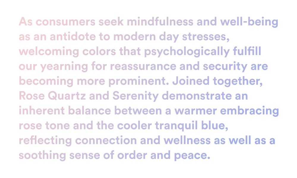
“Rose Quartz” and “Serenity” (hereafter abbreviated as RQ+S) present a far more nefarious situation. There’s no doubt that Pantone’s trend forecasters/cool hunters are once again on point (much more so than last year’s Marsala), yet anyone who has spent a little too much time on Tumblr over the last few years probably could have seen this coming. The tonal pink and blue palette has been growing exponentially in popularity online since the emergence (circa 2010-11), purported death (circa 2012), and expanding influence of the micro-cultures of Seapunk, and its successor, Vaporwave, as part of a more broadly defined subculture of internet-fuelled art employing what can be described as a Tumblr aesthetic.
The popular use of these colours, and specifically their combined usage, has emerged out of a tumultuously contested subcultural space. Pantone’s conceptual framing of RQ+S is disingenuous at best, and once one digs a little deeper, can be seen to represent a clearly reactionary political force.
Seapunk #wet #deep #dolphins
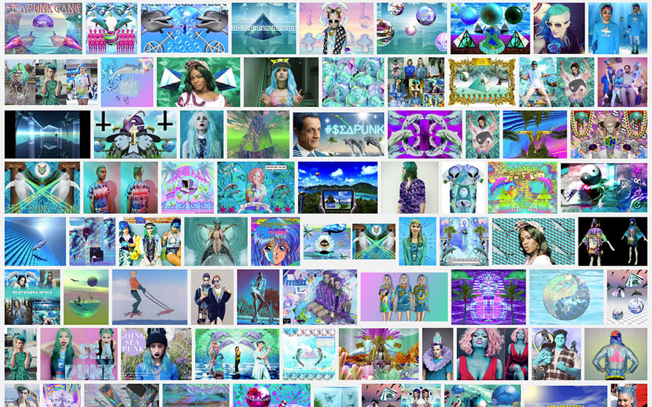
Seapunk, an electronic music micro-genre that started out as a hashtag in-joke on Twitter, became more identifiable for its online visual aesthetic than its music; psychedelic dreamscape collages of underwater imagery (with a clear overrepresentation of Ecco the dolphin), web 1.0 graphics and gifs, classical roman sculptures, and 90s era rave nostalgia, all immersed within shimmering pastel and neon tones of turquoise, aquamarine, pink and purple. Not quite RQ+S, but we’re getting there.
In late 2011, Seapunk graphics and fashion imagery exploded on tumblr and the style was quickly picked up by fashion bloggers and online music and culture magazines. By March 2, 2012, the NY Times style section ran an article, entitled “Little Mermaid Goes Punk”, signalling “la petite mort” of the micro-culture to many of its progenitors. On November 10, 2012, Seapunk truly broke into the mainstream with Rihanna’s performance of Diamonds on Saturday Night Live, which was described as a “screensaver performance” before the frenzied backlash brought the Seapunk terminology into the limelight. Azelia Banks’ Atlantis video dropped the next day, and Seapunk’s co-optation and death was officially declared.
also, why aren’t y’all frustrated AT ALL at the rihanna thing? that performance marked the commodification of an aesthetic movement…— Bebe Zeva (@BebeZeva)
…which means all taste-makers have to start all over. it’s a lot of work. clearly ur not doing shit but consuming if ur not peeved by this — Bebe Zeva (@BebeZeva)
“wow amazing rihanna performance i love seeing my tumblr on SNL” why? that Aesthetic served as an exclusive binder for URL counterculture…— Bebe Zeva (@BebeZeva)
…tomorrow, when it enters Phase Three and Forever 21 puts a price tag on it, it will no longer be exclusive. its purpose is gone.— Bebe Zeva (@BebeZeva)
The Seapunk story is as much about its co-optation and commodification as it is about the music or visual style. It was arguably one of the first internet-based subcultures to be thrust so quickly into the mainstream. Angry responses to its co-optation, and articles mocking these responses flooded the internet in equal measure. For the corporate taste-makers, the style offered an exciting counterpoint to the wholesome faux-nostalgia and whitewashed elitism of hipster aesthetics, and thus provided a new market to explore, develop and extract value from. This wellspring was short-lived however, as artists and adherents soon jumped ship, no doubt seeing where the style was headed.
Vaporwave: The Jester in the King’s Court
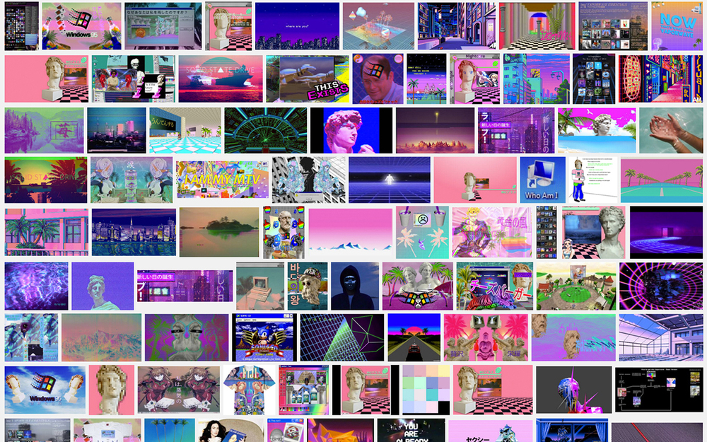
Vaporwave has been hailed as Seapunk’s successor, though it actually emerged in parallel, with less dolphins, and a more mature theoretical grounding. The dolphins have been replaced by renderings of the assorted detritus of techno-capitalism; anachronistic corporate logos, dead media formats, GUI elements, and perspective grids. Musically, the genre samples and remixes the corporate soundscape; elevator and on-hold music, the piped-in pop of shopping malls and office lobbies, smooth jazz, easy listening and motivational new age harmonies. Vaporwave differentiates itself from Seapunk through its critical self-awareness, and it is far more intentional in how it employs its parodic kitsch aesthetics. It is darkly cynical and sickly sweet, exemplified by artist and label names such as The Pleasure Centre, New Dreams Ltd., Fortune 500, Business Casual or Condo Pets