
In combining the skyline of Scandinavia's classiest capital with one of the twentieth century’s greatest authors and a classic typeface, Non-Format has performed a perfect three-point turn.
Can you begin by describing the project in basic terms?
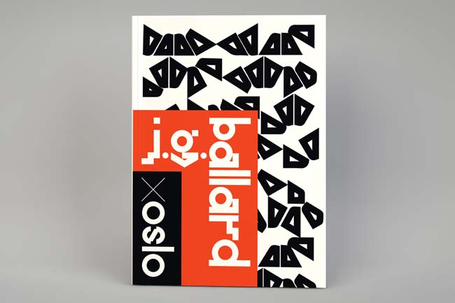
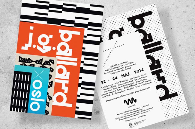
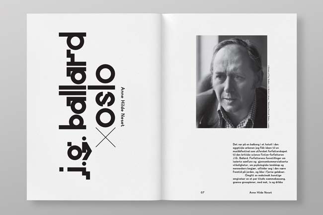
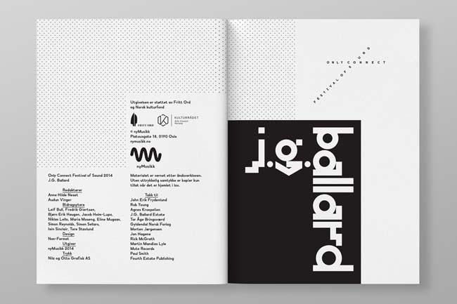
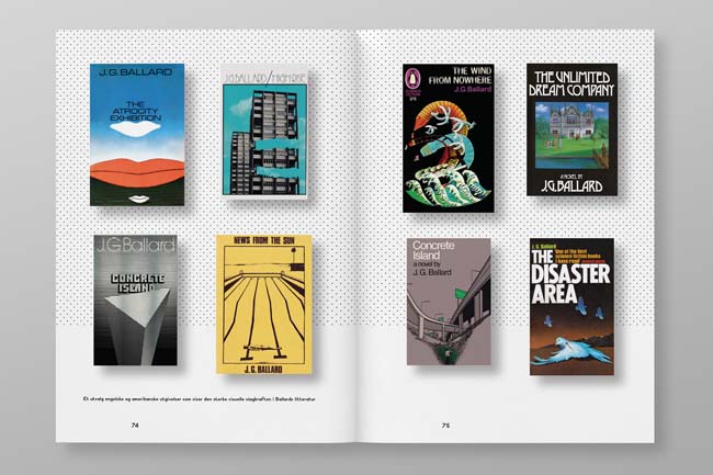
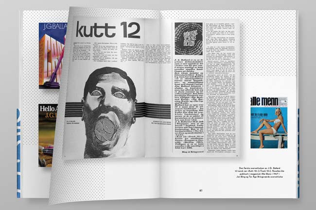
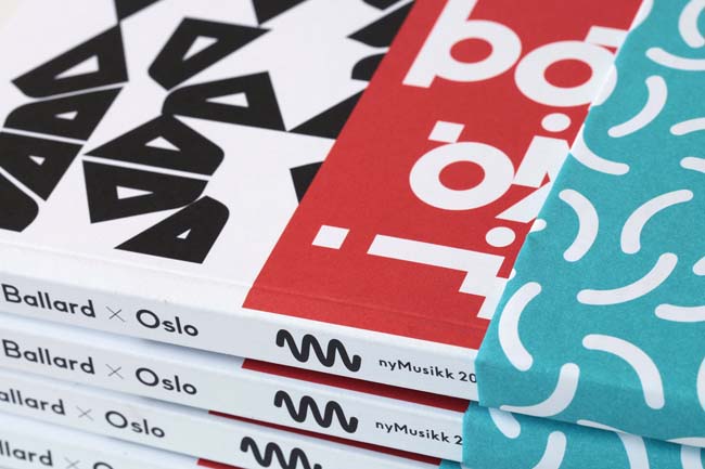
The Only Connect Festival of Sound is an annual event staged in Oslo by nyMusikk, Norway’s leading promoter of contemporary music. The theme for this year’s event was British science fiction writer and predictor of the near future, J.G. Ballard. The festival explores all things Ballardian through concerts, talks, film screenings and performances. We were invited to design all of the promotional material for the festival including a special book, which gathers together essays, photography and various printed ephemera relating to the man himself.
How did the project originally come about?
This is the third annual Only Connect Festival of Sound. As a precursor to redesigning nyMusikk’s entire identity, and as a way to test the creative waters, we were invited to create the identity for the first Only Connect festival – A Tonal View of Times Tomorrow – and, subsequently, last year’s festival – Machine Dreams – for which we created a series of robot faces that appeared in all of the promo material. This year, alongside the usual posters and programs and flyers and other advertising, they also threw a book at us.
What was the original brief and did it change at all?
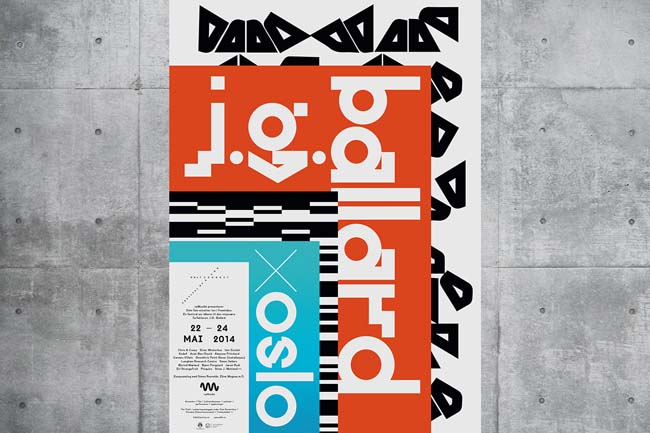
When we first heard that the festival’s theme would be J.G. Ballard we had no idea quite how challenging it would be to come up with a decent visual identity. It turns out that dystopian visions of the near future can be a concrete highway to cliché hell. It wasn't until the hidden layers of this particular festival were revealed to us that we were finally able to grab hold of a convincing and flexible design idea. As it turned out, the key to this festival is pitting Ballard’s work against Oslo’s recent architectural facelift. By placing Ballard within the context of Oslo’s contemporary urbanisation, we finally had a hook to hang it on.
Were you already familiar with Ballard's writing? How did it inform your approach?
In truth, neither of us was as familiar with Ballard’s writing as we thought necessary to really get to grips with the design, but we did our best to coax out a decent description of the who, what, where, when, how and why of this festival from the organisers, curators and editors themselves, so before long we didn't feel quite so ignorant or ill-read.
How did you go about translating Oslo’s contemporary architecture into graphic motifs?
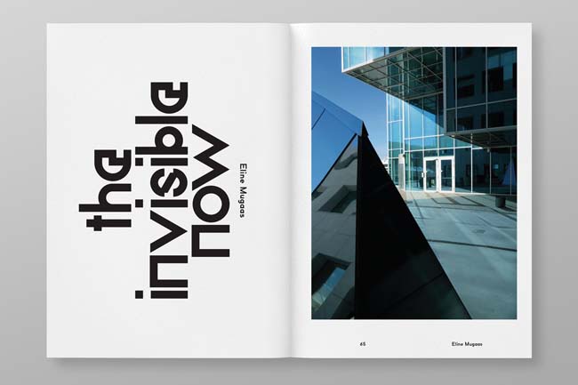
There’s a brand new urban redevelopment in central Oslo called the Barcode Project which the festival organisers described as being “in a permanent state of ‘the near future’” and which is characterised by its distinctive architectural styling. Each building seems to project its own personality, as if to convince us that the entire development is the result of decades, if not generations, of additions and redevelopments. Individually the buildings appear to exude the spirit of strident modernism but, when seen as a whole, the deliberate mismatching of textures and scale has the unmistakable stink of postmodernism. We stole the facades from each building, boiled them down to logo simplicity and then layered them on top of each other to create our own Ballardian vision of Oslo’s new skyline.
Why did you choose Paul Renner's sketches as a starting point for your typeface?
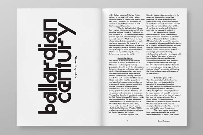
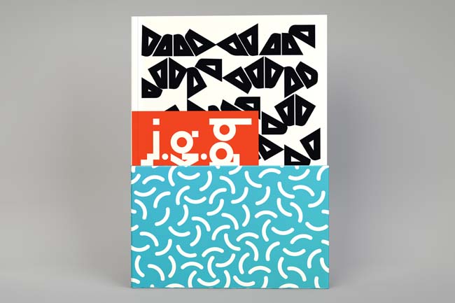
What’s striking about Paul Renner’s sketches for Futura is that they offer a reminder that no matter how geometric and dispassionate the finished typeface became, it was once oozing with quirks and idiosyncrasies that betray its thoroughly human and heartfelt origins. Renner’s desire for purity of form was indeed a human desire. His early sketches are charming and, it seems to me, all the more revealing of the power of emotion in the face of utopian idealism. So, we took these early sketches as a starting point but instead of continuing Renner’s path to modernism, we embraced the idiosyncrasies and then added more of our own. The zig-zag motif is again borrowed from the Barcode Project architecture, but it’s also a conscious nod to Wolfgang Weingart, one of the early pioneers of postmodern typography.
Did this project present any other notable challenges, and if so how were these overcome?
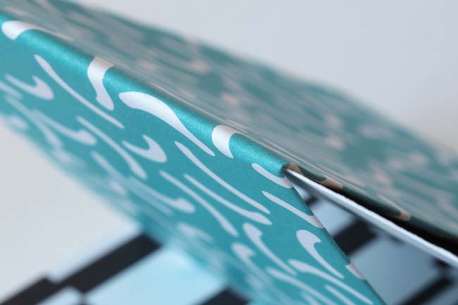
Fairly early on in the design process one of the festival organisers suggested creating an image of Oslo submerged in water: a reference to Ballard’s novel The Drowned World. We explored this concept, mostly unsuccessfully, until we hit upon the idea of adding a belly-band to the catalogue (it’s actually a festival program folded inside-out) to wrap a highly stylised depiction of water around the cover. We borrowed this water motif from David Hockney’s swimming pool paintings so as to create a romanticised vision of water, as though in wilful denial of the impending menace of rising sea levels.
What do you think has worked particularly well?
Being on the subject of J.G. Ballard we’re just happy it didn't end up being a complete car wreck, even if it had meant we could finally “join the car crash set”.
What was the client's feedback?
Well, as we write this the festival is in full swing. No doubt we'll get some proper client feedback once the panic is over.
non-format.com


