
The latest Letterform Live was a fascinating evening devoted to brutal typography, and as you might expect – from skyscrapers to poetry – concrete played a significant part. Theo Inglis reports.
Last night we presented the second event in Grafik’s Letterform Live series, hosted by Protein Studios and kindly supported by partnerships with Monotype and the ISTD. The packed audience witnessed five different speakers, each giving a short presentation inspired by a typographic letterform of their choice. The over-arching theme this time being ‘Brutal’, a term that is on trend yet also potentially divisive or contentious, but proved to yield five rich and varied talks from our panel.
Brutal could be interpreted literally, as in it’s dictionary definitions; “unpleasant or harsh” or “direct and without attempting to disguise unpleasantness”. Or of course there is ‘Brutalism’ the twentieth-century architectural style, defined by RIBA as having “an emphasis on materials, textures and construction, producing highly expressive forms”. It’s etymological origins being the French term ‘Béton Brut’, literally meaning raw concrete. Definitions aside ‘Brutal’ proved to be more of a feeling or mood last night, something that you know when you see it…
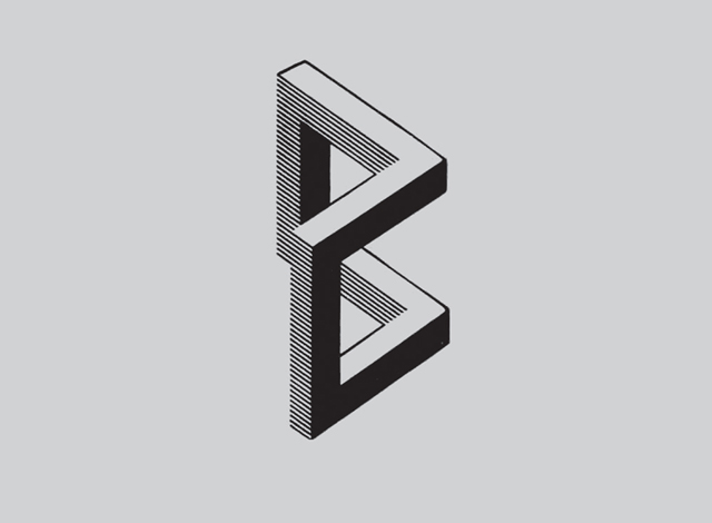
Up first was Clare Skeats, a freelance book designer and art director, who previously worked in-house for Penguin Books, Random House and fashion designer Margaret Howell. She also teaches graphics on the foundation course at Central Saint Martins. Clare began with her chosen letterform; an angular and M.C Escher-esque ‘B’. This ‘B’ was the logo of Interbau, a Berlin housing development constructed in 1957, which featured buildings designed by luminaries of Modernism, such as Oscar Niemeyer, Walter Gropius, Arne Jacobsen, Le Corbusier and Alvar Aalto. The designer of the logo itself remains unknown, but its structural construction and strong aesthetic does justice to such notable architecture.
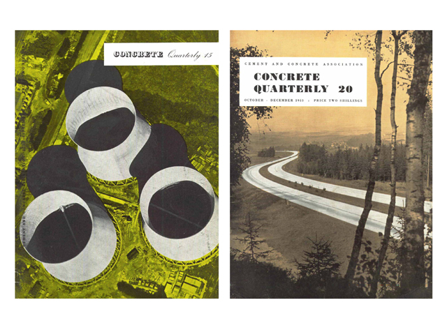
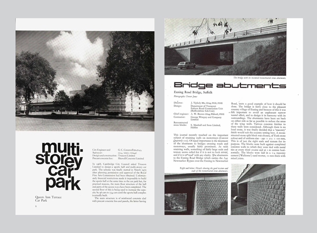
Clare found this logo in a 1958 issue of the specialist magazine Concrete Quarterly, her interest in this subject had partly been sparked while working for Margaret Howell. Someone who is well known for her promotion of post-war modernism and utilitarian design, and had given Clare a collection of concrete related ephemera as a reference point for a design brief. So began a graphical tour through the design of Concrete Quarterly guided by Clare, starting with mainly slab-serif typefaces accompanying dry articles on new bridges and roads. But the editorial soon became more optimistic, with one feature celebrated the new Alton Estate in Roehampton. Although this development was later voted one of London’s worst building in a poll by Thames TV viewers in 1984. By issues 15 to 20 the covers had become more expressive and “madly overprinted” with imagery that “made clear it was about concrete, just in case you thought it was a magazine about trees”.
In the mid sixties, once concrete became more ubiquitous, the magazines circulation surged to an impressive 25,000 readers. Clare showed some examples from this era, where the magazines designers had used ‘jolly decorative type’ to contrast with the heavy content, but this was soon replaced by a more expected use of the strong typeface Compacta in 1969. By the seventies the photography in the magazine, and on its cover, had become less monumental and harsh, instead it now included people, interiors and more lifestyle imagery, all at a “more human scale”. One particular issue in 1977 suddenly used lots of fun display typefaces and playful typographic layouts to mirror the subject matter of the individual articles.
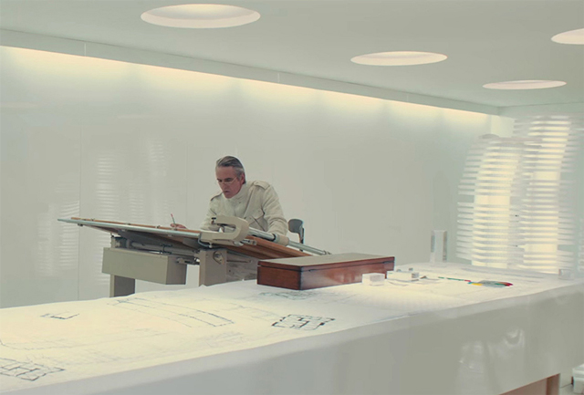
But the “party was over” by the next issue, which only used Futura Condensed, Clare wondered if there was a new and more serious art-director who “confiscated all the Letraset.” Her talk ended with an image of the architect character, played by Jeremy Irons, from the recent J.G Ballard film High-Rise. She accompanied this with a quote found in Concrete Quarterly about an unnamed architect (although somebody else will name him later) who moved into a flat at the top of the tower-block he had designed as a PR stunt, and an anecdote about visiting journalists being shown by the architect how the windows could be opened and cleaned, which resulted in a gigantic gust of wind knocking over everything in the flat. Despite the heroic optimism of the period when concrete was king, things were clearly far from perfect…
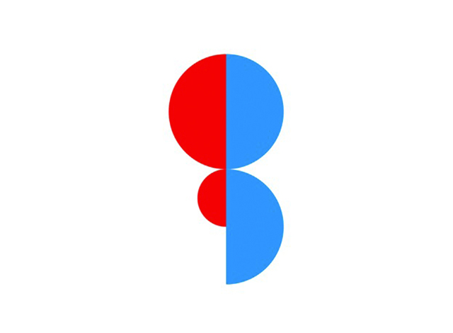
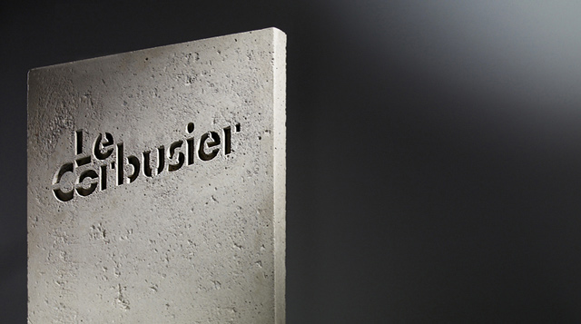
Our next speaker Patrick Myles continued this discussion of typography meeting architecture. Patrick is a freelance graphic designer and art director with extensive experience of this subject, having previously worked on both Blueprint magazine and the RIBA Journal. His choice was also a ‘B’ from a logo. This time, however, it is a contemporary one, designed by Polish design studio UVMW for the ‘Beton Foundation’. The foundation covers a wide variety of interests, starting with the 20th century and the legacy of modernism, as well as the different ways of depicting architecture in film, computer games and futuristic utopias. Their logo took inspiration from the architect, and father of Brutalism, Le Corbusier and his famous ‘Modulor’ diagram. The logo follows both its colour scheme, and proportional scale. This scale was something ‘Corb’ used when designing all his buildings to try and create a “harmonious human scale”.
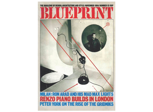
Patrick went on to talk more about Le Corbusier, explaining how he coined the term ‘Béton Brut’, and pioneered the Brutalist style with his Marseille housing block Unité d'Habitation. Corbusier also believed that “a house is a machine for living”, something which for Myles partly explains his consistent use of the stencil font Charrette, usually found in an industrial context on machines and vehicles. Patrick pointed out that the font was not in fact Corb’s design as sometimes claimed, and its name is simply the French for stencil. However, it has become the iconic font of choice for many architects ever since, and inspired the masthead of Blueprint magazine, which also used his red blue colour scheme in one cover in 1984.
This discussion of architecture and typography working in harmony continued with Patrick’s next example; Bibliothèque’s identity and design for the Barbican’s 2009 Le Corbusier exhibition. For this, the design agency chose to blend both the Barbican and the architect’s work, by creating a stencil version of Futura and setting it into raw concrete. The exhibition’s posters also used this rough texture, and the different sections of the gallery were divided using his red and blue colour scheme. Finishing off his presentation, Patrick commended another logo which, although not ‘Brutal’, “marries architecture and typography”; the Hepworth Wakefield logo designed by A Practice for Everyday Life. Designed to be sandblasted into David Chipperfield’s minimalist concrete building, with it’s angled stems delicately reflecting the buildings form. Luckily if you want to know more about this, Patrick has written about it for us here.
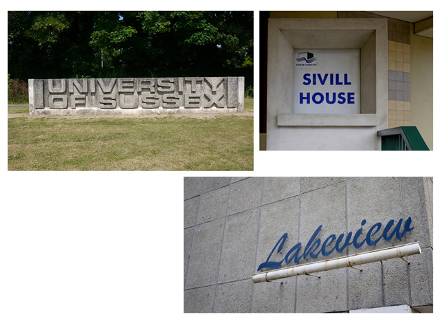
Presenting next, and continuing our journey across all things Brutal, was Peter Chadwick, who runs Popular UK and teaches graphic design at Chelsea College of Art. Luckily for us, Peter also runs the hugely popular twitter account This Brutal House which celebrates Brutalism extensively, and has recently become a book published this week by Phaidon. His talk began with a confession; “I like concrete, electronic music and letterforms”, but not being able to afford a red Ferrari for a mid-life crisis, Peter instead chose concrete… This honesty was followed by a discussion of the good (concrete letters by Basil Spence) the bad (a dull printed sign at Lubetkin’s Sivill House) and the ugly (a dated script on the raw concrete of the Lakeview estate) of Brutal typography.
We swiftly moved onto better things; Peter’s chosen letterform. Which was a mysterious ‘W’ from the signage at one of his favourite buildings, the Ernő Goldfinger designed Balfron Tower in Poplar, East London. However not being able to recognise the typeface used, Chadwick got a little worried and turned to his many online followers… no luck there either sadly.
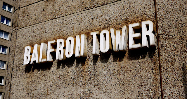
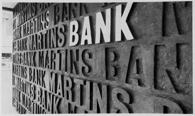
Then Stephen Coles of Typographica came to his aid, by comparing it to similar typefaces he pointed out that the ‘W’ is distinct and inconsistent, and the letters shows many signs (highly technical ones at that) of not being designed by a typographer at all. Next came typographer and type historian Phil Baines’ opinion, he pointed out that Goldfinger took a keen interest in the signage of his buildings, and that the letters were probably not from an existing typeface, rather prefabricated by a supplier, or perhaps custom made. They do however make a rather appropriate accompaniment to the Brutalist tower block’s raw concrete. Peter then showed some more examples of typography in Goldfinger’s work, pointing out his taste for condensed, bold and all-caps sans-serifs and showing the great lettering on his 1957 Martins Bank building.
Next we learned a little more information about Ernő Goldfinger, who was born in Hungary and knew Mies van der Rohe and Le Corbusier in Paris, before fleeing, like many other modernists, to Britain in the thirties amid the political chaos of Europe. Peter explained that despite his deep socialist views and seemingly utopian architecture, Goldfinger was a “bit of a monster” and a “very humourless man”. The James Bond creator Ian Fleming first crossed his path when objecting to Ernő’s demolition of the traditional cottages in Hampstead on the plot where Goldfinger built his own Modernist house at 2 Willow Road. A scathing discussion Fleming had with Goldfinger’s cousin in-law then prompted him to appropriate the name for one of his Bond villains. Something which resulted in a legal threat from Ernő, although it was eventually resolved out of court.
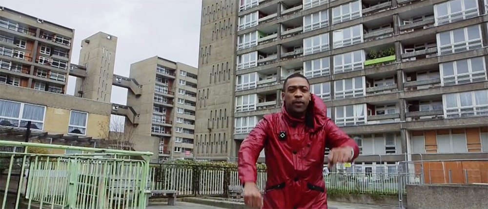
Balfron Tower is one of his most iconic buildings, and for Chadwick one of the best examples of Brutalism in this country, with it’s iconic linked service shaft straddling the main building. Goldfinger even moved into the top floor penthouse (as alluded to by Clare earlier), but this didn’t last long, and due to poor management it eventually became a symbol of inner city decay in an era when such high rise blocks were neglected and vilified. Balfron was eventually used in Danny Boyle’s dystopian film 28 Days Later, but also became a totem for the east London grime music scene, namechecked in a song by Dizzee Rascal and providing the backdrop in the music video of Wiley’s track ‘P Money’.
Our next speaker was Paul Finn of graphic design partnership Fitzroy & Finn, and associate on Central Saint Martins’ MA Communication Design course. Paul’s energetic and passionate presentation began with his chosen letterform; an intriguing combination of ‘m’ and ‘n’. This letter was an entire poem in a single letterform, Aram Saroyan’s A Poster Poem created in 1965.
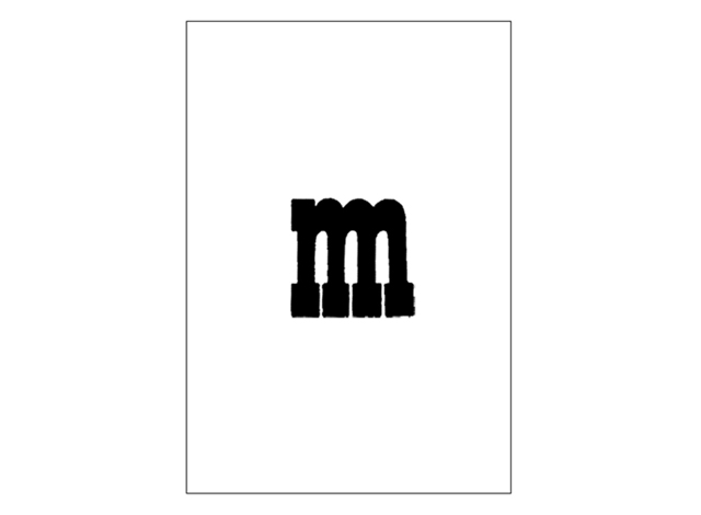
This is an example of ‘Concrete Poetry’ a twentieth-century movement which involved “being aware of graphic space as structural agent”, Paul found this new hybrid letterform particularly interesting, as it is the alphabet being “compressed, but then also expanded, as the new letter is created”. He then took us on a fascinating and visually incredible whirlwind tour through concrete poetry, from it’s origins in the late 19th-century work of Stéphane Mallarmé who “liberated the page”, “rocked asymmetry” and was “totally radical”. Finn used quotes from concrete poets to explain what he was showing us, including “the concrete poem communicates its own structure”. The poets he highlighted included; Eugen Gomringer, who was at HfG Ulm with Max Bill, Augusto de Campos, the Futurist Guillaume Apollinaire, Bob Cobbing, Diter Rot, Hansjörg Mayer, Wolf Vostell, Reinhard Döhl, Mary Ellen Solt, Ian Hamilton Finlay and Dom Sylvester Houédard (who often used Edward Wright’s Flaxman typeface). As well as the influential artist Kurt Schwitters.
With it’s “restricted use of language” Finn drew parallels between the way the concrete poet’s worked and how new modern forms of technology are making us use language. He also finds inspiration in the playful way they use typography, how it manages to be expressive yet simple just through the form of the layouts. The way the letters and words flow or are so particularly assembled. Sometimes they can almost be puzzles which use typography to make you “aware of time and space and language” without you even realising. Paul concluded that it is amazing how much can be “manifested just from twenty-six letters”.
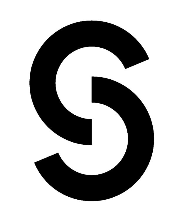
Our final speaker, closing out the evening, was German designer Holger Jacobs, the co-founder of the agency Mind Design, and professor for typography at the University of Applied Science in Düsseldorf. He began his talk, in Shoreditch appropriately, by showcasing what he calls the ‘Hipster S’ a strange “mutated” letterform constructed from two circles that Holger has started noticing everywhere. From the hairdressers opposite where he lives, to the trendy new identity of the university he teaches at. The hipster ‘S’ is taking over…
Holger then introduced a mysterious designer, known on social media only by his moniker - ‘KPD’, an “obvious hipster”, this clear from the beard, big glasses and grainy effect in his profile picture, this designer uses the hipster ‘S’ in his work. Which “like all German hipster designers, he creates without a computer”, instead drawing by hand. His work apparently “appears to be inspired by the likes of M/M Paris”.
But Holger, after showing some of the amazing typographic work of ‘KPD’ then pulled the rug from under us, by revealing that the whole thing was a fabrication. KPD, in fact, stands for Klaus Peter Dienst, an almost completely unknown German artist and designer who in fact died in 1982, and all the incredible work we had been shown was created in the sixties and seventies, and has rarely been seen by anyone! Klaus spent most of his life working as a high school art teacher in a small town in “the middle of nowhere” which he rarely left because he was “pretty broke and couldn’t afford a train ticket to Hamburg”, this in part explains his obscurity. He was also “in between everything” not really a designer, artist or typographer, he slipped between the cracks. Holger finds it fascinating how contemporary his work now looks, despite its “very amateur approach”. He considers him to be an “outsider typographer”. But also rather “borderline” he tried many techniques throughout his work, not all of which worked, and most of it was created “without an audience, mainly for himself”. For Jacobs this made it very difficult to research him, there is not much online about him. He ended up meeting his brother Rolf-Gunter Dienst, who was a more well-known artist (he sadly died recently), and being shown a portfolio full of previously unseen KPD work.
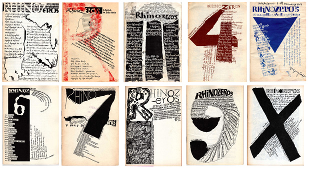
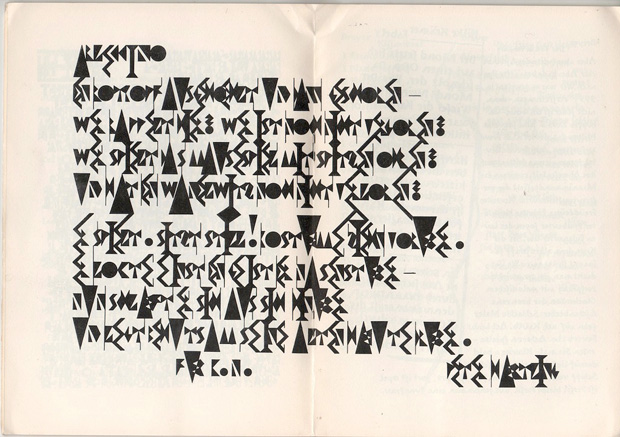
Klaus Peter Dienst and his brother, when aged twenty-five and eighteen had worked together on self-publishing a cheap but innovative literary zine called ‘Rhinozeros’ which ran from 1960-64. Rolf had contacted the contributors, and Klaus worked on the design. They somehow managed to get many famous Beat writers to contribute previously unpublished texts, William Burroughs even came to see them at home and their mother made him a cake. Despite the high calibre of content, Klaus showed little concern and “brutalized their texts” with his experimental layouts and typography. Even prompting a highly critical letter from one contributor, the Dadaist Hans Arp.
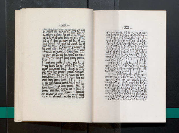
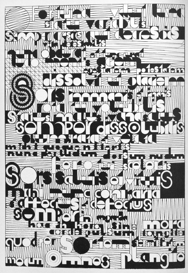
Holger also showed us another of his projects, the ‘Dictonaire Grapho-Grammatico’. A book created by drawing on top of an existing book, obscuring the text. It begins gentle and gets more brutal as the book goes on, turning text into texture. Jacobs had a huge amount of examples of Klaus Peter Dienst’s unique work, the majority of which you sadly won’t find online. But luckily he is working on a book and exhibition of his work. So hopefully KPD won’t remain so little known and unrepresented for much longer…
The evening concluded with a handful of questions to our speakers from the audience, before everyone retired to the bar for drinks and a chat, probably about all things ‘Brutal’.
Special thanks to all of our speakers and to Monotype and the ISTD for their ongoing support. The next Letterform Live event ‘Experimental’ will take place on 29 June 2016.


