
Novelist Will Wiles believes that, when it comes to Royal portraiture, artists should aim to make their audience tremor rather than simper.
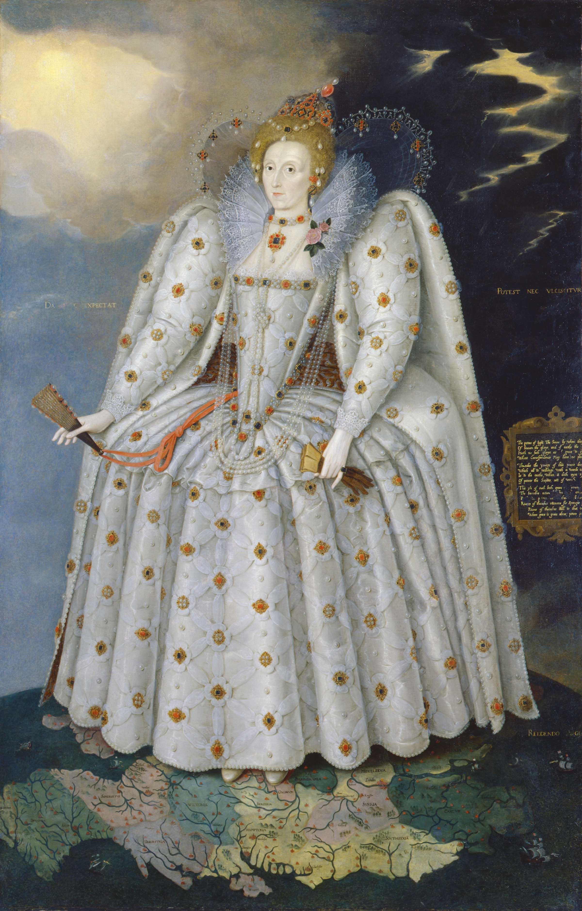
Sir Roy Strong's book Gloriana, a study of the portraits made of Queen Elizabeth I, opens with a striking comparison. A 1546 painting of the future Elizabeth R as a young girl is set against the 1592 “Ditchley” portrait. The first depicts its subject as human and vulnerable; the second is barely human at all, more a mass of menacing abstraction. The vanquisher of the Armada stands with England literally at her feet, encased in a dress that is more Mecha battlesuit than frock, under a sky poised between sunlight and storms. The nation, the seas, the very elements are hers to rule. “The painter … approaches her awestruck as he struggled to depict someone who had become an unmarried ruler of legendary fame, a visionary figure towering above her realm of England, an image of almost cosmic power. In a span of forty years an individual has been transposed into a symbol.”Royal portraiture was a risky business in the time of the first Elizabeth. Ever brand-conscious, she banned on unauthorised images of herself and instructed public officers “to aid the Queen's Serjeant Painter in seeking out unseemly portraits which were to her 'great offence' and therefore to be defaced and no more portraits to be produced except as approved by the Serjeant Painter.” Portraits were to Renaissance diplomacy what weaponry was to war. They were highly encoded instruments of power-projection, part of the equipment used to assert legitimacy, weld alliances and buttress dynasties. The under-housetrained hounds of the British press corps have always seen the fine arts as an entertaining chew toy. In the time of the second Elizabeth, royal portraits might have lost their geostrategic potency, but they can still prove dangerous for painters. Strong was director of the National Portrait Gallery and oversaw the production of several. In his highly entertaining diaries he recalls a 1967 lunch with Her Majesty, when he was new in the role, in which she denounced a series of the images made of her. She wouldn't allow one to go to Scotland “as it was too awful. Another made her into a midget.” The disapproval of the monarch is the least the portraitist has to worry about. The under-housetrained hounds of the British press corps have always seen the fine arts as an entertaining chew toy. That is particularly that case when artists stray into what the papers see as their exclusive territory: depicting the Royal Family. Pietro Annigoni, painter of two of the most successful portraits of Elizabeth II, had the Daily Express try to guile its way into his studio.Little has changed since the 1960s. When Lucian Freud's 2001 portrait was revealed, the Sun called it a travesty and the Times' critic said: “The chin has what can only be described as a six-o'clock shadow, and the neck would not disgrace a rugby prop forward.” The artist Antony Williams was surprised by the reaction his 1996 portrait received: “I simply didn't anticipate such a tirade of abuse, especially from some of the critics.” Williams' rendering of the Queen's hands took particular flak: his portrait is still associated with the phrase “sausage fingers”. “Lord St John of Fawsley says they are not the Queen's hands, but they are,” Williams wrote. “They were like that! There is some exaggeration, because you're not painting a photograph. A painting is transformed actuality. They are paintings of hands - not real hands … My portrait is an honest painting of the Queen, but it is not honest to the visual accuracy only: it is more than that. It is honest to the process of painting.”
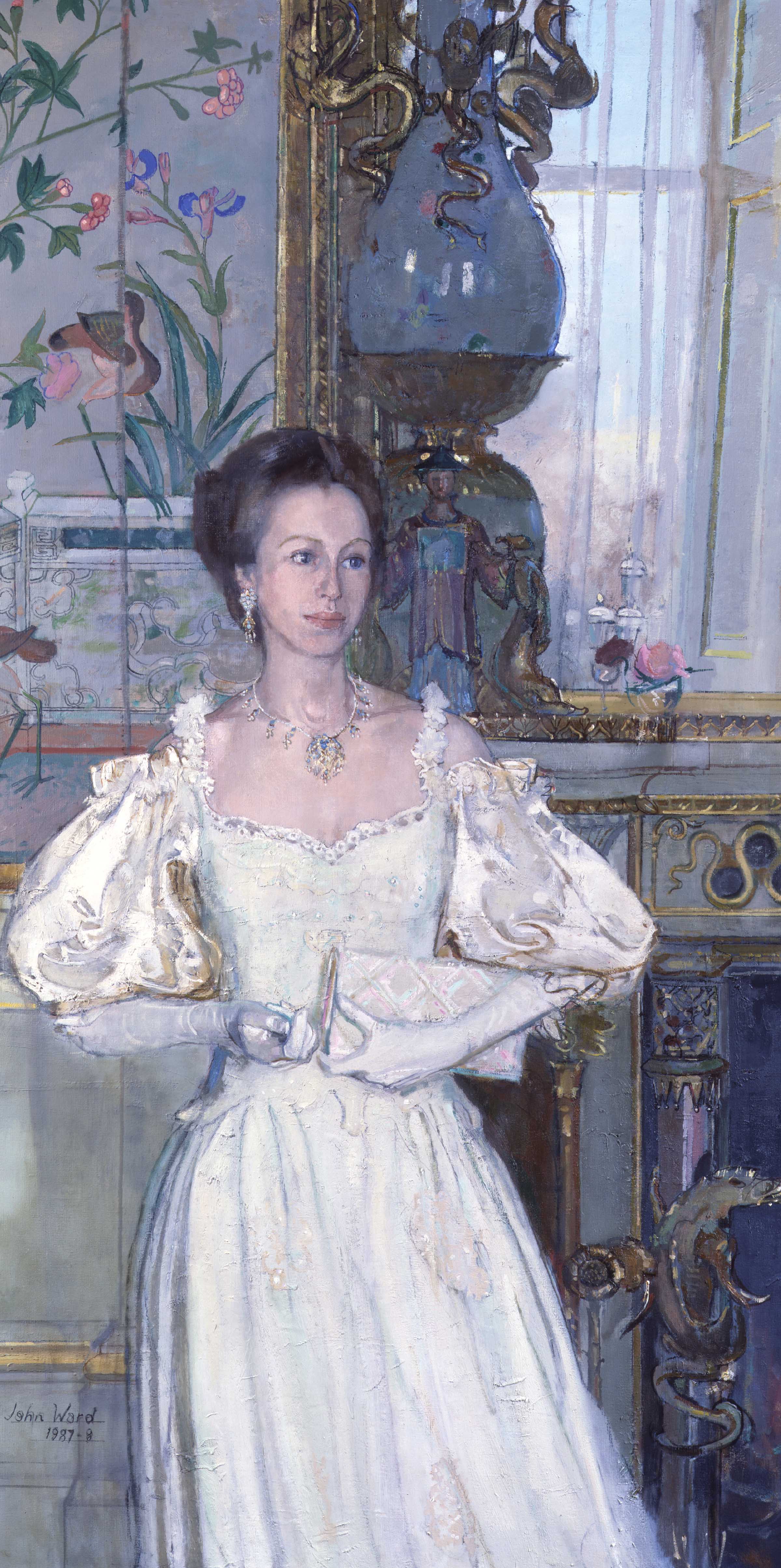
The Freud and the Williams are in fact two of the most interesting paintings of the Queen, simply because they are honest and naturalistic. Scores of portraits have been produced during her long reign, and the majority are simply forgettable. Others are memorable for the wrong reasons: they are sentimental and saccharine. Rolf Harris's 2006 portrait stands out as a particular horror, with its soft-focus pointillist pastels and the unlikely rictus of pleasure on the Queen's face. Whether or not those are the Queen's teeth, it is hard to imagine her ever arranging and displaying them in that manner. Unbelievably the Harris portrait came third in a 2006 Radio Times poll in which readers were asked which of ten portraits of the Queen they preferred – one wonders how much that figure reflects fondness then adhering to Harris, and what the result would be if the poll were repeated today. As a subject, the Queen can flummox even gifted portraitists such as Tai-Shan Schierenberg, whose 1997 painting of the Queen and the Duke of Edinburgh sits ill at ease with the rest of his work – a gaudy PG Wodehouse novel mistakenly shelved with serious social realism. Meanwhile Susan Ryder's 1997 painting and John Stanton Ward's 1988 vision of Princess Anne draw more from the popular romance section, all wistful looks and gilt-heavy furnishings.
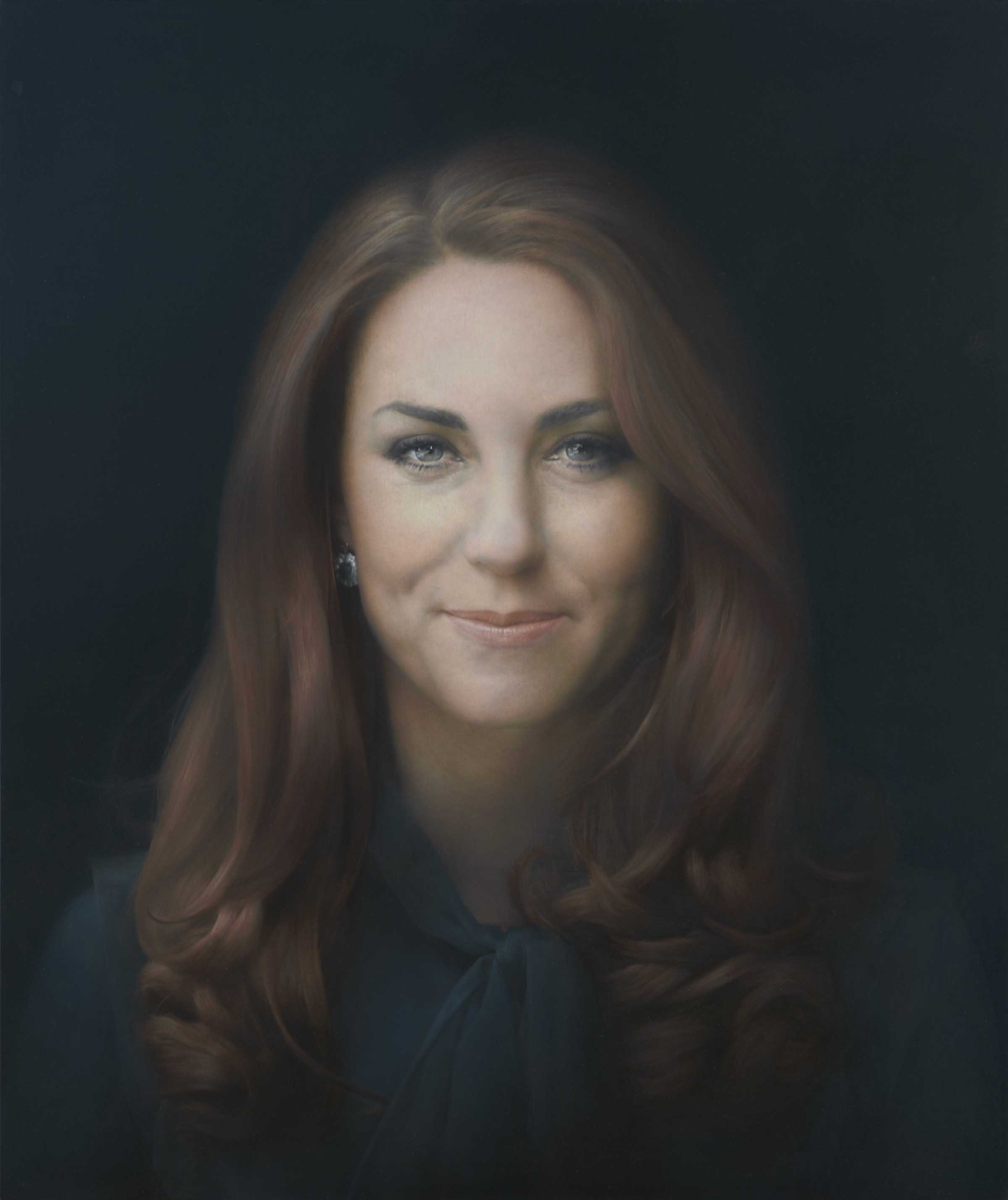
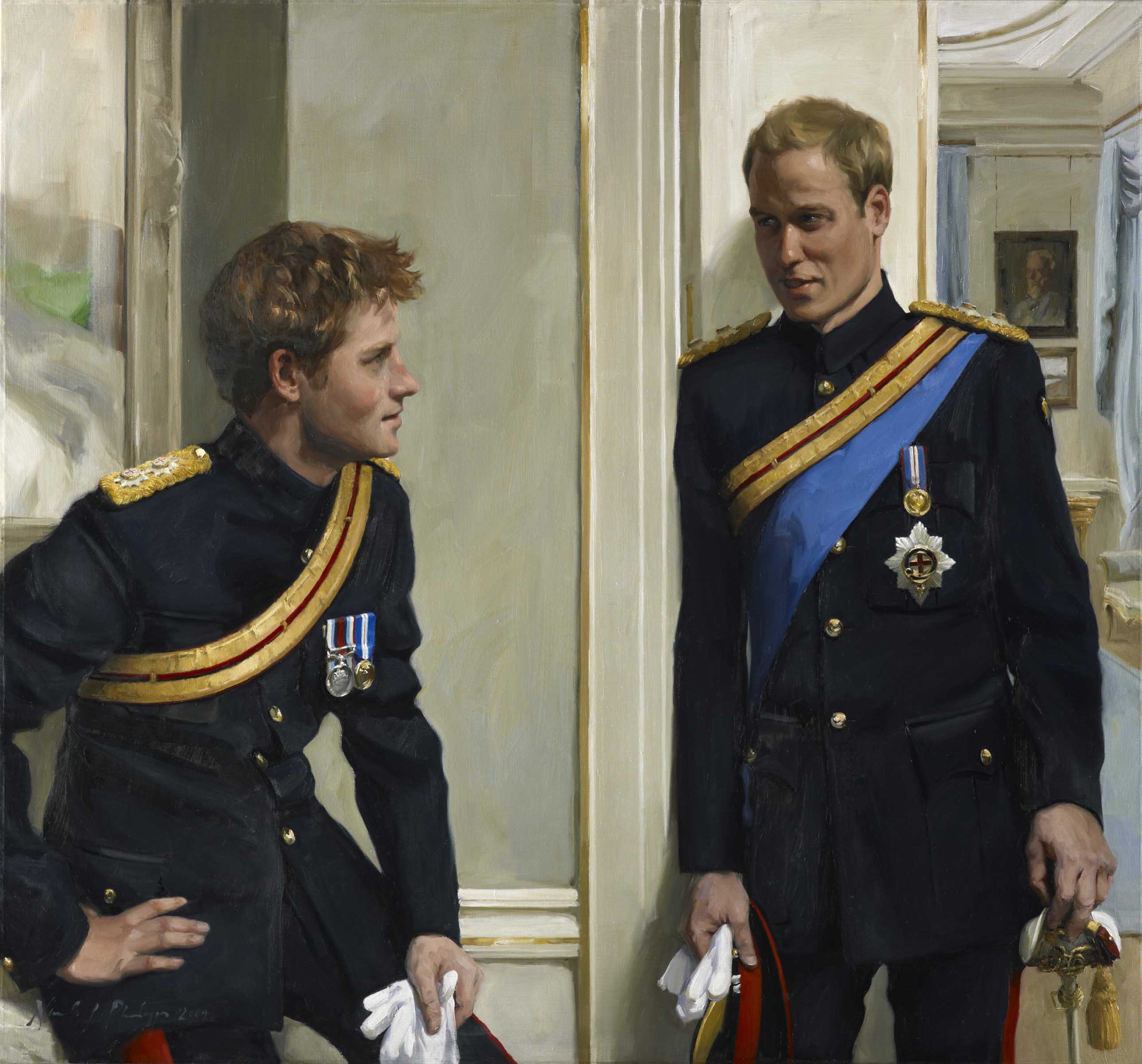
The most recent major portrait is by Nicky Phillips, commissioned by the Royal Mail for use on stamps. (One of the interesting things about undertaking a survey of portraits of the Queen is the range of organisations that have commissioned them: the Royal Automobile Club, the Cunard shipping line, the Ascot Authority, the Worshipful Company of Drapers, the island of Jersey.) Phillips' portrait has an Edwardian, dull-but-worthy quality to it, a quality shared by her 2009 portrait of William and Harry, in which the formality of the princes' military uniforms is countered by relaxed poses. But they do at least have a sort of reassuring solidity, unlike Paul Emsley's portrait of the new-minted Duchess of Cambridge – “rotten … the nose is wrong … the eyes are wrong … all-round disaster”, The Daily Mail – which has the eerie non-specificity and indistinct edges of one of those composite images in which thousands of photographs are melded together to produce an “average” face. Perhaps those qualities are inherent in the Middleton features, a kind of standardised ideal, suitable for princessing.
The trouble here is not that the Queen and her family is almost always painted in a very traditional way. That's to be expected, and can have perfectly decent results, such as Rupert Alexander's 2010 portrait. And when artists are consciously modern or iconoclastic in their approach, the results are often unsatisfying or uncomfortable. In particular, George Condo's infamous 2006 “Cabbage patch queen” is too ugly for a tribute and too cuddly to be a bracing sacrilege. Trad and non-trad alike get equally rough treatment from the papers. “Sneering at royal portraits is part of British culture,” wrote the Daily Telegraph's Mark Hudson at the conclusion of a gleeful hatcheting of the Emsley Kate. But that may be the British press confusing its own proclivities with those of the people it claims to represent, not for the first time. Royal portraitists have a nigh-impossible job. Be rigorous and naturalistic enough – or outrageous enough – to please critics who don't care for the idea of the Queen, let along paintings of her, and you'll upset the middlebrow jackals of Fleet Street. Play it chocolate-boxy and you'll be dismissed as a suck-up, a kitsch-merchant, and the jackals probably still won't be pleased, because a jackal is only really pleased after it has ripped something to shreds.
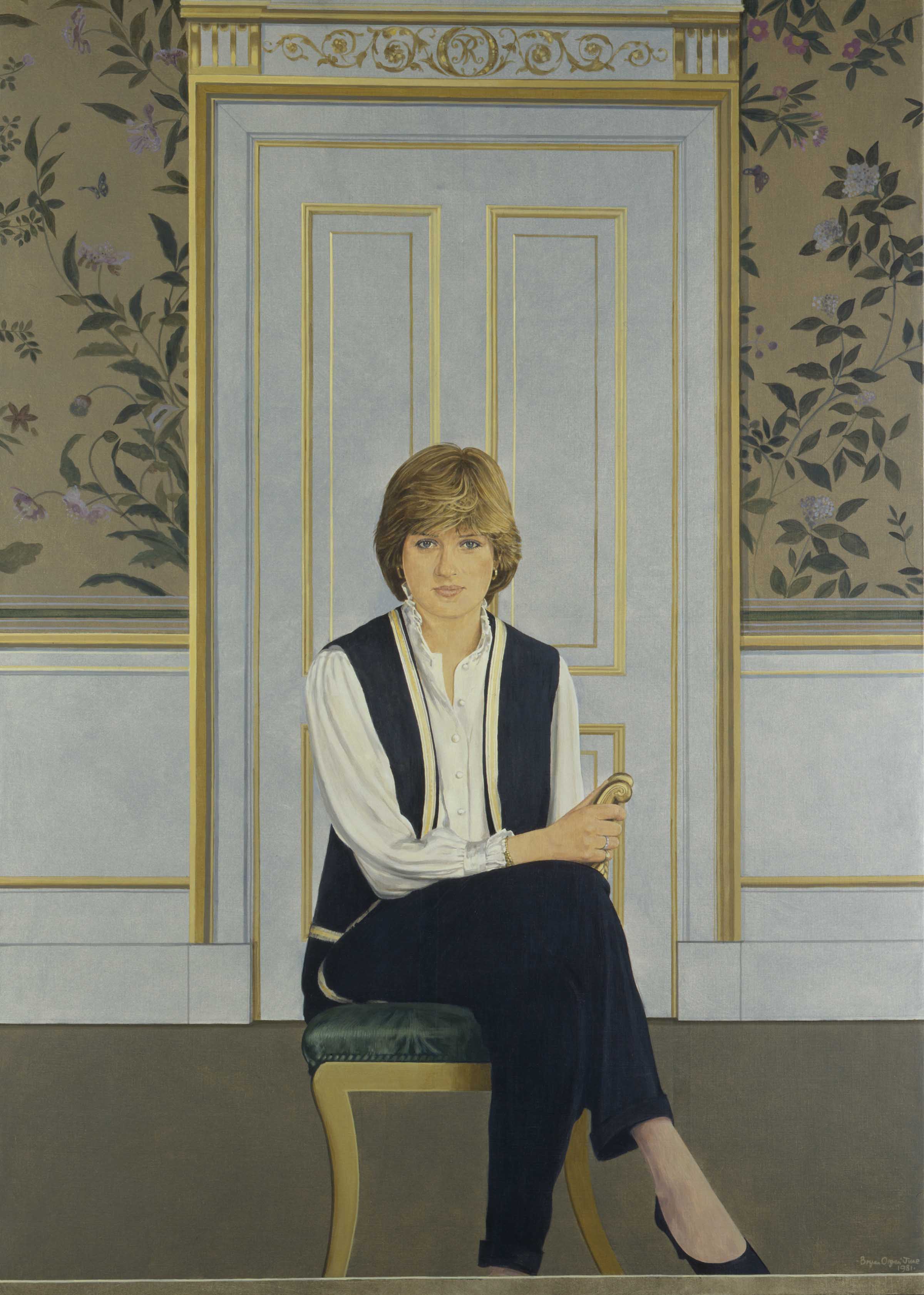
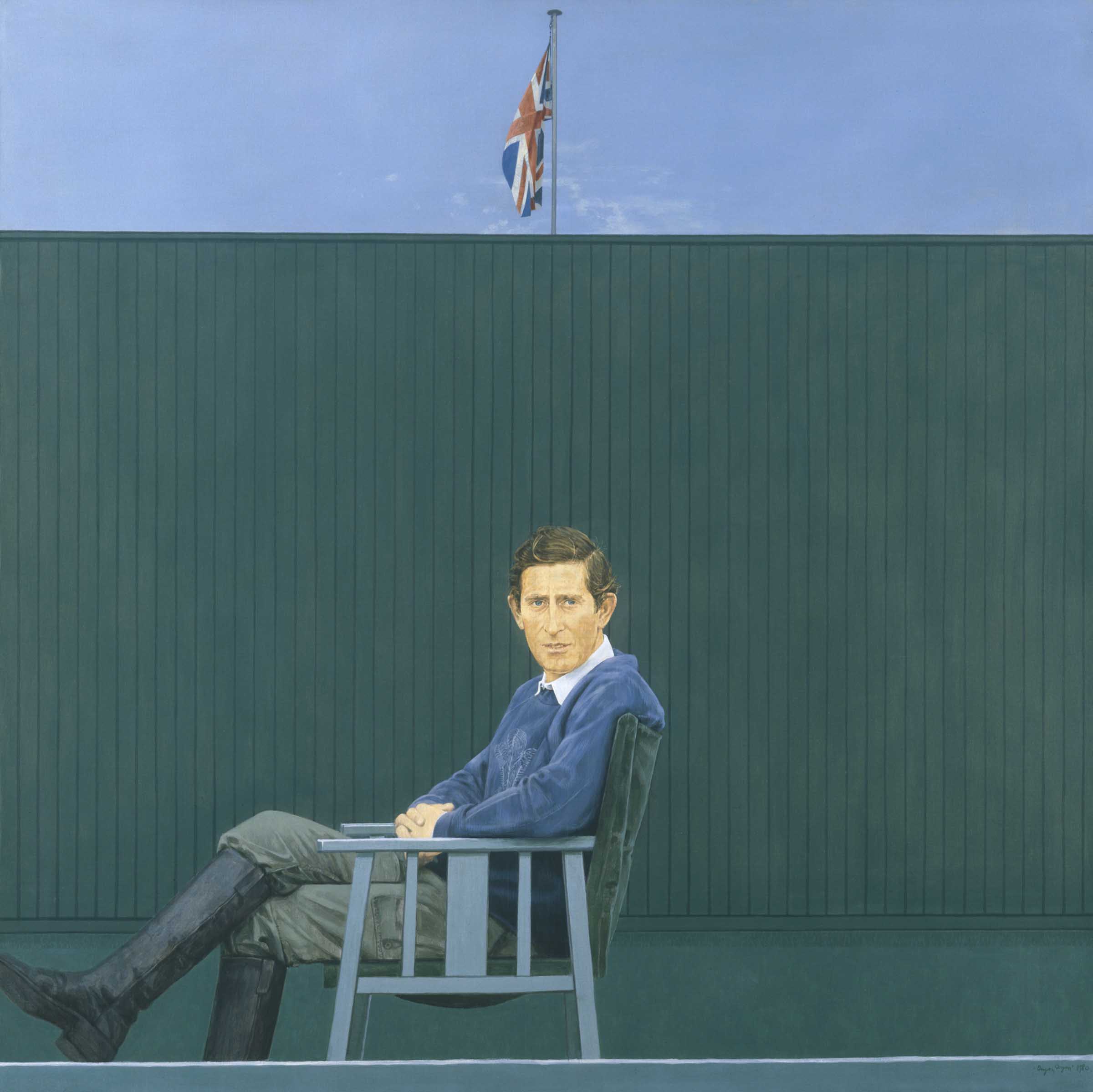
In retrospect, some of the royal portraits of the 1980s look like successful efforts to reconcile a highly traditional subject with a modern approach and the necessary regality with some humanity. Michael Leonard's relatively casual Queen and corgi – which came second in that Radio Times poll – still stands out from the crowd as fresh and interesting. So too do Bryan Organ's twinned paintings of Prince Charles and pre-princessing Diana – a Hockneyesque simplicity to the composition, their subjects relaxed yet still formal. They look far more like products of their age than Phillips' leaning princes or Emsley's photofit princess. Yes, the Queen is a human being, but as a matter of basic constitutional fact she is Not Like Us. But while this desire for the royals to appear human might be very widespread, maybe it's the real poison in the poisoned chalice of their portraits. Royal portraitists may believe they are painting a person and that respect and honesty is enough, but the Queen, while undeniably corporeal, is also and perhaps more importantly an idea held in the heads of her subjects. That idea will of course vary from head to head, and even it can be a very confused and contradictory idea, jumbling up the long-serving ruler of a storied state, the embodiment of English and British history and continuity, the head of an international church, with a kind of winsome national granny. This explains the popularity of chummy parodic Twitter accounts like @Queen_UK, and also why such accounts are so fucking awful. Yes, the Queen is a human being, but as a matter of basic constitutional fact she is Not Like Us.
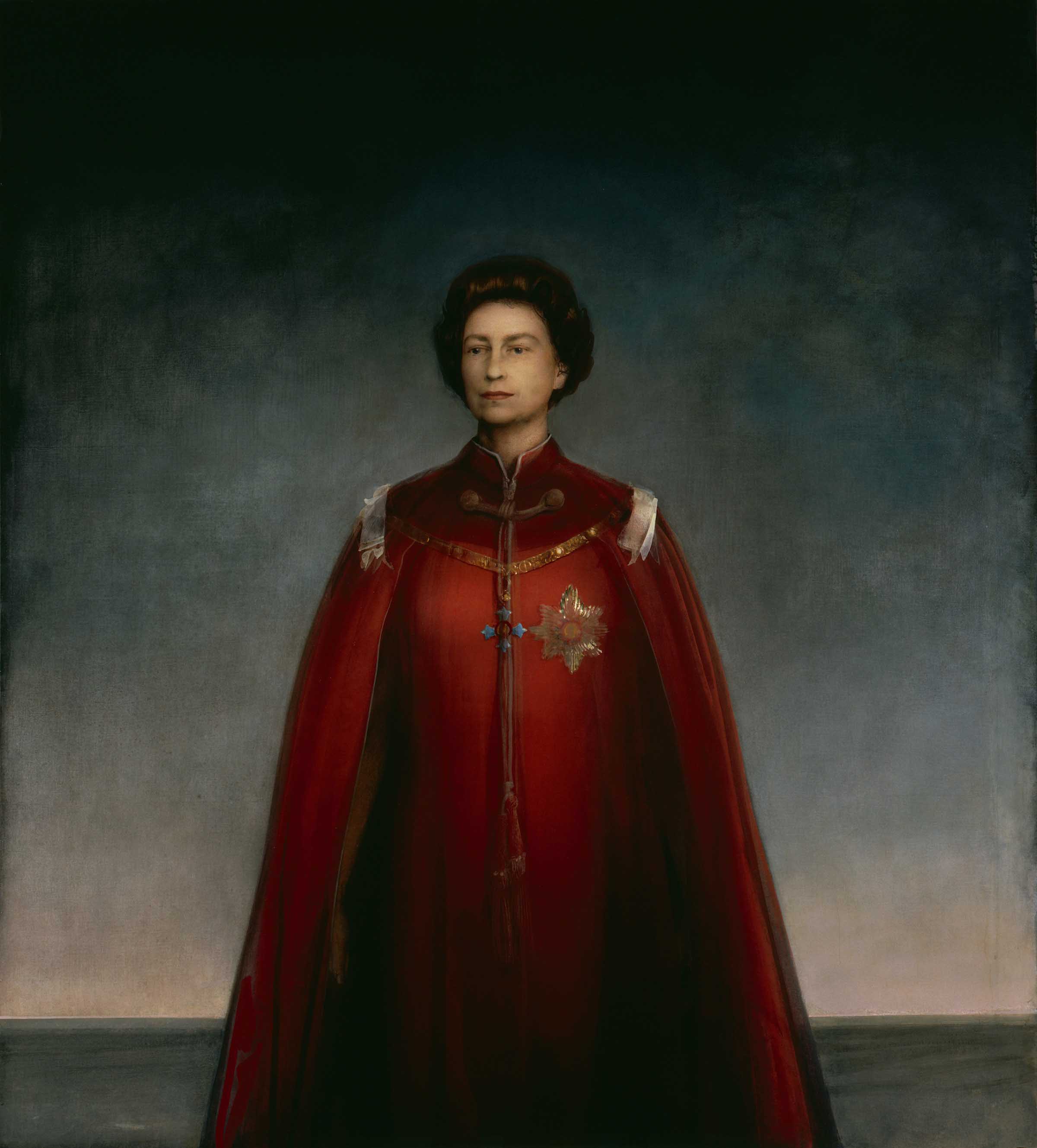
If we are going to have a monarchy, and all signs point to that continuing to be the case for the foreseeable future, we should be clear about that. Justin Mortimer's hugely controversial beheaded queen of 1997 was interpreted as being disrespectful, but has a sinister mystery about it, a touch of regal distance and difference, unreality, sublimity, thrilling terror. It makes you yearn for a Francis Bacon study of the monarch (if only). Pietro Annigoni's 1955 portrait of the young Queen is often cited as the best made, and it is a superb combination of technical excellence, reliable likeness and moody windswept majesty. There's also a great deal to be said for the same artist's less popular 1969 portrait of Elizabeth robed in scarlet, a fearsome figure against an epic, blasted horizon. “I did not want to paint her as a film star,” says Annigoni in the explanatory note that accompanies this painting in the National Portrait Galley. “I saw her as a monarch, alone in the problems of her responsibility.” Damn right. What's needed from royal portraits is a bit of sublimity and awe – some of that “cosmic power” Strong saw crackling around the Tudor Elizabeth. All the paintings used to illustrate this article are held within the collection of the National Portrait Gallery, London. Founded in 1856, the institution's stated aim is "to promote through the medium of portraits the appreciation and understanding of the men and women who have made and are making British history and culture, and ... to promote the appreciation and understanding of portraiture in all media". The gallery can lay claim to the most extensive collection of portraits in the world.