
Since its first edition in 1897, Bram Stoker's blood sucking Count Dracula has continued to capture readers' imaginations. Emma Tucker looks at how this gothic horror story has been depicted over the years, through twelve classic book covers.
As with so many pieces of classic literature, each edition of Dracula calls up the ghost of its predecessors. Much like Alice in Wonderland, designers of covers for the Count must tread carefully to avoid tired old graphic motifs.
As Tim Pye – curator of the recent Terror and Wonder: The Gothic Imagination exhibition at the British Library – says, “There's only so many ways of depicting the Count, fangs exposed, heading towards the neck of his next virginal victim.” However while the 118-year-old book might conjure up obvious imagery, Dracula's visual history is not only surprisingly varied but has inspired a raft of contemporary covers that have done away with the standard bat-and-blackletter.
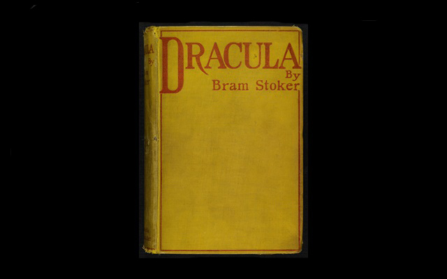
The first edition of the book – published by Archibald Constable and Co. in 1897 – was a remarkably restrained affair, with just four red words and an 'R' with a beautiful fang-like descender. Although there's no records of who might have designed it, Pye explains the cover has led to plenty of speculation about the significance of the chosen colours. “Was the yellow used to suggest that the novel's content was risqué, daring and excitingly disreputable (much like Aubrey Beardsley’s The Yellow Book or the corrupting yellow novel read by Dorian Gray)? Does the red lettering hint at the role of blood in the novel? In these regards the cover ties the novel to the perceived degeneracy and unease of the Victorian fin de siècle,” he says.
Later editions took more literal approaches, like the 1902 Doubleday cover which depicts a looming, shadowy cloaked figure; or the 1930s Grosset and Dunlap edition which features an enormous pair of eyes hovering over a women lying in bed. Some, like Scholastic Classics' 2002 paperback, which shows Dracula emerging from a coffin surrounded by spiky gothic type and architectural forms, were perhaps too obvious.
In latter years designers have taken less conventional routes, with design studio Non-Format creating a Penguin Classics cover that dispensed with imagery in favour of angular typography. Given a short excerpt from the text to create a cover with, the studio described the process as akin to “walking a tightrope across a vast cavern of cliché”.
“It was a matter of creating a typographic expression that would convey a convincing Dracula vibe that wouldn't seem archaic or weighted down by past visual expressions of this classic vampire story,” the studio told Grafik.
Cover designer Coarlie Bickford-Smith also found Dracula an intimidating design challenge, made all the more so by her own “guilty” enjoyment of vampire novels. “I have a lot of this imagery floating around in my head that I tried to ignore,” she says. “I just wanted to respond to the text on a personal level rather than consume myself with another person's response.”
The end result was satisfyingly non-traditional, with a cover taken over by a tangle of garlic flowers. However while avoiding the novel's raft of go-to imagery is a challenge, curator Pye believes that the story's familiar status could give designer's greater liberty. “Dracula’s incredibly striking imagery and themes, its horror and humour, provide huge scope,” he comments. “It helps that the story is so well known that a new design doesn’t necessarily need to be explicitly tied to the plot.
With some help from Pye, Grafik looked back at twelve stand-out covers from the past 118 years.
Archibald Constable and Co edition, 1897
“The only hint at any sort of decoration is a thin red border running around the edge of the front cover. It’s quite understated and a fairly unremarkable cover by the standards of the time (the bindings on Stoker’s two previous novels for Constable at least had a little gilt decoration and lettering) and doesn’t warrant a special mention in any of the contemporary published reviews. It would have been designed in-house and its lack of more elaborate decoration may be explained by the last-minute change of the title of the book, from Stoker’s original The Un-Dead. We’re not sure when the change occurred, or who made the decision, but perhaps the now famous cover was a rush-job. Unfortunately, we don’t have any records to corroborate this.” - Tim Pye
–
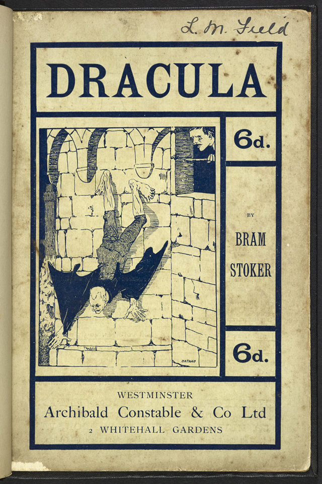
Archibald Constable and Co., 1901
“I have a real soft spot for the first illustrated cover of Dracula and the first pictorial depiction of the Count. It appeared in 1901 and was presumably sanctioned by Stoker himself. The scene – drawn and signed by the mysterious ‘Nathan’ – shows Dracula climbing down the wall of his castle, with a horrified Jonathan Harker looking on. Naïve and crude it may be but as an eye-catching device to sell the novel, to a public who at this point were not familiar with the story, it was probably quite successful.” - Tim Pye
–
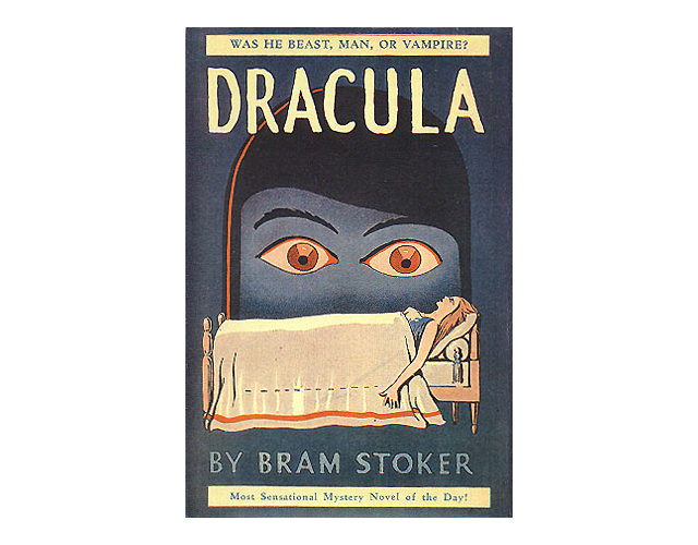
Grosset and Dunlap, 1930
“This is a favourite (one of many editions to use a similar image). The giant looming head of the Count looking down at the figure of a young woman asleep in a bed emphasises the theatrical, over-the-top nature of the book. As an image it’s quirky, menacing and strange in equal measure which fits the nature of the events portrayed in the novel rather well. Gothic tends to go over the top and highlighting this theatrical aspect plays upon the often bizarre and surreal nature of much Gothic literature.” - Tim Pye
–
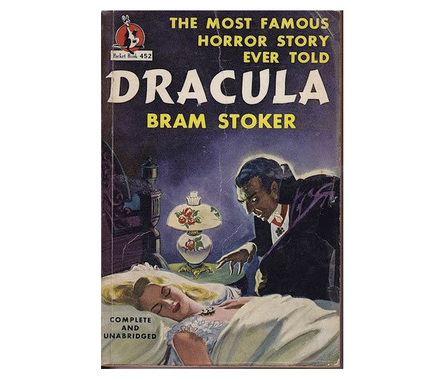
Pocket Books, 1947
“The cover for the 1947 Pocket Books Edition is taken, as an image, directly from Bella Lugosi’s portrayal of the Count in the film Dracula (1931) while every aristocratic and urbane depiction of the Count produced from the late 1950s onwards surely owes something to Christopher Lee’s superb portrayal of the character in the series of films made by Hammer Studios.” - Tim Pye
–
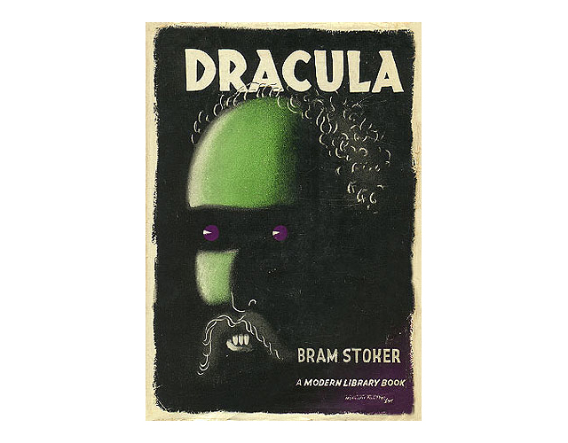
Modern Library, 1950s
“I’m not sure it qualifies as radical but this cover from the early 1950s is just downright weird. Presumably it’s a representation of the Count but with a tall green forehead, receding hairline, purple eyes and some distinctly fangless teeth. I’m not sure where the literary inspiration comes from or who the publishers were trying to attract.” - Tim Pye
–

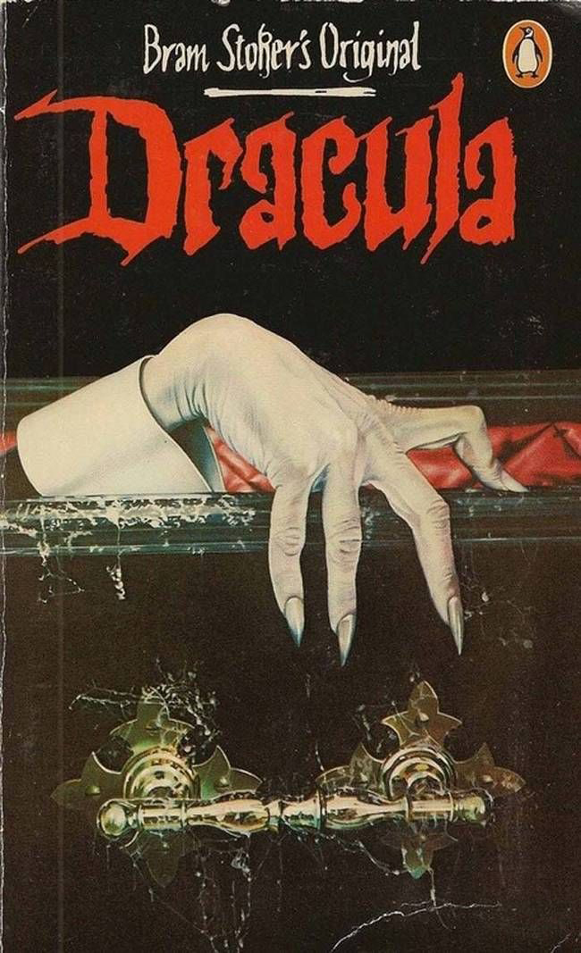
Penguin, 1980s
“Another cover I’ve always liked is from this Penguin edition dating back to, I think, the very early 1980s. It’s the copy of the book that I first owned myself, and it shows the Count’s gaunt, white hand on the edge of his cobwebbed coffin: very simple, but beautifully effective and very Gothic.” - Tim Pye
–
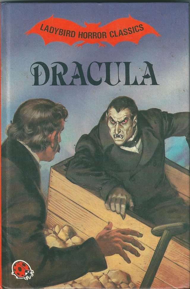
Ladybird Books, 1984
“While perhaps not being radical in terms of design the Ladybird Books edition published in 1984 is quite radical in terms of concept. The book was one of a series of horror titles aimed at children. The illustrations were of a high quality but coming from a publisher noted for their educational titles the appearance of a Ladybird book featuring a vampire climbing from his coffin probably delighted children and horrified parents in equal measure.” - Tim Pye
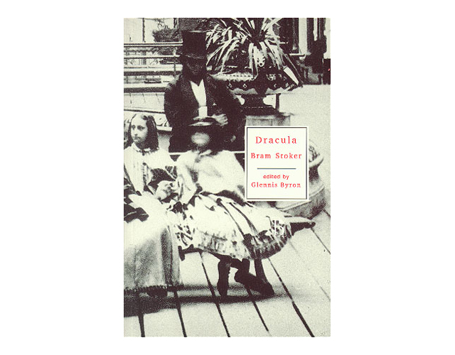
Broadview, 1998
“By cropping a Victorian photograph of visitors to the International Exhibition of 1862, the designer has managed to create a creepy and unsettling image of a shadowy figure sitting menacingly behind some oblivious children. I think it evokes the idea of the unseen danger, the Count amongst us, very successfully.” - Tim Pye
–
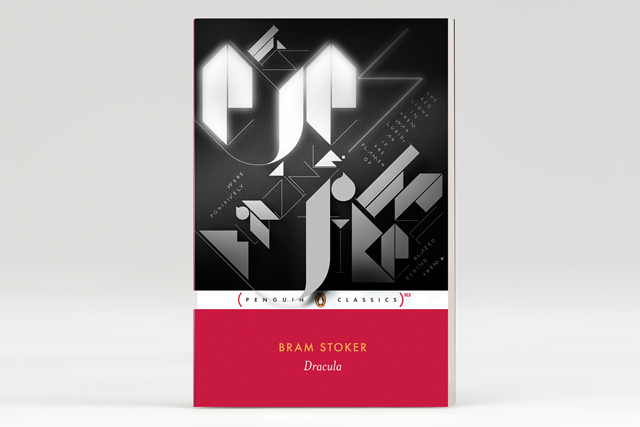
Penguin Classics, 2010
“Given that the quote was fairly long for such a small print area we decided to emphasise just a few of the key words and set the rest in a simple custom made geometric typeface. We chose ‘eyes’, ‘blazing’ ‘hell’ and ‘fire’ as the display words, which pretty much sum up the book right there. We deliberately combined a slightly disorientating mixture of typefaces, stroke weights, capitals and lowercase, often changing within a single word. We also placed some words and columns of text at a plus or minus 45 degree angle to further add to the unsettling nature of the composition.
The finishing touch was to give the word ‘eyes’ the same kind of burned out glow that’s reminiscent of titles from early-1920s movies, such as F.W. Murnau’s original Dracula movie Nosferatu. Actually, the real finishing touch was letting the tail of the first letter of ‘fire’ hang over that cute little penguin’s head, like the very sword of Damocles.” - Non-Format
–
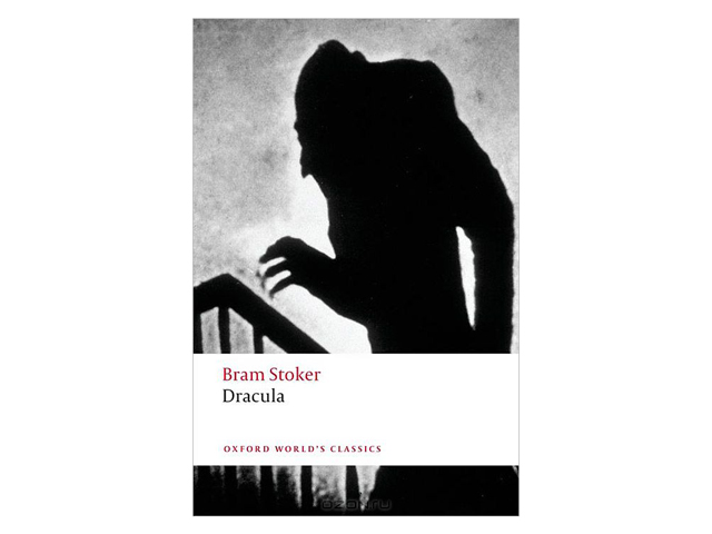
Oxford World's Classics, 2011
“The current Oxford World's Classics edition features on the front cover a still from F.W. Murnau’s 1922 film Nosferatu. The image, showing the shadow of the count as he moves up the stairs towards the heroine’s bedroom, is one of the most iconic in horror cinema and its use to promote the novel which first introduced Count Dracula to the world is telling. Over the years Bram Stoker’s novel has become inextricably entwined with the numerous film and television adaptations. Just as with the monster in Mary Shelley’s Frankenstein keeping the original literary creation separate from the numerous cinematic depictions is almost impossible. if you want to take inspiration from the cinema using a still or a photograph actually tends to work better than using a graphic treatment inspired by film. The former is immediately recognisable and striking while the latter can resemble pastiche.” - Tim Pye
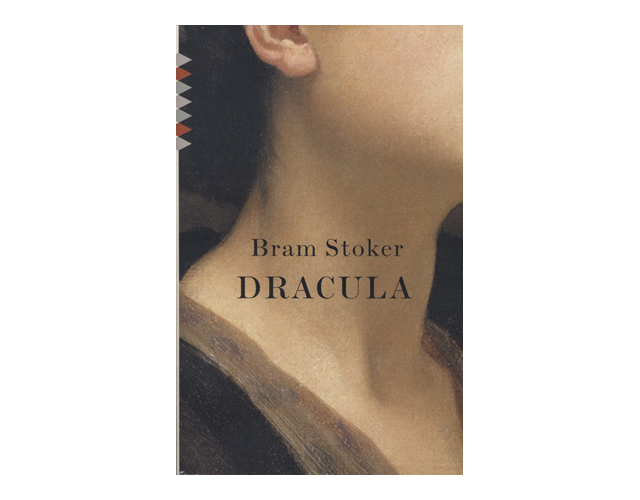
American Vintage Classics, 2011
“The massive expanse of bare neck is a detail from a painting by Frederic Leighton and it is by turns sexy, creepy, sensual and full of danger. The designers have cleverly avoided the clichéd image of the Count feasting on blood but it’s hard for the viewer to think of anything else: the neck looks ready for the taking and (literally) has Dracula’s name all over it. I think it’s a stunning design, almost perfect.” - Tim Pye
–
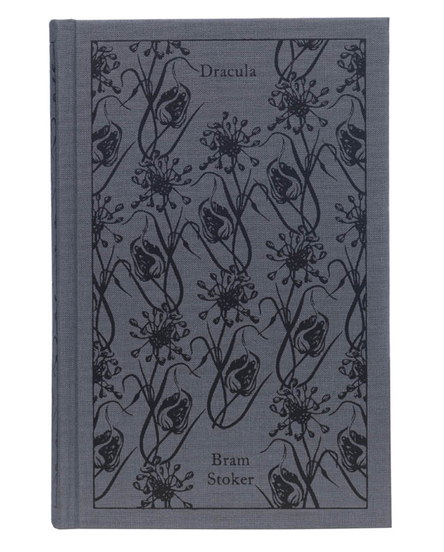
Penguin Hardcover classics, 2011
“Stoker describes garlic flowers being weaved as wreaths and placed around the woman's neck to ward off the vampire. Instantly this visual hit me as a beautiful yet practical concept for the cover. In my mind the flowers would keep Dracula trapped within the pages of the book, so I wove garlic flowers around the cover, making sure he would not be able to get out at night when the book was left by the side of the bed. I would say that tonally it is the darkest book cover I have got away with, and contrasts with the choice of flowers rather nicely.” - Coralie Bickford-Smith
With thanks to Tim Pye, Non-Format and Coralie Bickford Smith.