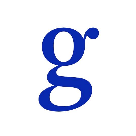
Created in 1999 for a Dutch newspaper, Arnhem feels both new and timeless. Type designer Johannes Lang sings its praises, especially the perfectly balanced counters of its lowercase ‘g'.
When asked about their favourite character, type designers often name the lower case double-storey ‘g’ their kingpin. Compared to other letters of the latin script alphabet, this shape has a special position. While most letters can be grouped with similar shapes (like hmnilu or bdpq) the ‘g’ has some unique characteristics. It does not belong to any group and is one of the few characters with two counters, the area of a letter enclosed by its form. As an additional cherry on the top, it features an ear on the upper bowl. Its singular character also results in a special shape on the left and right margin. This peculiar shape makes the spacing an inherent part of the design process.
This unparalleled structure requires special attention. It offers a certain freedom to put some personality into it and to make it recognisable as something unique and new. The difficulty of this freedom lies in the restraint to design features like contrast, weight and stroke emulation in relation to all other characters. The design should still be easily legible and readable, keeping the whitespace of the counters balanced and building enough contrast with the black of the strokes.
To my eyes all of these requirements are fulfilled beautifully in the lower case 'g of the typeface Arnhem by Fred Smeijers. Building on more than 500 years of typographic history and still managing to push in a new direction and create something unseen is not an easy task. Arnhem does a great job in feeling like something new but not being a temporary passing trend. Originally designed in 1999 for a Dutch newspaper, it still holds up very well fifteen years later, making it a timeless option for running text. A great part of this beauty comes from the well-balanced shape of the ‘g’. Without loosing any of is fine elegance, Fred Smeijers lets the ball terminal ear raise like a sprout instead of dangling it from the top like many other typefaces. The slight slant, which is only built by the contrast, gives a nice hint towards the reading direction without making it a fugitive from the other letters. This very functional and yet distinct design makes Arnhem a beautiful option for any text.
langustefonts.com
Johannes Lang
Vienna-based designer Johannes Lang studied graphic design at the University of Applied Arts in Vienna before specialising in type design at the Royal Academy of Art in The Hague. His typefaces are often rooted in experimental designs and play with how we use arbitrary shapes to make audible words visible. Recent typefaces include the hand-drawn Elfenfreund and Noncept, an exploration of everyday objects that resemble letters.
Counter Culture
When designing typefaces for the screen he aperture (the opening between the counter of a letter and its exterior) is increasingly important. Narrow closed apertures when translated onto low-resolution screens struggle to make themselves visible, making distinguishing an ‘8’ and ‘9’ or an ‘e’ and an ’s’ very tricky. Lucida Grande, Trebuchet MS, Corbel and Droid Sans were all designed with this obstacle in mind. But the problem isn’t new to digitisation, printing on poor quality paper, where the ink is likely to spread also gives the same effect.

