
With its unreliable narrator and themes of child abuse and despair, readings of Vladimir Nabokov’s Lolita have altered dramatically over its sixty year history. Its cover design has been no less controversial, as Emma Tucker finds out.
Lolita is a notorious book. Even today, as it celebrates its sixtieth anniversary, readers can hardly fail to be shocked by its subject matter. It's also a book that designers have wrestled with, on a visual level, for decades. John Bertram, author of Lolita: The Story of a Cover Girl, describes it as “an erudite, nuanced work by a master prose stylist, who agonised over every word. It features an unreliable narrator and a storyline in which child sexual abuse figures prominently. It is a tragedy, a comedy, and, improbably, a love story.” Couple this with the dissemination of the term ‘Lolita', which has come to signify a certain kind of sexuality, rather than the child abuse the book depicts, and the result is a novel that continues to challenge even the most accomplished graphic designers around the world.
“I want pure colours, melting clouds, accurately drawn details, a sunburst above a receding road with the light reflected in furrows and ruts, after rain. And no girls,” were Nabokov's own equally demanding and puzzling instructions on to how to illustrate the book. In a note to an editor, the author himself seemed uncertain as to who could craft an appropriate visual representation, questioning, “Who would be capable of creating a romantic, delicately drawn, non-Freudian and non-juvenile, picture for LOLITA?”
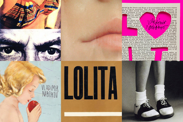
Nabokov was right to wonder. His no girls rule, in particular, has been repeatedly flouted by both publishers and designers over the years. Stanley Kubrick's 1962 film adaptation has also played a major part in the book's perception. “In particular one arresting promotional image of actress Sue Lyon (with lollipop and heart-shaped sunglasses) taken by photograph Bert Stern really influenced how Lolita came to be viewed,” comments Bertram who, finding himself disappointed with the novel's history of tasteless covers, launched a project in 2013 that asked designers to rethink the book's visual identity.
“The provocative nature of so many published covers is such an egregious misreading of the novel that, of all books, this one practically demands that the record be set straight,” comments Bertram, on his motivation behind the project. .Initially setting the project as an open competition, he admits to being disappointed by many of the covers that fell back on typical motifs – lollipops, roses, hearts, butterflies, lingerie and lipstick, to name a few. It was his decision to actively commission professional book designers that resulted in a collection of accomplished and varied new covers, ranging from the darkly suggestive to the purely typographic, challenging publishers' propensity to fall back on the stereotypical girl image. “It's interesting because I think many of the covers that I commissioned for Lolita: The Story of a Cover Girl are far superior to the actual published covers,” says Bertram. “This is probably due to the complete freedom that the designers had and of course the fact that they didn't actually have to sell books.
”It's precisely this tension between publishers' need for commercial success, and Lolita's unsettling subject matter, that's resulted in six decades of sometimes brilliant but often misguided covers.
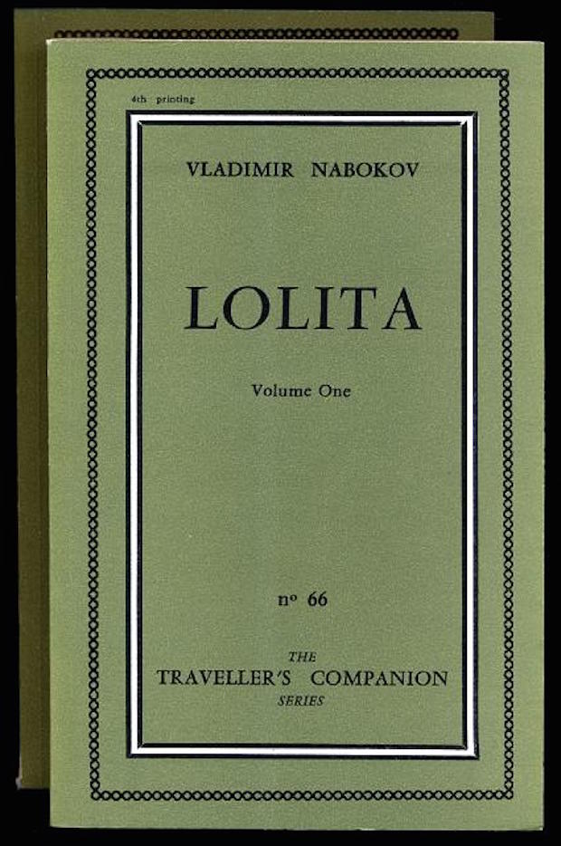
Olympia Press
The absence of imagery on this, the original Olympia Press edition of the novel, ironically says far more about the book's contents than many of the more lurid covers that came later. Its simple green jacket was standard for the publisher's 'porn' catalogue, and, as US literature professor Lara Delage-Toriel commented in a recent LA Review of Books interview, Olympia Press “was one of the rare publishers to offer an acceptable cover by Nabokovian standards.”
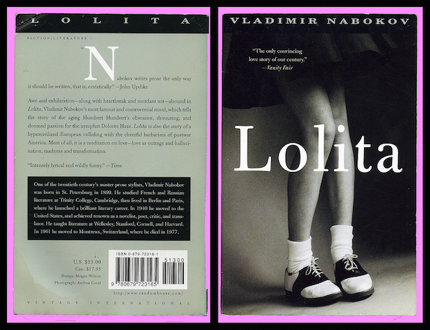
1997 Vintage edition, by Megan Wilson
“Megan Wilson's 1997 cover for Vintage International has been singled out by many people for special praise and with very good reason,” says Bertram. “The black and white photograph of a girl form the waist down wearing a skirt and bobby socks and saddle shoes at first appears a bit banal, possibly somewhat coquettish. But, Mary Gaitskill and Peter Mendelsund among others have been quick to note the girl's apparent defensive cringing posture. I think this is progress, since it addresses in a remarkably subtle way Lolita's victimhood.”
1994 Companhia das Letras edition
“I am quite fond of the 1994 cover by Brazilian publisher Companhia das Letras, which establishes a suitably creepy, sexually predatory, and darkly hypnotic tone,” say Bertram.
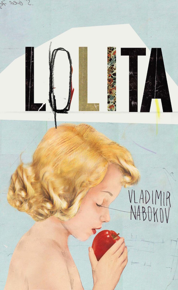
2011 Penguin edition, by Kathryn Macnaughton
“I tend to hold the more recent covers to a much higher standard than I would those from earlier decades," says Bertram. "Let's take, for instance, the 2011 Penguin cover by Kathryn Macnaughton. It is not a terrible cover. In fact, the title treatment is truly fantastic. But depicted is an angelic pink-skinned blond-haired child apparently preparing to bite into an apple, a rosy refugee from an early Fifties greeting card or a wartime advertisement for the healthful properties of Post Toasties or Ovaltine. But, readers of the novel know that Lolita is not pink-skinned but 'tanned,' 'honey-hued,' 'almond,' and 'russet' and her hair, far from being blonde is 'bright brown,' 'chestnut,' and 'auburn.' The child depicted also seems younger than twelve. You may say that this is nitpicking, but Nabokov was obsessed with details; for him they were most definitely not mere embellishment, but the all-important building blocks from which a story is constructed word by word.”

50th anniversary Vintage edition, by John Gall
“I would consider John Gall's cover for the Vintage 50th Anniversary Edition controversial,” says Bertram. “Although the cover as published shows a close up of one side of a girl's mouth (which certainly is innocent enough) in the original design the lips were oriented vertically giving a much different reading, which I suppose was ultimately too much for the publisher, and perhaps rightly so.”
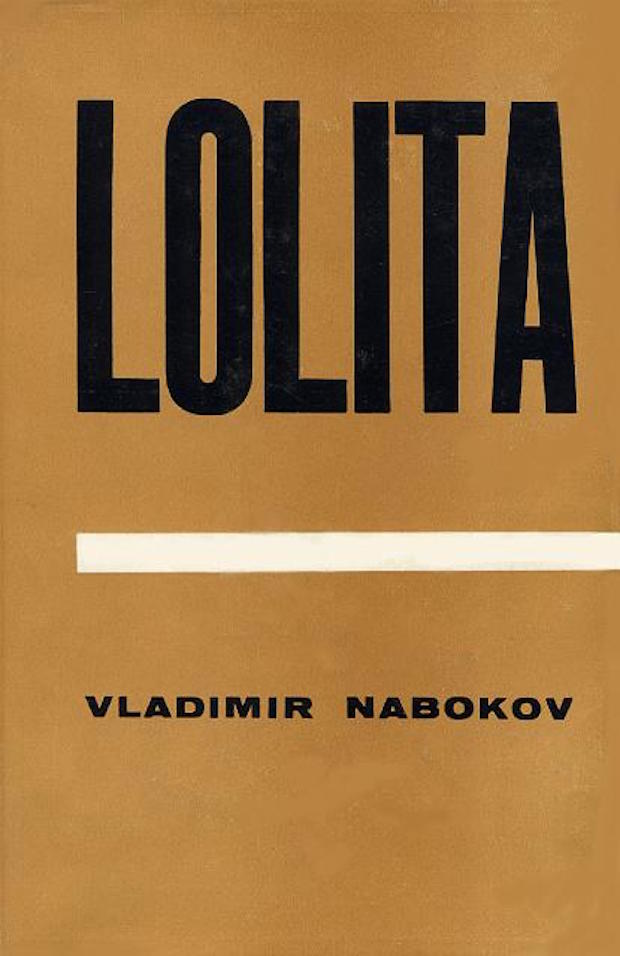
1959 Weidenfeld & Nicolson edition
“Personally, I'd prefer not to see an image of a girl on the cover,” says Bertram. “Generally speaking, I think the selection of imagery must be negotiated very carefully in order to avoid the pitfalls that have ensnared many designers over the years. Of the text-only covers, I am partial to the tan-brown 1959 Weidenfeld & Nicolson cover with black text and a white bar separating title and author. It is surely understated: Dieter E. Zimmer called it 'uninspiring' and said it was 'as if the novel were about Lolita's court records.' But there is also something sinister about it, as well as a reference to the heated controversy that at the time was still swirling around the novel."
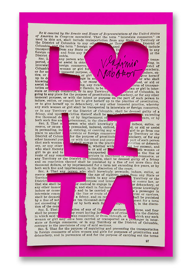
Lolita by Michael Bierut
Created as part of Bertram's Story of a Cover Girl project, Bierut's design features type hand-lettered and cut out from a sheet of paper, which is actually the Mann Act – a 1910 law prohibiting trafficking of women for “immoral purposes”, specifically mentioned in the novel itself. The apparently childish hand, paired with a backdrop of more serious subject matter, creates an appropriately jarring effect.

Lolita by Sam Weber
Another cover commissioned by Bertram, Weber's interpretation stands out as a rare example of a designer focusing on the novel's dubious protagonist, Humbert Humbert. While the cover might not adhere strictly to Nabokov's requested “colours” and “melting clouds”, its sense of inherent despair is perfectly in keeping with the tone of the novel.