How do you brand a bunch of veteran front-end developers? For Swedish studio Bedow the answer was to keep it fun but play ugly.
Can you begin by describing the project in basic terms?
In the mid 90’s two suburban juniors outside Stockholm got their hands on a personal computer. They put their skateboards away for a moment and started experimenting. Today, twenty years later, they are still experimenting, but now consider themselves seniors. A couple of months ago they asked us if we were interested in communicating their skills through a visual identity for their digital studio — Polyester.
How did the project originally come about?
Fifteen years ago, I (Perniclas Bedow) used to work together with one of those juniors at an advertising agency. Since that time we have collaborated on a couple of projects and earlier this year, when they decided to do something about their branding, they asked us if we could help them define and visualise their strengths.
What was the original brief and did it change at all?
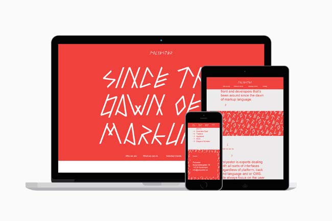
These guys are really, really senior. Today you find front-end developers who were born in, like, 1993 – that is about when Polyester were running a BBS (bulletin board system) in a wardrobe. But since they’re still interested in experimenting you get the benefit both of the experience and the curiosity. That’s the history that we tried to communicate. Although recognising that using markup language as a communication device is a cliché, we thought we could do something slightly different with it.
Did this project present any particular challenges, and if so how were these overcome?
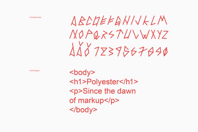
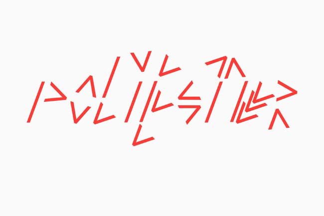
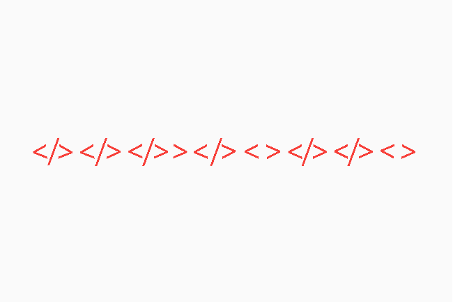
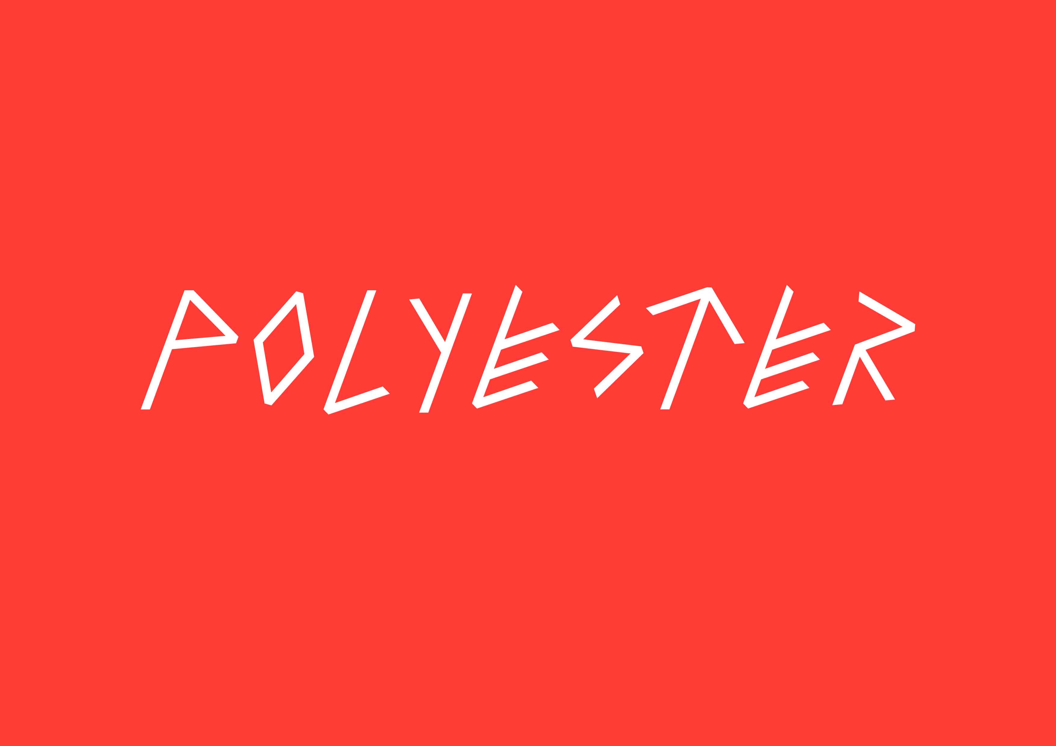
One of the toughest challenges was to find a way of communicating their experience within their field of expertise without being too corporate or too boring – after all, they still define themselves around a willingness to test the boundaries of their discipline. We overcame this by making a runic style typeface based on the characters <, / and >, all elements commonly used in coding. We call the typeface Polyester Sans. A particularly challenging part of that solution was in creating the numbers for the typeface – they really look like they’ve been out all night. But we thought that added some character so we kept them.
What do you think has worked particularly well?
The best thing is undisputedly the Polyester Sans typeface – the whole identity is built upon it and you couldn’t replace it with anything without ruining the result. Some people think the identity is quite ugly and I think that is a good thing – it proves that the idea is so strong that it survives ugliness. Whatever that is...
What was the client's feedback?
Since they gave us the freedom to create something unique and playful they were a bit nervous before the presentation. And so were we – we had no idea how they would react on this quite unorthodox identity. As it turns out we needn’t have worried, they were very enthusiastic. No one looks like that – especially not among front enders. And we are both overwhelmed by all the press they’re getting – that was not something we expected.