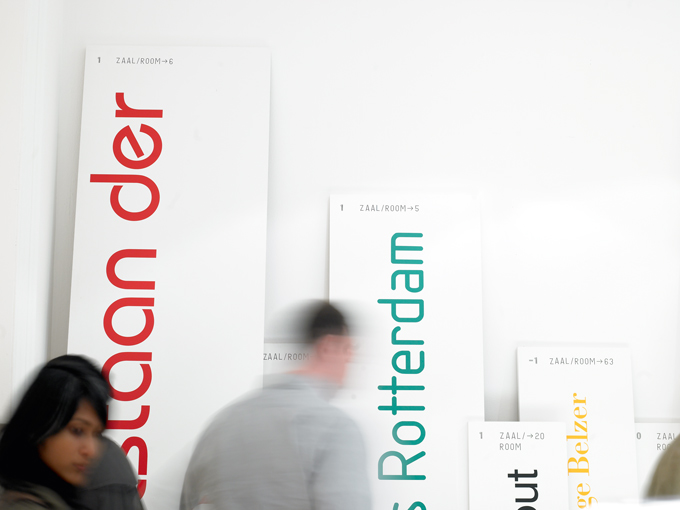
Reviewed in Grafik 152, Zak Kyes's 2007 Architectural Association show Forms of Inquiry went on to become a landmark exhibition, touring extensively and reigniting the debate surrounding critical graphic design.

The thing that really strikes you when you walk into the Architectural Association (after you’ve got over Cornel Windlin’s massive inflatables attached to the beautiful Georgian frontage on Bedford Square) is the sheer amount of rather lovely graphic design that permeates the building.
Exhibition aside, everywhere you look there are beautifully crafted posters about previous and forthcoming talks, prospectuses and other random bits of printed paraphernalia dotted around the place. The man responsible for most of this is of course the AA’s creative director, Zak Kyes, who along with fellow designer Wayne Daley runs the AA’s inhouse Print Studio. Forms of Inquiry is an ambitious project conceived and curated by Kyes which takes the shape of a publication (co-edited by Mark Owens), a reading room and a touring exhibition. The exhibition is subtitled “The Architecture of Critical Graphic Design” – all the participants were chosen as their work was deemed to be based on “critical investigation”, as opposed to, say, a passion for foil-blocking. Those things need not be mutually exclusive in a graphic designer, but it seems like they often are. What the participants all have in common is a desire to delve deeper into their subject matter, and a shared approach to generating original and thought-provoking content through research.
The project proposes to examine the ongoing relationship between the disciplines of graphic design and architecture, which apparently is based “equally in admiration as well as productive envy”. That may be the case, but what’s become apparent to us over the years is that architects are the only profession even more anal than graphic designers. It’s often said that every architect thinks that they can master the art of graphic design, which must stem from having the ability to create a whole building from scratch (ergo, what’s a bit of kerning in comparison?).
Each of the nineteen designers was asked to contribute three separate elements to
the show. The first is a past project related in some way to architecture, the second is
an ‘inquiry’ – a personal investigation into something loosely architecture-related, and the third is a commissioned print that stems from the research gleaned from the aforementioned ‘inquiry’. If it sounds a bit complicated, that’s because it is – well, compared to rounding up all the usual suspects and getting them to design a black and white poster, anyway.
It’s an exhibition that does require the viewer to make some degree of effort (there’s a lot of reading involved), but ultimately it’s all the more rewarding for it. Kyes described the exhibition as “fantastically dense” and it’s certainly a very intense gallery experience. The slightly limiting space has dictated how the work is organised, and it’s not always ideal to have to go from one part of the room to another to see the work of the same designer. Also, being privileged to see the research element of a project (which the viewer is not generally privy to) can mean that the finished print can be something of a let-down. Paradoxically, though, this means that you don’t feel too short-changed as you’ve understood the thought processes behind it, even if you’re not in love with the outcome.
As with any group show there is a degree of inconsistency, but there are many highlights including Mevis en van Deursen’s inquiry into the Rietveld Academy and Paul Elliman’s investigation into the Whispering Gallery at St Paul’s; both stood out as projects that posed as many questions as answers. There’s also a rare chance to see Jürg Lehni’s very cool (if slightly temperamental) spray-paint device, Hektor, in action.
An additional bonus is the first-floor reading room curated by a panel including Kyes and Daly, 032C’s Joerg Koch, Benjamin Sommerhalder of Swiss publisher Nieves and Textfield’s Jonathan Maghen. Easy to miss, it’s a veritable sweet shop of intriguing publications from the libraries of the curators, and it makes for compulsive viewing (although the students didn’t seem that bothered when Grafik was there). While we’re not generally prone to kleptomaniac tendencies, we have to say it’s a good job that all the pieces are safely tied down.
If you can’t make it along to the exhibition, then we recommend get your hands on a copy of the book, which has much of the content from the exhibition, plus additional essays by Owens and Will Holder. The only real negative aspect to Forms of Inquiry is that it should take an architectural body (as opposed to a graphic-design organisation) to mount one of the most challenging graphic-design shows of the year so far.
formsofinquiry.com/
Download the original article here
Forms of Inquiry was held at The Architectural Association School of Architecture
, 08–31 October 2007

