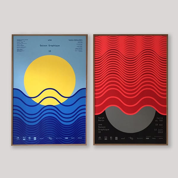
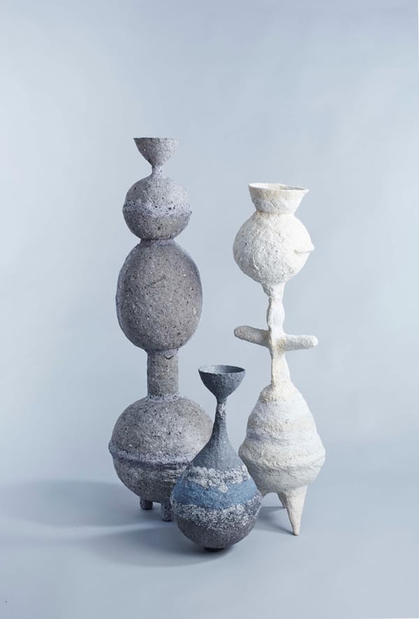
Adapting to the North African climate, Studio Hato learn some valuable lessons as they create a publication and exhibition identity for the British Council’s latest expedition in Marrakech.
Can you begin by describing the project in basic terms?
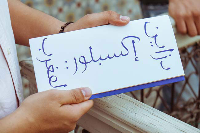
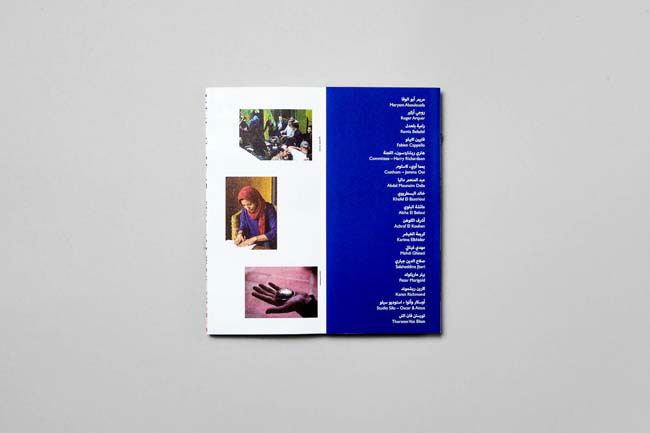
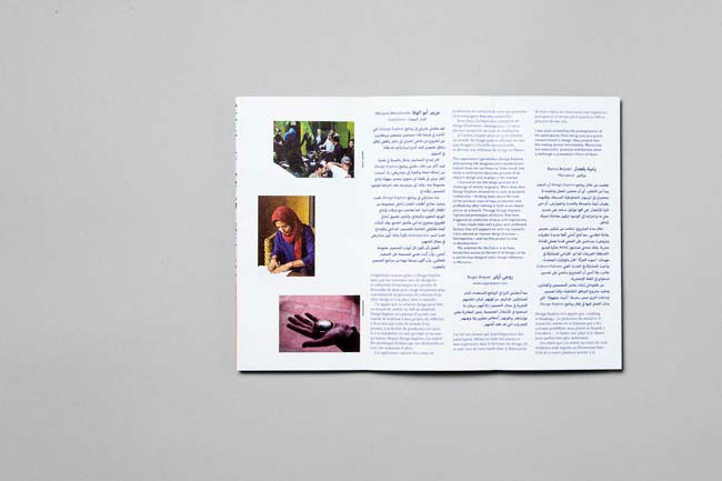
We were asked to design a small publication to document Design Explore, a project organised by the British Council that took place in Marrakech between April 2013 and April 2014. Design Explore brought together a group of young Moroccan creatives and UK-based designers around a series of workshops. The publication features Moroccan and UK designers’ testimonies, reflecting on the cultural diversity of the initiative as well as on the variety of experiences during this year-long workshop.
What was the original brief and did it change at all?
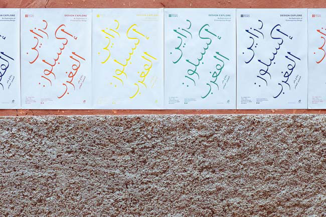
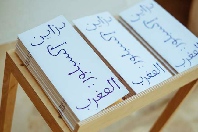
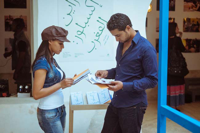
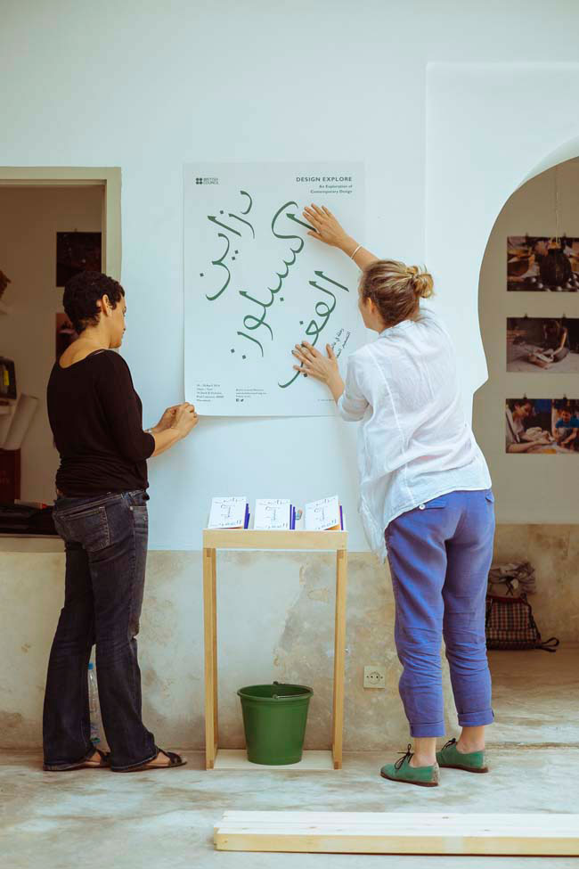
The brief was clear and well set out from the beginning. We worked closely with Kendall Robbins from the British Council and Karen Richmond who was the curator of the project. Conversations with them gave us a good insight into what Design Explore was about conceptually but also in terms of experience for the participants. As the project progressed, we ended up doing more than just the publication: we designed a series of posters for the exhibition and the design for the publication was adapted as part of the exhibition graphics, evolving into a form of identity. We also commissioned Peter Marigold, who was also one of the participants, to produce a lectern to hold the publications.
Did this project present any particular challenges and if so how were these overcome?
Working with three different languages was definitely a huge challenge. A crash course in Arabic typography was needed, as well as digital typesetting. The format of the booklet itself was quite difficult to produce but a really enjoyable process. With all our projects we work closely with the production teams; however, for this book we had a lot of extra meetings with our printer and finisher throughout the design process to make sure that what we were designing could be made as we intended. We had fold-out pages throughout the book, which hides the bulk of the text, thus allowing a book to act as a visual diary of the project. It’s easy to make one mock-up in the studio and then assume that it can be done in bulk but in the end, our finisher had to bind each book by hand, due to its irregular format.
Why was Eric Gill such an appropriate reference point for this project?
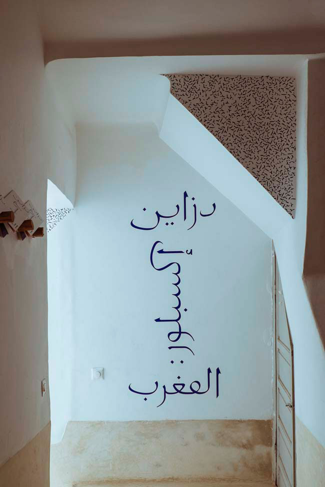
Apart from the exchange of design thinking between UK and Morocco, a major part of Design Explore is about craft and learning. A few years ago, whilst researching for another project, we came across an Arabic typeface that Eric GIll left unfinished. He is undoubtedly one of the great British craftsmen and we felt that this was the perfect opportunity to honour him by redrawing it for this project. Apart from the conceptual relevance, drawing the typeface gave us the opportunity to learn about Arabic typography.
Are there any aspects of the finished work that you are especially happy with? Are there any frustrations?
We are particularly happy with the typeface we drew for the identity and also the format of the publication itself. But those are also the two things that presented the most challenge for us. It is always nice when you finish a project and feel that you have learnt quite a lot from it.
What was the client's feedback?
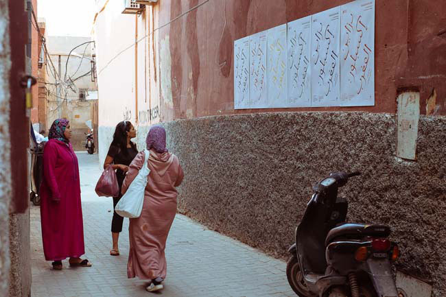
We worked on the project for over two months and it was a great feeling to see everything come together. The client was thrilled by the end result. Posters in Morocco are often more illustrative and colourful, so there was some initial concern about the posters we designed for the exhibition, as our approach was heavily typographical and applied a lot of white space to contrast the urban landscape; however, we were told that they functioned really well in the city.
studiohato.com
design.britishcouncil.org
