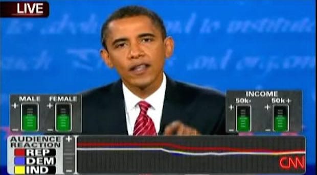
For Eric Gunther, co-founder of interactive design studio Sosolimited, CNN’s live data-visualisations during the US Presidential debates is a technological step forward that throws up some problematic ethical questions.
For American television, more is more. Graphs, maps, readouts, stats, tickers, bumpers, bugs, updates, and pictures in pictures in pictures. Total information awareness. Have a nightcap, squint your eyes, and you won’t be able to tell the difference between Fox Sports, CNN, Bloomberg, and Call of Duty. Talking heads framed by dense graphical dashboards, twitching with text and data.
There’s no reason to think that political television should be exempt from this infographics arms race. And what better event to turn into a sporting broadcast than the Presidential debates?
During the 2008 US Presidential Debates, the year Obama took the gold, CNN broadcast a nationwide experiment in politics, psychology, and data visualisation. We’d been working on our own real-time multimedia debate remixes for a few years at Sosolimited, and were excited to see something like this attempted at such a large scale.
Selected members of the live audience at each debate were given a handheld grey box with a dial and a numerical readout. Officially called the Perception Analyzer Dial, it looks like it might measure your Thetan levels, but it doesn’t. When a candidate says something you like, you turn the knob to the right. When you don’t like what you’re hearing, you turn it to the left. The positions of all the knobs in the audience were averaged, turned into a value labelled 'Audience Reaction', and displayed as a moving graph at the bottom of CNN’s live broadcast of the debates.
When it comes to selling a proposition, data visualisation can be as dangerous as good writing. It can make everything seem so simple, boiling down the overwhelming complexity of reality into aesthetically pleasing lines and circles. CNN’s debate graph seemed to take this to the extreme, with its distillation of complex intellectual arguments into a single axis. I like it. I don’t like it.
This alarmed me, but the more I thought about it, the debates are argumentum ad passiones, the factual content often feeling irrelevant compared to the emotional response felt. Some neuroscientists even acknowledge the role of emotion as a precursor to rational decision making – you might say that those three little lines were an elegant compression of the conflict between emotional and rational responses playing out in that debate hall.
Was CNN’s tidy little graph subtly telling viewers what to feel and when to feel it by broadcasting the reactions of a small audience to millions of viewers? Infographics have an implicit scientific authority; were CNN’s graphs the equivalent of a laugh track, telling us who was winning the game?
We humans are slaves to our emotions and we look to others for validation of our feelings. Maybe CNN’s opinion graph points to the day when data feeds in our embedded heads-up displays will give us the real time approval ratings of our social network as we navigate real life. “I feel good, because my friends indicated a net positive sentiment about those five hours I just spent lying on my couch drinking scotch, catching up on Mad Men Season 4.”
In the short term, I’d like to see CNN real-time-focus-group their own broadcasts. One more graph at the very bottom of the screen labelled Malarkey Meter, and a room full of people in a nondescript office park watching every minute of every broadcast, turning a dial right for truthful and left for bullshit.
Sosolimited
...is an art and technology studio founded in 2003 by Justin Manor, John Rothenberg, and Eric Gunther. The three met at MIT where they collectively studied physics, computer science, architecture, arts and music. Today they have studios in Boston and San Diego, and continue to operate at the boundary of art, design, experience and information.
US Presidential TV debates
...started in 1960 with a series of four debates between Richard Nixon and John F. Kennedy. Going into the first debate with a lead in the polls, Nixon refused to wear makeup or to rest beforehand; Kennedy, on the other hand, appeared tanned and healthy. A majority of the 70million people watching the debates on TV believed that Kennedy had won, while those listening on the radio apparently thought Nixon had won, leading to the belief that Kennedy’s physical appearance swayed a tight election in his favour.

