
In this archive Logoform piece which first appeared in Grafik 174, Joshua Ted Millar reminisces about Italia 90, and the tournament's unmistakable mascot Ciao...
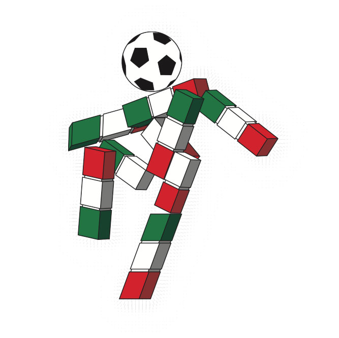
As a child in the early 90s I remember first realising that a logo was part of a bigger picture and not just a lone symbol or icon – it was part of what I now know as an identity system. Therefore the first thing that I think of when the 90s are mentioned is Ciao, the mascot for the 1990 World Cup in Italy.
I’m not saying it’s the best logo of the 90s, or my favourite, but this stick figure with a football head and an Italian tricolour body is so much more than that. This is the symbol that reminds us of love for an unknown Cameroon national team, Paul Gascoigne crying, the Three Tenors performing Nessun Dorma, and it reminds me of when I fell in love with something visual that would ultimately shape my future.
I wonder what the conversations were like between the great designers of that time? I imagine they laughed and said, “That’s awful, I would love to have had a go at that.” Which is possibly the reaction that some designers and a visually savvy generation of the British public had when they first saw the logo for London 2012.
I actually like the 2012 logo, but I also had that same reaction when I first saw it, horrifically reproduced on the front page of Metro.Then a few months later I received my new bank card and saw the 2012 logo on the top corner, reproduced in two colours. I loved it. I felt proud to be British. I was excited about the Games coming. Is the logo growing on us as a nation? I think so. I also challenge any critic to look at the logos for the 2016 Games proposed by Prague, Madrid, Tokyo and Chicago and choose any of those over our 2012 marque.
In summary, generations will worship icons for what they stand for, regardless of how they look, but the best ones will help themselves be remembered. I know the 2012 logo will never be forgotten in graphic design history, and I expect the children of this Olympic generation will use the logo as I used Ciao – as a symbol of all the great moments they witnessed at this fantastic event. I’m excited to see how the 2012 brand is rolled out over the next three years.
joshuatedmillar.com
This piece first appeared in Grafik 174, June 2009