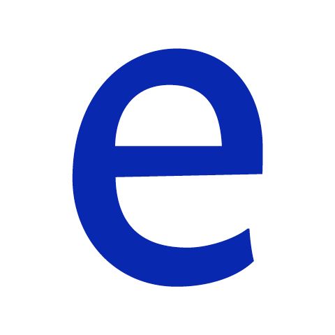
In today's Letterfom, James Langdon looks at the lowercase ‘e’ from Evert Bloemsma's Legato – a unique typeface which has sunk into obscurity, but somehow still resists the vagaries of fashion.
Aren’t all typefaces anachronistic? Certainly, forms produced by various tools for shaping letters have accumulated in confusing ways over time. Traces of the nib, the punch, and the Bézier remain because they are embedded in customs and physiologies of reading. They’ve earned their longevity by easing the difficult transitions readers have made through eras of change in the reproduction of text. The typeface Legato, by Dutch designer Evert Bloemsma, confronts these historical accumulations with a subtly radical handling of form.
Bloemsma’s first typeface, Balance, appeared in 1993. It’s a sans serif with a top-heavy construction and the appealing characteristic — which Legato shares — of having no straight lines in its letterforms. Balance has an awkwardness to its styling, ignoring some of the historical craft of drawing type — the slight corrections that designers normally make to give letters their optical ‘rightness’. I still occasionally see it in use, but in retrospect Balance seems like an exercise, an intermediate point in a process of thinking through form. Legato, published in 2004, is a resolution of that process.
Two things got me interested in Legato around the time of its release. I admired it in the ‘Team 10’ architectural monograph that Jaap van Triest designed for NAi publishers in Rotterdam in 2005. Legato looks totally believable in relation to the book’s subject matter — a reassessment of modernist values in architecture — and in relation to van Triest’s layout. In his work things always seem as if placed casually but thoughtfully on the page, never forced to conform to grids and unnecessary alignments. The fact that he had used it made the typeface appealing to me.
And I remember a long discussion on the Typophile website, in which members of the type design forum excitedly declared the novelty of Legato. There was a term, that I can’t recall now, used by one commentator to describe its unusual formal disconnection of strokes and counters. It was something like the Japanese ‘wabi-sabi’. The forum is probably still online, but as much as I would like to get that word off the tip of my tongue, I hesitate to check. I like the mysticism the memory gives to my perception of Legato.
What makes Legato extraordinary is Bloemsma’s attempt to reconcile the serif with contemporary aesthetics. He recognised that serifs have a function – whether culturally conditioned or objectively physiological – in making text legible. With Legato he rationalised the serif. Not ideologically, by just removing it, but through a formal synthesis. Bloemsma sculpted Legato precisely, digitally; modulating the strokes of each letter to produce swellings and tightenings, absorbing the function of the serif into a new morphology. More than any other typeface I can think of, Legato resists anachronism.
But Legato is unfashionable now, receding into obscurity beneath the deluge of new typefaces. Type design has always necessarily been a retrospective activity, but that tendency is exaggerated at present, and Bloemsma’s (lowercase ‘m’ modernism) increasingly disconnected from preoccupations with historical letters. Revivals of seriffed typefaces are popular with graphic designers presumably because they give pages a familiar, definitive appearance. They come with authoritative stories of archives and provenance. Yet the current state of the sans serif is also curiously backward looking. The mid-twentieth century rhetoric of neutrality is exhaustively revisited with barely a hint of irony.
I’ve only used Legato for one substantial piece of work. A book on Steina and Woody Vasulka, two pioneers of video art in the 1960s. Designed in 2006, it’s one of the few things I made at that time that I can bear to revisit. Looking at it now confirms that I was an incompetent (self-taught) typographer. But the type itself still retains its unfamiliarity. There’s nothing else like it. I suppose that Legato misses its designer, who died prematurely at 47. What more might he have done to canonise and contextualise it? And what letters would he have made next?
jameslangdon.net
Evert Bloemsma...
…was a Dutch graphic and type designer born in 1958 who studied in Arnhem, and later went to work on the production of digital fonts at URW (home of Ikarus software). Bloemsma and his beautifully crafted typefaces were hugely respected by the type design community, with Legato winning a Type Directors Club Award in 2005. When he sadly died in 2005, Stephen Coles commented on Typograhica that “It felt like he was just getting started.”
James Langdon...
…is a designer, editor and curator. He edits and designs many of the publications for the artist-run exhibition space Eastside Projects in Birmingham (where he is a director), has curated exhibitions including Arefin & Arefin and Book Show, and in 2013 he set up the School for Design Fiction. He restaged Norman Potter’s 1974 play In:quest of Icarus with a group of students from Werkplaats Typografie, and is currently renovating Potter's old house in France, where it will become a residency for design writers.
February 10, 2016 3 minutes read
Curve Ball
James Langdon looks at the lowercase ‘e’ from Evert Bloemsma's Legato – a unique typeface which has sunk into obscurity, but somehow still resists the vagaries of fashion.


