
Delicate visually but rough to the touch, the packaging for a DVD featuring work by Cindy Van Acker perfectly matches the Swiss choreographer’s unconventional approach, says its creator Paris-based studio Akatre.
How did the project originally come about?
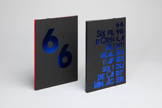
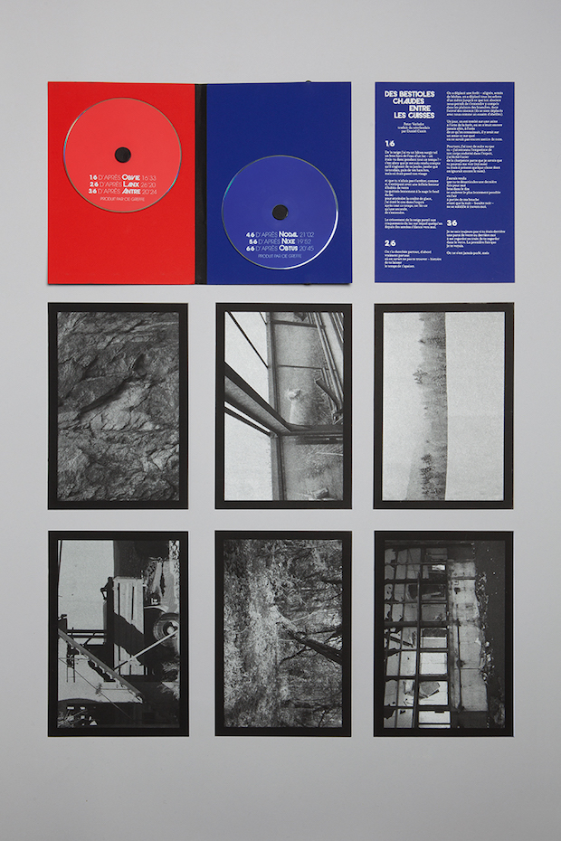
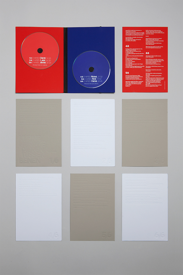
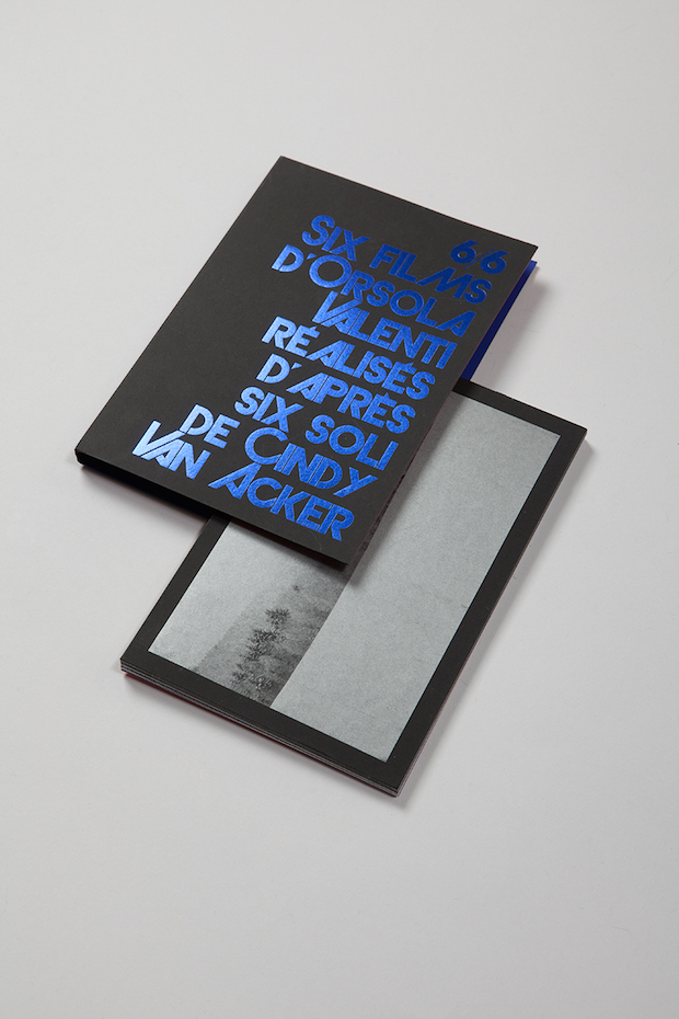
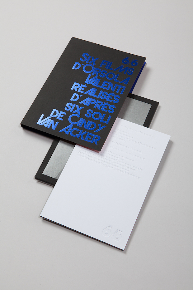
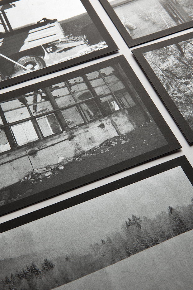
We’ve worked for Cindy Van Acker for several years now and we look after the visual identity for her company Cie Greffe. She worked on a set of six films, directed by Orsola Valenti, and wanted to release the work on DVD and asked us to create the packaging.
What was the original brief?
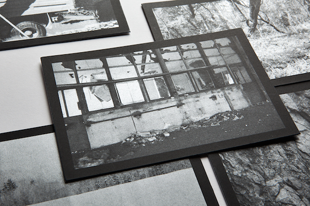
The original brief was to translate these films into the physical realm. We were supplied with some materials such as images and texts.
Tell us about the design concept and your inspirations.
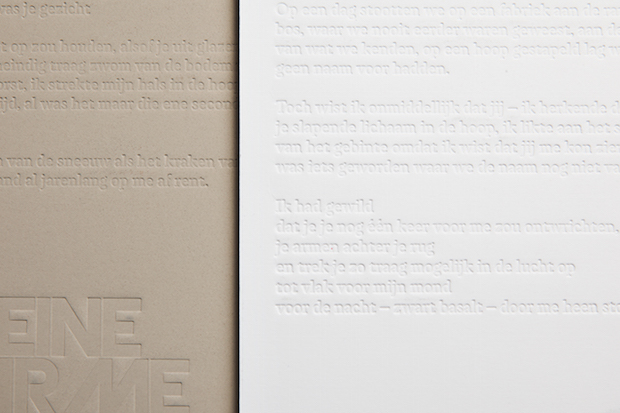
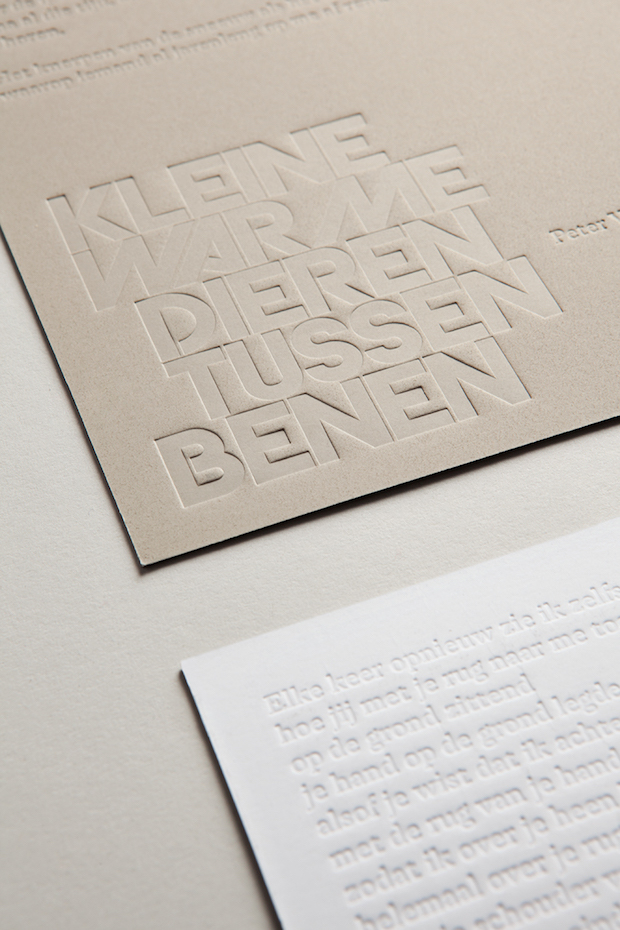
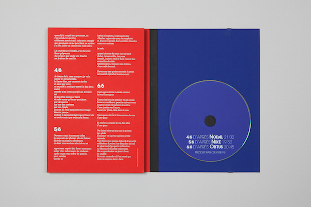
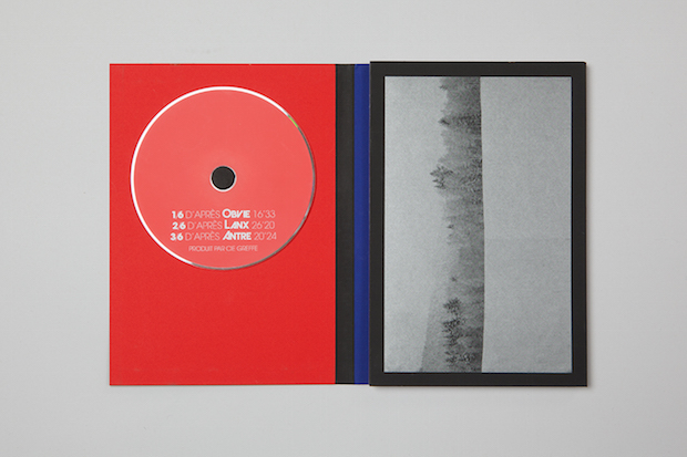
We wanted something graphic and simple but using a material that was as rough as possible.The work of Cindy can seem rough but it’s really masterful. We tried to translate this feeling with a rough paper stock. It feels really disturbing to the touch.
Did the DVD project present any particular challenges, and if so how were these overcome?
A DVD box is a challenge because if you want to deviate from the standard format, you need to find the right processes. The challenge is obviously how and where to store the DVDs. After that we had to co-ordinate all the materials that Cindy gave us. We thought about this project in the same way we think about books, except with a DVD. We needed to find the right printer and the right materials.
What do you think has worked particularly well?
We definitely like the delicacy of the object and the surprise you get when you touch it and when you open it. It’s like a Russian doll.
Did this project involve sourcing any new materials or using any new processes?
We source the paper from Arjowiggins, it’s a stock called Curious Matter. We had help with the print process and packaging by printers Imprimerie du Marais.
akatre.com


